Click here for full code
def rk4step(f,t,h,y):
  k1=h*f(t,y)
  k2=h*f(t+0.5*h,y+.5*k1)
  k3=h*f(t+0.5*h, y+0.5*k2)
  k4=h*f(t+h,y+k3)
  return (y+(k1+2*(k2+k3)+k4)/6)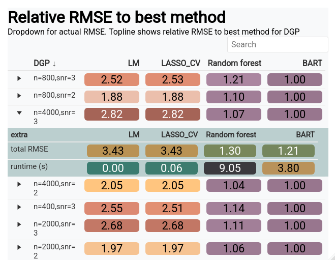
A simulation study is a great way to test how well a devised method will work in practice. At the minimum, the method should well in the case it was designed for. This is, of course, the most favorable case, so more realistic simulated data should also be proposed so that users of the method (or software) can know when it will not work and how poorly it might perform in the less optimal conditions. Just because a method does not always work does not mean it is doomed, just that it has limitations.
While the goal of a simulation study can be written down (as we just did), designing a proper simulation study is a different beast. For one, simulations mean different things across disciplines. For that reason, we will showcase several different types of simulations, their use-cases/pitfalls, and where the analyst should be careful when designing them.
Before we start, let’s investigate a concrete example. The Bayesian additive regression trees (BART) model is a powerful tool for function approximation and being a Bayesian method, is equipped with automatic uncertainty estimates for the estimated function. However, being a Bayesian method, there are no “frequentist coverage” guarantees for the furnished intervals. That means we do not know for sure if 95% intervals contain the truth 95% of the time as guaranteed by other statistical uncertainty quantification methods. Luckily, BART intervals have been vetted across many different simulated scenarios and for the most part have been pretty decent. A good simulation study would test different properties of the generated data, and also allow for metrics into the coverage. Are the intervals too wide (an infinitely wide interval will always contain the true parameter)? Are the the intervals too narrow (we are overconfident and thus have less than the correct coverage percentage)? Are the intervals the right length but the BART estimate is terribly biased (meaning the estimator is inaccurate and our intervals will exhibit “under-coverage”)? Do we do well when the function of \(\mathbf{x}\) is a complicated non-linear function? All things we can check in a simulation study, as we’ll explore in this chapter.
This equation dates back to the days of Isaac Newton. The motion of the celestial bodies is defined by
\[ F_{i} = \sum_{j\neq i}^{N}G\frac{m_i\cdot m_j}{{\mathbf{r}}_{ij}^2}\hat{\mathbf{r}}_{ij} \]
\(\mathbf{r}_{ij}^2 = \sqrt{(r_{i,x}-r_{j,x})^2+(r_{i,y}-r_{j,y})^2}^2\) and \(\hat{\mathbf{r}}_{ij} =\frac{\{r_{ix}-r_{jx}, r_{iy}-r_{jy}\}}{\sqrt{(r_{i,x}-r_{j,x})^2+(r_{i,y}-r_{j,y})^2}}\)
for a planet \(i\) in our solar system interacting with all other planets \(j=1,\ldots, N\) except for \(j=i\). Since the mass of the sun is so massive, a good approximation is just to take the pairwise force interaction of each planet with the sun and ignore the gravitational pull of the other planets, because the sun is so massive (the Earth does not orbit around Pluto after all). For simplification purposes, we are only looking at the 2-d orbit, hence we are trying to model \(\{r_x, r_y, v_x, v_y\}\).
Additionally, there is actually a closed form solution to this problem (when there are two bodies), which can be found on the Kepler problem wikipedia page (https://en.wikipedia.org/wiki/Kepler_problem/). For more than 2 bodies, must be numerically solved (and is also chaotic1), which we will do shortly. As mentioned earlier, we will use Euler’s method, which has the follow relatively simple construction:
1 This is the premise of the nice sci-fi series the 3-Body Problem. As a dynamical system sensitive to small perturbations, the system is chaotic…
\[ \begin{align} x_{\text{planet}, t+1} &= x_{\text{planet}, t}+\Delta t*v_{x,\text{planet}, t}\\ v_{x,\text{planet}, t+1} &= v_{x,\text{planet}, t}+\Delta t*\text{acc}_{x,\text{planet}, t} \end{align} \]
At each time step, this is repeated for every planet (and also for the y-coordinate), so the positions and velocities update for the next iteration where the accelerations are re-calculated. Following this procedure allows us to generate a trajectory for the Earth and the other planets in the solar system, which is well suited for an animation. However, this method accumulates error quickly and is not super reliable. We should probably evolve the differential equation using the RK45 solver from pythons scipy package, or with our own custom one, instead of Euler’s method. This method is numerically more stable and should eliminate some of the weird trajectories we get if we run the simulation too long. If you are interested (in other words, as a homework question), the structure of an Runge-Kutta solver can be built from the following function (where \(f\) in the code would be the velocity for \(x\) or the acceleration for \(v_x\)):
def rk4step(f,t,h,y):
k1=h*f(t,y)
k2=h*f(t+0.5*h,y+.5*k1)
k3=h*f(t+0.5*h, y+0.5*k2)
k4=h*f(t+h,y+k3)
return (y+(k1+2*(k2+k3)+k4)/6)The code we will present below is adapted from an assignment for Andrej Prsa (Villanova astronomy professor) modeling course, with significant input from Vincent Mutolo.
Let’s code this bad boy up:
import matplotlib.pyplot as plt
import matplotlib
from matplotlib import animation
import numpy as np
import pandas as pd
import seaborn as sns
from scipy.integrate import ode, odeint
from scipy.optimize import fsolve
import scipy.constants as sc
from matplotlib.font_manager import FontProperties
font = {'family' : 'Fantasy',
        'weight' : 'oblique',
        'size'   : 28}
matplotlib.rc('xtick', labelsize=18)
matplotlib.rc('ytick', labelsize=18) #changing tick size
plt.rcParams['axes.labelweight'] = 'bold'
plt.rcParams['font.family'] = 'serif'


# set of the constants
# From that stackoverflow answer
G = 2.96e-4#6.67e-11/(1.496e11)**3 * 31559626**2      # (AU^3/(kg*yr^2))
M = 1.989e30               # mass of sun (kg)
q = 0.587                   # perihelion (AU)
e = 0.967                   # eccentricity
a = q / (1-e)
t_0 = 0
maxv=np.sqrt(G*M * (2/q - 1/a))
AU = 1#147.1e9

# set up the initial conditions for each planet:
# rx, ry,vx, vy, mass
# make sure the distances are in AU and the speeds are in AU/sec
# to calculate the speed -->  Circumfrence of circle = 2*pi*r (orbit approximation) / #days
# Earth is at .98 AU away
# The planets are aligned at the same y-coordinate to start

sunstate=[0,0,0,0, 1, 'Sun']
mercurystate=[0.4,0.1,0,(2*np.pi*(0.4))/(88),3.28e23/M, 'Mercury']

venusstate=[0.72,0.05,0,(2*np.pi*(0.72))/(224.7), 4.87e24/M, 'Venus']
earthstate=[1,-.1,0,(2*np.pi)/365, 5.97e24/M, 'Earth']
marsstate=[1.5,0.2,0,(2*np.pi*(1.5))/687,6.39e23/M, 'Mars']
jupiterstate=[5.2,0.05,0,((5.2)*(2*np.pi))/(11.86*365), 1.898e27/M, 'Jupiter']
saturnstate=[9.5,0.1,0,((9.5)*(2*np.pi))/(29.46*365),5.68e26/M, 'Saturn']
uranusstate=[19,0.2,0,((19)*(2*np.pi))/(84.01*365), 8.681e26/M, 'Uranus']
neptunestate=[30,0.4,0,((30)*(2*np.pi))/(164.79*365),1.02e26/M, 'Neptune']
plutostate=[39,0.8,0,((39)*(2*np.pi))/(248*365), 1.31e22/M, 'Pluto']

planet_list=[sunstate, mercurystate,venusstate,earthstate, marsstate,
jupiterstate, saturnstate, uranusstate, neptunestate, plutostate]

def dist_func(rx,ry):
  return(np.sqrt(rx**2+ry**2))


def calc_force(planets):
  planet1 = planets[0:6]
  planet2 = planets[6:12]
  rx1 = planet1[0]
  ry1 = planet1[1]
  vx1 = planet1[2]
  vy1 = planet1[3]
  m1 = planet1[4]
  rx2 = planet2[0]
  ry2 = planet2[1]
  vx2 = planet2[2]
  vy2 = planet2[3]
  m2 = planet2[4]
  rcurly = np.sqrt((rx1-rx2)**2+(ry1-ry2)**2)**3
  Force_x = ((G*m1*m2)/(rcurly))*(rx2-rx1)
  Force_y = ((G*m1*m2)/(rcurly))*(ry2-ry1)
  vxdot=((-G*m2)/(rcurly))*(rx2-rx1)
  vydot=((-G*m2)/(rcurly))*(ry2-ry1)
  # Return the velocities and acceleration=F/m_1
  return(np.array([Force_x/m1, Force_y/m1]))
The previous code block calculate the velocities and accelerations of a planet based on its interactions with the other planets, as well as the sun. These are then passed to an integrating tool, where the integral of the velocity of the position of the planet at the next time step and the integral of the acceleration is the velocity at the next time step. We then have successfully evolved the system for a planet to the next time point. These coordinates are then used for the next step calculations for how the planet interacts with the others based on its new position and velocity. We display some code to animate the trajectories (commented out), but this might be a scenario where saving the outputs to a csv file then uploading to flourish would be an easier and prettier approach to animation, with more visual customizability.
# for the other planets
# Sun is index [0,1,2,3], Mercury: [4,5,6,7], Venus: [8,9,10,11], Earth:[12,13,14,15]
planet_names = ['Sun','Mercury', 'Venus', 'Earth','Mars', 'Jupiter', 'Saturn', 'Uranus','Neptune',  'Pluto' ]
#planet='Earth'
def planet_calc(planet):
  force_list = np.zeros(2)
  for new_planet in planet_names:

    if new_planet != planet:

      # Just find the index of the other planet to compare to
      index_val = np.where(np.array(planet_list)[:,5] == new_planet)[0][0]

      # Find the index of the current planet
      planet_index_val = np.where(np.array(planet_list)[:,5] == planet)[0][0]
      both_planets = [planet_list[planet_index_val]+ planet_list[index_val]][0]

      force_list += calc_force(both_planets)
  return(force_list)

# h is the step size in time units
def Euler_step(loc_inputs, force_inputs,h):
  x_loc = loc_inputs[0]
  y_loc = loc_inputs[1]
  v_x = loc_inputs[2]
  v_y = loc_inputs[3]
  acc_x = force_inputs[0]
  acc_y = force_inputs[1]
  x_loc += v_x*h
  y_loc += v_y*h
  v_x += acc_x*h
  v_y += acc_y*h
  return(np.array([x_loc,y_loc, v_x, v_y]))


#Euler_step(earthstate[0:4],planet_calc('Earth'),1)

tau = 1
time_tots = 365
time_steps = np.arange(0,time_tots)
# Loop one time step at a time
# Calculate the acceleration for each planet, update their next position
# for each planet, then at the next time step calculate the forces on
# each planet

# so it goes planet 1 x, planet 1 y, planet 1 vx, planet 1 vy,..., down all t times
values = np.zeros((time_tots, len(planet_list)*4), dtype=object)
i = 0

# loop through the time
for time in time_steps:
  #print('i = ' , i)
  # for each planet, update their positions
  for k in range(0,len(planet_list)):

    # this calculates the forces on the planets cumulatively...also returns the velocity
    planet_vals = planet_calc(planet_list[k][5])

    # the next step updates the locations of the planet
    next_step = Euler_step(np.array([planet_list[k][0],
      planet_list[k][1], planet_list[k][2],planet_list[k][3]]),planet_vals, 1)

    # Update the locations for every planet
    planet_list[k][0:4] = next_step
    # Save the locations & velocities of the planets over time

    values[i, (4*k):(4*(k+1))] = next_step

  i += 1

# First set up the figure, the axis, and the plot element we want to animate
fig = plt.figure()
ax = plt.axes()#xlim=(-500, 500), ylim=(-700, 500))
line, = ax.plot([], [], lw=4, color='#55AD89')

# initialization function: plot the background of each frame
def init():
    line.set_data([], [])
    return line,

# animation function.  This is called sequentially
def animate(i):
    x=[]
    y=[]
    for k in range(i+1):   # we read in the first i points
        x.append(values[k,12])
        y.append(values[k,13])
    line.set_data(x, y)
    return line,


  # call the animator.  blit=True means only re-draw the parts that have changed.
#anim = animation.FuncAnimation(fig, animate, init_func=init,
#                               frames = time_tots+2, interval=1)
#plt.scatter(values[0:time_tots, 12], values[0:time_tots, 13], label='Earth', color='white' )
#mywriter = animation.FFMpegWriter()
#anim.save('spange.mp4', writer=mywriter)

plt.scatter(values[0:time_tots, 0], values[0:time_tots, 1] , label='Sun', color='#D4A017',s=8)
plt.scatter(values[0:time_tots, 4], values[0:time_tots, 5] , label = 'Mercury', color='#55AD89', s=4)
plt.scatter(values[0:time_tots, 8], values[0:time_tots, 9] , label='Venus', color='#E0B0FF', s=4)
plt.scatter(values[0:time_tots, 12], values[0:time_tots, 13], label='Earth', color = '#0000A5' , s=4)


plt.scatter(values[0:time_tots, 16], values[0:time_tots, 17], label='Mars', color='#7c1d1d', s=4)
plt.legend()


plt.show()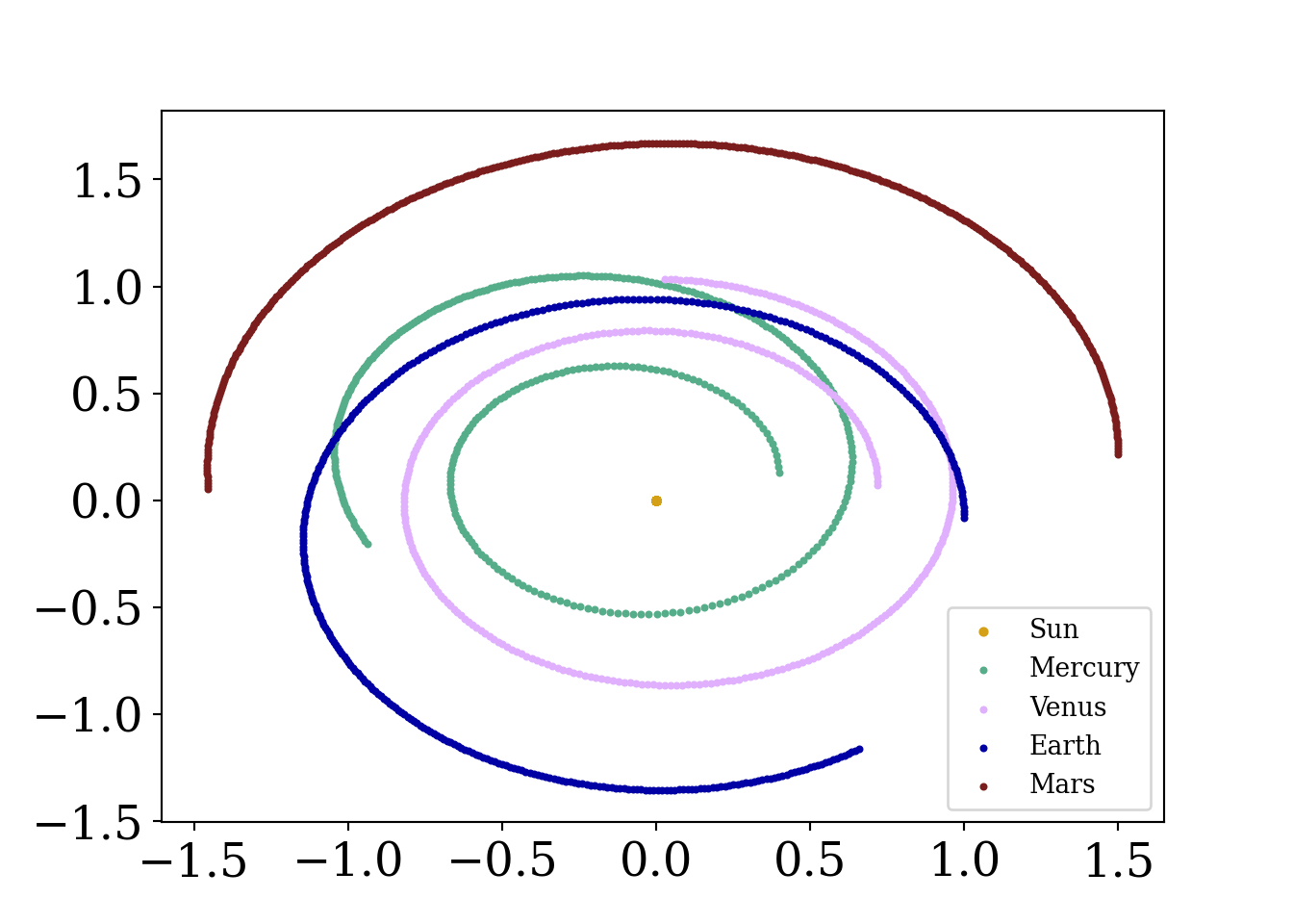
What is going on here? Is the Earth at risk of moving farther and farther away from the sun over time (a catastrophic outcome!)? Well…no. This is simply an artifact of the method we are using to advance the simulated solar system.
You, a young scientist working remotely in your newly renovated 1B/1BA have been given a message from the government.
Trouble is afoot. We speculate that a zombie outbreak has begun in Tempe, Arizona.
Cold. Afraid. Alone. These thoughts quickly race through your head…but, but wait. You can model this outbreak as a system of ordinary differential equations! If \(H\) indicates your human population and \(Z\) your zombie population, we can model our system of equations as:
\[ \begin{align} a&=2\\ b&=1 \end{align} \]
import matplotlib
import matplotlib as mpl
import matplotlib.pyplot as plt
from scipy.optimize import curve_fit
from matplotlib import pyplot as plt
from scipy.integrate import odeint
from scipy.stats import norm
import numpy as np
from matplotlib.font_manager import FontProperties
font = {'family' : 'Fantasy',
        'weight' : 'oblique',
        'size'   : 28}
matplotlib.rc('xtick', labelsize=16)
matplotlib.rc('ytick', labelsize=16) #changing tick size
from scipy.stats import norm
import matplotlib.pyplot as plt
from sklearn import linear_model
from mpl_toolkits.mplot3d import Axes3D
# Set figure width to 12 and height to 9
fig_size = plt.rcParams["figure.figsize"]
fig_size[0] = 7
fig_size[1] =5


fig = plt.figure()
ax = fig.add_subplot()#111, projection='3d')

#initial constants
alpha=.01  #proportion of healthy who get sick
beta= 0.1  #percent of zombies who are essentially immune


#d=.95  #percent of sick that die
initial_pts=np.array([95,3,2])  #95 healthy, 3 sick, 2 immune, total stays constant
t_pts = np.linspace(0, 100,  1000)
zombie_pts=np.array([99,1])


def zombie_eq (y,t):
    humandot=-alpha*y[0]*y[1]-beta*y[0]  #zombies have no immune!
    zombiedot=alpha*y[0]*y[1]#once you become a zombie you stay there forever!
    #Idot=beta*y[1]+v1*y[0]-v2*y[2]
    return([humandot, zombiedot])


human, zombie=odeint(zombie_eq,zombie_pts, t_pts ).T
plt.plot(t_pts, human, label='human', color='#55AD89')
plt.plot(t_pts, zombie, label='zombie', color='#073d6d')
plt.legend()
plt.xlim(0,25)
(0.0, 25.0)plt.show()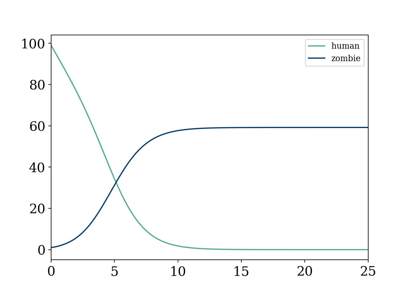
Oof, that was quick and utter devastation.
As usual, uncomment the animation when ready (to resave it manually). This example is meant to show the extra flexibility that comes with this type of model, but also the mathematical intractability that comes with such enormous amounts of parameters. Recall, this type of modeling is not based on a “likelihood” approach as is the norm in statistics, meaning we cannot estimate the parameters even if we had data (in fact we can not even write the data as a function of the parameters). We make the box have an “L” around it where humans are “safe”.
import matplotlib
import matplotlib.pyplot as plt
import numpy as np
from matplotlib import pyplot as plt
from matplotlib.font_manager import FontProperties
font = {'family' : 'Fantasy',
        'weight' : 'oblique',
        'size'   : 28}
matplotlib.rc('xtick', labelsize=16)
matplotlib.rc('ytick', labelsize=16) #changing tick size
from scipy.stats import norm
import matplotlib.pyplot as plt
from sklearn import linear_model
import random
from matplotlib import colors
import matplotlib.animation as animation
# Set figure width to 12 and height to 9
fig_size = plt.rcParams["figure.figsize"]
fig_size[0] = 7
fig_size[1] =5
plt.rcParams["figure.figsize"] = fig_size

#color scheme


# make a color map of fixed colors
cmap = colors.ListedColormap(['#073d6d','#f8f9fa', '#55AD89'])  #red is positive, white is 0, blue is negative


#https://stackoverflow.com/questions/26873415/python-random-array-of-0s-and-1s
N = 100 # 100^2=10000
m = 200 # zombies
n = 9800 # humans

grid_init = []
while m + n > 0:
    if (m > 0 and np.random.uniform(0, 1, size=1) < float(m)/float(m + n)):
        grid_init.append(0)
        m -= 1
    else:
        grid_init.append(1)
        n -= 1

grid_init = np.array(grid_init).reshape(100,100)
#np.count_nonzero(grid_init==1)
#plt.imshow(grid_init, cmap='PuOr')
#plt.show()


def randommovement(grid):
    xs = []
    peoplecount=[]
    peoplecount.append(np.count_nonzero(grid == 1))
    for k in range(30):  #30 iterations
        for i in range(0,90):
            for j in range(10,99):
              value=random.randint(0,4)  #to get random movement
              #change this to get more things that can happen
              #simplified, all fox and all rabbits, no empty spaces
              #humans and zombies

              if value==0:
                  grid[i,j]=grid[i,j]*grid[i,j+1] %grid.shape[0]
              if value==1:
                  grid[i,j]=grid[i,j]*grid[i,j-1]%grid.shape[0]
              if value==2:
                  grid[i,j]=grid[i,j]*grid[i+1,j]%grid.shape[0]
              if value==3:
                  grid[i,j]=grid[i,j]*grid[i-1,j]%grid.shape[0]
        peoplecount.append(np.count_nonzero(grid == 1))


        x=plt.imshow(grid, cmap=cmap, animated=True)
        #plt.show()
        xs.append([x])

    return (grid,xs, peoplecount)


#plt.colorbar()


fig = plt.figure()
mapp,xs,count=randommovement(grid_init)

#Create grid

ani = animation.ArtistAnimation(fig, xs)


mywriter = animation.FFMpegWriter()
ani.save('zombies2.mp4', writer=mywriter)
#plt.imshow(mapp, cmap=cmap)
#plt.show()


plt.figure()

i=np.arange(0,31)
plt.plot(i, N**2-np.array(count), label='Zombie population', color='#073d6d')
plt.plot(i, count, label='Human population', color='#55AD89')


#plt.plot(count, N**2-np.array(count)) #phase diagram
plt.xlabel('Iterations')
plt.ylabel('Count')

plt.title('Populations over time Zombie vs Human')
plt.legend()
plt.show()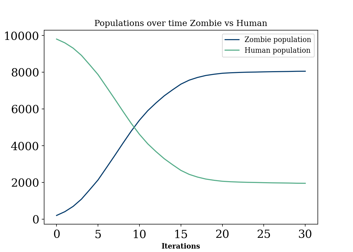
Generally, these are models that are probably of interest in an industrial setting for certain “scenario” planning or simulating situations where there is unlikely to be a lot of data for verification. They have a lot in common with “interacting particle systems”, defined below:
Classes of stochastic processes that fall under the umbrella term of “interacting particle systems”. Essentially, a stochastic process where there is a “spatial” component and interactions between units that overlap spatially. Mathematically, from (Lanchier 2017), an interacting particle system is a continuous time Markov chain with state at time \(t\) defined by the function:
\[ \xi_t:\mathbb{Z}^d\rightarrow\{0, 1, \ldots, \kappa-1\} \]
Agent based models are a peculiar breed of models. In one sense, they are infinitely flexible and can simulate many, many problems. Puzzlingly, to the statistician at least, these models have intractable likelihoods. This makes not only any identification (a precursor for statistical inference) of parameters impossible, it renders the whole operation of trying to learn anything from a given dataset with this type of model very difficult to do in non-qualitative ways.
In this sense, this type of model is certainly the most heavy handed a researcher can be in dictating the behaviour they want to see. A physicist will usually derive (ideally from first principle) an equation that permits certain shapes as outputs and then finds parameters that best explain the data, usually by maneuvering the pre-specified class of curves to match the observed data as well as possible. Identification of these parameters2 would be a plus, as statistical inference can proceed on these terms. Because we cannot really write down a likelihood for many of these models , it is difficult to use statistical methods, meaning any comparisons with done are usually done qualitatively. However, there are some interentisting approaches to these problems. See Shalizi paper, (Shalizi 2021), agent based model statistical challenges (Banks and Hooten 2021), and statistical model for simple agent based model (Monti et al. 2023).
2 Meaning that giving infinite data the parameter can be learned or in other terms that no two parameters yield the same probability distribution. If two values of the parameter cannot be learned from any amount of data, then the parameter is not identifiable. For example, if two columns in a linear regression are collinear (i.e. \(x_2=2*x_1\), then both \(\beta_{1}\) and \(\beta_{2}\) estimates lead to the same sampling distribution of \(y\).
In other words, if two sampling distributions (likelihoods) with different parameter values are identical, then their parameter values must be identical.
This type of model has flexibility as we can add extra considerations (cities, safe havens, etc) but these also have the downside of making the model incompatible with data, meaning we cannot finetune any of the parameters. In a sense, this makes the model more flexible. But, by essentially imposing a major assumption that the model is a correct representation of the behaviour being modeled, one has to be very clear about the assumptions they are making. This is especially true when it is difficult to collect any data that would guide these assumptions.
While the above paragraph would suggest we do not recommend this type of modeling, that is not true. Like most models, there are use cases and an avoid at all costs cases. These types of interacting particle system models are useful for things like scenario planning. A school may have an intuition for how pickup traffic will look but cannot access any data. They can simulate many scenarios to have a rough idea of when to expect massive traffic jams (which scientists “solved”…at least under some ideal conditions traffic solved!… another one). Of course, this requires some strong assumptions, can really only be evaluated qualitatively, and may not add much beyond a hand wavy “traffic will be a disaster between 3 and 4 pm”.
Another use case is when the agents act in a way that is actually observed. For example, ants behave in relatively predictable ways, following general paths but with some stochasticity built in. In this case, this type of model is quite interesting. For example, Turing patterns are a fascinating example of this type of model mimicing real life scenarios in a super cool way. See this fun article. But human behavior? A little more complicated.
“Digital twins” in the context of scientific investigation run the risk of begging the question. To study a system you cannot presume to know the minute workings of that system.
You can of course investigate a priori unknown implications of a set of rules, but whether or not those rules adequately describe the world cannot be inferred from the simulation itself!
The previous quotes above from Richard does not merely pertain to agent based models. Giant system of PDE’s or statistical machine learning generative models may also fall into the category. But, just to pick on agent based models a little more (YES they are cool and can be useful caveat), let’s try and motivate this with a real life example.
Madden and FIFA are very popular and well developed video games that can “simulate” football and soccer respectively. That being said, no sports analytics department is hiring people to simulate their sports outputs with a video game! Madden and FIFA are probably two of the best researched agent based models in the world. They are “data driven” (since we know the athleticism of each player and their “skill level”) and the games they are modeling have known rules. Additionally, we have a rough grasp of the physics constraints athletes adhere to (no one can run slower than 0MPH nor faster than 30MPH). And yet, madden and fifa would be laughed off if suggested as digital twins! In fact, ELO forecasts of NFL seasons seem to be far more predictive of league wide win loss records despite being enormously less complex. Food for thought.
The so called “Voter model” was introduced, independently, by (Holley and Liggett 1975) and (Clifford and Sudbury 1973). The model was explained excellently and in great detail in the textbook Stochastic modeling by Nicholas Lanchier (Lanchier 2017). The book also provides C++ code to implement the model, which we build our code off of below.
The voter model, in simplest terms, is modeled by a d−dimensional integer lattice occupied by an individual of type 0 or type 1. Independently of one another, the individuals update their opinion at a generation of the model by mimicking one of their nearest neighbors (within 2d), where the neighbor within this distance of the individual of interest is chosen uniformly at random.
import random
import numpy as np
import matplotlib.pyplot as plt
import seaborn as sns; sns.set()
import matplotlib as mpl
import warnings
warnings.filterwarnings("ignore")
#define N 50
N=100 #100 x 100 grid
# Take a number uniformly at random in (0,1)
u=np.random.uniform(0,1)
T = 1
#exponential (u, mu)
#both function parameters
def expo(u,mu):
s=-np.log(u)/mu
return(s)
#Choose a neighbor of x on the 2D torus
def neighbor(x, u):
z=np.floor(4*u)
if z==0:
y=x+1
elif z==1:
y=x-1
elif z == 2:
y=x+N
else:
y=x-N
y=(y+N*N)% (N*N)
return(int(y))
t=0
x=0
pop=[]
#here we define our map, breaking the map into 16 squares which alternate
# between all one party or all the other
tred=[]
#bottom left
for j in range(0,25):
for i in range(0, 25):
tred.append(i+j*100)
#top left
for j in range(75,100):
for i in range(0, 25):
tred.append(i+j*100)
#bottom right
for j in range(0,25):
for i in range(75, 100):
tred.append(i+j*100)
#top right
for j in range(75,100):
for i in range(75, 100):
tred.append(i+j*100)
#mid bottom left
for j in range(25,50):
for i in range(25, 50):
tred.append(i+j*100)
#mid top left
for j in range(50,75):
for i in range(25, 50):
tred.append(i+j*100)
#mid top right
for j in range(25,50):
for i in range(50, 75):
tred.append(i+j*100)
#mid bottom right
for j in range(50,75):
for i in range(50, 75):
tred.append(i+j*100)
#xs=[]
##polarization zones
random.seed( 12024 )
#while x is in the grid, append 0 or 1
# initialize the grid
# move around some people into new neighborhoods (the square blocks)
# based on the polarization parameter
# 1 being most polarized
# 2 being not polarized
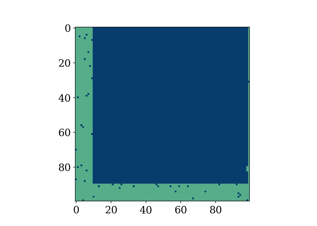
polar_param = 1.2024
for x in range(N*N):
# the upper range sets degree of initial polarization
# 1 means perfectly polarized amongst the grid
u=np.random.uniform(0,polar_param)
#uh oh...this isnt your turf
if (x in tred):
if(u>1):
pop.append(0)
else:
pop.append(1)
#but here we do okay
else :
if(u<1):
pop.append(0)
else:
pop.append(1)
init_grid = np.zeros((N, N))
init_grid[0,]=pop[0:N]
for i in range(1,N):
init_grid[i,]=pop[i*N:(i*N + N)]
fig, axis = plt.subplots()
fig.set_size_inches(7, 5)
heatmap = axis.pcolor(init_grid, cmap=plt.cm.Blues)
axis.hlines(0.5*N,0, 100, color='#AF5460', lw=2)
axis.vlines(0.5*N,0, 100, color='#AF5460', lw=2)
axis.hlines(0.5*N, 0,50, color='#AF5460', lw=2)
axis.hlines(0.25*N,0,100, color='#AF5460', lw=2)
axis.hlines(0.75*N,0,100, color='#AF5460', lw=2)
axis.vlines(0.25*N,0,100, color='#AF5460', lw=2)
axis.vlines(0.75*N,0,100, color='#AF5460', lw=2)
plt.show()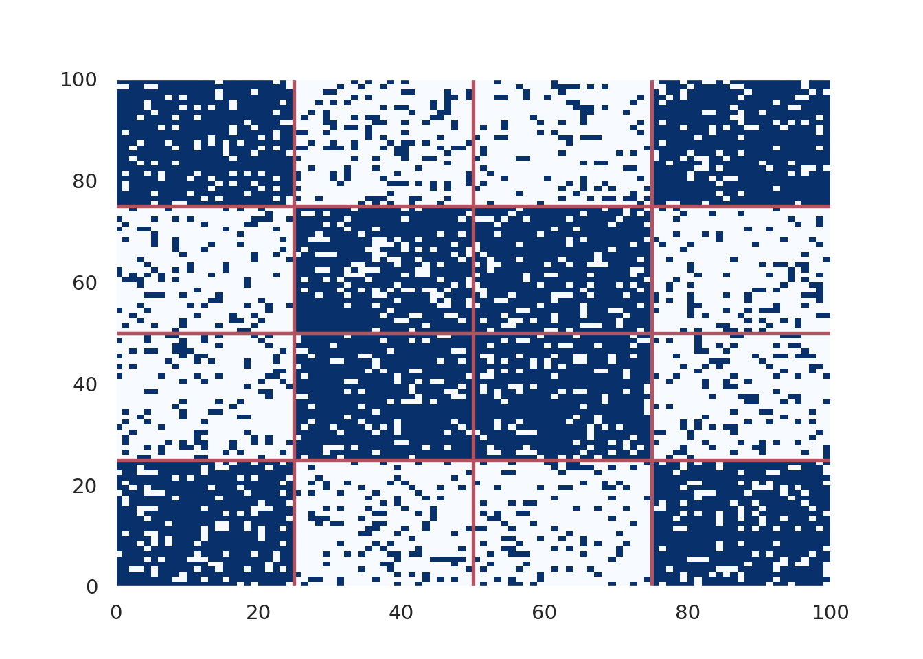
x_val=[]
y_val=[]
iter=0


num_iter = 100000
for t in range(num_iter):
     u=np.random.uniform(0,1)
     t=t+expo(u, N*N)
     u=np.random.uniform(0,1)
     x=np.floor(N*N*u)
     x=x%(N*N)
     x=int(x)
     u=np.random.uniform(0,1)
     y=neighbor(x,u)
     pop[x]=pop[y]
     iter+=1
     #if pop[x]==1:
     x_val.append(pop.count(1))

     #elif pop[x]==0:
     y_val.append(pop.count(0))

#plt.hist(pop)
# X, Y : grid
matrix = np.zeros((N, N))

matrix[0,]=pop[0:N]
for i in range(1,N):
    matrix[i,]=pop[i*N:(i*N + N)]

#plt.imshow(matrix,cmap='RdBu')
fig, axis = plt.subplots()
heatmap = axis.pcolor(matrix, cmap=plt.cm.Blues)
plt.title('T=%i, N=100' %num_iter)

#axis.set_yticks(np.arange(matrix.shape[0])+0.5, minor=False)
#axis.set_xticks(np.arange(matrix.shape[1])+0.5, minor=False)

#axis.invert_yaxis()

#xs.append([heatmap])
fig.set_size_inches(7, 5)
axis.hlines(0.5*N,0, 100, color='#AF5460', lw=2)
axis.vlines(0.5*N,0, 100, color='#AF5460', lw=2)
axis.hlines(0.5*N, 0,50, color='#AF5460', lw=2)
axis.hlines(0.25*N,0,100, color='#AF5460', lw=2)
axis.hlines(0.75*N,0,100, color='#AF5460', lw=2)
axis.vlines(0.25*N,0,100, color='#AF5460', lw=2)
axis.vlines(0.75*N,0,100, color='#AF5460', lw=2)

plt.show()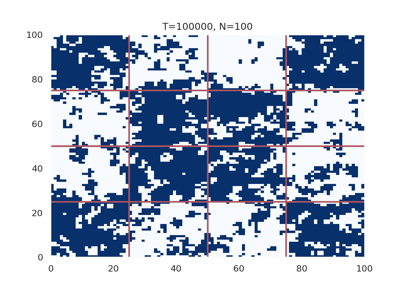
plt.figure()
plt.plot(x_val[1:num_iter],  '-', linewidth=2,label='Party A', color='#012296')
plt.plot(y_val[1:num_iter],  '--', linewidth=2, label='Party B', color='#55AD89')
plt.ylabel('Count', fontsize=12)
plt.xlabel('Iteration', fontsize=12)
plt.title('Count vs iteration, polarization parameter=%i, N=100, Heavy Polarization'%polar_param)
plt.legend(fontsize=12, loc='upper left')

plt.show()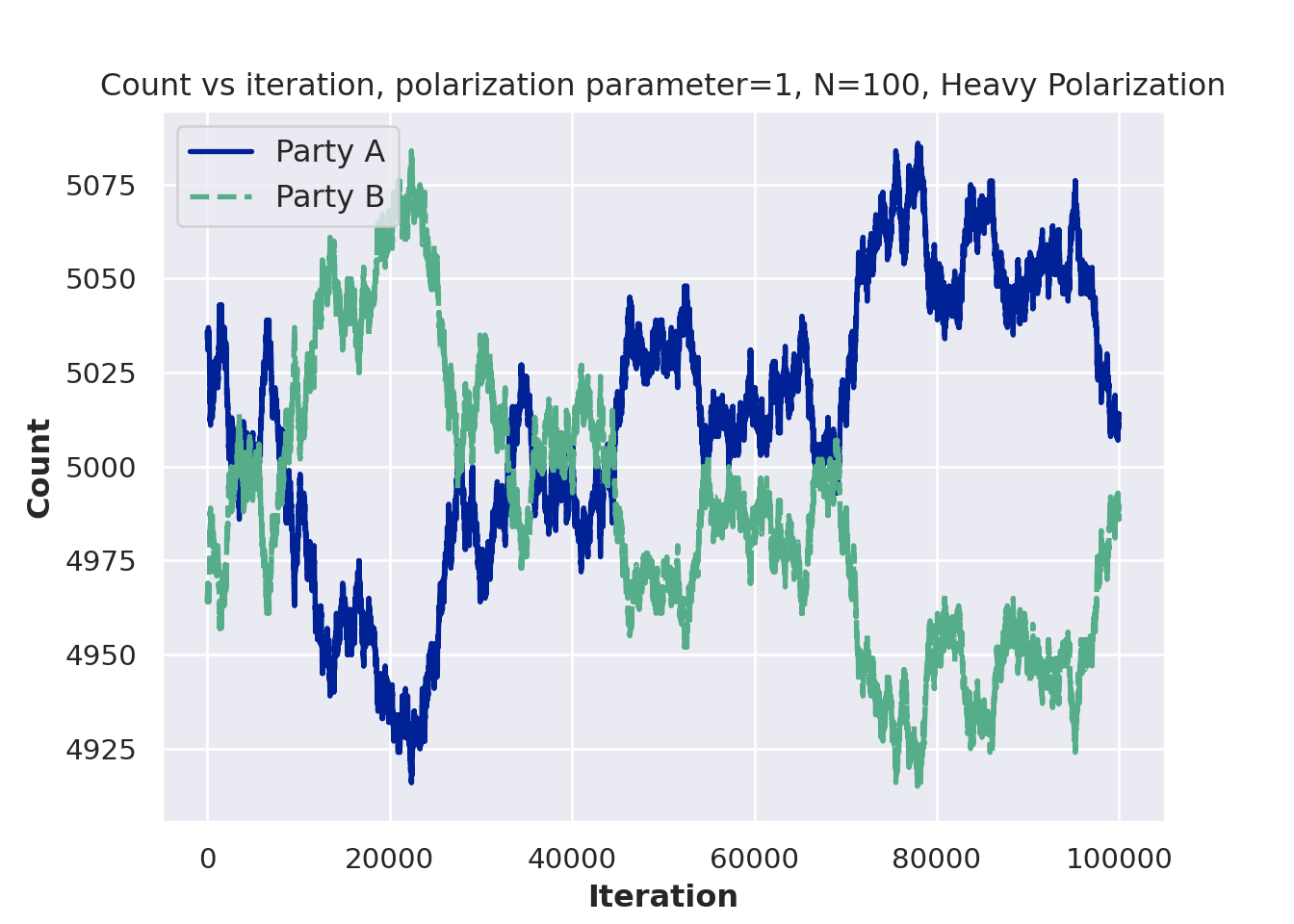
Modify the voter model to include a “prophet”. That is, if someone interacts with the prophet, they change their opinion to the prophet’s opinion with some probability. Plot the populations of belief A, belief B, and belief prophet people over time.
There is an interesting “modeling philosophy” that arises from using random walks as stock models. Stocks are not random walks. They go up and down for a reason (news, earnings, etc.). But the random walk (with a drift) model is actually a reasonable approximation.
This example is borrowed from this econometrics textbook, (Hanck et al. 2021)
# simulate and plot random walks starting at 0
set.seed(12024)
N = 60
n_unit = 50
RWs <- ts(replicate(n = n_unit,
                    arima.sim(model = list(order = c(0, 1 ,0)), n = N-1, mean=0.25)))
RWs = as.data.frame(RWs)
RWs_2 = as.data.frame(unlist(lapply(1:n_unit, function(j) RWs[, j])))
colnames(RWs_2) = 'vals'

RW_df = data.frame(value = RWs_2$vals,
                   group_id = unlist(lapply(1:n_unit, function(j) rep(j, N))),
                   time = rep(seq(from=1, to=N),n_unit),
                   treat_indicator = c(rep(0,N/2),rep(1,N/2), rep(0, n_unit*N - N)))
RW_df = as.data.frame(RW_df)

# plot spurious relationship

highest_cor = order(sapply(1:n_unit, function(k)sort(cor(RWs[,])[,k])[n_unit-1]))[n_unit]

matplot(RWs[, c(highest_cor,
                order(cor(RWs)[,highest_cor])[n_unit-1],
           order(cor(RWs)[,highest_cor])[n_unit-2]) ],
        #lty = 1,
        lwd = 3.25,
        type = "l",
        col = c( "#073d6d", '#d47c17', "#55AD89"),
        lty = c(1,2,4),
        xlab = "Time",
        ylab = "",
        main = "Random walk with drift realizations")
legend('bottomright',
       c('Stock of interest', #paste0('Unit: ',highest_cor),
         'Most correlated', #paste0('Unit: ',order(cor(RWs)[,highest_cor])[n_unit-1]),
         'Second most correlated'),#paste0('Unit: ',order(cor(RWs)[,highest_cor])[n_unit-2])),
       lty=c(1,2,4),
                col = c('#073d6d','#d47c17', '#55AD89'),
                lwd=2,bty = "n", title='')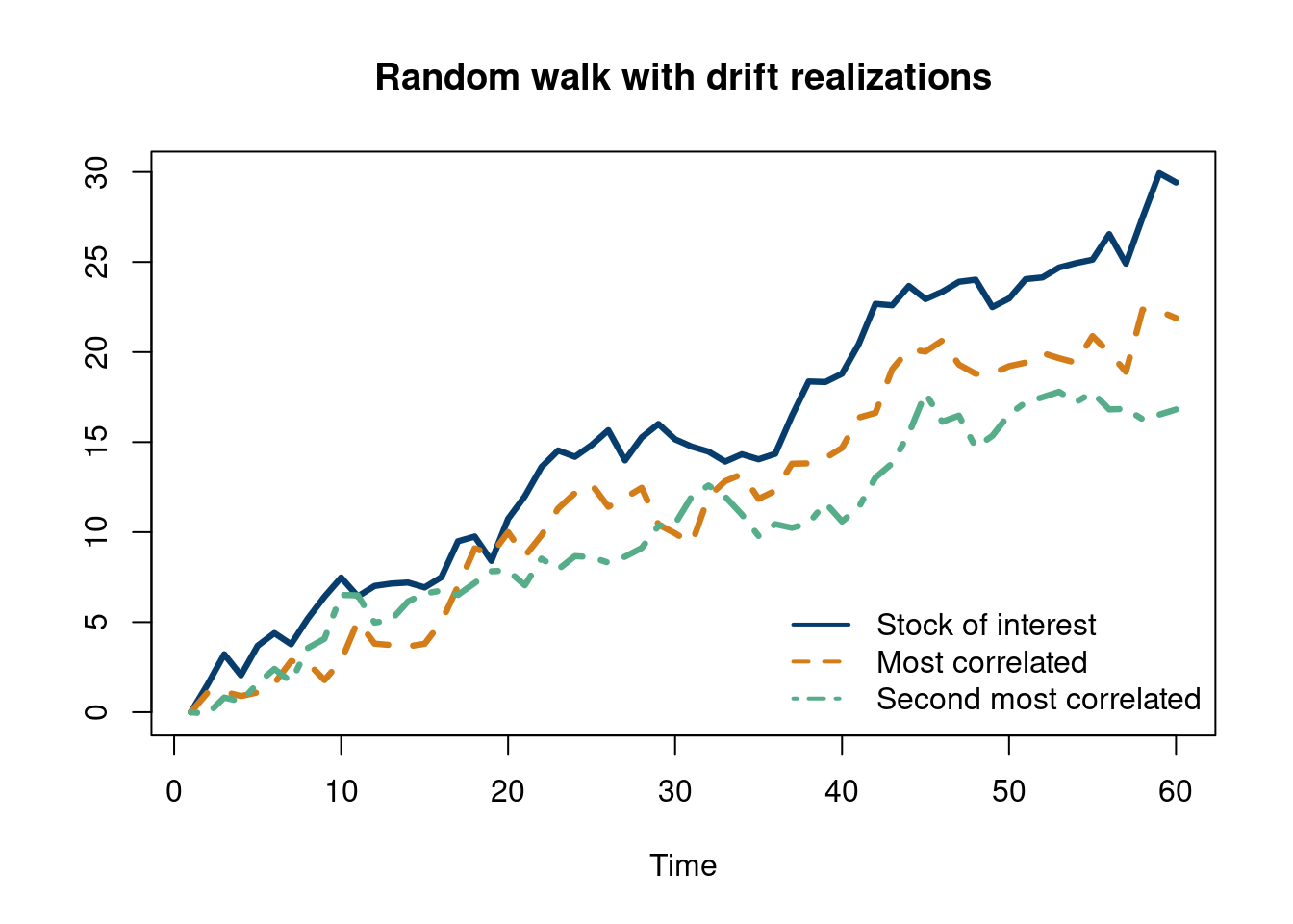
Monte Carlo methods, or Monte Carlo experiments, are a broad class of computational algorithms that rely on repeated random sampling to obtain numerical results. The underlying concept is to use randomness to solve problems that might be deterministic in principle. The name comes from the Monte Carlo Casino in Monaco, where the primary developer of the method, physicist Stanislaw Ulam, was inspired by his uncle’s gambling habits.
Conveniently, the Monte Carlo method for simulation is straightforward to implement in R. As we have seen, drawing \(n\) samples from a standard normal distribution can be done with the command “rnorm(n)” in R . Under the hood, things get pretty interesting. Turns out, which you may learn in a stats/probability course, you can use the Box-Muller method to create two independent standard normal distribution from two uniform distributions. Great, so now you just need a way to get a sample from a uniform random variable. This sounds easier, as any number in a range is selected at random and is equally likely to be selected. But how does a computer do that? Psuedo random number generators, which use physical properties to approximate random numbers.
From the Monte Carlo wikipedia page, the general pattern is:
Define a domain of possible inputs
Generate inputs randomly from a probability distribution over the domain
Perform a deterministic computation of the outputs
Aggregate the results
Wikipedia
A brief code example of flipping 500 coins should show how to do the first two steps in R and how as we perform more “Monte Carlo draws” we converge on the truth.
options(warn=-1)
suppressMessages(library(tidyverse))
suppressMessages(library(dplyr))
NN=500
set.seed(12024)
coin_list=rbinom(NN,1, 0.5)
data.frame(Flips=seq(from=1, to=NN, by=1), heads=cumsum(coin_list))%>%
  mutate(heads_percent=heads/Flips)%>%
  ggplot(aes(x=Flips, y=heads_percent))+
    geom_hline(aes(yintercept=0.50), color='#55AD89', lwd=1.25)+
  geom_line(lwd=1.5,  color='#073d6d')+
theme_minimal(base_size = 16)+
  ylim(c(0,1))+
  theme(plot.title = element_text(hjust = 0.5,size=16))+
  theme(legend.title  = element_blank())+
  xlab("Flips")+ylab('Percent Heads')+ggtitle('Percent Heads vs Flips (fair coin)')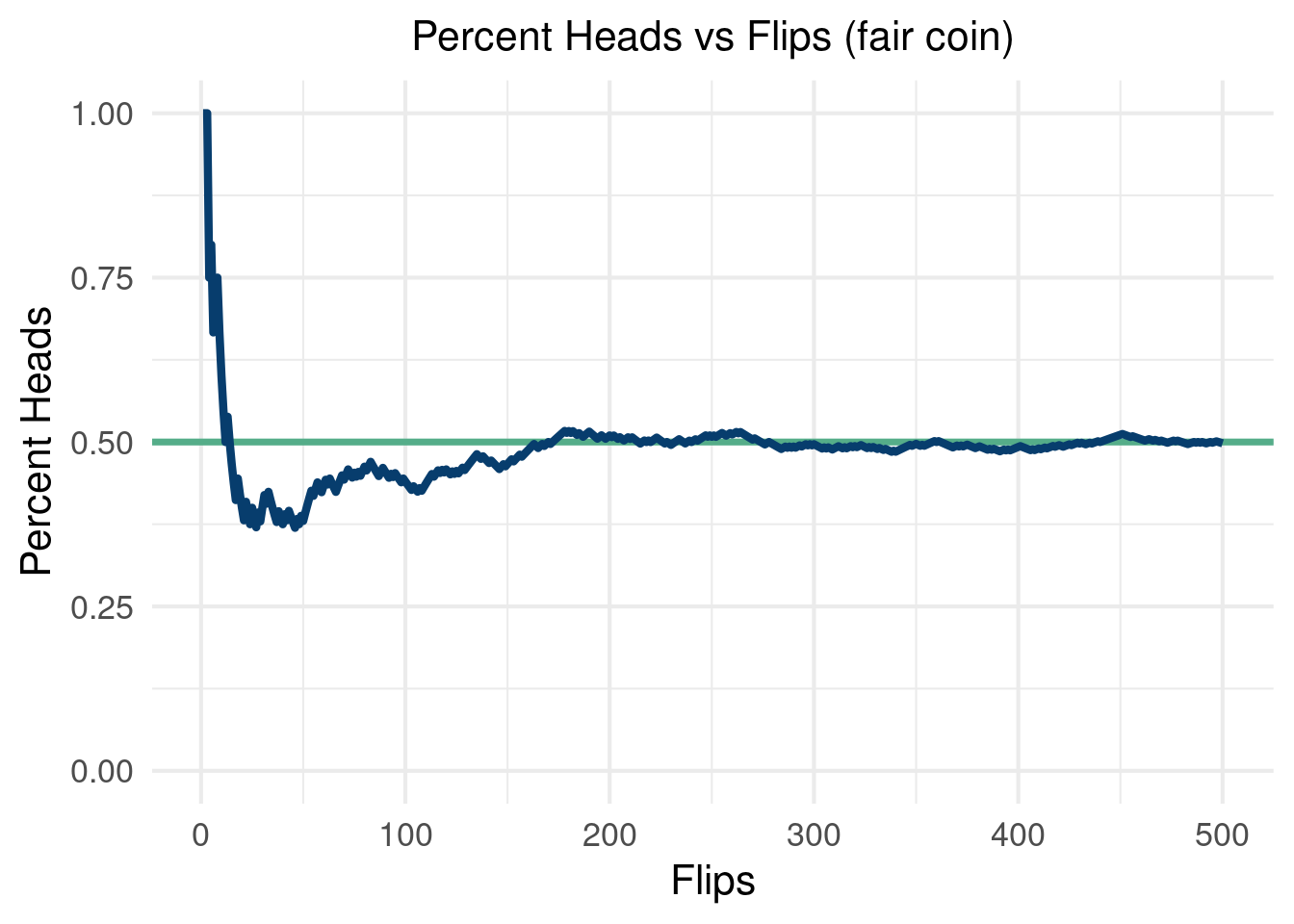
We will use the Monte Carlo framework to simulate a “causal inference pipeline”. We will generate data that include an outcome, an binary “intervention”, and “confounding” variables. The outcome is written as:
\[ y(\mathbf{x}_i)=\mu(\mathbf{x}_i)+\tau(\mathbf{x}_i)z_i + \varepsilon_i \]
Where \(z_i\) is a binary indicator determined by \(\pi(\mathbf{x}_i)\), a function called the “propensity function”. We will talk about this and more in causal inference in more detail in chapter 8, but for now we just mention that \(z_i\) is a binary indicator of whether or not someone is “treated” or not (whether they received the intervention). \(\mu(\mathbf{x}_i)\) is what would have happened to someone (given their covariates) in the world they did not receive the intervention (irregardless if they did or not). \(\tau(\mathbf{x}_i)\) is how much the intervention impacted someone’s outcome.
There are many things we can tune in a simulation study like this. For example, following the recommendations in (Hahn, Murray, and Carvalho 2020), we can vary the noise as a function of the variance in \(\mu(\mathbf{x}_i)\) to see how the “signal to noise” ratio effects our estimator. We can also change the size of \(\tau(\mathbf{x}_i)\) to \(\mu(\mathbf{x}_i)\), with a larger relative treatment effect easier to estimate.
Below, we run 100 Monte Carlo simulations with a data generating process meant to stress test a causal effects estimator. In each run, we re-draw \(\varepsilon\) and keep everything else the same. We estimate \(\tau(\mathbf{x}_i)\) with the “naive estimate” taking the form \(\frac{1}{n_{z_1}}\sum_{i=1}^{n_{z_1}} \left(Y\mid Z=1\right)-\frac{1}{n_{z_0}}\sum_{i=1}^{n_{z_0}} \left(Y\mid Z=0\right)\), which estimates \(E(Y\mid Z=1)-E(Y\mid Z=0)\). As we will see in this simulation, this estimate will be garbage3. Stay tuned for more on why this is the case.
3 As we will see, this is because we are estimating the wrong thing altogether.
This will be a seemingly “easy” problem, with a fixed treatment effect of \(0.5\). As we will see, the estimator will give very biased estimates of the true average treatment effect. Worryingly, we cannot even guess the direction of the bias, as a different DGP can have large biased estimates using the naive estimator in the opposite direction!
options(warn=-1)
library(dplyr)
library(NatParksPalettes)
library(tidyverse)
library(ggthemes)
n <- 1000
# generate 1000 points for 5 different
# covariates, 3
x1 <- rnorm(n, 0,1)
x2 <- rnorm(n, 0, 1)
x3 <- rnorm(n, 0, 1)

x4 <- rbinom(n, 2, 0.5)
x5 <- rbinom(n, 1, 0.5)


# 100 Monte Carlo draws
MC = 100
naive_tau = c()
for (i in 1:100){
tau_x <- 0.5#5*(0.2-0.5*x1*x4)

mu_x <- 0.5*cos(1*x1)-1.2*x2 +1

pi_x <- 0.7*pnorm(mu_x/sd(mu_x)-1.5)+runif(n,0,1)/10+0.1
# generate a treatment variable
Z <- rbinom(n, 1, pi_x)

Y <- Z*tau_x + mu_x + 1*rnorm(n, 0, sd(mu_x))

naive_tau[[i]] = mean(Y[Z==1])-mean(Y[Z==0])
}
tau_hist <- data.frame(tau_naive = unlist(naive_tau))%>%
ggplot( aes(x = tau_naive)) +
  geom_histogram(aes(y=..count../sum(..count..)),
                 color='white',fill='#1d2951', bins=40) +
  labs(x = expression(tau), y = "Density") +
  geom_vline(aes(xintercept = mean(tau_x)), lwd=2, col='#55AD89')+
  theme_economist_white(gray_bg=F, base_family="ITC Officina Sans") +
  theme(plot.title=element_text(hjust=0.5, size=16))+
  theme(text = element_text(size=14))+
  scale_fill_economist(name=NULL)
tau_hist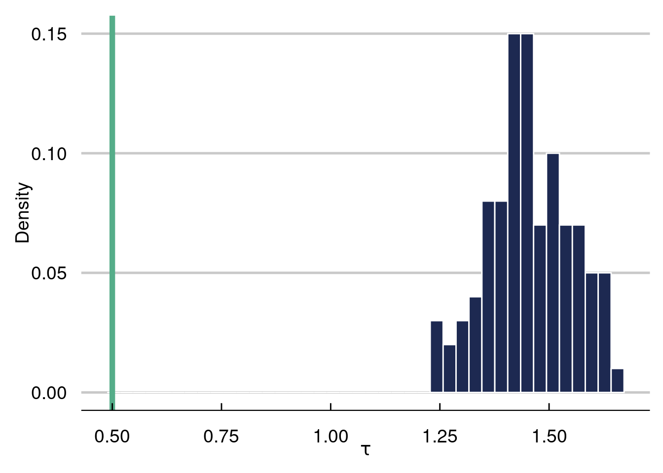
The histogram represents the 100 naive estimates of the ATE and the green line is the truth, which equals \(0.5\). Notice how far off the naive estimate is in this example, where the confounding is very strong.
Some things to consider (which we will discuss in more detail in chapter 8) include the level of heterogeneity in \(\tau(\cdot)\), how non-linear \(\mu(\cdot)\) and \(\tau(\cdot)\) are, how much confounding we have, the “signal to noise” ratio [\(\text{sd}(\mu(\cdot)/\text{sd}(\varepsilon)]\), and the magnitude of \(\tau(\cdot)\) to \(\mu(\cdot)\). In the next simulation batch, we will explore the final knob.
options(warn=-1)
suppressMessages(library(dplyr))
suppressMessages(library(NatParksPalettes))
suppressMessages(library(tidyverse))
suppressMessages(library(ggthemes))
n <- 1000
# generate 1000 points for 5 different
# covariates, 3
x1 <- rnorm(n, 0,1)
x2 <- rnorm(n, 0, 1)
x3 <- rnorm(n, 0, 1)

x4 <- rbinom(n, 2, 0.5)
x5 <- rbinom(n, 1, 0.5)


# 100 Monte Carlo draws
MC = 250
naive_tau = matrix(NA, ncol=5, nrow=MC)
for (k in 1:5){
  tau_x <- c(0.25, 1, 2, 3, 5)

  mu_x <- 0.5*cos(1*x1)-1.2*x2 +1

  pi_x <- 0.7*pnorm(mu_x/sd(mu_x)-1.5)+runif(n,0,1)/10+0.1

for (i in 1:100){
    # generate a treatment variable
Z <- rbinom(n, 1, pi_x)


Y <- Z*tau_x[k] + mu_x + 1*rnorm(n, 0, sd(mu_x))

naive_tau[i,k] = mean(Y[Z==1])-mean(Y[Z==0])
}
}

tau_hist <- data.frame(tau_naive = c(unlist(naive_tau[,1]),
                                     unlist(naive_tau[,2]),
                                     unlist(naive_tau[,3]),
                                     unlist(naive_tau[,4]),
                                     unlist(naive_tau[,5])),
                       tau_val = c(rep(tau_x[1],MC ),
                                   rep(tau_x[2], MC),
                                   rep(tau_x[3], MC),
                                   rep(tau_x[4], MC),
                                   rep(tau_x[5], MC)))%>%
ggplot( aes(x = tau_val, y=tau_naive, color=tau_val)) +
 # geom_histogram(aes(y=..count../sum(..count..)),
#                 color='white',fill='#1d2951', bins=40) +
  labs(x = expression(tau), y = "Density") +
        ggdist::stat_dotsinterval( dotsize=2.5,stackratio=.5, fatten_point=1, color='#012296')+
      scale_color_manual(values=c('#012296'))+
  #geom_vline(aes(xintercept = mean(tau_x)), lwd=2, col='#55AD89')+
  geom_segment(aes(x=tau_x[1],xend=tau_x[1]+0.5,y=tau_x[1],yend=tau_x[1]), color='#FD8700', lwd=1.25)+
  geom_segment(aes(x=tau_x[2],xend=tau_x[2]+0.5,y=tau_x[2],yend=tau_x[2]), color='#FD8700', lwd=1.25)+
    geom_segment(aes(x=tau_x[3],xend=tau_x[3]+0.5,y=tau_x[3],yend=tau_x[3]), color='#FD8700', lwd=1.25)+
    geom_segment(aes(x=tau_x[4],xend=tau_x[4]+0.5,y=tau_x[4],yend=tau_x[4]), color='#FD8700', lwd=1.25)+
    geom_segment(aes(x=tau_x[5],xend=tau_x[5]+0.5,y=tau_x[5],yend=tau_x[5]), color='#FD8700', lwd=1.25)+
  theme_economist_white(gray_bg=F, base_family="ITC Officina Sans") +
  theme(plot.title=element_text(hjust=0.5, size=16))+
  theme(text = element_text(size=14))+
  scale_fill_economist(name=NULL)
tau_hist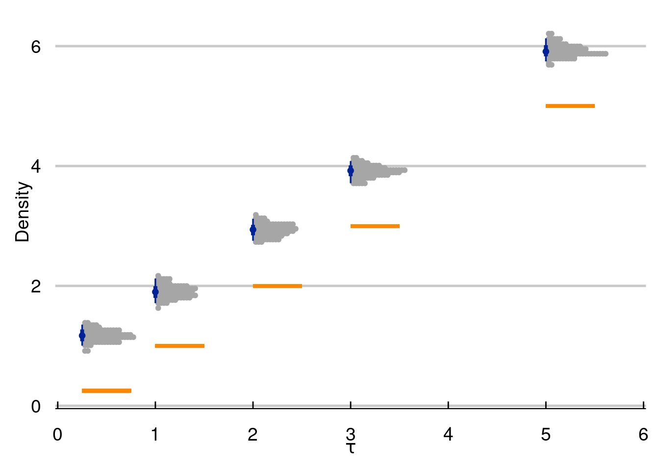
With great power comes great responsibility. By that, we mean that simulation is a great tool to study the world around you. But a careless simulation study can be inadvertently unrealistic, making it useless at best and harmful at worst.
The R-script below will simulate a causal inference study where treatment effects are enormous and highly varied. We will discuss prognostic effects in more detail later, but the example to keep in your mind is that most medicines/policies/interventions are NOT magic. For a concrete example to ground the upcoming code, consider that dieting does not account for the majority of someones weight. Maybe they lose 20 pounds, but weigh 200 pounds in the absence of any dieting. Further, it would be odd to expect some people to lose enormous amounts of weight while dieting while others gain a lot of weight dieting. In the following example, treatment effects are much larger than prognostic effects, vary wildly from one observed unit to another, and even vary wildly by subgroup (glasses wearers).
For the visual, inspiration came from r-graph gallery and the work of Angsar Wolsing.
options(warn=-1)
suppressMessages(library(tidyverse))
suppressMessages(library(ggtext))
suppressMessages(library(ggdist))
suppressMessages(library(glue))
suppressMessages(library(patchwork))


bg_color <- "#f8f9fa"
font_family <- "Fira Sans"

plot_subtitle = glue("Treatment effects are unrealistically large
and vary way too much by subgroup
")
n=2500
N = 1000 # this is how many data you want
K <- 3
# probability in each mixture
probs = c(0.1, 0.6, 0.3)
#rmultinomial needs the
cum_prob = cumsum(probs)
mu = c(-3,0,4)
sigma = c(2,1,.5)
cluster_assignment = sapply(1:n,function(i)which(rmultinom(n, size = 1, prob = cum_prob)[,i]==1))
eps <- c()
for (i in 1:n){
  if (cluster_assignment[i]==1){
    eps[i] = rnorm(1, mu[1], sigma[1])
  }else-if(cluster_assignment[i]==2){
    eps[i] = rnorm(1, mu[2], sigma[2])
  }
  else{
    eps[i] = rnorm(1, mu[3], sigma[3])
  }
}

n=2500
K <- 2
# probability in each mixture
probs = c(0.6, .4)
#rmultinomial needs the
cum_prob = cumsum(probs)
mu = c(-2, 2)
sigma = c(2,1)
cluster_assignment = sapply(1:n,function(i)which(rmultinom(n, size = 1, prob = cum_prob)[,i]==1))
eps2 <- c()
for (i in 1:n){
  if (cluster_assignment[i]==1){
    eps2[i] = rnorm(1, mu[1], sigma[1])
  }else-if(cluster_assignment[i]==2){
    eps2[i] = rnorm(1, mu[2], sigma[2])
  }
  else{
    eps2[i] = rnorm(1, mu[3], sigma[3])
  }
}


hist(eps2, col='#073d6d', main='Distribution of errors', xlab=expression(epsilon), 40) 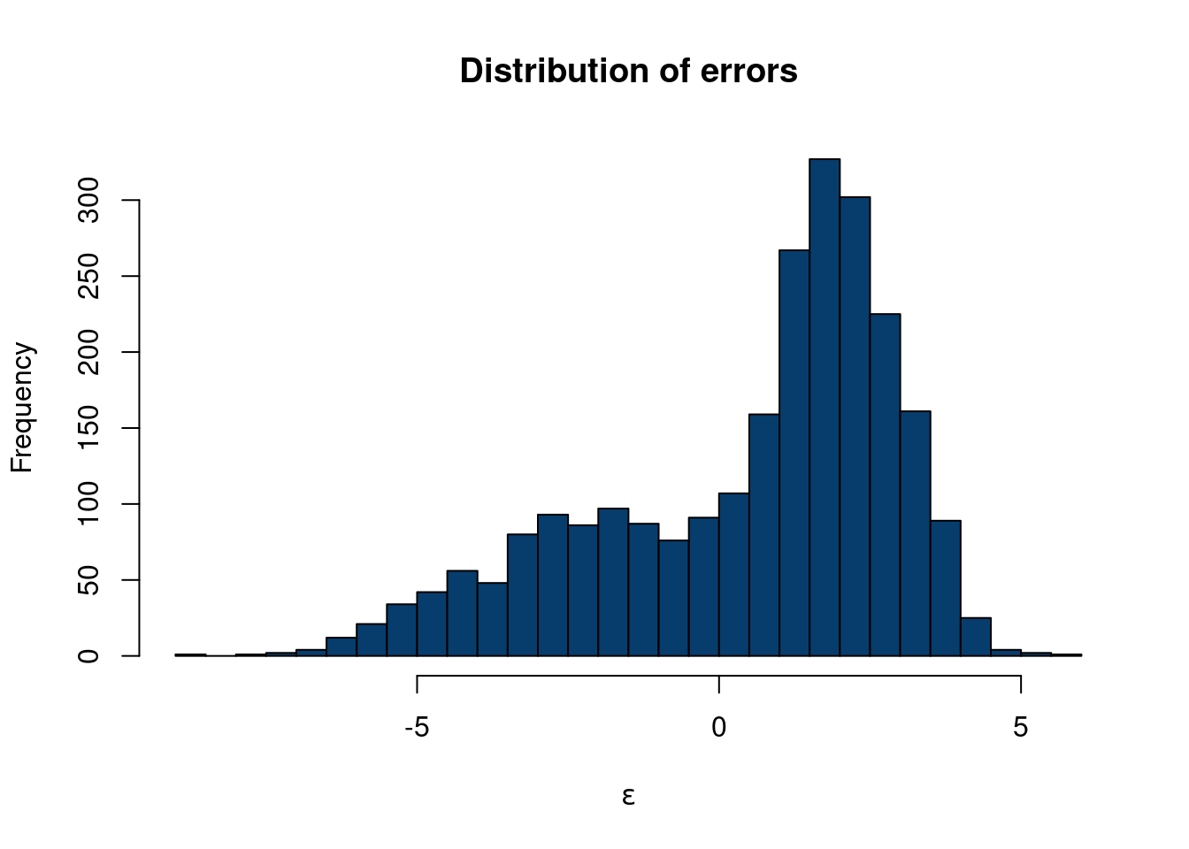
df_plot = data.frame(word = c(rep('Prognostic',n),
                              rep('Treatment',n),
                              rep('Treatment: Glasses subgroup',n),
                              rep('Treatment: No glasses subgroup',n)),
                     price = c(
                       rnorm(n, 0, .5),
                       eps,

                               eps2,
                               rnorm(n,2,.75)))
font_family = 'roboto'
bg_color='#f8f9fa'
p <- df_plot %>%
  ggplot(aes( forcats::fct_relevel(word, sort), price)) +
  stat_slab(alpha = 0.72, normalize='groups', outline_bars=T, fill='#073d6d', breaks=100) +
  stat_interval() +
  stat_summary(geom = "point", fun = mean, color='#3CF0C2', size=4.5) +
  #geom_hline(yintercept = median_price, col = "grey30", lty = "dashed") +
 # annotate("text", x = 16, y = median_price + 50, label = "Median rent",
#           family = "Fira Sans", size = 3, hjust = 0) +
  scale_x_discrete(labels = toupper) +
  scale_color_manual(values = MetBrewer::met.brewer("Cassatt2")) +
  coord_flip(ylim = c(-6.5,16), clip = "off") +
  guides(col = "none") +
  labs(
    title = toupper("Simulations must plausibly reflect real world expectations"),
    subtitle = plot_subtitle,
    caption = "Designed from r-graph-gallery.com/web-ridgeline-plot-with-inside-plot-and-annotations.html
    <br>
    Visualization: Ansgar Wolsing",
    x = NULL,
    y = "Causal impact"
  ) +
  theme_minimal(base_family = font_family) +
  theme(
    plot.background = element_rect(color = NA, fill = bg_color),
    panel.grid = element_blank(),
    panel.grid.major.x = element_line(linewidth = 0.1, color = "grey75"),
    plot.title = element_text(family = "Fira Sans SemiBold",
                              margin = margin(t = 10, b = 10, r=4, l=4), size = 16),
    plot.title.position = "plot",
    plot.subtitle = element_textbox_simple(
      margin = margin(t = 4, b = 16, r=4, l=4), size = 14),
    plot.caption = element_textbox_simple(
      margin = margin(t = 12), size = 9
    ),
    plot.caption.position = "plot",
    axis.text.y = element_text(hjust = 0, margin = margin(r = 0), family = "Roboto",
                               size=10),
    plot.margin = margin(1, 1, 1, 1)
  )
Registered S3 method overwritten by 'MetBrewer':
method from
print.palette NatParksPalettes# create the dataframe for the legend (inside plot)
p_legend <- df_plot%>%
dplyr::filter(word=='Prognostic')%>%
ggplot(aes( forcats::fct_relevel(word, sort), price)) +
stat_slab(alpha = 0.72, normalize='groups', outline_bars=T, fill='#073d6d', breaks=100) +
stat_interval() +
stat_summary(geom = "point", fun = mean, color='#3CF0C2', size=4.5) +
annotate(
"richtext",
x = c(.85,.85, .85, 1.75),
y = c(.627, 1.07,.05,1.00),
label = c("80%",
"95%", "Mean", "Distribution<br>of effects"),
fill = NA, label.size = 0, family = font_family, size = 5.25, vjust = 0.425,
) +
geom_curve(
data = data.frame(
x = c( .9,.9, .9, 1.67),
xend = c(.975, .975, .975, 1.57),
y = c( .1250,.6, 1.05, 1.0),
yend = c(.0250,.5, .95, 0.50)),
aes(x = x, xend = xend, y = y, yend = yend),
stat = "unique", curvature = 0.08, size = 1.25, color = "grey12",
arrow = arrow(angle = 15, length = unit(4, "mm"))
) +
scale_x_discrete(labels = toupper) +
scale_color_manual(values = MetBrewer::met.brewer("Cassatt2")) +
coord_flip(ylim = c(-1.5,1.5), xlim=c(1.35,1.45),clip = "off") +
guides(color = "none") +
labs(title = "Legend") +
theme_void(base_family = font_family, base_size=16) +
theme(plot.title = element_text(family = "Fira Sans SemiBold", size = 22,
hjust = 0.5),
plot.background = element_rect(color = "grey30", size = 2.90, fill = bg_color))
# Insert the custom legend into the plot
p + inset_element(p_legend, align_to='plot',
left = .68, bottom = .4, right = 1.0, top = 1.11)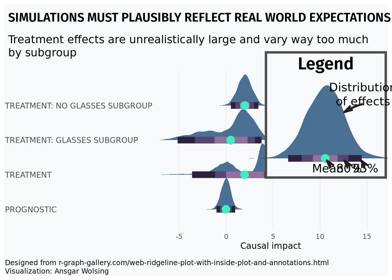
Imagine we are studying a pulse from an oscilloscope. We know we expect alternating signals that are positive and negative that will be corrupted by noise. Ideally, we derive a first principled physics model to generate this data, but we can also combine Monte Carlo methods with R programming tricks to make realistic looking data. We can then test a potential method on this data (eventually replacing the generated data with physics generated data). However, this method can serve as a quick and dirty place in to investigate a method:
n = 500
# Alternating pulse for even and odd intervals leading digit, with noise
x = seq(from = 0, to = 11, length.out = n)
y = ifelse(floor(x)%%2==0, 10, -10)  + rnorm(n,0,1)


plot(x,y,type='l', col='#073d6d', lwd=2.5)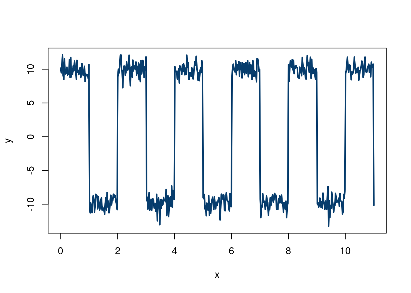
One nice thing about simulating data is that we can mix and match different concepts to design a stress test. For example, say we want to test our new regression method on a less favorable environment than the usual linear regression assumptions imply. For example, say we want to have some of our covariates to depend on each other, but to have different dependencies for different values of the covariates. Say we are also skeptical about normal & homoskedastic errors. We can easily create this type of data!
We will use a factor model (which we learn about in chapter 10) for our \(\mathbf{X}\) problem, and a sum of 3 Gaussian distributions (also introduced in the Gaussian mixture section of chapter 10) to create non-normal errors. We will not encode any heteroskedasticity here, but stay tuned…
First, we simulate from a factor model with 4 clusters, basing our code off Hedibert Lopes’s code here. Although we will discuss in more detail later, the model is \(X_i =\mathbf{B} f_i+\varepsilon\) where \(\varepsilon \sim N(0, \Psi)\) and \(f_i\sim N(0, I_k)\). We have \(p\) variables in \(\mathbf{X}\), we specify \(k\) “factors”, such that \(\mathbf{B}\) is a \(p\times k\) matrix. \(f_i\) are the “factor scores”, and \(\mathbf{f}\) has dimension \(p\times n\). We will discuss more in chapter 10, building off content from Richard Hahn, Kyle Butts, and Hedibert Lopes.
set.seed(012024)
n      = 1000
p      = 8
k = 4
B = matrix(c(0.99, 0.95, 0.90, 0.75, 0.50, 0.40, 0.25, 0.05),p,k)
Sigma = diag(c(0.10,0.25,0.40, 0.50,0.75,0.90, 0.95,1))


f = matrix(rnorm(k*n),k,n) # k factor loadings
Psi = sqrt(Sigma)%*%matrix(rnorm(p*n),p,n)
# The factor model is given by X = Bf+eps
X     = B %*% f + Psi
# Make sure X is n x p
X = t(X)
Now, we sample from a 3-component Gaussian mixture, manually doing a Monte Carlo procedure, which should be informative. These two stackoverflow answers show different ways to do this.
Approach 1: Generate a random variable \(U\sim\)uniform(0,1). If \(u\), the draw from \(U\), is in the interval corresponding to the cumulative probability of the \(k\) to the \(k+1\) component, then generate from the \(k\) componnet, otherwise, draw a new value from \(U\).
Approach 2: Draw a \(q_i\) (representative of a latent) sample from a \(\text{Multinomial}(\pi_k)\) distribution, meaning there are \(k\) mixture components, with each having \(\pi_k\) probability to land the \(x_i\) data point. We then draw a datapoint \(i\) from \(x_i\mid q_i\sim N(\mu_ {q_i}, \sigma_{q_i}^2)\). This means we are choosing which of the \(k\) clusters in the “\(q\)-step” , and then draw from the normal distribution associated with that cluster to get a value for that \(x_i\).
The second approach is easier, so we will code it up that way. Note, rmultinom, which we use to draw the multinomial output, needs a cumulative probability for its probability argument.
N = 1000 # this is how many data you want
K <- 3
# probability in each mixture
probs = c(0.1, 0.6, 0.3)
#rmultinomial needs the
cum_prob = cumsum(probs)
mu = c(-3,0,8)
sigma = c(2,1,4)
cluster_assignment = sapply(1:n,function(i)which(rmultinom(n, size = 1, prob = cum_prob)[,i]==1))
eps <- c()
for (i in 1:n){
  if (cluster_assignment[i]==1){
    eps[i] = rnorm(1, mu[1], sigma[1])
  }else-if(cluster_assignment[i]==2){
    eps[i] = rnorm(1, mu[2], sigma[2])
  }
  else{
    eps[i] = rnorm(1, mu[3], sigma[3])
  }
}
hist(eps, col='#073d6d', main='Distribution of errors', xlab=expression(epsilon), 40) 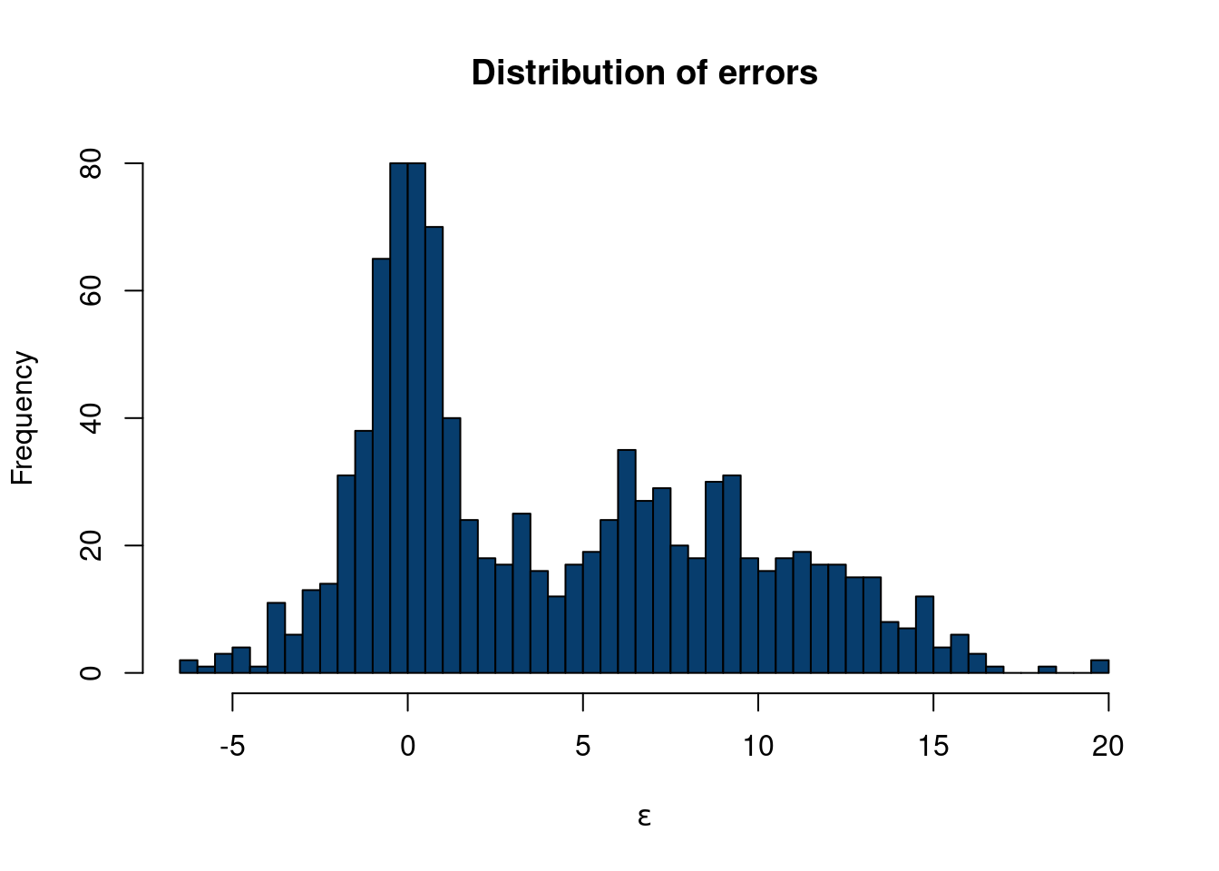
So now we have generated \(\mathbf{X}\) with a factor model structure and a unique error structure that definitely is not normally distributed. Now, let’s say
\[ y = X_1 + 3*X2+ 0.5*X_7*X_8+\varepsilon \]
where \(\varepsilon\) is the error term from the dgp above.
In the Monte Carlo examples, we showed two examples where we generated \(\mathbf{X}\) and \(y\), and some relation between the two, with different types of error distributions, \(\varepsilon\). However, we are making a pretty big assumption when generating \(\mathbf{X}\), especially since we consider \(\mathbf{X}\) to be fixed (from a Bayesian perspective). One way around this is through a “semi-synthetic” data construction.
We have so far talked a fair deal about statistics, inference, and quantifying our uncertainty. While we tend to have numerous observations of some event, we rarely have replicate data of these observations. A workaround would be to perform more experiments, but the real world isn’t that simple. If we are willing to specify a prior, Bayesian methods offer another alternative to this problem. However, if neither are available/feasible, there is a fairly simple alternative method that can be used to study the distribution of an estimate we care about. What can we ever do?? The bootstrap has entered the chat.
The bootstrap idea is actually fairly simple. We have Bradley Efron to thank for its introduction in the now famous 1979 paper “Bootstrap method: another look at the Jackknife method” (EFRON 1979). A nice quick summary by Andrew Gelman can help build intuition.
The basic idea of the bootstrap “procedure/algorithm” is to resample our observed data (with replacement), and use these new “hypothetical” data as a basis for estimating properties of estimands we care about (such as the variance of the mean). This wikipedia example summarizes the method well.
As an example, assume we are interested in the average (or mean) height of people worldwide. We cannot measure all the people in the global population, so instead, we sample only a tiny part of it, and measure that. Assume the sample is of size N; that is, we measure the heights of N individuals. From that single sample, only one estimate of the mean can be obtained. In order to reason about the population, we need some sense of the variability of the mean that we have computed. The simplest bootstrap method involves taking the original data set of heights, and, using a computer, sampling from it to form a new sample (called a ‘resample’ or bootstrap sample) that is also of size N. The bootstrap sample is taken from the original by using sampling with replacement (e.g. we might ‘resample’ 5 times from [1,2,3,4,5] and get [2,5,4,4,1]), so, assuming N is sufficiently large, for all practical purposes there is virtually zero probability that it will be identical to the original “real” sample. This process is repeated a large number of times (typically 1,000 or 10,000 times, but more on that later), and for each of these bootstrap samples, we compute its mean (each of these is called a “bootstrap estimate”). We now can create a histogram of bootstrap means. This histogram provides an estimate of the shape of the distribution of the sample mean from which we can answer questions about how much the mean varies across samples. (The method here, described for the mean, can be applied to almost any other statistic or estimator.)
Our exposition follows this example using the bootstrap to estimate the distribution mean weight of Chipotle orders. The idea is that we do not necessarily have enough data to confidently report our mean restaurant rating for a city. Yes, we have a point estimate, but we want be able to say “hey, we really aren’t that sure because the sample size is small”. The distribution of restaurant ratings is not normal, as we only allow for 10 options on a scale of 1-5 with 0.5 intervals for each restaurant, so many standard inference techniques fail. Therefore, we certainly are not comfortable reporting inferential statistics, like confidence intervals, for the mean, and cannot really give a reliable estimate of our uncertainty regarding the number we report on. From wikipedia:
Adèr et al. recommend the bootstrap procedure for the following situations (Adèr 2008)
When the theoretical distribution of a statistic of interest is complicated or unknown. Since the bootstrapping procedure is distribution-independent it provides an indirect method to assess the properties of the distribution underlying the sample and the parameters of interest that are derived from this distribution.
When the sample size is insufficient for straightforward statistical inference. If the underlying distribution is well-known, bootstrapping provides a way to account for the distortions caused by the specific sample that may not be fully representative of the population.
When power calculations have to be performed, and a small pilot sample is available. Most power and sample size calculations are heavily dependent on the standard deviation of the statistic of interest. If the estimate used is incorrect, the required sample size will also be wrong. One method to get an impression of the variation of the statistic is to use a small pilot sample and perform bootstrapping on it to get impression of the variance.
So the bootstrap is a powerful way to study uncertainty about estimands of interest. For example, we can use the bootstrap to get a handle of the variation of the median in our sample, for which a mathematically derived expression is difficult.
Caveats
While the bootstrap seems great, there are some caveats as always.
In general, to bootstrap your samples it is recommended to have a sample size of around 30 or so. So it cannot save you if you only recorded 3 observations.
From this cool blog:
You might say that the bootstrap makes very naïve assumptions, or perhaps very conservative assumptions, but to say that the bootstrap makes no assumptions is wrong. It makes really strong assumptions: The data is discrete and values not seen in the data are impossible.
(Schenker 1985) discussed scenarios where the bootstrap would yield poor coverage statistics in small and moderate data regimes, due to inapplicable assumptions & theory. The bootstrap method was “improved” to adjust to these concerns. (Chernick and Labudde 2009) discuss further issues with the modified bootstrap over 20 years later. They study data generating processes withnheavy tailed and/or skewed data and found the bootstrap exhibitied poor coverage statistics for estimates of the variance. To offset this, a large(ish) sample with many repeated sampling steps were needed, which quickly becomes computationally expensive.
The data we use are from Demetri and Samantha’s restaurant ratings. The scale is as follows:
Actively bad, would not go back
Not necessarily bad, but would not go back.
Will eat if someone wants to go. Good enough to keep the doors open, but not particularly excited to spend money and time to eat there.
Excited to eat there, very good.
Would recommend others go and actively recruit them to.
First, let’s show a cool visualization:
options(warn=-1)
suppressMessages(library(dplyr))
suppressMessages(library(reactablefmtr))
suppressMessages(library(sparkline))
data <- read.csv(paste0(here::here(), "/data/restaurant_ratings.csv"))
data = data[,c(1:6)]

colnames(data)[1] = 'City'
data$metro = data$City
data$metro = ifelse(data$metro%in%c('Tempe', 'Phoenix', 'Mesa', 'Chandler', 'Gilbert', 'Scottsdale'), 'Phoenix', data$metro)
# anonymize restaurant names
data$Restaurant = seq(from=1, to=nrow(data))
averages <- data %>%
  group_by(metro) %>%
  summarize(
    distribution = list(Overall),
    Overall = round(mean(Overall),3),
    Vibes = round(mean(Vibes),3),
    Food.drink = round(mean(Food.drink),3),
    count = n(),
    .groups='keep'
  )

averages = averages[averages$count>10,]
reactable(
  averages,
  theme = fivethirtyeight(),
  style=list(background='#f8f9fa',
             background_color='#f8f9fa',
             margin=0),
  borderless=F,
  searchable = T,
 # resizable = T,
  columns = list(
    metro = colDef(maxWidth = 250),
    distribution = colDef(cell = function(values){
      sparkline(values, type='box', lineColor='#073d6d',
                fillColor='#b4c6d6', line_width=10)
    }),
    Overall = colDef(
      maxWidth = 200,
      cell = data_bars(
        data = data,
        fill_color = suppressMessages(NatParksPalettes::natparks.pals('Acadia',5)),
        number_fmt = scales::label_number(accuracy = .01)),
      format = colFormat(digits = 3)),
    Vibes = colDef(
      maxWidth = 200,
      cell = data_bars(
        data = data,
        fill_color = rev(suppressMessages(NatParksPalettes::natparks.pals('Yosemite',8)))[1:4],
        number_fmt = scales::label_number(accuracy = .01))),

    Food.drink = colDef(
      maxWidth = 200,
      cell = data_bars(
        data = data,
        fill_color = suppressMessages(MetBrewer::met.brewer('Demuth',20))[1:10],
        number_fmt = scales::label_number(accuracy = .01)
        ))

  ),

  onClick = "expand",
  details = function(index) {
    data_sub <- data[data$metro == averages$metro[index], ]
    reactable(
      data_sub,
      defaultPageSize = 5,
      theme = espn(),
  #    resizable = T,
      searchable=T,
      columns = list(
        metro = colDef(show = FALSE, maxWidth = 150),
        Restaurant = colDef(maxWidth = 175),
        #Model = colDef(maxWidth = 120),
        Overall = colDef(
          maxWidth = 200,
          cell = data_bars(data, fill_color = suppressMessages(MetBrewer::met.brewer('VanGogh3',5)),
                           number_fmt = scales::label_number(accuracy = .1))),
        Vibes = colDef(
          maxWidth = 200,
          cell = data_bars(data, fill_color = suppressMessages(MetBrewer::met.brewer('VanGogh3',5)),
                           number_fmt = scales::label_number(accuracy = .1))),
        Food.drink = colDef(
          maxWidth = 200,
          cell = data_bars(data, fill_color = suppressMessages(MetBrewer::met.brewer('VanGogh3',5)),
                           number_fmt = scales::label_number(accuracy = .1))),
        Cost = colDef(
          maxWidth = 200,
          cell = data_bars(data, fill_color = suppressMessages(MetBrewer::met.brewer('VanGogh3',5)),
                           number_fmt = scales::label_number(accuracy = .1)))

      )
    )

  }
)
Santa Fe with a unique distribution.
Or, if you want to initially toggle by restaurant:
options(warn=-1)


averages <- data %>%
  group_by(Restaurant,City) %>%
  summarize(
    Overall = round(mean(Overall),3),
    Vibes = round(mean(Vibes),3),
    Food.drink = round(mean(Food.drink),3),
    .groups='keep'
    )
averages2 = data %>%
  group_by(Restaurant,City) %>%
  summarize(
    Overall = round(mean(Overall),3),
    Vibes = round(mean(Vibes),3),
    Food.drink = round(mean(Food.drink),3),
    count = n(), .groups='keep')%>%
  group_by(City)%>%
  summarize(    Overall = round(mean(Overall),3),
                                 Vibes = round(mean(Vibes),3),
                                 Food.drink = round(mean(Food.drink),3),
                                 count = n()
                ,.groups='keep')

reactable(
  averages,
  theme = fivethirtyeight(),
  searchable=T,
  columns = list(
    Restaurant = colDef(maxWidth = 250),
    Overall = colDef(
      maxWidth = 200,
      cell = data_bars(
        data = data,
        fill_color = MetBrewer::met.brewer('Demuth',10),
        number_fmt = scales::label_number(accuracy = 0.01)),
      format = colFormat(digits = 3)),
    Vibes = colDef(
      maxWidth = 200,
      cell = data_bars(
        data = data,
        fill_color = MetBrewer::met.brewer('Demuth',10),
        number_fmt = scales::label_number(accuracy = 0.01))),
    Food.drink = colDef(
      maxWidth = 200,
      cell = data_bars(
        data = data,
        fill_color = MetBrewer::met.brewer('Demuth',10),
        number_fmt = scales::label_number(accuracy = 0.01)))
  ),
  onClick = "expand",
  details = function(index) {
    data_sub <- averages2[averages2$City==averages[index, 'City']$City,]

    reactable(
      data_sub,
      theme = clean(centered = TRUE),
      columns = list(
        City = colDef(show = TRUE),
        #Model = colDef(maxWidth = 120),
        Overall = colDef(
          maxWidth = 200,
          cell = data_bars(data, fill_color = NatParksPalettes::natparks.pals('Acadia',5),
                           number_fmt = scales::label_number(accuracy = .1))),
        Vibes = colDef(
          maxWidth = 200,
          cell = data_bars(data, fill_color = NatParksPalettes::natparks.pals('Acadia',5),
                           number_fmt = scales::label_number(accuracy = .1))),
        Food.drink = colDef(
          maxWidth = 200,
          cell = data_bars(data, fill_color = NatParksPalettes::natparks.pals('Acadia',5),
                           number_fmt = scales::label_number(accuracy = .1)))
      )
    )

  }
)
Anyways, back to the stats! We can sample with replacement easily in base R, and do so in the “bootstrap_median” line. For the graph, we use the tidymodels package to easily put it into dataframe form.
suppressMessages(library(tidymodels))
suppressMessages(library(dplyr))
suppressMessages(library(gridExtra))


set.seed(123) # to ensure reproducibility

# observed difference

bootstrap_mean = unlist(lapply(1:1000,
                                 function(k) mean(sample(x = data[data$City%in%'Santa Fe',]$Overall,
       size = length(data[data$City%in%'Santa Fe',]$Overall) , replace = TRUE))))


bootstrap_median = unlist(lapply(1:1000,
                                 function(k) median(sample(x = data[data$City%in%'Santa Fe',]$Overall,
       size = length(data[data$City%in%'Santa Fe',]$Overall) , replace = TRUE))))


boot_df_mean <- data %>%
  dplyr::filter(City %in% 'Santa Fe')%>%
  specify(response = Overall) %>%
  generate(reps = 1000, type = "bootstrap") %>%
  calculate(stat = "mean")

boot_df_median <- data %>%
  dplyr::filter(City %in% 'Santa Fe')%>%
  specify(response = Overall) %>%
  generate(reps = 1000, type = "bootstrap") %>%
  calculate(stat = "median")

bootstrap_mean_plot = boot_df_mean %>%
    ggplot(aes(x=stat))+geom_histogram(color='white', fill='#073d6d')+geom_vline(xintercept=mean(data[data$City=='Santa Fe', ]$Overall), color='#55AD89', lwd=2, lty=2)+ggtitle('Bootstrapped mean')+
  theme_minimal()

bootstrap_median_plot = boot_df_median %>%
    ggplot(aes(x=stat))+geom_histogram(color='white', fill='#073d6d')+geom_vline(xintercept=median(data[data$City=='Santa Fe', ]$Overall), color='#55AD89', lwd=2, lty=2)+ggtitle('Bootstrapped median')+
  theme(plot.title = element_text(hjust = 0.5))+
  theme_minimal()

grid.arrange(bootstrap_mean_plot, bootstrap_median_plot, nrow=1)
`stat_bin()` using `bins = 30`. Pick better value with `binwidth`.
`stat_bin()` using `bins = 30`. Pick better value with `binwidth`.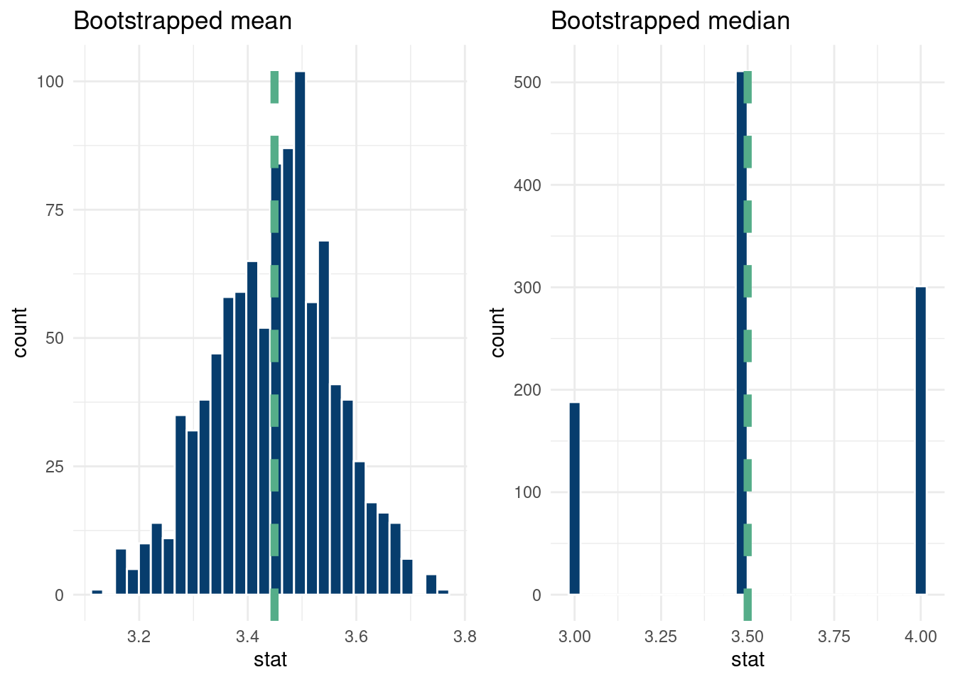
And that’s it!
Circling back to the unseen data caveat, let’s discuss it in more detail with our data example. Assuming the probability of a restaurant in Santa Fe being a one star being 5%, that each visit has the same probability, and the visits are independent, we can do a quick Fermi calculation with the “binomial distribution” to get a rough estimate of the probability of not seeing any one star restaurants4.
4 Of course, we do have a one star in our data, but ignore that for now.
# | label: sims_binomial

print(paste0('Probability of zero 1-star ratings: ',
      round(pbinom(0, size=nrow(data[data$City=='Santa Fe',]), prob=0.05),3)))
[1] "Probability of zero 1-star ratings: 0.028"So there is about a ten percent chance of not seeing any one star ratings, meaning the bootstrap distribution will never include a one star rating. This might not matter too much for the distribution of the statistic of interest, but it is nonetheless something to consider and a motivator for sample size considerations.
From (Heiss 2025), we show how to make a cool looking histogram of our data.
options(warn=-1)
detach("package:reactablefmtr", unload=TRUE)
suppressMessages(library(fiftystater))
suppressMessages(library(patchwork))
data <- read.csv(paste0(here::here(), "/data/restaurant_ratings.csv"))
data = data[,c(1:5)]

data$metro = data$City
data$metro = ifelse(data$City%in%c('Tempe', 'Phoenix', 'Mesa', 'Chandler', 'Gilbert', 'Scottsdale'), 'Phoenix', data$metro)
data$metro = ifelse(data$City%in%c('Manchester', 'Boston', 'Providence'), 'Boston', data$metro)
data$metro = ifelse(data$City%in%c('New York City','Philadelphia'), 'Philadelphia', data$metro)
data = data[data$metro%in%c('Phoenix', 'Santa Fe', 'Boston', 'Philadelphia', 'Houston'),]
# Nudge the ratings a little randomly
data$Overall = data$Overall + rnorm(nrow(data), 0, 0.01)

bin_size=0.7

hist_santa_fe = ggplot(data[data$metro=='Santa Fe',], aes(x = Overall)) +
  # Fill each histogram bar using the x axis category that ggplot creates
  geom_histogram(
    aes(fill = after_stat(factor(x))),
    fill='#d36651',
    binwidth = bin_size, boundary = 0, color = "#f8f9fa"
  ) +
  # Fill with the same palette as the map
  scale_fill_brewer(palette = "PuOr", guide = "none") +
  # Modify the x-axis labels to use >9%
  scale_x_continuous(
    breaks = 1:5,
    labels = case_match(
      1:5,
      1 ~ "1",
      5 ~ "5",
      .default = as.character(1:5)
    )
  ) +
  # ggtitle('Santa Fe')+
  # facet_wrap(~metro, nrow=1)+
  # Just one label to replicate the legend title
  labs(x = "Santa Fe") +
  # Theme adjustments
  theme_void(base_family = "Roboto Condensed", base_size = 16) +
  theme(
    plot.margin = unit(c(0,0,0,0),"cm"),
    #  plot.title = element_text(hjust = 0.5),
    axis.text.x = element_text(size = rel(0.5)),
    axis.title.x = element_text(size = rel(0.6), margin = margin(t = 1, b = 1)
    ))
hist_phx = ggplot(data[data$metro=='Phoenix',], aes(x = Overall)) +
  # Fill each histogram bar using the x axis category that ggplot creates
  geom_histogram(
    aes(fill = after_stat(factor(x))),
    fill = '#493267',
    binwidth = bin_size, boundary = 0, color = "#f8f9fa"
  ) +
  # Fill with the same palette as the map
  scale_fill_brewer(palette = "PuOr", guide = "none") +
  # Modify the x-axis labels to use >9%
  scale_x_continuous(
    breaks = 1:5,
    labels = case_match(
      1:5,
      1 ~ "1",
      5 ~ "5",
      .default = as.character(1:5)
    )
  ) +
  #ggtitle('Phoenix')+
  # facet_wrap(~metro, nrow=1)+
  # Just one label to replicate the legend title
  labs(x = "Phoenix") +
  # Theme adjustments
  theme_void(base_family = "Roboto Condensed", base_size = 16) +
  theme(
    plot.margin = unit(c(0,0,0,0),"cm"),
    #  plot.title = element_text(hjust = 0.5),
    axis.text.x = element_text(size = rel(0.5)),
    axis.title.x = element_text(size = rel(0.6), margin = margin(t = 1, b = 1)
    ))

hist_bos = ggplot(data[data$metro=='Boston',], aes(x = Overall)) +
  # Fill each histogram bar using the x axis category that ggplot creates
  geom_histogram(
    aes(fill = after_stat(factor(x))),fill='#004D40',
    binwidth = bin_size, boundary = 0, color = "#f8f9fa"
  ) +
  # Fill with the same palette as the map
  scale_fill_brewer(palette = "PuOr", guide = "none") +
  # Modify the x-axis labels to use >9%
  scale_x_continuous(
    breaks = 1:5,
    labels = case_match(
      1:5,
      1 ~ "1",
      5 ~ "5",
      .default = as.character(1:5)
    )
  ) +
  #ggtitle('Phoenix')+
  # facet_wrap(~metro, nrow=1)+
  # Just one label to replicate the legend title
  labs(x = "Boston") +
  # Theme adjustments
  theme_void(base_family = "Roboto Condensed", base_size = 16) +
  theme(
    plot.margin = unit(c(0,0,0,0),"cm"),
    #  plot.title = element_text(hjust = 0.5),
    axis.text.x = element_text(size = rel(0.5)),
    axis.title.x = element_text(size = rel(0.6), margin = margin(t = 1, b = 1)
    ))

hist_hous = ggplot(data[data$metro=='Houston',], aes(x = Overall)) +
  # Fill each histogram bar using the x axis category that ggplot creates
  geom_histogram(
    aes(fill = after_stat(factor(x))),
    fill = '#002D62',
    binwidth = bin_size, boundary = 0, color = "#f8f9fa"
  ) +
  # Fill with the same palette as the map
  scale_fill_brewer(palette = "Orange", guide = "none") +
  #scale_fill_manual(values=met.brewer("Greek",6))+
  # Modify the x-axis labels to use >9%
  scale_x_continuous(
    breaks = 1:5,
    labels = case_match(
      1:5,
      1 ~ "1",
      5 ~ "5",
      .default = as.character(1:5)
    )
  ) +
  #ggtitle('Phoenix')+
  # facet_wrap(~metro, nrow=1)+
  # Just one label to replicate the legend title
  labs(x = "Houston") +
  # Theme adjustments
  theme_void(base_family = "Roboto Condensed", base_size = 16) +
  theme(
    plot.margin = unit(c(0,0,0,0),"cm"),
    #  plot.title = element_text(hjust = 0.5),
    axis.text.x = element_text(size = rel(0.5)),
    axis.title.x = element_text(size = rel(0.6), margin = margin(t = 1, b = 1)
    ))


hist_phl = ggplot(data[data$metro=='Philadelphia',], aes(x = Overall)) +
  # Fill each histogram bar using the x axis category that ggplot creates
  geom_histogram(
    aes(fill = after_stat(factor(x))),
    fill = '#6f95d2',
    binwidth = bin_size, boundary = 0, color = "#f8f9fa"
  ) +
  # Fill with the same palette as the map
  scale_fill_brewer(palette = "Orange", guide = "none") +
  #scale_fill_manual(values=met.brewer("Greek",6))+
  # Modify the x-axis labels to use >9%
  scale_x_continuous(
    breaks = 1:5,
    labels = case_match(
      1:5,
      1 ~ "1",
      5 ~ "5",
      .default = as.character(1:5)
    )
  ) +
  #ggtitle('Phoenix')+
  # facet_wrap(~metro, nrow=1)+
  # Just one label to replicate the legend title
  labs(x = "Philadelphia") +
  # Theme adjustments
  theme_void(base_family = "Roboto Condensed", base_size = 16) +
  theme(
    plot.margin = unit(c(0,0,0,0),"cm"),
    #  plot.title = element_text(hjust = 0.5),
    axis.text.x = element_text(size = rel(0.5)),
    axis.title.x = element_text(size = rel(0.6), margin = margin(t = 1, b = 1)
    ))


plot_map = fifty_states %>%
  ggplot(aes(map_id=id)) +
  geom_map(map = fifty_states,fill = '#012296', #"#2D78F1", #"#259196",
           #"#2D78F1",
           alpha=0.08, color = "#012024", linewidth = 0.05)+
  expand_limits(x = fifty_states$long, y = fifty_states$lat) +
  coord_map() +
  theme_void(base_size=16)+
  inset_element(hist_phx, align_to='plot',left = .15, bottom = 0.325, right = 0.275, top = 0.6)+
  theme(text = element_text(size = 22),
        base_family = 'roboto',
        font_face='bold')+
  inset_element(hist_santa_fe, align_to='plot', left = .325, bottom = 0.375, right = 0.45, top = 0.625)+
  theme(text = element_text(size = 22),
        base_family = 'roboto',
        font_face='bold')+
  inset_element(hist_bos, align_to='plot', left = .825, bottom = 0.635, right = .975, top = 0.885)+
  theme(text = element_text(size = 22),
        base_family = 'roboto',
        font_face='bold')+
  inset_element(hist_hous, align_to='plot', left = .45, bottom = 0.2, right = .575, top = 0.475)+
  theme(text = element_text(size = 22),
        base_family = 'roboto',
        font_face='bold')+
  inset_element(hist_phl, align_to='plot', left =.725, bottom = 0.5, right = .85, top = 0.75)+
  theme(text = element_text(size = 22),
        base_family = 'roboto',
        font_face='bold')

plot_map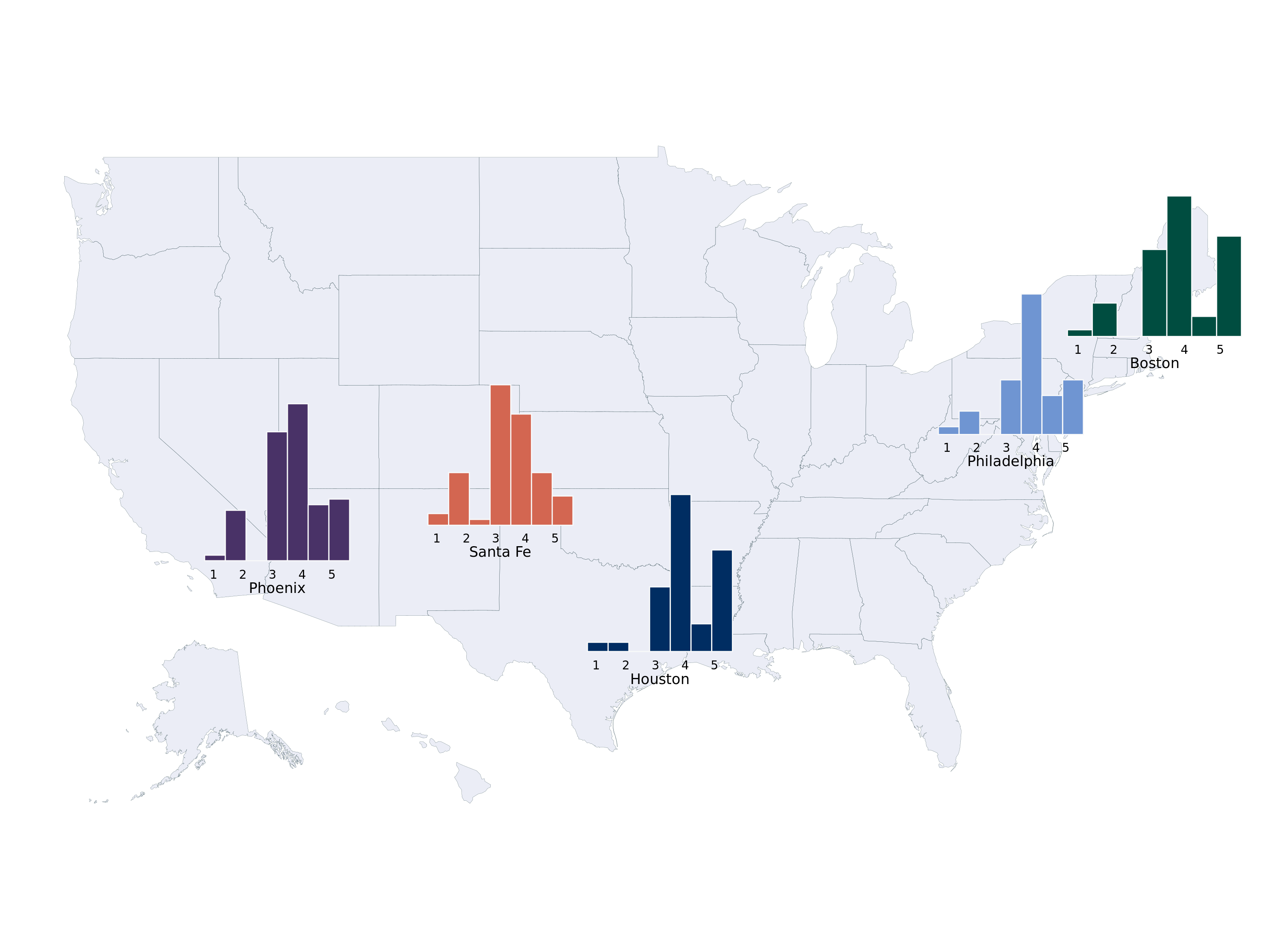
The Markov model was essentially a next token generator (from Ian Soboroff)!
Here is an embedded link for fun:
A more practical place to begin is with the following R package, sabRmetrics, with an official citation (Powers 2025).
From the package,
Possibly the most fundamental model in sabermetrics is base-out run expectancy. The function below fits a Markov model assuming the state is specified by the bases occupied and the number of outs, using the empirical transition probabilities between states.
In a little more detail, following these nice references, chapter 5 here (Thomay 2014) and this fangraphs article, we want to track the probability from moving between “states” in a baseball game. This type of modeling dates back to (Bukiet, Harold, and Palacios 1997). For simplicity, assume the states are the location of runners on the basepaths in baseball and the number of outs in an inning. So the base state is no runners on base and zero outs. A run is scored if there is a runner on home and there are less than 3 outs.
(Thomay 2014) does a really great job describing the set-up, so we reproduce their explanation below:
At any point during an inning of a baseball game, a team currently on offense finds itself in one of 24 possible states. There are 8 possibilities for the distribution of runners on the bases: bases empty, one man on first, second, or third, men on first and second, men on first and third, men on second and third, and men on first, second, and third. Also, there can be zero, one, or two outs at any point during an inning. Thus, we have 24 states when considering the occupied bases and the number of outs. Furthermore, we need to account for when the half inning ends with three outs. For analysis that will be shown later, we will denote the 25th state as being three outs and zero runners left on base when the inning ends. Likewise, the 26th, 27th, and 28th states will denote the situations in which the inning ends with one, two, and three runners left on base, respectively.
We can certainly create a Markov chain for an inning of a baseball game satisfying these criteria. We have 28 states in the state space described before and can create a transition matrix determining how the process will move from state to state. We can also implement the Markov property, saying that the probability of moving to the next state in an inning of a baseball game is determined only by the current state the batter is in, and not how the team got to that state. For example, if a batter is facing a situation with runners on first and second base with one out, the probability of the batter hitting a single is the same as if he were batting with no one on base and zero outs.
Let’s do a simplified example with only 2 bases and 2 outs. Note we have 4 states: \[ \begin{align*} \text{State 1}&:\text{0 runners, 0 outs}\\ \text{State 2}&:\text{1 runner, 0 outs}\\ \text{State 3}&:\text{2 runners, 0 outs}\\ \text{State 4}&:\text{0 runners, 1 outs}\\ \text{State 5}&:\text{1 runner, 1 out}\\ \text{State 6}&:\text{2 runners, 1 out}\\ \text{State 7}&:\text{0 runners, 2 out}\\ \text{State 8}&:\text{1 runner, 2 outs}\\ \text{State 9}&:\text{2 runners, 2 outs}\\ \end{align*} \]
The transition matrix is (with made up probabilities that are not realistic):
| States | State 1 | State 2 | State 3 | State 4 | State 5 | State 6 | State 7 | State 8 | State 9 |
|---|---|---|---|---|---|---|---|---|---|
| State 1 | 0.00 | 0.48 | 0.40 | 0.12 | 0 | 0 | 0 | 0 | 0 |
| State 2 | 0.32 | 0.00 | 0.04 | 0.02 | 0.02 | 0.4 | 0.12 | 0.07 | 0.01 |
| State 3 | 0.05 | 0.15 | 0.00 | 0.10 | 0.05 | 0.05 | 0.04 | 0.50 | 0.01 |
| State 4 | 0 | 0 | 0 | 0.00 | 0.5 | 0.02 | 0.01 | 0.24 | 0.20 |
| State 5 | 0 | 0 | 0 | 0.52 | 0.00 | 0.10 | 0.05 | 0.12 | 0.21 |
| State 6 | 0 | 0 | 0 | 0.32 | 0.18 | 0.00 | 0.22 | 0.16 | 0.10 |
| State 7 | 0 | 0 | 0 | 0 | 0 | 0 | 1.00 | 0.00 | 0.00 |
| State 8 | 0 | 0 | 0 | 0 | 0 | 0 | 0.00 | 1.00 | 0.00 |
| State 9 | 0 | 0 | 0 | 0 | 0 | 0 | 0.0 | 0.0 | 1.00 |
The zero elements in Table 6.1 are a consequence of the rules of baseball. You cannot “remove” an out after you get one. You also cannot get two outs in one play with no runners on base. You cannot end up in the same state after an at-bat, because you either get on-base or record an out.
Below, in Figure 6.1, visualizes an example of a “state”. The sportyR package is a really cool aide for stuff like this.
options(warn=-1)
 suppressMessages(library(sportyR))
  runner_data <- data.frame(
    x = c(55), # Approximate x-coordinates for 1st, 2nd, 3rd base
    y = c(71)   # Approximate y-coordinates for 1st, 2nd, 3rd base
  )
  scoreboard_x <- 83
  scoreboard_y <- 150
  scoreboard_width <- 50
  scoreboard_height <- 16
  geom_baseball(league = "MLB", rotation = 0, display_range = "infield") +
    geom_point(data = runner_data, aes(x = x, y = y), color = "#8b1a1a", size = 16) +
    geom_text(data = runner_data, aes(x = x, y = y, label = "Runner"), color = "white", size = 4)+
    geom_rect(
      aes(
        xmin = scoreboard_x - scoreboard_width / 2,
        xmax = scoreboard_x + scoreboard_width / 2,
        ymin = scoreboard_y - scoreboard_height ,
        ymax = scoreboard_y + scoreboard_height
      ),
      fill = alpha('#012296', 0.08),
      color = "white"
    )+   # Scoreboard title
    annotate(
      "text",
      x = scoreboard_x,
      y = scoreboard_y + 10,
      label = "Current state",
      color = "#f8f9fa",
      size = 4,
      fontface = "bold"
    ) +
    # Away team name and runs
    annotate(
      "text",
      x = scoreboard_x ,
      y = scoreboard_y,
      label = "Outs: 1",
      color = "white",
      size = 3
    ) +
    # Home team name and runs
    annotate(
      "text",
      x = scoreboard_x ,
      y = scoreboard_y-6,
      label = "Count: 2 Balls, 2 Strikes",
      color = "white",
      size = 3
    ) +
    # Current inning
    annotate(
      "text",
      x = scoreboard_x,
      y = scoreboard_y - 12,
      label = "INNING: 7th",
      color = "white",
      size = 3
    )
How does that play out? Table 6.2 shows run-expectancies given how many outs there are in an inning and how many people are on-base, after calculating the Markov transition probabilities from all the games on June 10, 2025.
options(warn=-1)
  suppressMessages(library(sabRmetrics))
  suppressMessages(library(gt))
  data_statsapi <- suppressMessages(sabRmetrics::download_statsapi(
    start_date = "2025-06-10",
    end_date = "2025-06-10"
  ))

  estimate_base_out_run_exp(data_statsapi$event) %>%
    dplyr::mutate(exp_runs = round(exp_runs,3)) %>%
    arrange(exp_runs) %>%
    gt() %>%
    data_color(columns=vars(exp_runs),
               direction = "column",
               palette = "PuOr",
na_color = "white")| runner_1b | runner_2b | runner_3b | outs | exp_runs |
|---|---|---|---|---|
| FALSE | FALSE | FALSE | 3 | 0.000 |
| FALSE | FALSE | FALSE | 2 | 0.132 |
| FALSE | FALSE | FALSE | 1 | 0.282 |
| FALSE | FALSE | TRUE | 2 | 0.282 |
| TRUE | FALSE | FALSE | 2 | 0.338 |
| TRUE | TRUE | TRUE | 2 | 0.360 |
| FALSE | TRUE | FALSE | 2 | 0.367 |
| FALSE | TRUE | FALSE | 1 | 0.457 |
| FALSE | FALSE | FALSE | 0 | 0.516 |
| TRUE | TRUE | FALSE | 2 | 0.521 |
| TRUE | FALSE | FALSE | 1 | 0.539 |
| TRUE | FALSE | TRUE | 2 | 0.588 |
| TRUE | TRUE | FALSE | 1 | 0.666 |
| TRUE | TRUE | TRUE | 1 | 0.734 |
| TRUE | FALSE | FALSE | 0 | 0.802 |
| FALSE | TRUE | FALSE | 0 | 1.117 |
| FALSE | FALSE | TRUE | 1 | 1.207 |
| FALSE | TRUE | TRUE | 2 | 1.237 |
| TRUE | FALSE | TRUE | 1 | 1.285 |
| FALSE | FALSE | TRUE | 0 | 1.404 |
| TRUE | FALSE | TRUE | 0 | 1.527 |
| TRUE | TRUE | FALSE | 0 | 1.560 |
| FALSE | TRUE | TRUE | 1 | 1.569 |
| FALSE | TRUE | TRUE | 0 | 1.728 |
| TRUE | TRUE | TRUE | 0 | 1.952 |
Table 6.3 looks at further information we can gather after conditioning on pitch counts. For example, the there is a lower probability of scoring a run with the bases loaded if the hitter already has two strikes. From the sabRmetrics reference page:
A refinement on base-out run expectancy would be to include the ball-strike count in the state. Rather than expanding the Markov state to include count, the function below calculates the expected change in base-out run expectancy result from a plate appearance, conditional on the plate appearance passing through the specified count. We interpret this as the run value of the count, which allows us to measure the outcomes of individual pitches on the run scale.
  estimate_count_value(data_statsapi$play, data_statsapi$event, estimate_base_out_run_exp(data_statsapi$event)) %>%
    dplyr::mutate(count_value = round(count_value,3)) %>%
    arrange(count_value) %>%
    gt() %>%
    data_color(columns=vars(count_value),
               direction = "column",
               palette = "PuOr",
na_color = "white")| balls | strikes | count_value |
|---|---|---|
| 0 | 3 | -0.276 |
| 1 | 3 | -0.276 |
| 2 | 3 | -0.276 |
| 3 | 3 | -0.276 |
| 1 | 2 | -0.062 |
| 2 | 2 | -0.048 |
| 0 | 2 | -0.040 |
| 2 | 1 | 0.001 |
| 1 | 0 | 0.009 |
| 0 | 1 | 0.011 |
| 0 | 0 | 0.012 |
| 1 | 1 | 0.017 |
| 3 | 2 | 0.020 |
| 2 | 0 | 0.067 |
| 3 | 0 | 0.078 |
| 3 | 1 | 0.123 |
| 4 | 0 | 0.235 |
| 4 | 1 | 0.235 |
| 4 | 2 | 0.235 |
Soooo, you may ask, where is the “simulation” aspect of this. The tables above are used to generate expected runs, which are calculated from a matrix of probabilities that determine long run expected values. One could theoretically play a game of baseball by drawing random samples from those probabilities. You would start at the state with zero baserunners and zero outs. “Rows” are your current state and columns are the next state. Each row, then, sums to 1. So you sample all the rows with a multinomial distribution with the sample probabilities being the column values in the row you are currently in. You do a random draw and the state (the column number) that is chosen is the next row you go to.
We mentioned in the primer on Bayesian statistics that the prior predictive bears a passing resemblance to the marginal likelihood, but did not expand upon the point much further. However, the prior predictive is a powerful tool. Plotting the prior is interesting, but the prior just tells us about the distribution of the parameter. What we care more about is what would hypothetical data look like with a given prior. Studying the prior predictive is sometimes called a “prior ellicitation” procedure.
For an example, assume our likelihood is \(N(\theta, \sigma^2)\) and our prior on \(\theta\) is \(N(\mu_{0}, \tau^2)\). The prior predictive is given by (see the derivation here):
\(\Pr(\mathbf{y})=\int_{\theta}\Pr(\mathbf{y}\mid\theta)\pi(\theta)\text{d}\theta = N(\mu_{0}, \sigma^2+\tau^2)\)
A nice interpretation of this is the distribution of the data \(\mathbf{y}\) averaged over the values of the parameters \(\theta\) we expect to see. So we can get a sense of what data we’d expect to see given our choice of prior distributions.5 A nice stackoverflow about this point.
5 A similar concept to the marginal likelihood, which only differs in that the marginal likelihood is a single number based on the observed data, rather than a distribution for all possible future observed data.
n = 2500
sigma = 1
mu_0 = 0
tau = 1
theta = rnorm(n, mu_0, tau)

prior_predictive = rnorm(n, mu_0, tau+sigma)

hist(prior_predictive, 40, col='#073d6d', xlab='y')
This example does not really showcase why the prior predictive is an interesting concept. The likelihood and prior are both normal, with the mean of the likelihood the same as the mean of the prior. Therefore, just plotting the prior on \(\theta\) directly here is already informative, as the prior predictive is centered at the same point, but with a wider variance. A more interesting study will be seen in chapter 8, where we can take draws of the prior predictive of a Gaussian process, which is an informative way to see which functions we would expect to see prior to seeing any data.
So far, we have discussed that we can evaluate Bayesian methods using frequentist evaluation tools, but we can go the other direction too!