Click here for full code
N = 250
x = seq(from=1, to=10, length.out=N)
y = sin(x)
mod = lm(y~x)
plot(x,y, pch=16, col='#073d6d')
lines(x, mod$fitted.values, col='#55AD89', lwd=4)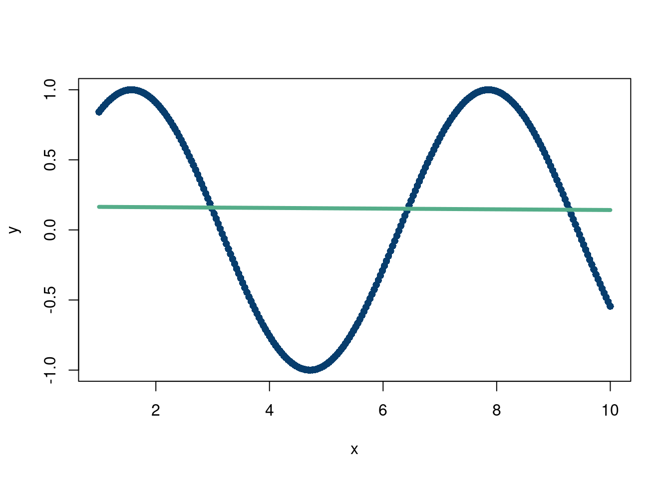
Broadly speaking, this chapter will be about “pattern matching”. Earlier chapters described algorithmic approaches to gaining insight from data and parametric modeling, where the shape of the output is mostly determined ahead of time (up to the values of the parameters). In machine learning, the goal is typically to learn the typical value of some outcome (\(y\)) we would expect given the covariates (\(\mathbf{X})\) we observe. A naive first pass is to take the average outcome across all covariates and predict that. The idea is sound, but we can do better by then taking averages for different regions in the input space. Samantha likes hot drinks when it is cold and cold drinks when it is hot. Instead of always making her a lukewarm drink, we leverage the additional information provided by the temperature and adjust accordingly.
Where to take averages over, however, presents a significant challenge. Taking the average over one temperature we saw was silly. Taking an average over every single interval is also silly. Say Samantha drank an iced coffee on a cold day with a high of 36 Fahrenheit1 for whatever reason, which is out of the ordinary for her. On average, serving her a cold drink between 34-37 degrees will probably be an unpleasant experience for her. This example is meant to illustrate the concept (loosely) of over-fitting, or difficulty separating signal from noise.
1 Hot take, but F>C in terms of judging temperature.
The idea then, is that we have to be careful to pick up the correct pattern but not chase every observed data point. To do so, we will discuss the concept of regularization (from chapter 2) and what it looks like for different machine learning methods.
When Demetri started graduate school in 2018, machine learning was all the rage 2. In particular, people were very excited about image recognition, with some early hype for self-driving cars. There was another corner of the nerd-verse that was pumped about tree methods like XGBoost and predicting credit default probabilities, housing prices, and whether or not you would have survived the titanic. At the time, this was incredibly exciting, although now it seems that most people care about generating text and answers to random questions. Although the scope of generative AI is far bigger, under the hood many of the tools used are still similar, and we will discuss them in this chapter.
2 Only to be replaced by “artificial intelligence” circa 2022
In this section we focus on “adaptive basis” methods for “machine learning” (Murphy 2012). We follow the exposition in (Murphy 2012) (the first edition of the famous “Machine Learning: A Probabilistic Perspective”) as well as this nice blog (adaptive basis functions). These models stand in contrast to the linear models we learned about earlier by no longer requiring the model to be linear in its parameters.
Other common modes of regression analysis include Linear models (and generalizations of them) and kernel methods (which we will discuss in a later chapter).
Recall, in the linear model
\[ f(\mathbf{x}) = \sum_{i=1}^{p}\beta_{i}x_i \]
A less restrictive approach is to let \(\mathbf{x}\) be transformed by \(\phi\), in other words, we can write the output
\[ f(\mathbf{x}) = \sum_{i=1}^{p}\beta_{i}\phi_{i}(\mathbf{x}) \]
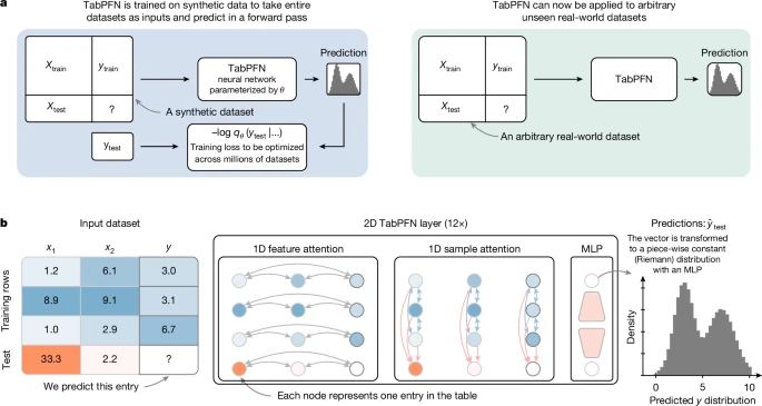
Where \(\phi\) is some function that does not need to be linear. For example, imagine the following data:
N = 250
x = seq(from=1, to=10, length.out=N)
y = sin(x)
mod = lm(y~x)
plot(x,y, pch=16, col='#073d6d')
lines(x, mod$fitted.values, col='#55AD89', lwd=4)
That’s a rough fit…but what is \(\phi(\mathbf{x})=\sin(x)\)
N = 250
x = seq(from=1, to=10, length.out=N)
y = sin(x)
mod = lm(y~sin(x))
plot(x,y, pch=16, col='#073d6d')
lines(x, mod$fitted.values, col='#55AD89', lwd=4)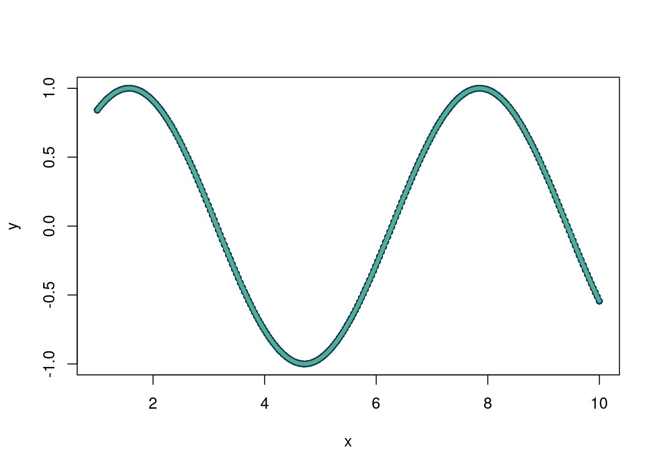
Much better! But we still had to choose \(\phi\), which is not always known. Especially with harder simulation data. For example, what if the data looked like this:
N = 250
x = seq(from=0, to=3, length.out=N)
y = abs(sin(x^x)/2^((x^x-pi/2)/pi))
mod = lm(y~sin(x))
plot(x,y, pch=16, col='#073d6d')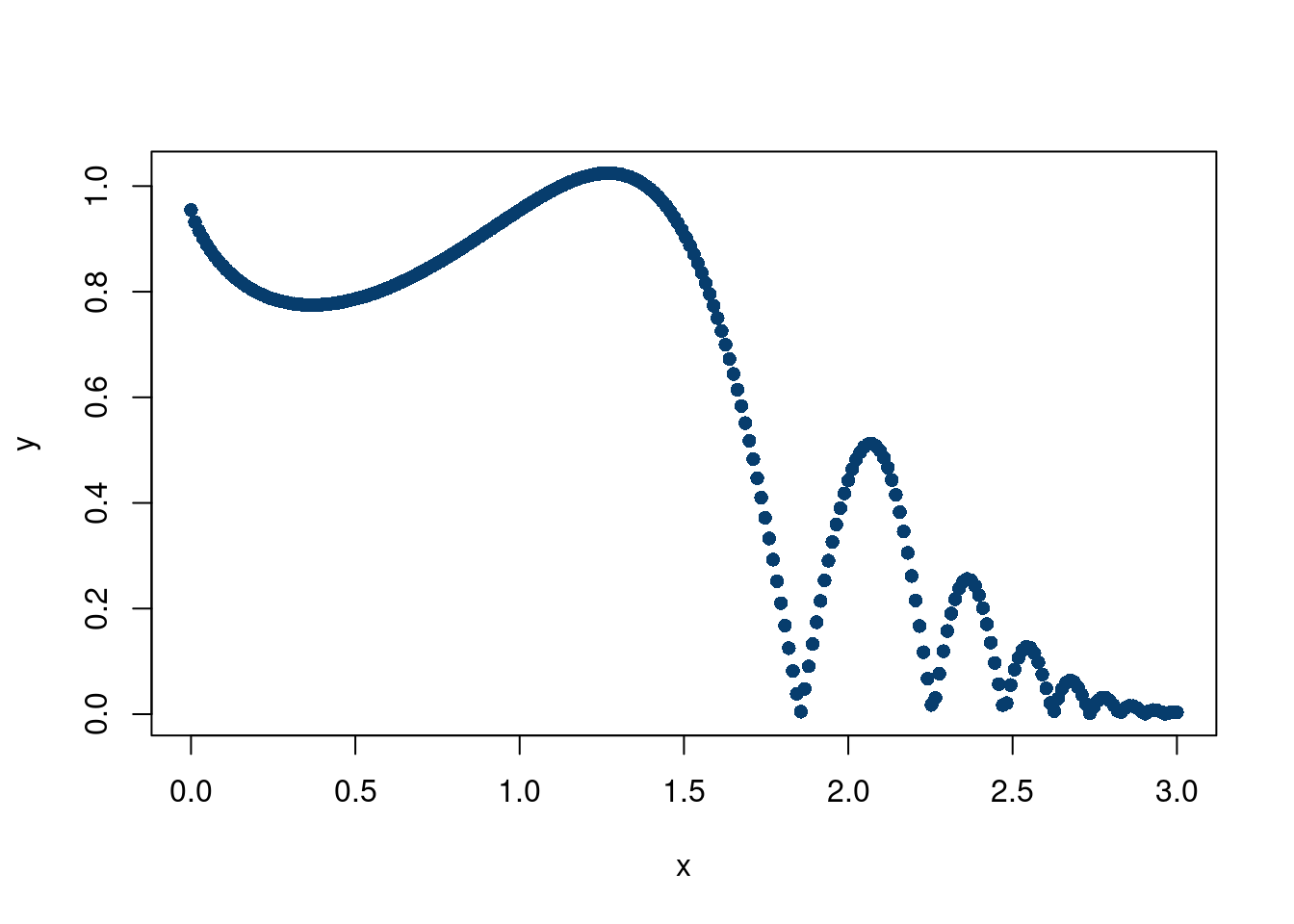
With an adaptive basis, for \(M\) basis functions,
\[ f(x) = w_0 + \sum_{i=1}^{M}w_i \phi_{i}(\mathbf{x}, \mathbf{\theta}) \]
but now, \(\phi_{i}(\mathbf{x}, \mathbf{\theta})\) is learned from the data, rather than be pre-specified ahead of time. This is because there are now parameters associated with \(\phi\), meaning \(\phi\) is no longer a known function, but rather one that changes with different values of \(\theta\) that are determined based on the observed data.
For example, following Murphy (2012), consider a decision tree with a single split. If \(x>\text{cutoff point}\), we assign \(f(x)\) the mean of the \(y\) response values in that region,which we call \(\beta_{1}\). If \(x\leq\text{cutoff point}\), then we assign it the mean of the \(y\) response values in that region, called \(\beta_{2}\). For a tangible example, say our input variable is sleep hours and our outcome is GPA of students at a high school. An example would be the tree splitting students with more than 7 hours of sleep a night and their GPA vs students with less than 7 hours of sleep a night and their GPA.
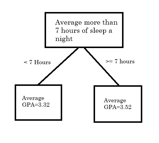
Mathematically, we can write this as, where \(R_1\) and \(R_2\) correspond to the two boxes in the picture above (Figure 7.1)
\[ f(\mathbf{x}) = \sum_{i=1}^{M}\beta_{i}\mathbf{1}(x\in R_{i}) \]
So how is this an “adaptive” basis? What is the parameter \(\theta\) that would be attached to \(\phi\)? Well, instead of choosing the cutoff to be 7 hours, what if we learned that from the data to choose the cutoff, which could be chosen to maximize predicting \(y\) as accurately as possible given whatever criterion the researcher cares about.
Non-parametrics, which can be defined as the number of parameters in your model not being fixed with sample size of observations (in other words, an infinite dimensional model, confusingly) and are generally powerful regression tools. For example, a Gaussian process is a non-parametric model that does not fall into the category of adaptive basis models. All this to say that pre-specifying basis functions for the expansion representation of the outcome variable ( \(f(x)\) to approximate \(y\)) does not necessarily mean those models are inflexible; in fact they can still be non-parametric, for example, Gaussian processes, where \(\phi_{i}\) is the chosen kernel. On the flip-side, having an adaptive basis does not necessarily make a model non-parametric. See this discussion about neural networks being parametric??
LOESS? GAM, Splines, knn (algorithm first), neural networks, boosting, random forest, boosting.
This is a very well discussed topic on the web. Additionally, readers of this book should familiarize themselves with calculus and linear algebra with contents outside of these notes. For these reasons, we will not be delving into many different architectures, or provide a thorough background on the workings of back-propagation and gradient descents. While the design of neural networks facilitates these powerful mathematical tools to incredible results (mostly through the chain-rule of calculus) and a further dive should be taken to really understand how deep learning works, we recommend looking elsewhere for those resources.
We will, however, provide an intuitive understanding for why neural networks work, where they may struggle, and point readers to useful softwares for implementing them. We will also touch upon extensions that are particularly valuable for a young data scientist as further reading.
AI is moving very fast. We will discuss limitations/strengths of underlying architectures from a somewhat “theoretical” avenue, but do note that 2026 AI is extremely capable, particularly for coding/mathematics tasks. Whether that be due to enormous data ingestion or some “emergent” behaviours is not really the point here.
The perceptron is the backbone of the neural network craze that has driven much of modern machine learning work. We will start with a code example and then explain some of the mathematics. The other tab talks about different architectures of neural networks which may be of interest to readers. This follows the example from: https://www.rob-mcculloch.org/2023_cs/webpage/notes/nnet.pdf.
Physics informed neural networks (PINN)
Here is a really cool blog post about PINNs.
The idea here is to regularize an output from a neural network to a known physics model. This works remarkably well with certain physics models and neural networks specifically because of the differential nature of many physics models and the differential form of back propagation in neural networks loss functions. This means certain “physics” can be directly incorporated into the loss function of a neural network’s training regime, when the weights are updated through back propagation.
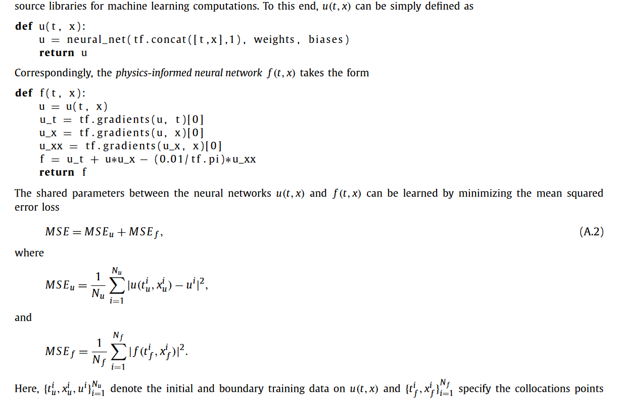
Another nice thing about PINN is the ability to potentially learn boundary conditions.
Recurrent neural networks
Graph neural networks
GAN
Autoencoder
Transformers: These are the foundation of large language models like chat-gpt. They are built off the idea of “attention” (Vaswani 2017). Chapter 12 of (Bishop and Bishop 2023) (with a free link) provides a really great overview of transformers. This 3Blue1Brown youtube series is a remarkable introduction on the topic. Specifically, chapters 5 through 7 give a really excellent intuitive explanation of transformers while not shying away from the technical details. They reference the Johnson-Lindenstrauss lemma, which we will discuss in more depth in chapter 10 when reading (Chari and Pachter 2023) (The Specious Art of Single Cell Genomics).
![]()
One of the coolest things about LLM’s (the transformer architecture is just a way to learn these distributions) is the distributional semantics theory. Essentially, it posits that language (or whatever you are trying to learn) has some structure. Mathematically, that means different dimensions encode different features of a language. Most modern (2025) LLM architectures embed a language “token” (like a word or a phrase) into 12,288 dimensions. Theoretically, then, 12,288 things can be learned, aka we are learning a 12,288 dimension joint distribution! If we know dimension 17 encodes “angry” and dimension 38 encodes “happy”, combinations of these also become meaningful. A famous example is
\[ \text{Embedding}(\text{Man}) - \text{Embedding}(\text{Uncle})\approx \text{Embedding(Woman)}-\text{Embedding(Aunt)} \]
Unfortunately, this example is a gross over-simplification. Click on the blog by Mike X Cohen for a super thorough, interesting, and novel dive into how these 2-dimensional linear representations of embeddings are not particularly realistic.
Personally, cooking seems like a useful analogy. Chefs might see recipes as some combination of underlying flavors, like salty, spicy, bitter, umami, etc. Knowing where a dish lies in these underlying components gives rise to similarities between dishes, which allows chefs to succeed on the fly.
Another interesting mathematical property related to LLMs (and neural networks) is known as “superposition”. It is a consequence of the Johnson–Lindenstrauss lemma. The lemma essentially details how much information you can cram into a lower dimensional space, so the application here is “going in the other direction”. It basically says you can learn more than the number of dimensions if you allow a little bit of error. For example, if two vectors are 89.9 degrees about, they are basically perpendicular and can be basically considered unique vectors of the structure. In fact, the number of practical dimensions is \(\approx \exp(\varepsilon N)\), where \(\varepsilon\) is how far off from 90 degrees the vectors are from one another. So nearly perpendicular vectors can encode a LOT of independent ideas. Of course…this is merely a plausible explanation for why LLMs have scaled so well. We don’t actually know what the tolerance is (\(\pm 1\) degree might be too much wiggle room).
Johnson-Lindestrauss says you can jam stuff into a smaller dimension. Results from compressed signal sensing (more on this when we discuss the LASSO) say you can recover a higher dimensional space with fewer features3 if the original space is “sparse”. The argument for sparsity is that a lot data exhibit sparsity4. In language models, this means most features in the data are not really strongly interacting with other features. In other words, that \(12,288\times12,288\) dimensional matrix is mostly zeroes. In songs, there are a few distinct sounds that are truly important but the rest is essentially background. The matrix here is length of time of song by length of time of song.
So, we know this “compression” is possible…but how do we do that and what does it have to do with neural networks? Do neural networks actually embed much higher dimensional data? We give a brief description based on the following three sources:
Cool visualization, although starting here might help followed by this article. (Elhage et al. 2022)
A nice towards data science article
The general takeaway is that neural networks can theoretically exhibit superposition, where individual neurons can represent multiple features! This is the embodiment of the Johnson-Lindenstrauss lemma (or the mechanism rather). Neural networks with the ReLu activation function are believed to behave this way, although we do not know for certain that they do. Empirically, it might explain the rapid improvement in LLM models over the 2010s to the 2020s.
Back to the architecture, a primary way that transformers work is through the attention mechanism, which is a linear way of learning how embeddings interact. It is basically learning a covariance matrix between the inputs (the question asked and the hypothetical answer). If you can accurately learn the distribution of the hidden features of language, attention spits out a similarity score for individual observations of that distribution, which in language models are the embeddings of a word. This is essentially a pre-processing step to separate tokens, similar to the “kernel trick” of higher dimensional embedding we learned about (Tarzanagh et al. 2023), with arxiv link, and (Egri and Han, n.d.), with another link. This has the effect of inducing sparsity, by attempting to remove noise and amplify more similar embeddings based on how close they are to one another. Attention is a pretty cool architecture, so we will discuss it in a little more detail now:
In the context of LLMs, attention also provides a natural way to deal with queries and keys. In language translation, you can think of these as the language to want to translate to and the language you translate from. For chatgpt, we want to learn the interactions (or “context”) between the question we ask and the all the other words in the training data (so wikipedia, reddit posts, old news articles, etc.). So part of the magic of attention is that it is a nifty computer science way of translating a question to a draw from a distribution.
Mathematically, \[ \text{attention}(Q,K,V)=\text{softmax}\left(\frac{QK^t}{\sqrt{d_k}}\right)V\]
Where \(Q\) is a query, \(K\) is a key, and \(V\) is the updated value. Basically, we take a dot product between what is being asked and the potential answer (\(Q\) and \(K\)) as a measure of how similar they are. Dividing by \(d_k\) is for numerical reasons, and the softmax just normalizes the values between 0 and 1. The embeddings of the queries and keys most similar get a value of 1, least similar get a 0. \(V\) then serves to be update where the embedding should be based on the similarity learned from the \(QK\) dot product. Each element of \(V\) is multiplied by the normalized weight which corresponds to the similarity between the query and key pairs, and these are summed together. If only one query and key have any similarity, then the value of the embedded word (the key) becomes completely attached to that one query. In a less extreme case, the key will be updated to reflect which of the queries it is most similar by taking a weighted sum of the interaction terms between the query and key pairs. which updates its embedding. For example, if the query is for funny and sad videos, and the keys are Grave of the Fireflies, Its Always Sunny, and The Bear, the updated value of the embedding for Grave of the Fireflies is probably mostly sad, for Sunny its mostly funny, and the Bear might be a 25,75% mix. The attention updates the context for the keys then. We now if someone wants a funny show, or a sad show, or a hybrid, where to look amongst our recommended movies based on where they lie in this 2-dimensional embedding space.
The second layer is a traditional perceptron architecture which learns further non-linearities between the embeddings. This is repeated over and over, taking advantage of GPU compute and parallelization. Finally, the output is the next most probable word given the input. This is then fed back into the beginning until the next most probable word is spit out…and so on. Because the outcome is created in the architecture, this is considered “self-supervised learning”. Further improvements come from human intervention to see if results are logical, which is known as reinforcement learning. This can be thought of as a modification to the loss function through putting a human “finger on the scale”.
Essentially, LLM’s are learning a really high dimensional joint distribution. This is a latent distribution…we do not know if there is actually an “angry” dimension, but it is a nice mathematical construct. There are a few main issues with this approach:
a) This is extremely difficult. For language, which is relatively structured and there is an enormous amount of data (as well as enormous computing resources), this seems to have worked out pretty well. That being said, we do not really know if we have enough dimensions in the first place, although superposition makes it more likely. Neural networks (attention plus multilayer perceptrons) are probably not the only way to do this, but they potentially exhibit superposition making them very efficient and are probably the only computationally feasible way to handle such large data in a non-linear fashion.
BUT…what might make neural networks work so well in large language models may not actually be that great. For very sparse data, superposition may be desirable. But when features are strongly interacting, then this could be an issue. It is quite well known that neural networks behave better in high signal to noise ratio settings (Grinsztajn, Oyallon, and Varoquaux 2022) , so having more correlated features may be problematic for the transformer architecture(Elhage et al. 2022). Sparse signals sort of imply a strong signal. Highly correlated features or noisy data may minimize the benefits of the extra features superposition could theoretically embed.
b) At the end of the day, the LLM’s are still only next word generators. Even if they learned the distribution of words perfectly, they still can only predict the next word at a time, which isn’t really thinking. The type of “thinking” LLM’s do has been coined as stochastic parroting by Emily Bender, meaning they are not understanding meaning just learning the next most probable word (ideally very well) and feeding it back in to itself to predict the word after that. Humans probably are not speaking based on drawing the next word from a learnt distribution of language. Human creativity goes beyong linkage of tokens (although chat-gpt is incredible at linking things across the knowledgeverse). And even if humans are drawing from a probability distribution, that distribution is probably much more “adaptive”. People can easily learn things in new ways or remove old information.
c) Given the enormous number of parameters, the token weights are certainly non-unique. So these “learning” models can be distilled to smaller models. See DeepSeek’s model stemming from OpenAI’s. d) Finally, even if the joint distribution is learned perfectly, it’s still just a distribution of words in the training set. If there are words or phrases it has never encountered, well tough potatoes. So it’s not necessarily representative of the true “language structure”, if that even exists! (see b). Garbage in, garbage out.
To summarize the lengthy ramble above frames LLMs into “interpolation” and “extrapolation”, and which they generally are in the “interpolation” regime.
Interpolation is still powerful, as filling in unfilled gaps in human knowledge is still a valuable form of novelty from traditional LLMs. Imagine having an infinite memory with some deductive ability through connection of similar ideas. Pretty, pretty, pretty good.
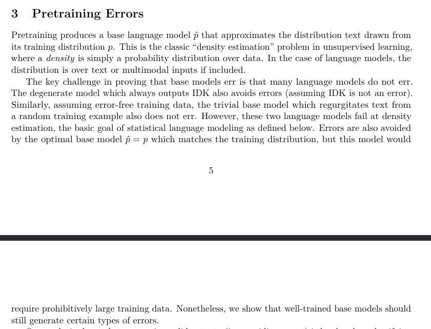
Interestingly, framing LLM’s as basically a giant probability density estimator of language is the approach OpenAI (Kalai et al. 2025) makes in their 2025 paper on the inevitability hallucinations. The figure below is an excerpt from the paper that reiterates the points we made here years earlier:
RAG: RAG is a really nifty engineering win. It basically allows the big language model to defer to traditional computing for tasks it’s ill-equipped. Since LLM’s have not actually learned how to calculate, if someone needs a calculator, a RAG like service allows the LLM to simply access a calculator.
Reinforcement learning: Another part of the secret sauce. While transformers with reinforcement rewards are still fundamentally probabilistic next token generators, there seems to be some benefit with adding some “human supervision” into the loop, which also statistically reframes the problem from a generative one to a discriminative one. However, this can be problematic too! If we reward LLM models that are “nice”, we may see the behaviour change to feed that reward at the expense of answer accuracy. There are similar issues in GANs, where the generated data will try and fool the discriminator at all costs, even through technically correct, but nonsensical solutions. See this very cool youtube video by Yosh.
Generative adversarial networks:
Foundation models: The idea here is you train one model on a lot of data, and then you use the learned weights from the model to predict in “new domain”. For example, predicting on weather data and then specifically forecasting hurricanes. See (Bodnar et al. 2025), with an arxiv link here and github repo. Two notions to know are 1) “finetuning”, where the foundation model updates its weight by doing a supervised learning task to learn the new domain data, which is usually far smaller, but starts with the pre-trained model and 2) “zero-shotting”, where the pre-trained model directly estimates on the new test data without any additional training/modifying of the model. These models need not be transformers, but usually are. The concepts of finetuning are very similar to “transfer learning”.
Generally, this seems like a challenging task and, worryingly, very difficult to validate. This model structure is very prone to over-fitting. For one, it is plausible some of the testing data found its way into the training data (data leakage is a term for this). Another issue is predicting well on a dataset is unlikely to generalize to a different dataset. These enormous models are extraordinarly complex due to the immense parameter space and the massive amounts of diverse input data make it possible to simply overfit/memorize reasonable looking patterns that are not generally true. Even with “trad” machine learning models, there are some ways to incorporate physical knowledge and constraints into the learning process. Additionally, with a tailored input/output supervised learning structure, it is easier to validate how well a model works for the task it is designed to. The foundation model approach explicitly rejects that premise. Instead, the are based off the idea that the massive learned model is indeed a foundation for how the world (or subset of the world we are interested in predicting) work. The claim then is that LLM’s learn all of language, weather foundation models learn how fluids and air flow in the atmosphere, etc.
That being said, in certain contexts like weather pre-trained models used specifically for hurricane forecasting, foundation models seem promising. Another potential interesting example can be found with tabPFN, who built a foundation model for “tabular data” (the kind of data we have been analysing in this chapter) (Hollmann et al. 2025). The model is trained on millions of synthetic datasets and then used to predict on future, unseen data. (Giordano 2025) argue that this model is essentially a data learned (“empirical Bayes”) prior predictive distribution.
a, The high-level overview of TabPFN pre-training and usage. b, The TabPFN architecture. We train a model to solve more than 100 million synthetic tasks. Our architecture is an adaptation of the standard transformer encoder that is adapted for the two-dimensional data encountered in tables.
Diffusion models:
3 In compressed signal sensing, you can recover the original signal (like a sound wave time series) from the compressed observed signal if the original is sparse.
4 Tabular data (social sciences, economics for example) not-withstanding.
We will look at a single layer neural network for this example, starting with a code based example which we will then explore in more “pen to paper” detail.
options(warn=-1)

suppressMessages(library(nnet))
m2 = 1000
set.seed(23)
x = runif(m2)
x1 = sort(x)
x2 = runif(m2)
y = exp(-80*(x1-.5)*(x1-.5)) + .05*rnorm(m2)
x1 <- sort(runif(m2, -10,10))
y = 0.9*dnorm(x1, -2, 1)+0.7*dnorm(x1, 2, 1)

#y = sin(x1)+.01*rnorm(1000)

df = data.frame(y=y,x=x1)

plot(x1,y, pch=16)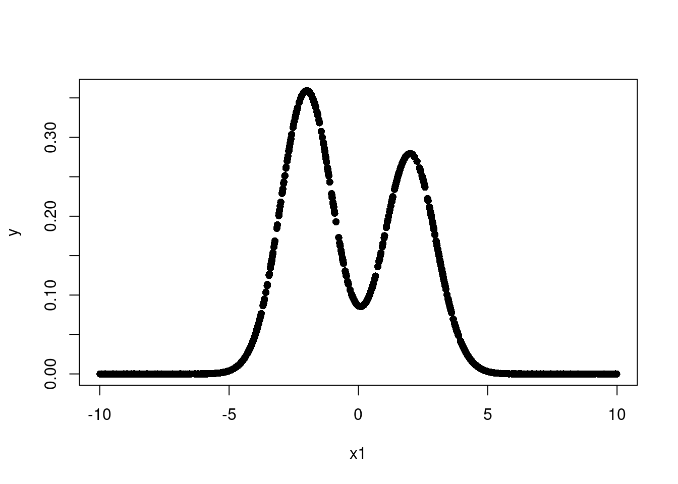
So our data is a mixture of two normal distributions. This is a non-linear function and not monotone. So we need both a non-linear fit and a way to guarantee we can model multiple non-linearities in multiple places.
Let’s try a single layer neural network with 3 neurons.
# Simple 1 layer neural network, 1 input variable
# Think of a neural network's first layer as a "linear regression"
# Each feature maps to a hidden unit, just a linear combination of form
# y = mx+b or beta1*x1+beta2*x2+...+beta0
# Then the activation function turns this into a non-linear function
# Then the next layer goes to the output as a weighted sum of the
# non-linear hidden units.  Extra layers repeat the process again
# Essentially these weighted sums of GLM's can approximate any function...
# People say "derived" features!
# Kind of like a GAM, but the functions are even less complex (a sigmoid of a linear combo)
#...but the real strength of neural networks comes from
# back-propogation and weight optimization.  Otherwise, its kind of like a spline
# in fact, you can choose the weights just to interpolate and
# overfit badly

nnsim = nnet(y~x,df,size=3,decay=1/2^12,linout=T,maxit=1000, trace=F)
thefit = predict(nnsim,df)
summary(nnsim)
a 1-3-1 network with 10 weights
options were - linear output units decay=0.0002441406
b->h1 i1->h1
6.76 -2.20
b->h2 i1->h2
-1.67 -1.61
b->h3 i1->h3
-1.33 -1.23
b->o h1->o h2->o h3->o
0.00 0.36 3.97 -4.34 plot(x1,y, pch=16, cex=2)
lines(x1,thefit, col='#A3A7D2', lwd=4)
We now use the “Sigmoid” activation function \(\sigma(x) = \frac{e^x}{1+e^x}\) . The first plot will not use the activation function and just some together 3 linear combinations of the inputs.
F_t = function(x) {return(exp(x)/(1+exp(x)))}
#F_t=function(x){x}
#F_t = function(x) sapply(x, function(z) max(0,z))
wts = summary(nnsim)[11]$wts
b1 = wts[1]
w1 = wts[2]

b2 = wts[3]
w2 = wts[4]

b3 = wts[5]
w3 = wts[6]

bias_overall = wts[7]
w1_out = wts[8]
w2_out = wts[9]
w3_out = wts[10]
# If no activation function
z1 = b1+w1*x1
z2 = b2 + w2*x1
z3 = b3 + w3*x1
f1 = w1_out*(z1)
f2 = w2_out*(z2)
f3 = w3_out*(z3)

rx=range(x1)
ry = range(c(f1,f2,f3,y))
plot(rx,ry,type="n",xlab="x",ylab="fit",cex.axis=2,cex.lab=2,pch=16)
points(x1,y)
lines(x1,f1,col=1,lwd=2)
lines(x1,f2,col=2,lwd=2)
lines(x1,f3,col=3,lwd=2)
lines(x1,bias_overall+f1+f2+f3,col=4,lwd=4)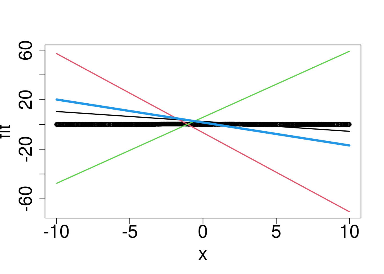
Hmmm without the activation function we can’t really return the correct function.
z1 = b1+w1*x1
z2 = b2 + w2*x1
z3 = b3 + w3*x1
f1 = w1_out*F_t(z1)
f2 = w2_out*F_t(z2)
f3 = w3_out*F_t(z3)

rx=range(x)
ry = range(c(f1,f2,f3,y))
plot(x1,y, pch=16,ylim=c(-2,2))
#plot(rx,ry,type="n",xlab="x",ylab="fit",cex.axis=2,cex.lab=2)
#points(x1,y, pch=16)
lines(x1,f1,col=1,lwd=2)
lines(x1,f2,col=2,lwd=2)
lines(x1,f3,col=3,lwd=2)
lines(x1,bias_overall+f1+f2+f3,col=4,lwd=4)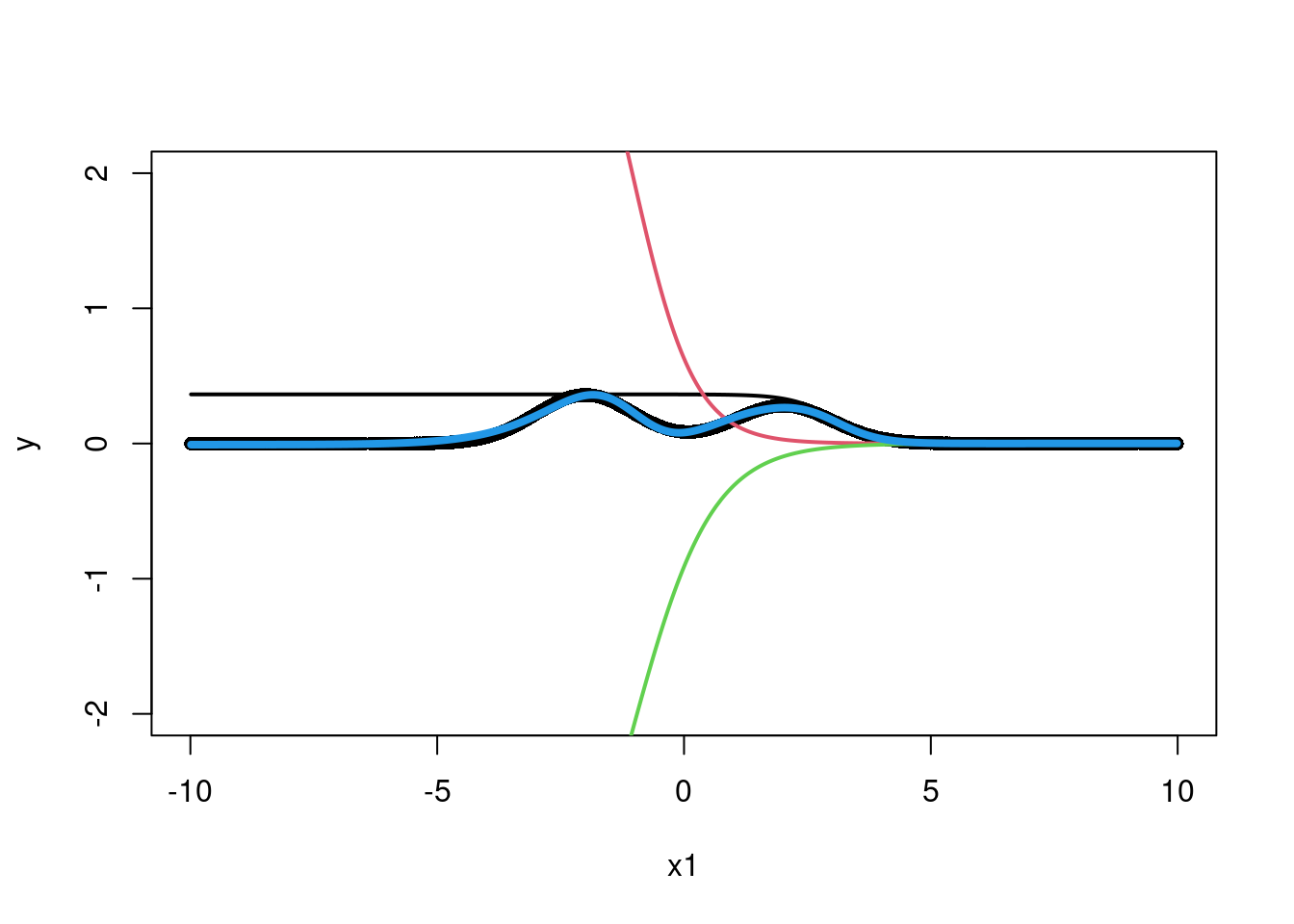
Wow, that is actually pretty nifty! We managed, through a weighted sum of activation functions (the sigmoid here) in particular regions of to return the shape of interest. The first set of weights, from the input to the first layer of “neurons” says where to activate the sigmoid. The second layer takes the three neurons and sums them together such that their sum looks as much like the curve that the data suggests as possible. The caveat here is the weights were carefully chosen to optimize the fit between the training output and the fit output through the back-propagation techniques we decided not to show you (whoops). Wikipedia is free IDC. What if we had multiple input variables?
#### Repeat with 2 input variables ####
set.seed(23)
x = runif(m2)
x1 = x
x2 = runif(m2)

#x2 = sort(x2)
y = exp(-4*(x1-.5)*(x1-.5)) + .05*rnorm(m2) + 2.5*x1*sqrt(x2)-1.75*max(x1,x2)
#y = x1*x2

df = data.frame(y=y,x1=x1, x2=x2)

#plot(x1,y, pch=16)


nnsim = nnet(y~x1+x2,df,size=3,decay=1/2^12,linout=T,maxit=1000, trace=F)
thefit = predict(nnsim,df)

#lines(sort(x1),thefit[order(x1)], col='#012296', lwd=4)


# Simple 1 layer neural network, 2 input variables
summary(nnsim)
a 2-3-1 network with 13 weights
options were - linear output units decay=0.0002441406
b->h1 i1->h1 i2->h1
0.22 0.42 -4.60
b->h2 i1->h2 i2->h2
-0.20 3.80 -0.32
b->h3 i1->h3 i2->h3
-1.24 0.77 -2.88
b->o h1->o h2->o h3->o
-2.80 4.56 4.43 -14.62 # The sigmoid
F_t = function(x) {return(exp(x)/(1+exp(x)))}
#F_t=function(x){x}
#F_t = function(x) sapply(x, function(z) max(0,z))
wts = summary(nnsim)[11]$wts
b1 = wts[1]
w1 = wts[2]
w12 = wts[3]
b2 = wts[4]
w2 = wts[5]
w22 = wts[6]
b3 = wts[7]
w3 = wts[8]
w32 = wts[9]
bias_overall = wts[10]
w1_out = wts[11]
w2_out = wts[12]
w3_out = wts[13]
z1 = b1+w1*x1+w12*x2
z2 = b2 + w2*x1+w22*x2
z3 = b3 + w3*x1+w32*x2
f1 = w1_out*F_t(z1)
f2 = w2_out*F_t(z2)
f3 = w3_out*F_t(z3)
NN_func <- function(x1, x2, val='overall'){
surface <- expand.grid(x1 = sort(x1),
x2 = sort(x2),
KEEP.OUT.ATTRS = F)
x1 = surface$x1
x2 = surface$x2
wts = summary(nnsim)[11]$wts
b1 = wts[1]
w1 = wts[2]
w12 = wts[3]
b2 = wts[4]
w2 = wts[5]
w22 = wts[6]
b3 = wts[7]
w3 = wts[8]
w32 = wts[9]
bias_overall = wts[10]
w1_out = wts[11]
w2_out = wts[12]
w3_out = wts[13]
z1 = b1+w1*x1+w12*x2
z2 = b2 + w2*x1+w22*x2
z3 = b3 + w3*x1+w32*x2
f1 = w1_out*F_t(z1)
f2 = w2_out*F_t(z2)
f3 = w3_out*F_t(z3)
if (val=='overall'){
surface$overall = bias_overall+f1+f2+f3
surface = reshape2::acast(surface, x2~x1, value.var = "overall")
return(surface)
}else-if(val=='neuron1'){
return(f1)
}else-if(val=='neuron2'){
return(f2)
}else-if(val == 'neuron3'){
return(f3)
}
else{
return(0)
}
}
rx=range(x)
ry = range(c(f1,f2,f3,y))
#plot(rx,ry,type="n",xlab="x",ylab="fit",cex.axis=2,cex.lab=2, pch=16)
#points(sort(x1),y[order(x1)], color='#012024', pch=16)
#lines(sort(x1),f1[order(x1)],col='#55AD89',lwd=2)
#lines(sort(x1),f2[order(x1)],col='#E0B0FF',lwd=2)
#lines(sort(x1),f3[order(x1)],col='#073d6d',lwd=2)
#lines(sort(x1),(bias_overall+f1+f2+f3)[order(x1)],col='#FD8700',lwd=4)The “activation” functions serve two purposes. They 1) map the features to say which “region” is active, and 2), they make sure we can model nonlinear outputs of the inputs. By taking a weighted average of the multiple hidden units, we can find heterogeneity across a features support and between features! That separates it from multiple linear regression with an activation function, which is still considered a general linear model (GLM). To summarize, the activation function allows one to find non-linear transformations of the input, \(\mathbf{X}\), as well as interactions between different variables \(X_{i}\) and \(X_{j}\)5. But, in the theme of adaptive basis functions, this is done automatically without any tinkerings or pre-specifications by the researcher. Do note, however, that the number of parameters in the model is not a function of sample size, meaning this is a sense a “parametric regression”.
5 To model multiple interactions in high dimensions, or multiple non-linearities (regions of monotonicity) requires many hidden nodes, which can lead to overfitting as well as added computational expense.
But, in the theme of adaptive basis functions, this is done automatically without any tinkerings or pre-specifications by the researcher. Do note, however, that the number of parameters in the model is not a function of sample size, meaning this is a sense a “parametric regression”.
Here is a nice plotly version of the previous plot.
options(warn=-1)

suppressMessages(library(plotly))
    x3 = plot_ly(x = x1, y = x2,
            z = y,
            type = 'scatter3d', mode = 'markers',
            marker=list(size=4), name = 'y')
    x3 = x3%>%add_trace(#z = NN_func(x1,x2, val='overall'),
                        #x = x1,
                        #y = x2,
                        z = bias_overall+f1+f2+f3,
                        name = 'predicted',

                        marker=list(size=4))#, #type='surface',
                        #colorscale = list(c(0, 1), c("blue", "blue")),
                        #opacity=0.7)#, f1, f2,f3),
    x3 = x3%>%add_trace(z = f1,
                        name = 'neuron 1',
                        marker=list(size=4))#, f1, f2,f3),
    x3 = x3%>%add_trace(z = f2,
                        name = 'neuron 2',
                        marker=list(size=4))#, f1, f2,f3),
    x3 = x3%>%add_trace(z = f3,
                        name = 'neuron 3',
                        marker=list(size=4))#, f1, f2,f3),

    x3 = x3 %>%layout(legend = list(x = 0.16, y = 0.9,
                                    #markersize=16,\
                                    #markerlegendsize=8,
                                    font=list(size=10)))
            #color=colors, #legend= c('y', 'y_pred',
                           #                 'neuron 1', 'neuron 2', 'neuron 3'),
            #type="scatter3d", mode="markers")
    x3
So we see we can approximate this complicated function using this architecture in a really interesting way. The idea behind the perceptron dates back to the 1950’s! Look at these articles from that era:
1958: NYT electronic brain teaches itself!
1958 NYT article: computer designed to read and grow wiser
People were really excited about this idea even then, although it wasn’t until modern computation could really exploit the “back propagation” idea we will talk about later that this idea really took off. The articles also show that the AI-hype has been around for a while and perhaps we should temper our expectations and what they can and cannot do.
We saw in the code example that a weighted combination of inputs plus a useful activation function could model complicated relationships in the data. That was pretty cool! However, we let those weights be learned by some yet to be explained function in the software. The secret is back-propagation, a quirk of the neural network architecture that takes advantage of the chain rule from calculus to extraordinary benefit.
We will now give a run-down of how a neural network works. We don’t focus on optimization; instead, we write the program to reflect how we think about the algorithm, pray it runs fast enough, and optimize later if needed.
Neural nets are composed of layers of units, or neurons. The idea is that the way in which the units are connected to each other resembles neurons in the brain.
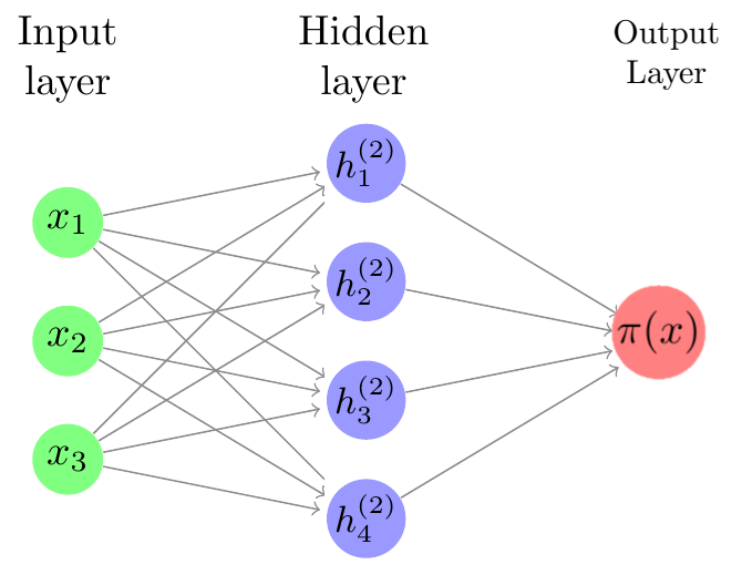
Neural networks are comprised of an input layer, one or more hidden layers, and an output layer. We input an observation into the input layer; computations with the data occur in the hidden layers, and then an output is generated.
One common goal for a neural network is prediction. When we train on data, we typically want to minimize some loss function which tells us how different the model is from the data. This optimization can be done using gradient descent, batch gradient descent, or stochastic gradient descent. Here, we will use stochastic gradient descent.
Consider training data \(\mathbf{X}\) which as \(p\) features, \(\mathbf{X}=(X_1,X_2,\dots,X_p)\). Given \(N\) nodes, we begin by creating a feature weights matrix \(z\) whose elements are a linear combination of the features of \(\mathbf{X}\):
\[z_n=w\_{0,n}+\sum_{j=1}^p w_{j,n}X_j\]
with \(n=1,\dots,N\). The feature bias is denoted \(w_{0,n}\). Then we use an activation function \(g(z_n)\) which transforms the linear combinations nonlinearly. We create yet another linear combination of the activation terms, given by
\[ f(X)=\beta_0+\sum_{n=1}^N\beta_n\left[g(z_n) \right]. \]
The output weights are denoted \(\beta_n\), and the output bias is denoted \(\beta_0\). Note that this process is done for every observation in the training data.
In order for the neural net to “learn”, we must update our feature weights (\(w\)) and output weights (\(\beta\)) so that they minimize the difference between the data and model prediction. We use the loss function
\[ L=(\mathbf{y}-f(\mathbf{X}))^2 \]
where \(\mathbf{y}\) denotes the vector of output data. Of course, to do gradient descent, we need the gradient. Using the chain rule,
\[ \begin{align*} \frac{\partial L}{\partial\beta_n} &= \frac{\partial L}{\partial f}\frac{\partial f}{\partial\beta_n} = -2(y-f)A_n = -2(y-f)g(z_n)\\ \frac{\partial L}{\partial\beta_0} &= \frac{\partial L}{\partial f}\frac{\partial f}{\partial\beta_0} = -2(y-f)\\ \frac{\partial L}{\partial w_{j,n}} &= \frac{\partial L}{\partial f}\frac{\partial f}{\partial A_n}\frac{\partial A_n}{\partial z_n}\frac{\partial z_n}{\partial w_{j,n}} = -2(y-f)\beta_n g'(z_n)X_j\\ \frac{\partial L}{\partial w_{0,n}} &= \frac{\partial L}{\partial f}\frac{\partial f}{\partial A_n}\frac{\partial A_n}{\partial z_n}\frac{\partial z_n}{\partial w_{0,n}} = -2(y-f)\beta_n g'(z_n)\end{align*} \]
Choosing an appropriate learning rate \(\alpha\), we update the feature and output weights at each iteration:
\[ \begin{align*}\beta_n &\xleftarrow{} \beta_n - \alpha*\frac{\partial L}{\partial\beta_n},\\ \beta_0 &\xleftarrow{} \alpha*\frac{\partial L}{\partial\beta_0},\\ w_{j,n} &\xleftarrow{} w_{j,n} - \alpha*\frac{\partial L}{\partial w_{j,n}},\\ w_{0,n} &\xleftarrow{} w_{0,n} - \alpha*\frac{\partial L}{\partial w_{0,n}}. \end{align*} \]
Theoretically, with a good choice of \(\alpha\), enough iterations, and enough nodes, we should have a close approximation of the data.
We’d be remiss not to point out that it is not the most useful result, and is in fact quite misleading. To understand why, let’s talk the bias-variance tradeoff.
\(MSE(\hat{\theta}) = E((\hat{\theta}-\theta)^2) = \text{bias}(\hat{\theta})^2+\text{Variance}(\hat{\theta})\)
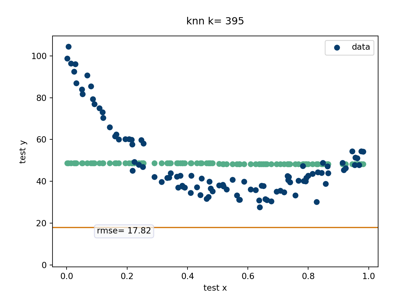
The bias-variance tradeoff essentially is all “signal” and “noise”. Signal represents the main driving force of the output and noise represents corruptions of the truth that yield the variable responses we observe in data. Fitting to noise will lead to poor extrapolation because of high variance estimates. Failing to fit the signal (due to an overly simple model) will yield poor bias. For example, say our prediction is to just fit the average of the response values for every \(x\). We’d have no variance since every prediction is the same, but the bias would be terrible! On the other hand, if our prediction model was to “connect the dots”, which assumes all the noise is signal, we’d have no bias, our next point estimates are going to be all over the place and hence high variance. A great way to visualize the bias-variance tradeoff is through the “K-nearest neighbors” algorithm (which is how this was taught by Rob McCulloch).
This is probably the most intuitive statistical method out there. While k-nearest neighbors (knn) is not an adaptive basis method (unless the number of neighbors is chosen adaptively according to the data), it is a useful algorithm to explain the bias-variance tradeoff. EXPLAIN the knn procedure! This is a very algorithmic approach that basically weights the points nearest. We will evaluate in a movie form the RMSE. Recall, \(E(\hat{y}-y) = \text{bias}(\hat{y})^2+\text{Variance}(\hat{y})\) which is the equation that helps explain the Bias-Variance tradeoff. For the k-nearest neighbor algorithm, the number of nearest neighbors can written down in closed form in terms of the bias-variance tradeoff, as seen on this wikipedia link. We generate data from the “half-life” equation added together with \(x^2\), with a decent amount of noise.
import matplotlib.pyplot as plt
import numpy as np

from sklearn.model_selection import train_test_split
import matplotlib as mpl
#mpl.style.use('fivethirtyeight')
import warnings
from matplotlib import animation
warnings.filterwarnings("ignore")
from sklearn.neighbors import KNeighborsRegressor
import os
os.chdir("..")


## helper functions
def rmsef(y,yhat):
   'compute root mean squared error'
   return np.sqrt(np.mean((y-yhat)**2))
def bias(y, yhat):
    return(np.mean(yhat-y))

# Do with simulated data

# This is basically the half life equation with noise
n = 500
x = np.linspace(0,1, n)#np.random.uniform(0,1, size=n)
y = 100*np.exp(-3*x) + 50*x**2 + np.random.normal(size=n, loc=0, scale=4)

#plt.figure()
#plt.scatter(x,y, color='#073d6d')
#plt.show()
# Train and test split
x_train, x_test, y_train, y_test = train_test_split(x,y, test_size=0.20,random_state=12024)


nneighb=[i for i in range(1,len(x_train))]

x_trainlist=[[i] for i in x_train]
y_trainlist=[i for i in y_train]
x_testlist=[[i] for i in x_test]
knn=[]
knnfit=[]
predictlist=[]
for i in range(len(nneighb)):
  knn.append(KNeighborsRegressor(n_neighbors=nneighb[i]))

#this is what syntax expects...

for j in range(len(nneighb)):
  fit_knn = knn[j].fit(x_trainlist, y_trainlist)
  predictlist.append(fit_knn.predict(x_testlist))

rmselist=[rmsef(y_test, predictlist[i]) for i in range(len(nneighb))]


varlist=[np.sqrt(np.var(predictlist[i])) for i in range(len(nneighb))]

biaslist=[bias(y_test, predictlist[i]) for i in range(len(nneighb))]


#frames to animate

klist=[i*5 for i in range(0,int(len(x_train)/5))]
predictpoints=[predictlist[i] for i in klist]

rmsepoints=[rmselist[i] for i in klist]


# =============================================================
xs=[]
fig=plt.figure()
fig, ax = plt.subplots()
# #multiple plots to match size of background pic

for item in range(len(klist)):
  xplot = ax.scatter(x_test, predictpoints[item],   color='#55ad89')
  yplot = ax.axhline( rmsepoints[item],color='#d47c17')
  title = ax.text(0.5,1.05,"knn k= {}".format(nneighb[klist[item]]-1),
                     size=plt.rcParams["axes.titlesize"],
                     ha="center", transform=ax.transAxes, )


  rmsestuff=ax.text(0.1,15,"rmse= {}".format(round(rmsepoints[item],2)),bbox=dict(boxstyle='round', facecolor='#f8f9fa',edgecolor='#CED0E8', alpha=0.75),)#,

#
  xs.append([xplot,yplot,title, rmsestuff])

#
ax.scatter(x_test,y_test, color='#073d6d', label='data')
ax.set_xlabel('test x')
ax.set_ylabel('test y')
 #ax.invert_yaxis()
# ax.text(0,15, 'rmse purple')
ax.legend(fontsize=10)

ani = animation.ArtistAnimation(fig, xs, blit=True)

mywriter = animation.FFMpegWriter()
ani.save('./quarto_bookdown/images/knn_example.mp4', writer=mywriter)
# =============================================================
Devising a method that can fit the data at hand to arbitrary precision actually isn’t super hard (as we saw with k-nearest neighbors). Careful regularization to ensure generalizable predictive accuracy on unseen data? That is where a statistician earns their bag.
What does “careful regularization” look like for “adaptive basis” methods? For neural networks, the regularization is difficult to pinpoint exactly, but people generally point to the back-propagation process where a loss function is included that (usually the squared error loss). FINISH THIS SECTION.
In contrast to neural networks, one of the other leaders in flexible adaptive basis machine learning methods are rooted in “decision trees”. Trees have some nice advantages. For one, a decision tree seems to mimic human decision making better. Function approximation through a series of if-else statements feels more natural than a linear combination of inputs passed through a “clipping” function. This isn’t super meaningful, but something to keep in mind if you need to explain your methodology to others. Trees also have the advantage of not really requiring transformations of the input variables. Multilayer perceptron neural networks absolutely need to consider the scale of the inputs, meaning you may need to log transform (or some other transform) certain \(X\)’s, which is a pain. You still can do this with trees, but no longer need to. Finally, trees tend to perform better than neural networks on tabular data (Grinsztajn, Oyallon, and Varoquaux 2022) and generally on noisier data. Neural networks reign supreme with image recognition among other regimes, but if you have economic or socioeconomic data, trees are probably your best bet.
CART, classification and regression trees, is a brilliant algorithm that serves as the basis for a lot of the best modern tree based machine learning methods. While the best methods are “ensemble” methods, we start with a single tree as a foundation. The CART algorithm builds a single decision tree greedily, meaning splits are made if they improve some prediction criterion. Trees can be made smaller after the tree has been grown deeper to try and prevent overfitting. The predictions that are made are the averages in the bottom buckets of the tree6, where the data are split into these bottom buckets (or “bottom leaf nodes” in tree terminology). We think visuals of these trees and code are probably the best way to explain this important concept.
6 Why the average? The average can actually be shown to minimize the sum of squares error. This can be shown in multiple ways, but here is one approach:
\[ \begin{align} E(x-a)^2&=E(X-\mu+\mu-a)^2\\ E(X-\mu)^2+&(\mu-a)^2+2E((X-\mu)(\mu-a))\\ 2E((X-\mu)(\mu-a))&=\mu-a(E(X-\mu))=\mu-a(\mu-\mu)=0\\ \xrightarrow{\text{therefore}}E(X-a)^2&=E(X-\mu)^2+(\mu-a)^2 \end{align} \]
Which is minimized when \(a=\mu\). This can also be shown by trying to find
\[ \min_{a}\left[E(X-a)^2\right]=\frac{\text{d}}{\text{d}a}\left[E(X-a)^2\right]=\frac{\text{d}}{\text{d}a}\int_{-\infty}^{\infty}(x-a)^2f_X(x)\text{d}x \]
Conveniently, the median minimizes the absolute error loss, found by minimizing \[ E| X-a|=\int_{-\infty}a-xf_X(x)\text{d}x+\int_{a}^{\infty}x-af_X(x)\text{d}x \] which involves setting the derivative equal to zero \[ \frac{\text{d}}{\text{d}a}(E| X-a|)=\int_{-\infty}f_X(x)\text{d}x+\int_{a}^{\infty}f_X(x)\text{d}x=0 \] which implies that \(a\) is equal to the median.
A single tree is often considered “interpretable” because we can follow predictions down the path of the tree. For example, a higher proportion of tall people who jump high play basketball than those who do not. In tree terms, the buckets corresponding to tall people who jump high have higher means than those who do not have those two attributes (based on some cutoff of what “tall” and “high jumper” means).
We will show an example of CART using the excellent dtreeviz (git repo) package available in Python. The data are about squirrel sightings in Central park and come from TidyTuesday 05-23-23, with the following description:
The Squirrel Census is a multimedia science, design, and storytelling project focusing on the Eastern gray (Sciurus carolinensis). They count squirrels and present their findings to the public. The dataset contains squirrel data for each of the 3,023 sightings, including location coordinates, age, primary and secondary fur color, elevation, activities, communications, and interactions between squirrels and with humans.
The following (not ran) code cleans the squirrel data and provides the subset of data we will study.
suppressMessages(library(dplyr))
squirrel_data = readr::read_csv('https://raw.githubusercontent.com/rfordatascience/tidytuesday/master/data/2023/2023-05-23/squirrel_data.csv')

squirrel_data = squirrel_data[, c('X','Y', 'Shift','Age',
                                  'Primary Fur Color',
                                  'Highlight Fur Color', 'Running', 'Chasing',
                                  'Climbing', 'Eating', 'Foraging',
                                  'Kuks', 'Quaas', 'Moans','Tail flags',
                                  'Tail twitches', 'Approaches', 'Indifferent', 'Runs from')]
df = squirrel_data %>%
  tidyr::drop_na()
df = df[df$Age!='?',]
write.csv(df,paste0(here::here(), '/data/squirrel_subset.csv'), row.names=F)
This is a classification problem (mainly because the data are fun). We will talk more about classification in a later chapter.
from sklearn.model_selection import train_test_split
from sklearn.tree import DecisionTreeClassifier
import pandas as pd
import dtreeviz
random_state = 12024 # get reproducible trees
import pandas as pd
import os
os.chdir("..")

#### Load the data ####
df = pd.read_csv('./quarto_bookdown/data/squirrel_subset.csv')

# Get one hot encoding of columns B
one_hot = pd.get_dummies(df[['Age', 'Primary Fur Color', 'Highlight Fur Color']])
# Drop column B as it is now encoded
df = df.drop(['Age', 'Primary Fur Color', 'Highlight Fur Color'],axis = 1)
# Join the encoded df
df = df.join(one_hot)

features = ['X', 'Y',  'Running', 'Chasing', 'Climbing','Eating','Foraging', 'Kuks', 'Quaas', 'Moans', 'Tail flags', 'Tail twitches','Age_Adult', 'Age_Juvenile','Primary Fur Color_Black', 'Primary Fur Color_Cinnamon','Primary Fur Color_Gray', 'Highlight Fur Color_Black','Highlight Fur Color_Black, Cinnamon','Highlight Fur Color_Black, Cinnamon, White','Highlight Fur Color_Black, White', 'Highlight Fur Color_Cinnamon','Highlight Fur Color_Cinnamon, White', 'Highlight Fur Color_Gray','Highlight Fur Color_Gray, Black', 'Highlight Fur Color_Gray, White','Highlight Fur Color_White', 'Indifferent',
'Approaches']
X = df[features]


# predict if squirrel is Indifferent (or maybe runs away)
y = df[['Runs from']]
tree_squirrel = DecisionTreeClassifier(max_depth=3,min_samples_leaf = 10, criterion="gini")
# fit the tree
tree_squirrel = tree_squirrel.fit(X.values, y.values)

#Initializing dtreeviz.model
viz_model = dtreeviz.model(tree_squirrel, pd.DataFrame(X), y['Runs from'],
                            feature_names=features,
                            target_name='Runs from', class_names = ['No','Yes'])
#v = viz_model.view()

#v.save("./quarto_bookdown/images/squirrel_tree.svg")  # optionally save as svg


#v.save("./quarto_bookdown/images/squirrel_tree.svg")  # optionally save as svg

#v2 = viz_model.view(x = X.iloc[1])
#v2.save("./quarto_book/quarto_bookdown/images/squirrel_tree_adult_graycinammon.svg")  # optionally save as svg

Okay, enough visualizations. The above example was merely meant to show the “interpretability” of a decision tree. Because the above only has 3 levels (set by us), it is fairly easy to follow down the path of the tree. It also fits well. We just found a statistical modeling panacea, nice. But, and there are two big buts here,
It is already becoming difficult to interpret the results, so any larger tree will lose any interpretability.
The fit is actually pretty good here (see below, with auc’s around 0.84 in cross-validation out of sample holdouts), but usually smaller trees do not do a great job fitting the data. A natural solution is to let the tree grow deeper, but we will see in the next simulated example the perils of doing so with regards to our old friend the “bias-variance tradeoff”.
Another adjacent topic of discussion regarding interpretability is in regard to how people tend to misinterpret statistical models, typically by confusing association for causation. These confuses muddle any notions of interpretability. For a pure prediction problem, no big deal. Sure, knowing someones coffee intake means we can guess their risk of heart disease. No, that does not mean we should be recommending people drink an additional unit of coffee to reduce their heart disease risk by 10 percent.
from sklearn.model_selection import cross_val_score

cross_val_score(tree_squirrel, X, y, cv=5, scoring='roc_auc')
array([0.82960169, 0.83173691, 0.88222382, 0.85671027, 0.8140294 ])Using the exponential decay plus \(x^2\) term simulation from the k-nearest neighbor example, we will show a similar concept using a decision tree.
options(warn=-1)
suppressMessages(library(rpart))
RMSE <- function(m, o){
  sqrt(mean((m - o)^2))
}
n = 1000
## 80% of the sample size
smp_size <- floor(0.8 * n)

## set the seed to make your partition reproducible
set.seed(12024)
train_ind <- sample(seq_len(n), size = smp_size)

x = seq(from=0, to=1, length.out = n)
x_train = x[train_ind]
x_test = x[-train_ind]
y = 80*exp(-3*x) + 40*x^2 + rnorm(n,0,10)
y_train = y[train_ind]
y_test = y[-train_ind]
train_data = data.frame(x = x_train,y = y_train)
test_data = data.frame(x = x_test,y = y_test)
evals = matrix(NA, nrow=10, ncol=3)
for (i in 1:10){
  tree_fit = rpart(y~x,data=train_data,control = rpart.control(minbucket=5,
minsplit = 20,
maxcompete=0,
maxsurrogate=0,xval=0,cp=(1e-1/i^3)), model=T)
  # A plot of the tree visual
#  rpart.plot::rpart.plot(tree_fit)
  tree_predict = predict(tree_fit, data.frame(x=test_data$x))

  evals[i,1] = RMSE(y_test,tree_predict) #rmse
  evals[i,2] = mean(tree_predict - y_test) #bias

  evals[i,3] = length(unique(tree_fit$where)) # number of bottom nodes
}

colnames(evals) = c('RMSE', 'bias','number of bottom nodes')
matplot(evals[,3], evals[,c(1:2)], col=c('#55AD89',  '#6f95d2'), type='l', lwd=4,
        lty=c(1,2),
        xlab = 'Number of bottom nodes', ylim=c(-2,14))
legend('topright',
       legend = c('RMSE', 'Bias'),
       pch=c(16,16),
       lty=c(1,2),
       cex=c(1,1),
       col = c('#55AD89', '#6f95d2'),
       bty='n')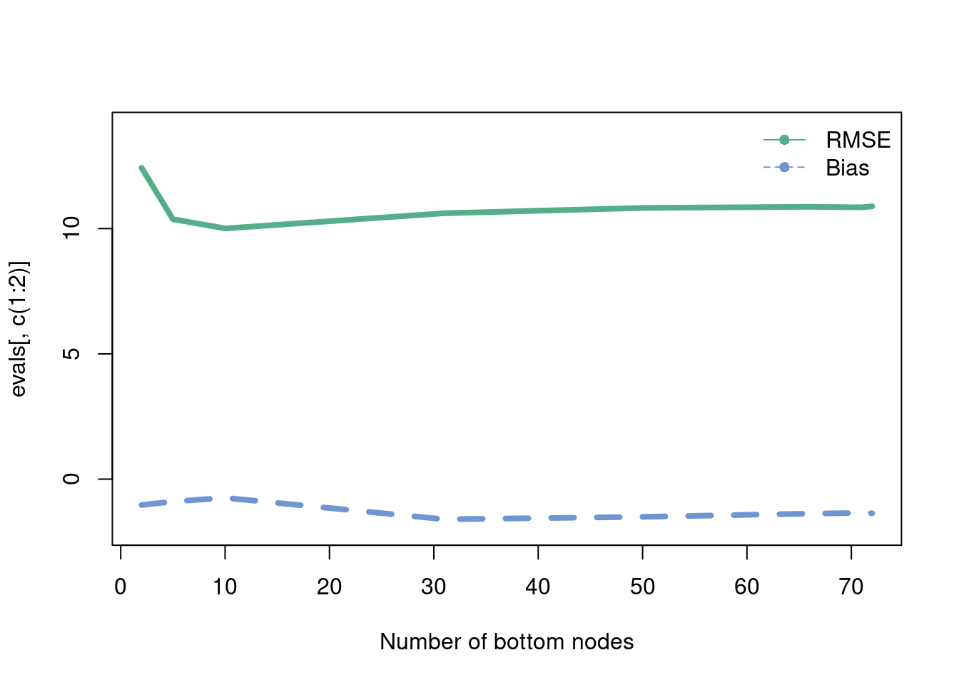
Random forests are a commonly used machine learning tool developed at the end of the 20th century in Breiman (2001). Our exposition will follow these notes courtesy of the excellent website of Hedibert Lopes.
We learned about decision trees earlier, which balanced “interpretability” (simple models which were quite biased) and “deep” trees that fit the training data quite well (low bias) but struggled to extrapolate. Again, this is the bias-variance tradeoff, as big trees are sensitive to small changes in the data yielding a lot of variance in estimates. So what do we?
The main idea of the random forest, which is brilliant both for its effectiveness and simplicity, is to average over many larger trees. In an ideal world, there would be multiple training sets of data and average the large decision tree fit over those samples; however we often only get one sample. The solution? Take \(M\) bootstrapped samples of the training data, and then average the \(M\) large tree fit predictions. This procedure is called bagging.
So why is this brilliant? Because each tree is grown deep, it produces accurate (low bias) estimates, but now precise ones (high variance). It is a well known result in statistics, that can be borne out intuitively as thinking about the mean-zero error terms averaging to zero when averaging many samples. More formally, following this stackoverflow link, assuming independent error terms (more on that later),
\[ \text{Var}\left(\frac{\sum_{i=1}^{M}\hat{y}_i}{M}\right) = \frac{1}{M^2}\sum_{i=1}^{M}\text{Var}(\hat{y}_i)\longrightarrow \frac{M\sigma^2}{M^2} \]
From the point of view of the model \(y_i=\mu_{i}+\varepsilon_{i}\) (where \(\mu\) is the “signal” and \(\varepsilon\) the “noise”, think about this as averaging out the noise, because \(E(\varepsilon_i)=0\) (by assumption of zero-mean error term). So the idea is to take many (high \(M\)) bootstrapped samples of the data (which does add computation, but is statistically beneficial).
Are we done? Not quite. There is one other thing we need to consider, and that pertains to the property that over the \(M\) samples certain predictors (variables) may be overly represented in the “top split” of trees. This will cause predictions between different trees to be correlated, which limits the effectiveness of the “averaging” strategy7. Luckily, the fix is easy. The random forest algorithm only considers a random sample of \(Q\) predictors, which helps to ensure that the same predictors aren’t always chosen at the tops of each deep tree.
7 In the derivation of why averaging removes bias, we assumed that the error terms are independent, (seen when we multiply the variances together), so this is why this is an issue.
While still being a tree based method, random forests aren’t really “interpretable”. For one, the trees are built deep, which make them hard to interpret. There are also many trees now, which make interpretation even more difficult. Out of sample prediction, however, is greatly improved.
Please read this interesting article by Leo Breiman, Statistical modeling: the two cultures. It has a lot of interesting points and write up your thoughts!
The following code illustrates how to use the random forest algorithm in practice. The goal is to predict fast food restaurants per 10,000 people in a state (as of 2018) given their average gas price in 2018 (a dataset scraped by Jerome Goh and publicly available in full in the data folder), whether or not marijiuana was legal in 2018, the percentage of the voteshare in 2016 that went to Trump, and the income and income rank in a state. Admittedly, this is not a super well motivated problem, but its the data available.
Below is a way to read in the gas price data for cleaning purposes:
suppressMessages(library(readxl))
df = read_excel(paste0(here::here(), '/data/Gasbuddy_data_ALL.xlsx'))

suppressMessages(library(dplyr))
df = df[,2:ncol(df)]
df = t(df)
states = rownames(df)

colnames(df) = format(as.Date(df2$Date), "%Y-%m-%d")
df = as.data.frame(df)
df <- df[, !duplicated(colnames(df))]
df <- sapply( df, as.numeric )
df = as.data.frame(df)  %>%
  mutate_if(is.numeric, round, digits=2)
df = cbind(states, df)
df = df[1:49,]

write.csv(df, paste0(here::here(), '/data/gas_merged_wide.csv'),row.names = F )
Once you have that data, here is a cool plot to visualize:
gas_prices = read.csv(paste0(here::here(), '/data/gas_merged_wide.csv'))
gas_2 = as.data.frame(t(gas_prices))
colnames(gas_2) =  gas_2[1,]
gas_2 = gas_2[-1,]
gas_2 <- cbind(Date = rownames(gas_2), gas_2)
rownames(gas_2) <- 1:nrow(gas_2)
gas_2$Date <- gsub('X', '', gas_2$Date)
gas_2$Date <- gsub('.', '-', gas_2$Date, fixed=T)


gas_long = gas_2 %>%
  tidyr::pivot_longer(cols =  -Date,
                      names_to = 'State' )


gas_long$Date_num <- unlist(lapply(1:length(unique(gas_long$Date)),
                            function(k)rep(k, length(unique(gas_long$State)))))

gas_long$value = as.numeric(gas_long$value)
X = as.matrix(as.numeric(gas_long$Date_num))
y = as.numeric(gas_long$value)


comb_frame = data.frame(gas_long)


comb_frame %>%
  ggplot(aes(x=as.Date(Date),
             y=value, group=as.Date(Date)))+geom_point(col='#073d6d',
                                                          size=.75)+

  stat_summary_bin(aes(x=as.Date(Date),
                   y=value, group=T),fun = "mean",
               colour = '#ffc20e',
               lwd=1.75,alpha=0.90, geom = "line", lty=1)+
  ylab('Gas price')+xlab('Date')+
  theme_minimal()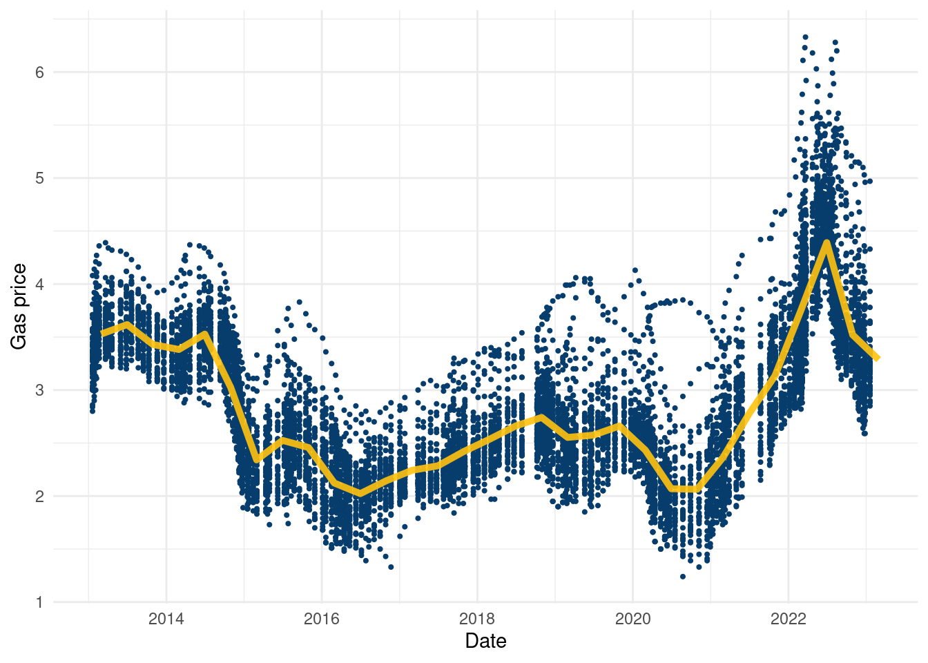
It’s a cool dataset, again courtesy of Jerome Goh, and to our knowledge the only publicly available data on gas prices by state in a table format free for the public. Using it just as a covariate in a regression feels a little uninspired, but if you can think of anything cool to do with the data, go for it!
options(warn=-1)
suppressMessages(library(readr))
suppressMessages(library(readxl))
suppressMessages(library(dplyr))
suppressMessages(library(randomForest))
suppressMessages(library(plotly))
suppressMessages(library(tidyverse))
gas_prices = Gasbuddy_data_ALL <- suppressMessages(read_csv(paste0(here::here(),"/data/Gasbuddy_data_ALL.csv")))


marijuana_legal = read_excel(paste0(here::here(), "/data/marijuana_legal.xlsx"), sheet=1)
marijuana_legal$state = marijuana_legal$State
fast_food <- suppressMessages(read_csv(paste0(here::here(), "/data/fast_food.csv")))
federalelections2016 <- read_excel(paste0(here::here(), "/data/federalelections2016.xlsx"), sheet=3)
federalelections2016 <-federalelections2016 %>%
  select(-c('Trump(elec)', 'ClintonElec'))

federalelections2016 <-federalelections2016 %>%
  mutate(trumpperc=`Trump ®`/Total,
         clintonperc=`Clinton (D)`/Total,
         otherper=Allothers/Total)%>%
  select(c('STATE','trumpperc', 'clintonperc', 'otherper'))
federalelections2016$code = federalelections2016$STATE
gas_prices = gas_prices%>%
  tidyr::pivot_longer(
    cols = 'Alabama':'Wyoming',
    names_to = "state",
    values_to = "value"
  )
# convert date to year
gas_prices$year = format(as.Date(gas_prices$date, format="%d/%m/%Y"),"%Y")
gas_prices = gas_prices%>%
  group_by(year, state)%>%
  summarize(avg_price = mean(value), .groups='drop')

tot_df = suppressMessages(left_join(gas_prices, fast_food))

tot_df = suppressMessages(left_join(tot_df, federalelections2016))
tot_df = suppressMessages(left_join(tot_df, marijuana_legal))

tot_df$legal_2018 = ifelse(tot_df$Legal==TRUE & tot_df$year==2018,1,0)

tot_df = tot_df%>%
  dplyr::filter(year==2018)

fit <- randomForest(total~avg_price+trumpperc+income+income_rank+population+Legal,data = tot_df)   # random forest model
yhat <- predict(fit,newdata = tot_df)  # make predictions
tot_df = tot_df[, c('avg_price','trumpperc','income','income_rank', 'population', 'Legal', 'state')]So we now have a prediction model trained on the covariates to predict fast food density per state in 2018. Now, we illustrate the concepts of individual conditional expectation (ICE) and partial dependence plots. We follow the script from Richard Hahn’s teaching site under the “conditional expectation plots” section. Here is a nice book chapter (Molnar 2020) talking about partial dependence plots for reference.
# now we are going to make the same curves, but for all observed baseline
# scenarios

yhats = c()
plot(tot_df$avg_price, predict(fit, tot_df),pch=20,type='l',lwd=1, col='white',
     xlab='Average 2018 gas price', ylab='predicted fast food per capita', xlim=c(2,3.75))
for (h in 1:nrow(tot_df)){  # we loop through all rows in the original data
  base_case <- tot_df[h,]      # define our baseline scenario to row h
  pred.data <- base_case[rep(1,100),]  # duplicate our scenario
  pred.data$avg_price <- seq(2,3.5,length.out=100) # swap out the bty.avg column
  yhat <- predict(fit,newdata = pred.data) # predict

  lines(pred.data$avg_price, yhat,pch=20,type='l',lwd=1, col='#073d6d') #overplot
  if (h %in% c(3,7,28,30,37)){
  text(pred.data$avg_price[100]+.16, yhat[100],tot_df$state[h])
  }
  yhats[[h]] = yhat
}
yhats = do.call('rbind', yhats)
lines(pred.data$avg_price, colMeans(yhats),pch=20,type='l',lwd=8, col= '#55AD89')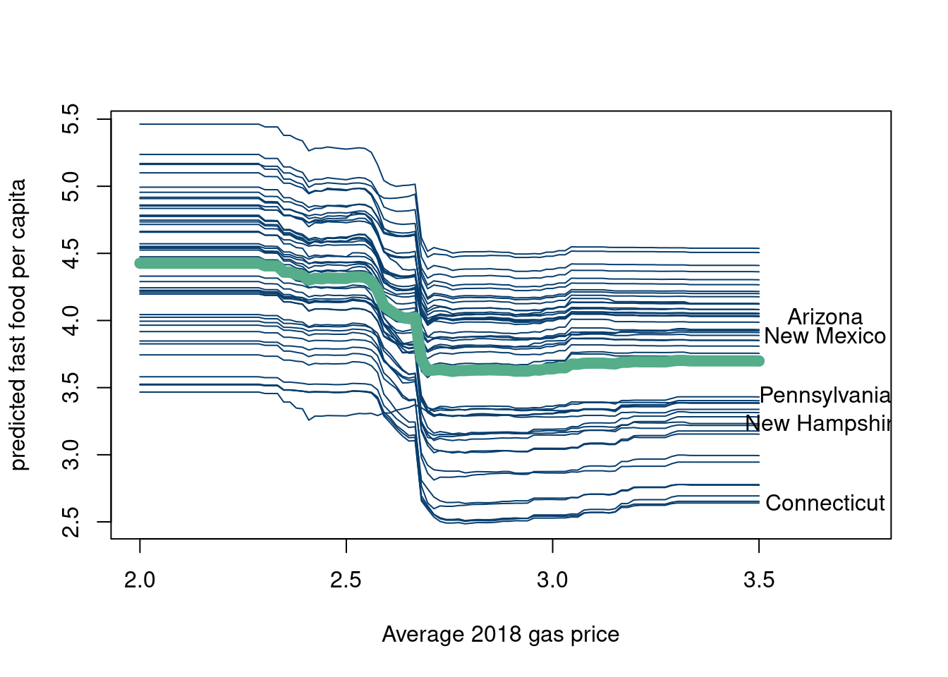
df_plot = data.frame(t(yhats))
df_plot$index = seq(2,3.5,length.out=100)
colnames(df_plot) = c(tot_df$state, 'gas price')

df_plot = df_plot %>%
  tidyr::pivot_longer(
    cols = !`gas price`,
    names_to = "state",
    values_to = "fastfood10k"
  )
df_plot$fastfood10k = round(df_plot$fastfood10k,3)

ggplotly(df_plot %>%
  ggplot(aes(x=`gas price`, y=fastfood10k, group=state))+
    geom_line(col='#073d6d')+stat_summary(aes(x=`gas price`, y=fastfood10k, group=F),fun = "mean", colour = "#55AD89", size = 2, geom = "line")+theme_minimal())
The blue lines are the conditional expectations for every state when holding every covariate constant but changing the price of gasoline in that state. The y axis is the predicted response for that state (in terms of fast food restaurants per 10,000 people). The green line is the average predicted response for a given “hypothetical” gas price across the 50 states and is called the partial dependence plot. Again, why gas price as the covariate we are varying while fixing the others is a good question, as is the question of whether you could feasibly vary the gas price without changing the other features (doubtful).
This method can be used with any prediction model, and is not unique to random forest outputs. It is a pretty powerful tool if one is curious about certain variables and cares about how their predicted output might change if that variable could be feasibly changed while holding others constant. However, in theme with these notes, we will now discuss the pitfalls of ICE and partial prediction plots.
If the covariates truly covary, then this method is not particularly useful. Since in actuality, many of the variables change concurrently, holding all else constant is not particularly realistic.
The plots describe model output. Therefore, it is not inconceivable to consider two models that give similar predictive accuracy, but give vary different partial dependence plots. See this nice https://businessthink.unsw.edu.au/articles/black-box-AI-models-bias-interpretability (Xin, Huang, and Hooker 2024). This is all to emphasize this depends on the outputs of the specific model you choose, not the ground truth.
Be wary of extrapolating to a region of a variable where the model has little data to train on.
While we are on the topic, let’s discuss “AI explainability” in a little more depth. Some other common methods used in “AI explainability” are riddled with far more damning issues. For example, SHAP values, which are now ubiquitous in the field, are particularly troublesome. We will highlight two of the main issues that were explored in (Herren and Hahn 2022). Here is the arxiv link. The authors relate the SHAP model to a functional ANOVA representation, and find through this formal analysis that two fundamental questions remain. The authors highlight two main questions:
Which of the \(2^p\) conditional expectations are you gonna evaluate?
What choice of baseline distribution should you use?
In their analysis, (Herren and Hahn 2022) show that the choice of baseline distribution is not a question of convenience, but rather a fundamental flaw of SHAP. From (Herren and Hahn 2022):
A result of this connection is that decades of literature on computer experiments and function approximation may be brought to bear on questions of model interpretability. However, this connection also dashes any hope of settling the question of “which Shapley values to use” due to the influence of the baseline distribution which is embedded in the estimand itself!
While SHAP is typically regarded as a tool for making modeling decisions “interpretable,” this interpretability is not free. As noted above, the estimand can be loosely messaged to stakeholders as “the average effect of setting a feature equal to its target value,” but this conceals decisions about the underlying distribution used in computing those averages.
SHAP requires taking averages, which by definition requires specifying a distribution. There is no getting around this. And ya, the chosen distribution can have a massive impact on the “importance” of features in the black box model.
For further reading, here is a nice blog on AI explainability by Jessica Hulman as a contribution to Andrew Gelmans blog.
What is a better alternative? (Wachter, Mittelstadt, and Russell 2017), who define “nearest counterfactuals”, seem like a promising place to go.
The other branch of ensemble tree methods that falls into the simple but brilliant category is “boosting”. Boosting, in terms of decision trees, refers to the concept of building a decision tree as the addition of many small trees (by small we mean trees that do not have too many bottom nodes). This is done by passing the residuals (the difference between the true values of \(y\) and the predicted values in the tree nodes which equal the mean of all the observations in the bottom leaf nodes) of each small tree as the input to the next tree in the sequence. The following code illustrates summing trees through boosting.
options(warn=-1)
suppressMessages(library(rpart))
suppressMessages(library(rpart.plot))


n= 1000
t = seq(from=0, to=2*pi, length.out = n)
y = sin(t)
tree1 = rpart(y~t, minbucket=20)
plot(t,y, pch=16, col='#073d6d', main='Tree 1')
lines(t,predict(tree1), lwd=4,col='#55AD89')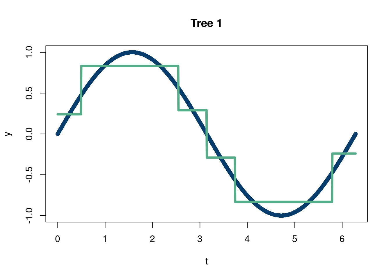
rpart.plot(tree1, fallen.leaves = T, tweak=1, extra=0)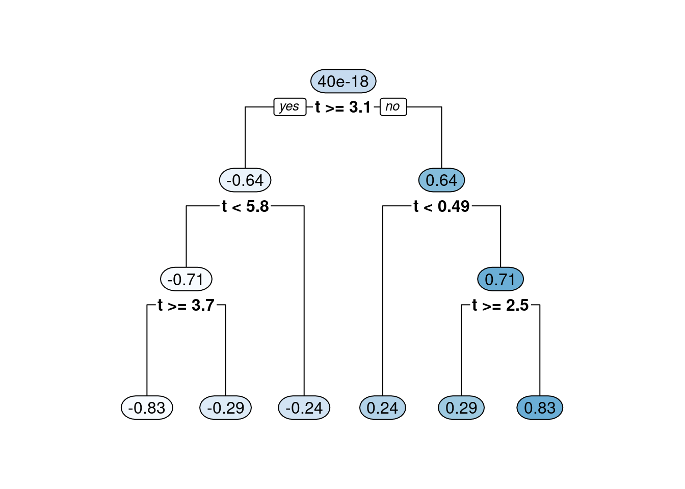
resid_y = y-predict(tree1)


tree2 = rpart(resid_y~t, minbucket=20)
#plot(t,resid_y, pch=16, col='#073d6d')
#lines(t,predict(tree2), lwd=4,col='#55AD89')

#rpart.plot(tree2, fallen.leaves = T, tweak=1, extra=0)

plot(t,y, pch=16, col='#073d6d')
lines(t, predict(tree1)+predict(tree2), lty=1,lwd=4, col='#Da70D6')
lines(t,predict(tree1), lwd=3,lty=4,col='#55AD89')
lines(t, predict(tree2), lwd=3, lty=2, col='#d47c17')

legend('topright',c('Combined trees', 'Tree 1', 'Tree 2 (residual)'),
       col=c('#DA70D6', '#55AD89', '#d47c17'),
       lty=c(1,4,2))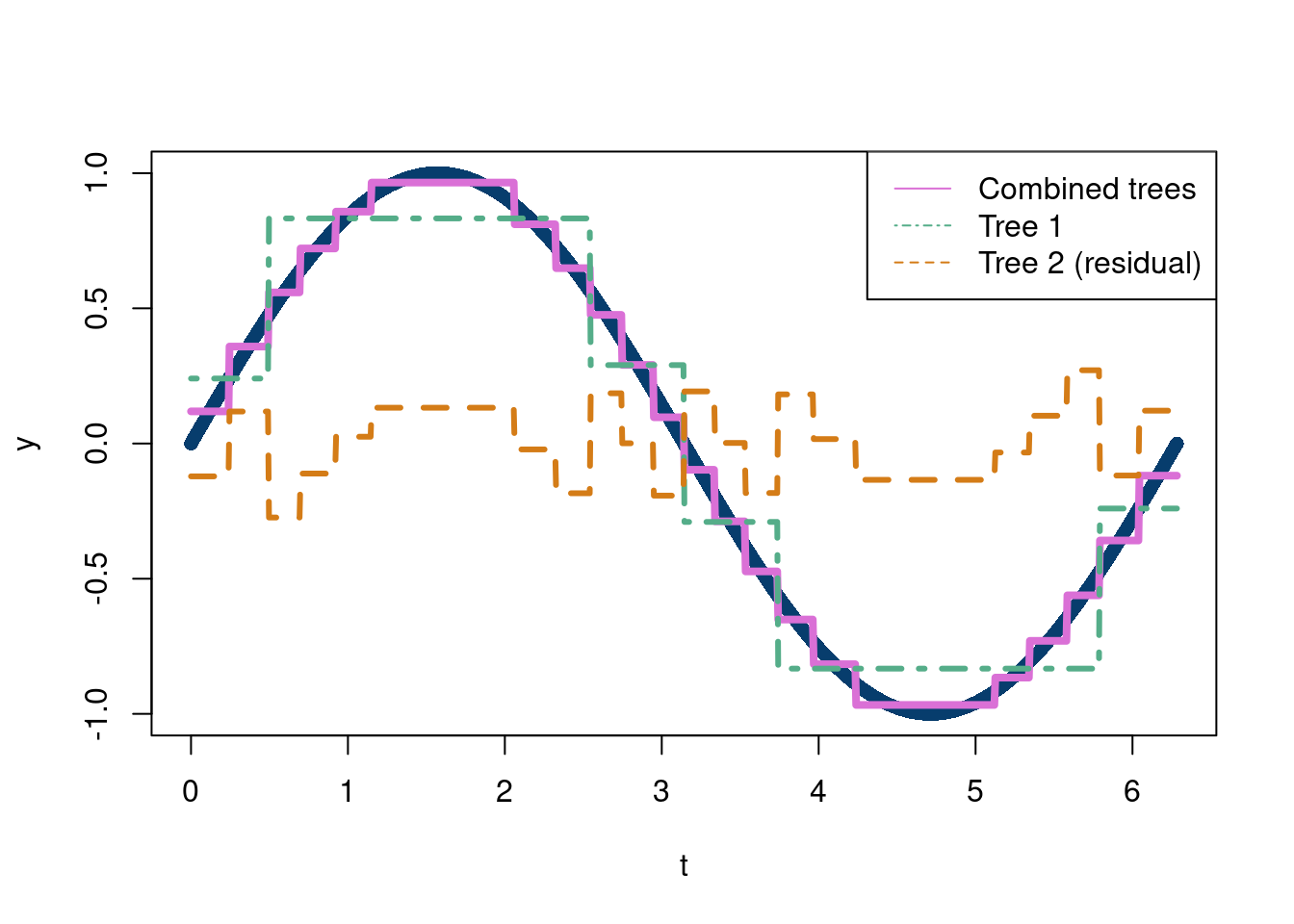
We will motivate boosting with a really simple toy example, motivated by this nice blog post. Imagine we are trying to predict how much we are going to sleep (based on 10 observations and 2 input variables). We will go through a very simple boosting decision example to show how (broadly) the idea works before delving into more detail.
The basic idea is we fit an outcome \(y_i\) given \(\mathbf{X}\) using sequential decision trees to capture the residuals of \(\hat{y}i-y_i\), with the first output being \(y_i-F_0(x_i)\). The trees are built as
\[ F_m(x_i) = F_{m-1}(x_i)+\nu \cdot\gamma \cdot \nabla(\mathcal{L}(F_{m-1}(x_i)) \]
where \(\nabla(\mathcal{L}(F_{m-1}(x_i))\) is the gradient of the loss function, which we normally take to be the mean squared error. It turns out with mean squared error loss, \(\mathcal{L} = \frac{1}{n}\sum_{i=1}^{n}(y_i-F(x_i))^2\), which means that \(\frac{\partial \mathcal{L}}{\partial F(x_i)}=\frac{2}{n}(y_i-F(x_i))\) meaning fitting to the residual is equivalent to finding the “local maximum descent” (see this wikipedia page). \(\gamma\) should be chosen to be small to make sure we do not move too far in the direction of the steepest descent. Smaller \(\nu\), the “learning rate”, tend to encourage more shrinkage (a form of regularization).
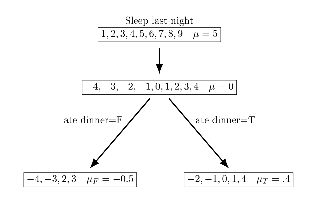
| Sleep | \(F_1(x)\) | 1st residual | avg \(\nabla\) (first feature) | \(F_1(x)\) |
|---|---|---|---|---|
| 1 | 5 | -4 | -0.5 | 4.5 |
| 2 | 5 | -3 | -0.5 | 4.5 |
| 3 | 5 | -2 | 0.4 | 5.4 |
| 4 | 5 | -1 | 0.4 | 5.4 |
| 5 | 5 | 0 | 0.4 | 5.4 |
| 6 | 5 | 1 | 0.4 | 5.4 |
| 7 | 5 | 2 | -0.5 | 4.5 |
| 8 | 5 | 3 | -0.5 | 4.5 |
| 9 | 5 | 4 | 0.4 | 4.5 |
Now, we fit a second small regression tree to the residuals from the first fit.
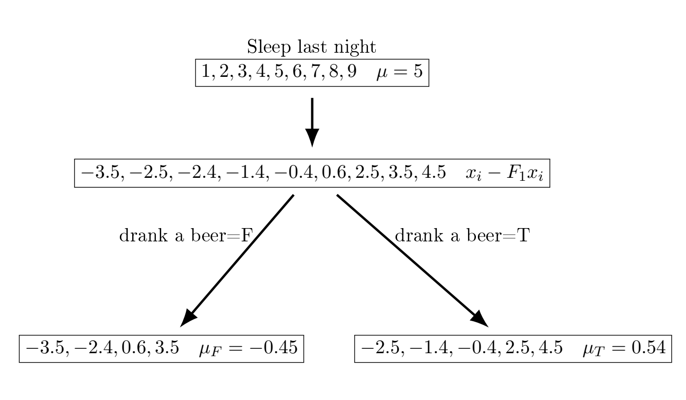
| Sleep | \(F_1(x)\) | 2nd residual | avg \(\nabla\) (second feature) | \(F_2(x)\) | 3rd residual |
|---|---|---|---|---|---|
| 1 | 4.5 | -3.5 | -0.45 | 4.05 | -3.05 |
| 2 | 4.5 | -2.5 | 0.54 | 5.04 | -3.04 |
| 3 | 5.4 | -2.4 | -0.45 | 5.05 | -2.05 |
| 4 | 5.4 | -1.4 | 0.54 | 5.94 | -1.94 |
| 5 | 5.4 | -0.4 | 0.54 | 5.94 | 0.94 |
| 6 | 5.4 | 0.6 | -0.45 | 5.05 | 0.95 |
| 7 | 4.5 | 2.5 | 0.54 | 5.04 | 1.96 |
| 8 | 4.5 | 3.5 | -0.45 | 4.05 | 3.95 |
| 9 | 4.5 | 4.5 | 0.54 | 5.04 | 3.96 |
So we see we’re starting to get more accurate predictions after just two rounds, and making no effort to choose \(\gamma\) appropriately.
Modifications for classification problems entail using the mode instead of the mean.
A famous software that builds upon this idea (with many additional bells and whistles) is called xgboost, which tends to perform really well in a lot of tabular datasets, where there is a lot of noise and not a lot observations. Examples of this data are common in the social sciences and economics. XGBoost is typically not an off the shelf method, meaning it often requires tuning of parameters, such as the learning rate, to be effective in practice. Remember this for later.