8How to probably (maybe) predict the future: Bayesian thinking with a functional spin
It’s tough to make predictions, especially about the future.
Yogi Berra
8.1 Priors over functions?
In this chapter, we are going to study a Bayesian approach to functional data. By functional data, we mean we want to model \(y=f(x)\), which means we are modeling an output variable that changes based on changes in another input (or inputs) variable. \(f(\cdot)\) is a function that describes how the changes in the inputs map to the output. In linear regression, \(f(\cdot)\) took the form of adding together the inputs weighed by different constant numbers for each input. \(f(\cdot)\) can be literally any function though, so we would like to not make any assumptions about it’s form. We then present two1 non-parametric Bayesian approaches to estimate \(f(\cdot)\), Gaussian processes and BART (H. A. and Chipman, George, and McCulloch 2012), with the latter being an “adaptive basis method” to tie back into chapter 7. But how are these Bayesian methods? What is the prior?
1 Technically semi-parametric for BART but more on that later.
The theme of the two methods presented in this chapter (in addition to them being the backbone of “Bayesian non-parametrics) are that the priors we are considering are now over”function space”. These methods are Bayesian tools used to model functional data, such as the data we saw in chapter 7, but with the automatic uncertainty quantification that come with Bayesian tools. Loosely speaking, the prior can be thought of as what we expect the function to look like in the absence of data, which is now even more important given that in functional approximation we will often have to interpolate (or even extrapolate), meaning the choice of prior can be consequential. This point is why we argue so strongly for BART, as it is equipped to elicit a well designed prior, making it useful in a broad range of difficult problems.
8.2 Gaussian Processes
A Gaussian process is a tricky subject to wrap your head around, but is a very powerful tool. In technical terms, a Gaussian process is an infinite dimensional multivariate normal. From wikipedia: (https://en.wikipedia.org/wiki/Gaussian_process)
In probability theory and statistics, a Gaussian process is a stochastic process, such that every finite collection of those random variables has a multivariate normal distribution.
Soooo, not super helpful. Let’s try again with a simpler approach. A Gaussian process is a multivariate normal distribution, but with the mean vector now a function, and the covariance matrix now a function as well. In particular, the covariance function (the kernel) is of particular importance.
To illustrate the multivariate normal informally, consider a time series with time points 1 through 50. At time point 1, we draw a random point from a standard normal distribution. That means we expect the point to be near 0, with a very high probability the value will be between -3 and 3. Then we draw a point at time 2 with the same process but with a correlation of -1 with time 1! Then we do the same at time 3 with a correlation of 1 with time 1 and so on. With this procedure, we have basically defined an oscillatory sine curve using just the multivariate normal! Also, we saw no data and yet still were able to generate hypothetical data based on this engineered covariance…sounds like a Bayesian prior in a sense right? With a couple modifications we will discuss later in the chapter, it is!
Okay nice…So we see above that we can create a function shape using the multivariate normal. Another way to visualize this is reproduced below:2
2 Noting that the mean will wiggle around 0 because we are not simulating enough Monte Carlo draws…nonetheless the correlations between the offsets from zero remain intact!
The second major aspect of the Gaussian process is what happens when we do see data. Luckily, we can just follow conditional distribution rules. So, let’s first change our covariance matrix so the correlations (making \(\rho=0.8\) instead of \(0.9999\)) are not as extreme so the visual is easier to follow. We also only look at 4 random variables to also aid with visualization. We use the conditional distribution equations for the bivariate normal, for \(x_i=x_2\) then \(x_3\) and then \(x_4\). Given that \(X_1=x_1=2\)3 in this hypothetical (where \(x_1\) is not the coordinate but the realization of the random variable \(X_1\)), then:
3 A relatively large value for a draw from a standard normal.
So once we have observed an outcome, our draws at the next points are significantly closer to their expected value because of the high correlation structure we imposed. The “distance function” our covariance implies is periodic4, meaning that \(X_2\) and \(X_4\) have the same mean and variance conditional on the value of \(X_2=2\). Often, farther away points will have covariances designed to make the distribution more uncertain, which we will see with the squared exponential kernel in a bit.
4 Notice, the conditional equation only shows a relation in the mean term between variable \(i\) and the observed variable “1” through the \(\sigma_{i1}\) term, which we set to be \(0.8\) is even and \(-0.8\) if the variable index is odd, and the actual observed value of \(X_1\), which is \(x_1\). Additionally, a higher correlation, from the bivariate equations, can only make the conditional variance smaller for \(X_i\).
Now that we have a better idea of how the multivariate normal works, let’s look at a third point we want to emphasize. That is that the marginal distributions (in every sub-dimension) are still normally distributed. This helps bridge the gap between the technical definition of Gaussian processes we see later and what we have covered so far. Let’s begin by studying the marginal distributions of \(X_1\), \(X_2\), and \(X_3\), as well as their pairwise bivariate distributions. These are the unconditional distributions, but we intend here to show that the multivariate normal is a normal distribution for 1 variable, and a bivariate normal for 2 variables.
In the above case we saw that the multivariate normal5 can generate these time series curves, meaning we can use this model as a proxy for the data generating process and a way to create synthetic data…right? Sorta. Notice that the way we generated the day prohibits any form of extrapolation: we simply cannot generate data where we have not seen any \(\mathbf{X}\) using the empirical covariance and mean. Second, if we want to interpolate, we need a decent amount of time points to ensure we are not imposing too much structure in the space between unobserved \(\mathbf{X}_{t}\) points, as right now we simply “connect” the dots (aka linearly interpolate in this case6) where we do not have points, a bigger issue with less data (lower dimensions). So what we really want in order to both interpolate better as well as have any hope for extrapolation is to truly treat the multivariate as infinite dimensional, which means we want a function for the mean and covariance versus the empirical estimates that only exist at the observed \(\mathbf{X}_t\). In the case of having an experiment, say signal from a radio wave, where we have a lot of data and do not want to extrapolate but do wish we had multiple samples, then this approach is smart.
5 Hopefully this gives a rough idea of how the multivariate normal works, how it can be used for function approximation, and how the high-dimensionality of the multivariate normal makes it a lot more flexible than one would think given that in one dimension it is very restrictive (a bell curve) and in 2-dimensions can only take on ellipse shapes. We also saw how conditioning on observed data impacts what the multivariate normal looks like.
6 although you could do a spline interpolation or fit a function between the two but at that point we are getting closer and closer to a Gaussian process kriging approach anyways.
7 Technically, using Ledoit-Wolf regularization, it is recommended to do \(\hat{\Sigma}=(1-\lambda)*\Sigma_{\text{empirical}}+\lambda\mathbf{I}\).
Now, we can do this with a real dataset. Using the data from (Brozak et al. 2024), we replicate the analysis above. The data describe flour beetle populations for larvae, pupae, and adult beetles over time. There are 6 experiment and 10 time points. The script below shows the data for the \(N=0.5, P=0.0\) experiments. Note, we regularize the empirical covariance by adding a term to the diagonal7.
Now, we can simulate distributions of the beetle populations over time using a truncated multivariate distribution (truncated because the populations must be greater than zero). Sampling from the truncated multivariate distribution basically entails rejecting samples outside the constraints. In high dimensions, this becomes impractical as most points will be outside the constraints, and this approach to generate samples becomes inefficient. Think about it. Say our bound is \(\pm\) 4 standard deviations from the empirical mean at each time point. If a “4-sigma” event happens about 1 in 10000 times and you have 10000 dimensions (in this case time points), then you’d expect a at least one point to be outside the 4-sigma zone. You’d have to throw away the entire curve and sample a completely new one! This would take forever…the curse of dimensionality all the way down. The provided R package uses efficient sampling techniques based on rejection sampling or Gibbs sampling from (Geweke 1991).
The parameterization below allows us to capture (empirically) the relationships between the larvae, pupae, and adult populations concurrently. Different simulated time series of adult beetles will impact the simulated larvae populations, and the draws at time 3 should impact time 7 and so on.
Essentially, we use the multivariate distribution as the distribution of the function describing the timeseries of the beetle populations. We “fill” in the blanks and weight more around where we have already observed data so that simulated beetle populations are more probable where there were more observations. Below, we draw 100 realizations from different multivariate distributions.
This approach is similar to (Yang, Tartakovsky, and Tartakovsky 2018), who use the empirical covariance to model the experiments. The following figure illustrates the method, which is from a slide version of (Swiler et al. 2020).
Interesting! Let’s explore this a little more with a simulation study:
Click here for full code
import pandas as pdimport numpy as npimport matplotlib.pyplot as pltfrom scipy.stats import multivariate_tdf_free =5n2 =30t2 =50time2 = np.linspace(1, t2, t2)mult = np.concatenate([np.random.uniform(4,8, int(n2))])data = np.zeros((t2,n2))for i inrange(n2): data[:,i] = mult[i]*(0.10*time2)*np.sin(time2/5) #+ np.random.normal(0, 0.22, t2) #### true data (full)n_full =5000mult = np.concatenate([np.random.uniform(4,8, int(n_full))])data_true = np.zeros((t2,n_full))for i inrange(n_full): data_true[:,i] = mult[i]*(0.10*time2)*np.sin(time2/5) #+ np.random.normal(0, 0.22, t2) plt.figure()pd.DataFrame(data).plot(legend=False, color='#42656b', linewidth=2, alpha=0.10)
Drawing a multivariate Gaussian from the estimated mean and covariance, aka “empirical Gaussian processes”, is a powerful tool. We have discussed the limitation of only working where we observe data. Additionally, empirical GP’s (or whatever process you want) are prone to fit the data too closely, which is more likely if the number of dimensions (time points here) is much greater than the number of replicates or the data are very noisy. A couple remedies could (and should) be implemented to mitigate this risk.
Smoothing each of the trajectories first, in the case of noisy data, and then taking the empirical means and covariances of the smoothed curves. This could be done with BART or with splines or a traditional Gaussian process regression! Tailor to your problem at hand.
It probably makes sense to try other covariance estimating procedures besides the base empirical covariance, but we leave that as a task for you to play around with. See this scikit-learn module, which estimates a sparse covariance matrix.
Regularizing the covariance matrix is also useful, which could include adding a diagonal matrix, which has the effect of upweighting the diagonal elements of the covariance to the expense of the correlations between the time points, which may be noisy.
Another pecadillo of the empirical Gaussian process is that it can be enormously slow. Generating from the multivariate normal (traditionally) uses the Choleskydecomposition. This is an \(\mathcal{O}(N^3)\) operation, so we’d like to speed that up if we could. A potential solution, for which we showed the code above courtesy of Richard Hahn, is to use a low rank approximation of the covariance matrix8. Linear algebra is dedicated to speeding up matrix operations, so certainly there are other approaches that could be useful that we are not familiar with.
8 The low-rank approximation entails finding a smaller number of dimensions to draw from. Rank refers to the number of linearly independent features. If all the columns in a matrix are multiples of one another, the rank is 1. If none are, it is \(n\). The psuedo-code to get a low rank generator is svd(empirical covariance)$d, which spits out the eigenvalues. You can then generate the multivariate normal from the top however many \(Q\) eigenvalues, as we saw earlier. One way would be based on some criteria you can get from inspecting the sorted eigenvalues, like if you say a dropoff after the 11th eigenvalue, for example.
Remember, the assumption is the data are draws from independent Gaussian processes. We estimate the mean and covariance empirically from the replicate experiments. We draw 100 simulated curves from the GP.
Now assume the curves are generated from a student t process with 10 degrees of freedom. Mess around with the degrees of freedom. If the number is too low, will get too many extreme outliers. This may be desirable, but could be problematic. We again draw 100 simulated trajectories.
Click here for full code
plt.figure()sim_draws_t.T.plot(legend=False, color='#7c1d1d', linewidth=.75, alpha=0.16, title='Student t process: df='+str(df_free))
But how well do these methods “work”? Do they estimate the density of the trajectories well? Let’s create 5,000 replicate curves to compare the true distribution to. The number of replicates trained on can be varied to assess sensitivity.
At each time pint, the simulated curves are drawn from either the student t or the normal distribution. What if we expected groupings of trajectories? Or that the trajectories at a certain time were “skewed” towards one side? Let’s try a weighted sum of multivariate normal distributions (i.e. assume the data are generated from a mixture of Gaussian processes), which we will discuss in more detail in chapter 10.
Click here for full code
from sklearn.mixture import GaussianMixtureclusters=4gmm = GaussianMixture(n_components = clusters, random_state=12024).fit(data.T)samples = gmm.sample(10000)# sample 500 at random, since the GMM lists them in ordergmm_df = pd.DataFrame(samples[0].T).sample(n=500, axis=1)# draw 100 from each cluster#np.array(samples[0][np.where(sample[1]==0)[1:100]], #samples[0][np.where(sample[1]==1)[1:100]],#samples[0][np.where(sample[1]==2)[1:100]],#samples[0][np.where(sample[1]==3)[1:100]])gmm_df.plot(legend=False, color='#Da70D6', alpha=0.025, linewidth=0.5)plt.plot(time2-1, pd.DataFrame(data_true).apply(lambda row: row.quantile(0.025),axis=1), color='#42656b',linewidth=2)plt.plot(time2-1, pd.DataFrame(data_true).apply(lambda row: row.quantile(0.975),axis=1), color='#42656b',linewidth=2)plt.plot(time2, gmm_df.mean(axis=1), linewidth=4,linestyle='--', color='#Da70D6')plt.fill_between(np.linspace(0,t2, num=t2), pd.DataFrame(gmm_df).apply(lambda row: row.quantile(0.025),axis=1),pd.DataFrame(gmm_df).apply(lambda row: row.quantile(0.975),axis=1),color='#Da70D6', alpha=0.22)plt.title('4 cluster GMM,'+' trained size='+str(n2))
Some potential issues with this method remain. For one, it is not obvious why this is really useful. Sure, it can ease uncertainty analysis, but we don’t really care about generating fake beetle population trajectories. More experiments would certainly be more interesting given that we only have 6 experiments (albeit at a higher cost and labor load). Additionally, there are only 10 time points. The former can really only be remedied with more data. As for the latter, we could interpolate the observed data between the observed data points, potentially using a biological model, such as continuous analogs of those proposed in (Brozak et al. 2024). This could be an interesting avenue to attend to, but a “non-parametric” approach could also be considered, as we are about to discuss.
This sets the stage for typical Gaussian Process regression, which we will show with a data example below following chapter 5 of Surrogates (link to online textbook) please read!
The main difference between the multivariate normal and a Gaussian process is that in the GP we specify the covariance kernel as a function of our inputs rather than manually encoding it is an our first example or just taking the empirical covariance as in the second example. Instead of manually entering our covariance matrix \(\Sigma\), we populate it from some function. Specifically, this function is a “distance” between two points, such that the covariance “kernel” we stipulate is \(\Sigma = f(x_i, x_j)=\text{distance}(x_i,x_j)\). Earlier, we discussed the correlation, which is in itself a distance function. A more general distance function is accompanied by the benefits described above, such as interpolation and extrapolation. Essentially, we estimate the covariance matrix with a function, which allows us to fill in the gaps where we did not see data.
This is a non-parametric approach, as a function of the distance between input variables serves to define the covariance. However, we can still plot realizations of the Gaussian process before seeing data, which gives us a rough idea of what we expect the interpolation to look like9! This will vary according to how much data we have and where those data are (according to the multivariate normal conditioning equations, as we will see below).
9 That sounds Bayesian right? That’s pretty cool. We will discuss this later, but section 5.3 of Surrogates provides a really interesting, intuitive, and also rigorous explanation of how this is indeed a valid Bayesian prior over functions.
So far, we have looked at the multivariate normal distribution and see how surprisingly flexible it as a modeling tool. We have informally hinted at the next steps with Gaussian process specification while mostly omitting mathematical detail.
The mathematical detail describes how to use Gaussian processes for regression, a method known as Kriging regression. Regardless of whether you read the math, we will use it on a cool example on some real data, which highlights both the strengths and the weaknesses of the Gaussian process methodology. We will introduce similar concepts with Gaussian mixture models and Bayesian additive regression trees in later sections as well. A key takeaway with Gaussian processes is that they offer a way to encode our beliefs about the state of the world; the kernel permits different shapes and dictates different behaviors, particularly where less data is available. Manipulation of the kernel can allow for physical constraints to be incorporated, among other interesting applications.
8.2.2 On the mean prior vs covariance prior
One thing to note is that the covariance function defines the behaviour of the Gaussian process. For this reason, people tend to set the mean equal to zero. This does not need to be the case. In linear regression, the outcomes, \(y_i\), were assumed to be distributed with the multivariate normal with mean function\(\mathbf{X}\beta\) and covariance \(\sigma^2\mathbf{I}\), which meant all the error terms were independent but there was a linear trend due to the mean term. Interestingly, the linear model could be written in terms of the covariance kernel as well. We will return to this point later.
The mean function has particular meaning when we discuss “extrapolation”, as the mean function determines the Gaussian processes behaviour the farther away from the training data we are. A specified mean function will have a larger impact in “far-away” points compared to training data, as the covariance kernel’s impact will diminish in these regions. Therefore, a constant or zero mean is more “conservative” with variance estimates in extrapolated regions, which is usually welcome behavior. In general, researchers want to be more agnostic about extrapolated behavior, another reason to focus more on the covariance rather than the mean.
Including the mean function can have use if there is prior information about the expected shape of the response being modeled. This could be from knowing the “physics” of the generating process, in which case including the mean is a smart choice, as it is more “physical” and could help induce behaviour you care about without having to design a bespoke kernel. For example, a mean function could be non-stationary, which is an easy way to include a trend.
A way to incorporate the mean function is to follow the suggestions of (Chiles and Delfiner 2012). They present the now popular method to subtract out a mean function from \(y\) (potentially estimated with a separate model or from some physical model of expected extrapolated behavior) and then add it back in after performing a Gaussian process regression with a zero mean on \(y-\mu(\mathbf{x})\) (see this link as well). The included mean function is sometimes known as the “reference function” in physics.
A Gaussian process is a set of random variables whose joint distribution is multivariate normal. More formally, a stochastic process if a Gaussian process if it’s characteristic function is of a certain form (which we will not discuss here). Informally, a draw from a Gaussian process is a draw from a multivariate normal, but with the mean and covariance now functions of the input space. That is, \[\text{Gaussian Process}\rightarrow \mathcal{N}(\mathbf{\mu}(\cdot), \mathbf{\Sigma}(\cdot))\]
However, \(\mathbf{\Sigma}\) (the “Kernel”) must be a positive definite and symmetric matrix, limiting the class of kernels that can be chosen in practice to usually a limited family (although kernels can be cominded together, which we will see later).
Advantages of Gaussian processes are that they require relatively little data and work well with smooth data. They also generalize well to multiple outputs. On the downside, the choice of kernel (prior) is very consequential, hyperparameter tuning can be difficult, and Gaussian process evaluation is computationally costly (\(\mathcal{O}(N^3)\)). A method like BART is typically preferred. Other avenues could be a student-t process, which uses the multivariate t-distribution in place of the multivariate Gaussian. state:
The main reason for using a student-t process then is because there are a wider range of likely realizations of the process which manifest themselves in different shapes of the credible intervals than the normal distributions of uncertainty from the Gaussian process. However, like the Gaussian process, the shapes of the permitted functions is still determined by the pre-specified kernel, which remains the biggest determinant of how the GP realizations will look. See (Shah, Wilson, and Ghahramani 2014) for more analysis on student-t processes. Recent work has been done on “Horseshoe processes” (Chase, Taylor, and Boonstra 2024). (Whitehead 2025) provide analytic derivations for “bimodal stochastic process regression” and “Heaviside stochastic process regression”, giving analytic forms for the equations that are used in Gaussian processes but to accomodate draws at each point from the bimodal and Heaviside distributions respectively. The Heaviside distribution looks something like a step function, and can be a more realistic distribution of permitted functions than a Gaussian would entail.10
10 Oliver Heaviside is an OP figure in physics history who doesn’t necessarily get the acclaim he deserves. He is the person who put Maxwell’s equations into vector form, reducing Maxwell’s original 20 equations into just 4, making life much easier for physics students for centuries to com. Read here.
11 A point we will hammer home throughout these notes is that BART, with normal priors for leaf parameters, IS a Gaussian process. But, crucially, BART does not require the user to pre-specify the form of the covariance kernel, which all the above processes require (Gaussian, student-t, Heaviside, etc.). The splitting of the data via the trees define the covariance.
More generally, BART regression is stochastic process regression. The normal priors in the leaves are chosen to be conjugate with a normal likelihood for the outcome, i.e. \(y=N(BART(\mathbf{x}),\sigma^2)\), but also conveniently yield the BART-Gaussian process equivalence.
While we will later argue that BART is a better alternative to these bespoke processes11, it is cool research to construct new stochastic processes that can be used for regression based on different generalizations of multivariate distributions.
The covariance terms, \(\mathbf{\Sigma}_{\mathbf{A},\mathbf{B}}\) refers to the covariance function \(K(\mathbf{A},\mathbf{B})\), which must be chosen by the user. Some common covariance kernels include the squared exponential (also known as the radial basis function’’) and the Matern, and are usually chosen.
$$
K(,)= (-)+^2 $$
\(\ell=\max\left(\sum_{i=1}^{p}(\mathbf{a}_i-\mathbf{b}_i)^2\right)^2\) where \(\ell\) is the length scale, \(\theta\) is the nugget, \(\tau\) is the scale parameter of the target function, and \(\beta\), the sill, controls smoothness of the target function. Choosing or tuning the hyper-parameters is a difficult problem, with approaches using frequentist methods (such as method of moment or maximum likelihood), Bayesian methods (putting priors on the parameters), and empirical methods such as cross validation commonly employed.
Posterior predictive distributions are given by: (rewriting \(\mathbf{x}_\text{train}\) as \(\mathbf{\tilde{X}}_{0}\) and \(\mathbf{x}_\text{test}\) as \(\mathbf{\tilde{X}}_{1}\) for ease of reading):
Gaussian Processes have several nice properties, such as ensuring interactions between every point and a guarantee of smoothness. Additionally, the Gaussian Process regression gives an obvious quantification of uncertainty by simply looking at quantiles of the posterior distribution. Despite these nice properties, Gaussian Process regression has several issues. One major issue is the specification of the covariance kernel, which can be viewed as a serious modeling choice. Potentially even more problematically is the computational burden with evaluating the terms in the conditioning equation above, where the matrix inversions are on the order of \(\mathcal{O}(N^3)\) (where \(N\) is the number of observations), which limits the utility in practice.
Gaussian processes as priors
We will not do the explanation justice here, but chapter 5.3 of Surrogates gives an excellent overview of the connections with Gaussian processes and Bayesian linear regression and the interpretation of the Gaussian process as a prior over functions. This is a really cool and useful interpretation, and makes the motivation of the prior covariance all the more insightful and important.
Some properties of kernels
Stationarity: The covariance kernel only depends on the distance between two points. Intuitively, imagine a ``time dimension’’. Stationarity implies the behavior of the process stays constant over time. \(K(x,y)\rightarrow K(x+c, y+c)\) are equal.
Isotropy: The covariance kernel decays radially. This means the process depends only on the absolute value of the distance between points.
Smoothness:
Periodicity:
The squared exponential kernel is stationary, isotropic, and infinitely smooth. It is for many the default kernel and often works fairly well. This is to say making a kernel anisotropic of non-stationary is not necessarily better.
Conveniently, the sum and product of kernels are valid kernels. We will soon show some common covariance functions and combinations of covariance functions.
To illustrate the power of the covariance kernel, imagine we have a linear model for the mean with a squared exponential kernel. This would yield the typical squared exponential prior curves but a linear trend. Alternatively, one could add the linear kernel to the squared exponential, which is still a valid kernel, to mimic the same behavior. Where these two models differ is in the extrapolation region: the mean zero model with a squared exponential plus linear kernel will revert back to zero eventually in the extrapolated region, whereas the linear function will center around the line that increases with the same slope across all future \(X\). In general, researchers want to be more agnostic about extrapolated behavior, another reason to focus more on the covariance rather than the mean.
Of course, there are other available kernels, see the kernel cookbook for web version of chapter 2 in: (Duvenaud 2014) which explores many different kernels in depth. An interesting one is the “linear kernel” \(k(x, x')= \tilde{sigma}^2+\sigma^2\left[(x-c)(x'-c)\right]\), which is actually equivalent to Bayesian linear regression, even with the mean function equal to 0, which further illustrated how the covariance kernel defines the behaviour of the Gaussian process. This approach to linear regression also helps show the Bayesian way of thinking. There is a prior for the shape of the “line” (the slope and intercept terms vary randomly yielding different realizations) and those different realizations after seeing the data yield the posterior distribution for \(f\). In traditional (frequentist) linear regression, the \(\beta\) parameter (\(\beta\)) is fixed and we choose the most “likely” value12. The uncertainty (for traditional confidence intervals we see) is computed by assuming that observed data are corrupted by noise and that were we to have observed the data over and over, the data would yield deviations around the line that would constitute a normal distribution centered at the line with standard deviation \(\sigma\). OTOH, the Bayesian approach assumes the slope and intercept are random variables (as is the noise term added on), with the point estimate being the average of the distribution of values for each term usually.
12 Which under the assumption of a normal likelihood is indeed the OLS estimate \(\hat{\beta}=(\mathbf{X}'\mathbf{X})^{-1}\mathbf{X}'\mathbf{y}\)
For a deeper dive into some of the mathematics behind Gaussian process kernels, see this blog(Simpson 2021). In particular, the focus is on the covariance function in the Gaussian process framework and the mathematical meaning behind it. It is a long and fun post and certainly not a dry read. (Driscoll 1973) show that the realizations of a Gaussian process lie in the reproducing kernel Hilbert space (RKHS), meaning that the Gaussian process covariance function is the reproducing “kernel”. Loosely, this means a kernel \(K\) is a reproducing kernel if the inner product of \(K\) and an arbitrary function \(f\) in the Hilbert space, \(\mathcal{H}\) return a continuous functional \(L_x(f)\) (a consequence of the Riesz representation theorem). In other words, if the following is true for a continuous functional, then \(K\) is the reproducing kernel:
\[
f(x)=L_x(f)=\langle f,K \rangle \text{ for all $f\in \mathcal{H}$}
\]
8.2.3 The role of the covariance kernel
The prior elicited by the process is technically a function of the mean and covariance function, but we can actually define the behaviour of the Gaussian process through the covariance function (the kernel). The prior predictive can be studied for different choices of kernels, choices which dictate the behaviour of the GP in the absence of data (interpolation and extrapolation zones). As we will see in the final chapter, this is a powerful way to encode prior information or physical constraints. A particularly interesting example of this is in (Zhou et al. 2019), who use a constrained Gaussian process to estimate the radius of the proton.
To summarize, we are interesting in modeling \(f(x)\). We learned we can do so by defining a notion of similarity (or distance) through the covariance of a multivariate normal distribution. Prior to seeing any data, we want to get a feel for how we’d expect the chosen covariance function will behave between and outside our testing zone. Essentially then, we gauge \(f(x)\) by studying the similarity between \(f_{\text{prior}}(x_j)\) and \(f_{\text{prior}}(x_i)\). If we want to assume that if \(x_i\) and \(x_j\) are identical every “365 units” (say days in a time series) apart, then a periodic kernel makes sense. The following R-script shows how to look at the prior predictive distribution, which is the distribution of \(y=f(x)\) we’d see given the choice of prior kernel and attached hyperparameters. We generate input values between 0 and 30 on a grid. We will look at the famous squared exponential. We generate prior samples from the multivariate normal through the Cholesky decomposition manually, using code from (Hoff 2009). This is a nice explanation as to how that works. Borrowing code from Richard Hahn, this can also be done with Singular value decomposition.
Click here for full code
options(warn=-1)suppressMessages(library(NatParksPalettes))# Generate the multivariate normal with Cholesky (Hoff)rmvnorm_multi<-function(n,mu,Sigma){ p<-length(mu) res<-matrix(0,nrow=n,ncol=p)if( n>0& p>0 ) { E<-matrix(rnorm(n*p),n,p) res<-t( t(E%*%chol(Sigma)) +c(mu)) } res}# Multivariate normal with Singular Value decomposition instead of Cholesky (Richard)rmvnorm_svd <-function(n, mu, Sigma){ temp <-svd(Sigma) p <-length(mu) k <-dim(temp$u%*%sqrt(diag(temp$d)))[2] x <-matrix(rnorm(k*n), nrow=k) res <- mu+(temp$u%*%sqrt(diag(temp$d)))%*%xreturn (t(res))}dist_func =function(t,tprime){ dist <-matrix(NA, nrow=length(t), ncol=length(tprime))for (i in1:length(t)){for (j in1:length(tprime)){# Alternative distance functions are available#dist[i,j] = (t[i]*tprime[j]) dist[i,j] = (t[i]-tprime[j])^2 } }return(dist)}t_seq =seq(from=0, to=25, length.out=25)D =dist_func(t_seq, t_seq)sig2 =10length2 =100eps2 =1e-6c2 =12Sigma = (sig2*exp(-D/length2) +diag(eps2, length(t_seq)) )N =4Y <-rmvnorm_svd(500, mu=rep(0, length(t_seq)),Sigma=Sigma)pal <-natparks.pals("Yosemite", n=5)matplot(as.matrix(t_seq), t(Y)[,1:N], type="l", ylab="Y", xlab='X',col=pal, main ='',lwd=2.25, xlim=c(0,25), lty=c(1,2,3,4))
The following python script shows the importance of the kernel choice. This is data that are smooth with respect to the input variable, so this should be a fairly easy problem for a GP. This example shows the GP posteriors, after conditioning on the observed data, but still expemplifies the interpolation and extrapolation notions we discussed above.
plt.figure(figsize=(7,5))GP_func('Linear plus Squared exponential')plt.show()
Click here for full code
plt.figure(figsize=(7,5))GP_func('Linear and Squared exponential')plt.show()
8.2.4 Example on real data
The data used below is Demetri’s walking data in 2021/2022 according to his iPhone 12 mini, a really nice machine. We will train on all but a certain section of the data and test on the whole time frame.
`summarise()` has regrouped the output.
ℹ Summaries were computed grouped by month and year.
ℹ Output is grouped by month.
ℹ Use `summarise(.groups = "drop_last")` to silence this message.
ℹ Use `summarise(.by = c(month, year))` for per-operation grouping
  (`?dplyr::dplyr_by`) instead.
Click here for full code
df$index <-seq(from=1, to=nrow(df))eps <-sqrt(.Machine$double.eps)which_months <-c(seq(from=50, to=60, by=1), seq(from=80, to=90))X_full <-as.matrix(df$index)#/max(df$index)y_full <- df$distance#df$mean_dist### Take a rolling average y_full = zoo::rollmean(y_full,10, align ='left')X_full = X_full[10:length(X_full)]plot(X_full, y_full, pch=16)
Click here for full code
X <- X_full[-which_months]y <- y_full[-which_months]XX <- X_fullX_train <- X_full[-which_months]y_train <- y_full[-which_months]X_test <- X_full[which_months]y_test <- y_full[which_months]D <-dist_func(X_train, X_train)# The negative log likelihoodnl <-function(par, D, Y){ theta <- par[1] ## change 1 g <- par[2] sill <- par[3] n <-length(Y) K <- sill*exp(-D/theta) +diag(g, length(y_train)) ## change Ki <-solve(K) ldetK <-determinant(K, logarithm=TRUE)$modulus ll <-- (length(y_train)/2)*log(t(Y) %*% Ki %*% Y) - (1/2)*ldetK counter <<- counter +1return(-ll)}counter <-0out <-optim(c(1e1,1e0,1e1), nl, method="L-BFGS-B", lower=c(1e-2,1e-6,1e-2),upper=c(1e3, 1e2,1e4),D=D, Y=y, control =list(maxit =5000,pgtol=1e-15,factr=0,trace=F, #dont print ndeps=c(1e-10, 1e-10, 1e-10)))ell <- out$par[1]g <- out$par[2]sill <- out$par[3]square_exp_kern =function(t, tprime, sill, ell,g){if (ncol(dist_func(t,tprime))==nrow(dist_func(t,tprime))){ sill*exp(-dist_func(t,tprime)/ell) +diag(g, ncol(dist_func(t, tprime))) }else{ sill*exp(-dist_func(t,tprime)/ell) }}Sigma <-square_exp_kern(X_train, X_train, sill, ell, g)#XX <- matrix(seq(-0.5, 2*pi+0.5, length=100), ncol=1)# Test on the full data setSXX <-square_exp_kern(X_full, X_full, sill, ell, g)SX <-square_exp_kern(X_full, X_train, sill, ell, g)Si <- MASS::ginv(Sigma)mup <- SX %*% Si %*% ySigmap <- SXX - SX %*% Si %*%t(SX)# Plot the "prior", with the maximum likelihood estimates# with mean 0matplot(X_full, t(rmvnorm(5, rep(0, nrow(SXX)), SXX)), type="l", col="#592f8c", lty=1,lwd=1.75,#ylim=c(range(y)[1]-3.5, max(y)+3.5), xlab='Days since June 1',ylab='Miles per Day', main='Squared Exponential GP')
Click here for full code
# look at the covariance kernelvals =unique(scales::rescale(volcano))o =order(vals, decreasing = F)cols = scales::col_numeric('PuOr', domain=NULL)(vals)colz =setNames(data.frame(vals[o], cols[o]), NULL)#plot_ly(x=X_full, y=X_full, z=as.matrix(SXX), colorscale=colz, reversescale=T, type='heatmap')df_heat =expand.grid(X=X_full, Y=X_full)df_heat$Z =c(SXX)ggplot(df_heat, aes(X, Y, fill= Z)) +geom_tile()+scale_fill_gradientn(colors=natparks.pals("Acadia"))+theme_minimal()
Soooo that doesn’t look great… The interpolation zones are very variable, and we really should be looking at extrapolation here since we framed this is a “time series” problem13.
13 Typically with time series modeling we would want to extrapolate out into the future. Including data on each side is essentially informing the present with both the future and past. Obviously, this is not a great idea, but for this example we are illustrating the expected shapes with Gaussian processes look goofy despite having information where we shouldn’t in the training set (in the “future” days). This is meant to illustrate the importance of the “prior” (the choice of kernel), which also motivates the adaptively learned from data covariance that BART provides.
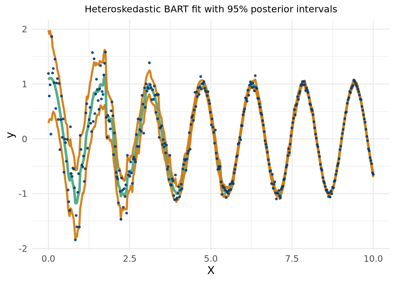
We are going to repeat this procedure using BART, which we will learn about in more detail in a bit. We follow this stochtree vignette. For reference, stochtree is a brilliant effort to allow for customizable Bayesian tree ensemble methods with R and python interfaces, obviating the need for extensive C++ knowledge.
It’s been mentioned already, and it will be mentioned again, but BART actually is a Gaussian process. The covariance kernel is defined by the proportion of trees that put observations in the same leaf nodes. Thus, the “kernel” is adaptively learned from the data!
The first two plots will plot the Kriging equations for the BART covariance kernel that pertain to the testing points of \(X\). This isn’t really an apples to apples comparison with the Gaussian process prior kernel14, because the BART kernel (as calculated below) is determined after seeing the \(y\) observations, meaning it is not a prior.
14 Even the GP prior isn’t really a prior because it was determined with the aid of a maximum likelihood estimates for the hyper-parameters, which involves the observed \(y'\)s.
So we see how the BART implied kernel differs from the Gaussian process one. Of course, this isn’t an apples to apples comparison. The GP kernel can easily be examined prior to seeing the data (we cheated and did so after hyperparameter tuning). The BART covariance term calculated above, while still a term in the typical Kriging pipeline that compares the implied covariance between testing points, was computed after running the BART model to predict \(y\mid x\), meaning it is not a prior in any sense. In fact, it is a posterior15. Even though in this Kriging equation we look at we are not conditioning on observed \(y\)’s, we are examining a kernel learnt from those \(y\). A true prior would just sample potential functions of \(x\) completely agnostic of what \(y\) actually is. BART being a tree based method would yield some collection of step functions that may or may not look at all like Demetri’s walking data. Plotting prior predictive distributions (what would\(y\) look like for this particular prior) would then be a smart way to see what you’d expect. Conveniently, as we saw above, prior predictive distributions fall out naturally with the Gaussian process machinery/set up. It could be used in some form to construct “data informed prior” for a future study, perhaps by guiding the choice of prior visually. The interpretation then for a chosen prior would be that these are the functions we’d expect to see if the rest of the world had walking patterns like Demetri16.
15 The posterior kernel is calculated from the proportion of points sharing occupation in the same leaves across the number of trees gives a “distance” (similarity) metric between the day timepoints. This distance function is then used to learn the miles walked on a given day, allowing us to characterize the covariance between miles walked on different days. If day 7 and day 38 often share common leaf nodes, then they are deemed “similar”, so we’d expect miles walked on day 7 to be close to miles walked on day 38.
As we have seen throughout the chapter, notions of similarity can be used to construct pretty much arbitrary shapes, and thus it is a useful tool for function approximation. That means that different distance measures of the inputs (days) will correspond to different walking behaviours. Days 7 and 8 may be neighbors in terms of distance in time, but meaningless with respect to Demetri’s walking. Arizona and California exemplify that with regards to voting preferences, in a more concrete real life example. They are geographically more similar than Connecticut and California, who are politically more similar. In the BART plot, the covariance that defines the similarity has been developed from already seeing & learning the walking distance as a function of time. While we are not specifically invoking the conditioning equation when plotting the kernel, the kernel was derived after observing the data.
16 A proper BART prior predictive would require editing the sampling process and turning off the likelihood contribution. This needs C++ mods, so the visual above for now is sufficient.
17 This is because the “Kriging” approach does not estimate the noise term, \(\varepsilon\) as the BART model does, so there would be perfect interpolation in the training data region and no variance.
This example hopefully illustrates a difficulty in Gaussian process regression. We know we want to model the similarity between the random variables (in this example describing the individual days in the time series of Demetri’s walking). Generally, this is done by defining some measure of distance between the points. The BART approach does so by splitting the space through a sum of tree partitions, which is advantageous in part because of how adaptive it can be with respect to the data. In the following block, we show the prediction output using the BART MCMC (while also showing how to implement the approach using the BART GP kernel).17
Click here for full code
# Compute mean and covariance for the test set posteriormu_tilde <- Sigma_12 %*% Sigma_22_inv %*% y_trainSigma_tilde <- (1/num_trees)*(Sigma_11 - Sigma_12 %*% Sigma_22_inv %*% Sigma_21)Y_bart = mvtnorm::rmvnorm(100, mean = mu_tilde, sigma = Sigma_tilde)# BART 95% posterior intervalqm =apply(bart_model$y_hat_test,1,quantile,probs=c(.025,.975))matplot(as.matrix(X_full), (bart_model$y_hat_test), type="l", col="#55AD89", lty=1,lwd=1,ylim=c(-2.5,6.5),xlab='Days since June 1',ylab='Miles per Day', main='BART')lines(X_full$x1, rowMeans(bart_model$y_hat_test),col='#073d6d', lwd=4)lines(X_full$x1, qm[1,], lwd=3, lty=2, col='#1d2951')lines(X_full$x1, qm[2,], lwd=3, lty=2, col='#1d2951')points(X_train$x1, y_train, pch=20, cex=1.25, col='#d47c17')points(X_test$x1, y_test, pch=15,cex=1.25, col='#592f8c')legend('topright', #legend = c('Weekdays', 'Weekends'),legend=c('Train', 'Hold out'),pch=c(20,15), cex=c(1,1), col =c('#d47c17','#592f8c' ),bty='n')
We can answer this in two steps. There is the really cool statistical machinery that allows for such a model to be made. And then there is the awesome performance of BART and some intuitions for why that is so.
For the former, the main contributions of BART can be broken down into the following components:
The Bayesian backfitting algorithm and its cousin the boosting algorithm we learned in the “XGBoost” section, is another simple, yet powerful idea in modern statistics. Having many trees explain only a portion of the fit is brilliant, and encoding it into a Bayesian framework is also brilliant.
The tree regularization prior is probably a big portion of why BART works so well and is also a really nifty approach to growing a tree, taking advantage of the prior encouraging smaller trees while also allowing the tree structure to respond to data in a way many other models cannot.
The MCMC algorithm is also extremely cool. While it is not the fastest or most memory efficient, being able to get uncertainty quantification that holds up in many simulations is a powerful feature tagging alongside the remarkable conditional expectation modeling that BART is known for. XBART (He and Hahn 2023a) can be thought of as a fast approximation to a good forest. Using XBART as initialized trees for the traditional BART MCMC, which then explores the posterior in a traditional Bayesian way, is brilliant. This idea is known as “warm start BART” and is a great way to improve mixing. Theoretically, XGBOOST trees could also be used as starting points, but the stochastic exploration of XBART trees, while not a true Bayesian posterior for \(f(y\mid \mathbf{x})\) seem to work a lot better in practice. There is more variation forest to forest due to stochastic sampling in XBART and XBART also builds trees based on a marginal likelihood of splitting criterion derived from the excellent BART regularization prior choices for tree building.
These are the main methodological advancements that BART contributes, to which it owes its performance, but also for just showing how one can build a reasonable Bayesian sum of tree model. But why does BART work so well?
The stochastic approximation of tree space seems to probably help BART perform better than “optimization” based competitors.
As mentioned above, the careful regularization inherited from the well designed priors is pivotal.
BART is model based and thus is easier to extend. We will discuss in the summary section (which is where the final projects reside) some of these in more detail. Want a smooth function in the leafs? . What about smooth boundaries? Want to do causal inference? How about constraints? General models? Random effects? More flexible error distributions? See the summary chapter for work addressing these mods.
BART is actually a Gaussian process if you condition on the tree structure. This connection makes it a little clearer some of the benefits of the model, and also means advances in Gaussian process research can be adapted to BART (for example, incorporating physical constraints or using the implied kernel for numerical methods work).
While we have been all aboard the BART hype train18, we should not skirt around its shortcomings. These are in addition to usual statistical issues, like limited data or very noisy situations. BART actually does okay in both these cases, but that’ another debate for another day. Here a few common constraints of the traditional BART model, and some workarounds (more on this in the summary chapter).
18 BART is the name of the San Francisco transit system
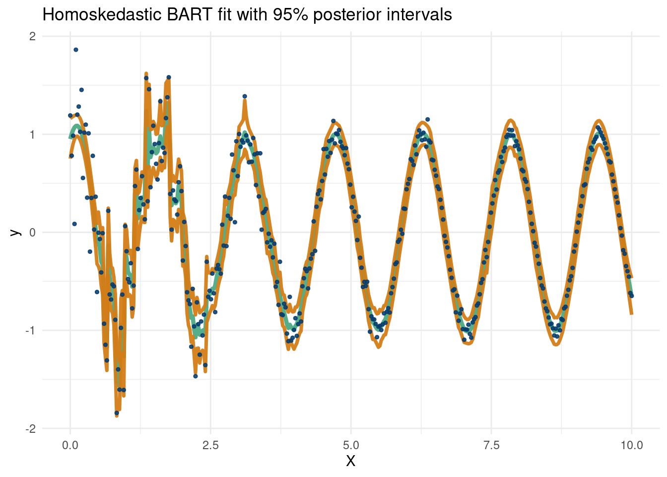
The assumption of normal and homoskedastic error does not always hold up well to scrutiny. There has been work to counter this, but in part because of these assumptions, BART 95% intervals do not always match the promises of a 95% interval. There are no theoretical frequentist coverage guarantees for Bayesian methods, but still we would like to see these intervals match the implied coverage.
Being a tree based methods, people will always mention the smoothness of the estimates. This is not really an issue, as BART estimates are practically smooth and asymptotically BART is a consistent estimator of a smooth function (He and Hahn 2023b). Nonetheless, if this is a concern, a BART like neural network (Linero 2022) or fitting Gaussian processes in the leaves of variables that are not split on (Starling et al. 2020) can provide some piece of mind. More in the summary chapter.
Finally, BART is computationally burdensome. A sum of many decision trees is a difficult posterior to explore, and mixing problems during the stochastic search are famously finnicky. (He and Hahn 2023a) develop XBART, an algorithm that builds trees based on the BART marginal likelihood that approximate the BART posterior fairly quickly. To return a valid Bayesian posterior19 the BART MCMC can begin at the initialized trees from the XBART algorithm, a procedure they call “warmstart” that is the default in stochtree’s BART implementation20. Additionally, individual trees are not statistically identified (as a sum of regression trees is still a regression tree), which in itself is not a huge concern, but could be annoying to people from a more parametric background. To those who are not, the plentitude of parameters in the BART model actually helps explain its remarkable predictive capabilities, inside and outside of sample, for a variety of data types.
19 Technically, this is because the XBART algorithm does not produce a reversible MCMC chain. More informally, the algorithm does not create a proper full conditional that would be necessary to sample the posterior space through a Gibbs sampling procedure, like the original BART MCMC, which updates the inidividuals trees through a Metropolis Hastings algorithm, and then passes them back into the Gibbs sampler.
20 Another nice feature of “warmstarting” is it allows for parallelization of multiple BART chains. That is, multiple BART forest posterior searches can be built on-top of the initialized XBART trees in parallel. Implementation is carried out in stochtree. Chains of MCMC samplers are useful because if one is not mixing well, you’re in trouble. Different chains will still likely get “stuck”, but probably in different areas of the posterior space. Thus, combining multiple independent chains lowers the chances of poor mixing overall and empirically has shown better coverage in simulation studies.
8.3.1 Bayesian CART vs CART
As we mentioned above, BART was built off the ideas of a single Bayesian tree. While this does not take advantage of the benefits of boosting and the associated Bayesian back-fitting algorithm, it is conceptually simpler.
Well that looks okay…but can we do better? What if we fit a regression function in each leaf? Recall, the default for a decision tree is to fit a constant basis in each leaf node, which means \(y\sim 1\) , meaning the coefficient on the vector of 1’s is just an intercept term. How about, being really stupid, we fit the following regression model in each leaf node: \(y\sim \sin(x)\) in each leaf node. So assume we know the exact equation…ya it’s dumb but just an illustration of a really cool feature in stochtree. A more interesting thing would be a Fourier basis, i.e. \(y \sim \beta_0+\sum_{i=1}^{m}\sin(2\pi i x)+\cos(2\pi i x)\), which you can find by editing \(W\) in the code below by passing the whole matrix as the input for \(W\) (where there are few random Fourier basis elements).
Click here for full code
suppressMessages(library(stochtree))n <-1000p <-10X <-matrix(runif(n*p, -pi, pi), nrow=n, ncol=p)X[,1] <-seq(from=-pi, to=pi, length.out=n)snr =4noise =sd(sin(X[,1]))/snry <-sin(X[,1]) +rnorm(n, 0, noise)# Set up a "Fourier basis"W =data.frame(X1=rep(1,n),X2 =sin(X[,1]), X3 =cos(X[,1]), X4 =sin(2*X[,1]), X5 =cos(2*X[,1]), X6 =sin(3*X[,1]), X7 =cos(3*X[,1]))W = W[,2]#X <- matrix(runif(n, -pi, pi), nrow=n, ncol=1)fit_1tree = stochtree::bart(X_train =as.matrix(X), y_train = y, X_test =as.matrix(X), leaf_basis_train =as.matrix(W), leaf_basis_test =as.matrix(W),mean_forest_params=list(num_trees =1))plot( X[,1], y, main='Single tree with leaf regression', col='#DA70D6', pch=16)lines( X[,1],rowMeans(fit_1tree$y_hat_test), main='Bayesian Tree MV_reg', col='#55AD89', pch=16, lwd=4)
8.3.2 From one tree to many…
This example is to show that a sum of trees is actually a pretty flexible model. This data is somewhere a Gaussian process would cook with almost no data, as we see below:
Click here for full code
suppressMessages(library(stochtree))suppressMessages(library(mvtnorm))eps <-sqrt(.Machine$double.eps) ## defining a small number# Following the exposition from Chapter 5 of Surrogates by Gramacyn <-50X <-matrix(seq(0, 10, length=n), ncol=1)dist_func =function(t,tprime){ dist =matrix(NA, nrow =length(t), ncol =length(tprime))for (i in1:length(t)){for (j in1:length(tprime)){ dist[i,j] = (t[i]-tprime[j])^2 } }return(dist)}n <-10X <-matrix(seq(0,2*pi,length=n), ncol=1)y <-sin(X)D <-dist_func(X,X)eps <-sqrt(.Machine$double.eps) ## defining a small numberSigma <-exp(-D +diag(eps, n)) ## for numerical stabilityXX <-matrix(seq(-0.5, 2*pi+0.5, length=100), ncol=1)DXX <-dist_func(XX,XX)SXX <-exp(-DXX) +diag(eps, ncol(DXX))DX <-dist_func(XX, X)SX <-exp(-DX)Si <- MASS::ginv(Sigma)mup <- SX %*% Si %*% ySigmap <- SXX - SX %*% Si %*%t(SX)YY <-rmvnorm(100, mup, Sigmap)q1 <- mup +qnorm(0.05, 0, sqrt(diag(Sigmap)))q2 <- mup +qnorm(0.95, 0, sqrt(diag(Sigmap)))matplot(XX, t(YY), type="l", col="#55AD89",lty=1, xlab="x", ylab="y", lwd=.5)lines(XX, mup, lwd=2); lines(XX, sin(XX), col='#073d6d')lines(XX, q1, lwd=4, lty=2, col='#d47c17');lines(XX, q2, lwd=4, lty=2, col='#d47c17')points(X, y, pch=20, cex=2.25,col='#DA70D6')
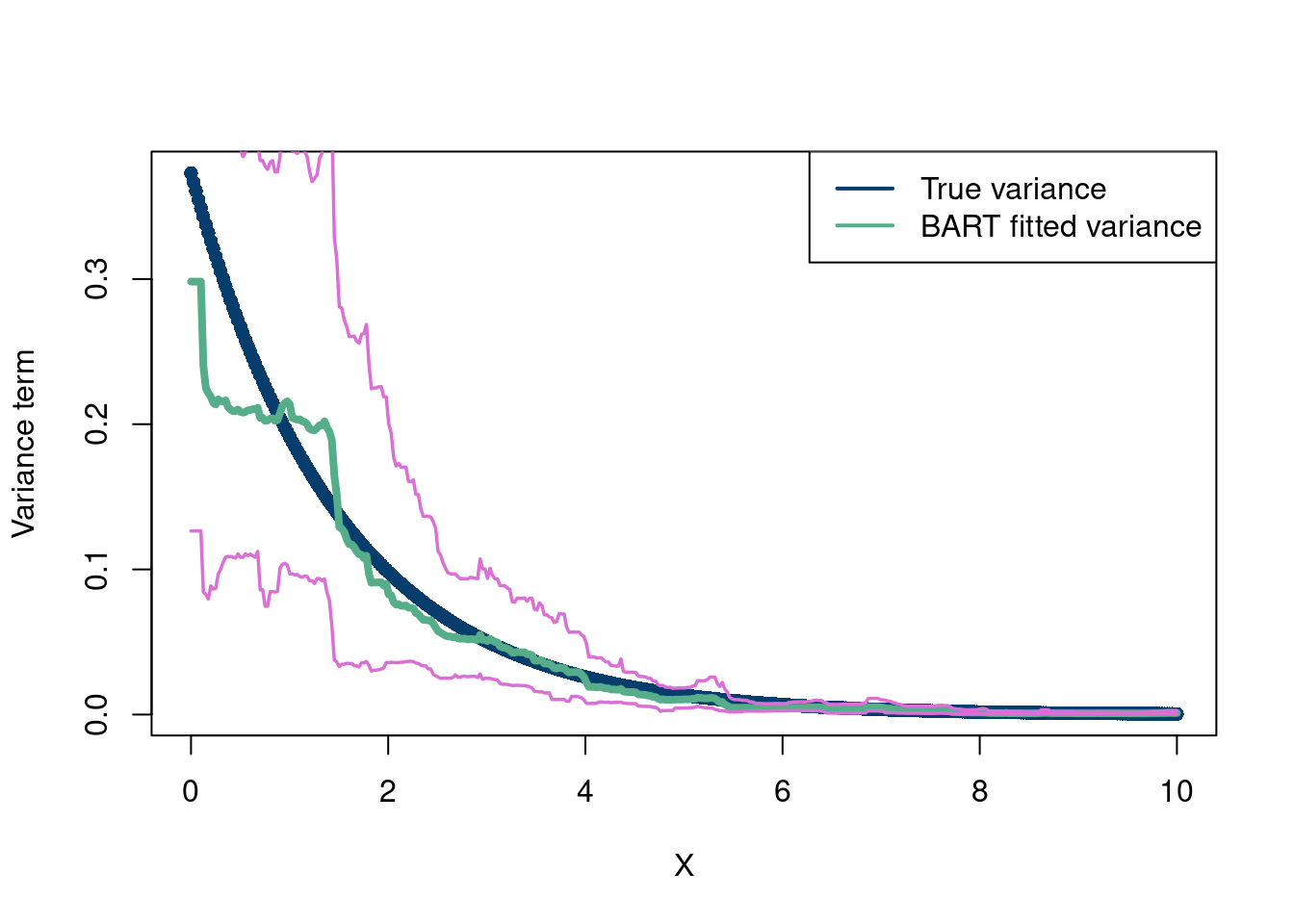
The Gaussian process (with the squared exponential kernel) regression does indeed cook. Of course it does. This is a smooth function with no noise. It is cool that it can work so well with so little data though. How about BART? Because we have so few data points, we make some modifications to the BART prior. We set the minimum samples per leaf=1, instead of 5, and make \(a=10\), \(b=0.25\), and \(q=0.99\), which make the prior on \(\sigma\) tighter, since the data also exhibit little signs of noise, so we want to emphasize that the data we see are signal and not noise. Otherwise, given how little data there are, it is unlikely BART will capture the function. We also use 200 trees since the observed function is very smooth.
Honestly not bad! The warmstart approach is helping here it seems (check for yourself if curious). This plot also shows a curious bug/feature about BART. In the absence of data (here in the extrapolation zones), BART is very conservative. This is because the output is the mean in the tree regions nearest to that zone, which are then a constant value (a different value in the different MCMC draws do to the leaf sampling that occurs). This is nice because it really hammers home the point that we tend to not want to predict where we do not have data. In the “summary” section, we will talk about a new paper which tackles the problem of extrapolation in BART models if you do want better extrapolation predictions.
Of course, we really care more about out of sample prediction on high dimensional, noisy data. Let’s take a look:
Correlation doesn’t imply causation, but it does
waggle its eyebrows suggestively and gesture
furtively while mouthing look over there.
Randall Munroe
It is a common refrain in statistics classes that “correlation does not imply causation”. A true statement, but not a particularly useful one. Some things obviously do cause others. In this section, we will explore how to study the effects of causes21. The term causal inference refers to studying how to do statistical inference for variables we deem to be “causal” of a response of interest.
21 Not to be confused with the causes of effects a much more difficult problem known as “causal attribution”.
22 We can look at similar students at non-Harvard graduates as a control group, and in fact this is the basic idea of many causal inference approaches that we will discuss in more depth later.
This is separate from problems where we care about associations or prediction. If we want to predict if someone will have a healthy salary, knowing that they went to Harvard will help us make those predictions. People who go to Harvard tend to make more money. But is it because they went to Harvard? If the average Harvard grad make $10,000 more a year than the average non-Harvard grad, does that mean going to Harvard will make an average person $10,000 dollars a year? No! There are factors that influence peoples entry and graduation from Harvard that also impact their career earnings. Perhaps admittance at Harvard is influenced by socioeconomic status, which plausibly also causes changes in earnings (people growing up wealthy are more likely to be wealthy as adults). So maybe it is not Harvard causing people to make more money, but rather higher future earners happen to attend Harvard. Students who do or do not graduate from Harvard are fundamentally different with respect to their potential career outcomes. The problem is confounded! We do not observe these people attend other universities directly and thus cannot conclude Harvard is the cause of their extra success22.
How about another toy example? Building intuition is important, particularly with a topic (causality studies) that is not commonly taught in college. Billy Bluetooth has a nice skincare routine in the high elevations of Santa Fe New Mexico. He forgets to bring his face-lotion down to Boston and notices a dropoff in skin softness. He tells all his friends that the face-lotion is magic. But he neglects to mention it works at 7,000 feet and maybe not at sea level. Certainly, we can predict Billy’s skin softness knowing his face-lotion usage, but cannot conclude it is the reason because it is always used at 7,000 ft! Perhaps the high altitude is causing the better face softness, and the lotion is only used at high altitude due to aviation rules for carrying liquids.
Okay, let’s get back to the task at hand. We want to formalize the causal inference problem and begin with common nomenclature. Specifically, we are interested in seeing how some “intervention”, or “treatment” causes some “outcome”. Sometimes this is really easy. Does dropping your phone in water cause it to break? Yes. There is a very obvious mechanism and outcome, and there are no other variables affecting this clear cut case. Let’s tackle a more challenging problem. Does the new toothpaste introduced by COLGATE reduce plaque buildup? There are a few ways to do this, the easiest being a randomized control trial. Randomly assign people to use either the new toothpaste or a placebo one. Compare their plaque after a few months (and hope they followed your instructions) and take the difference in average plaque in both groups. Because the groups are randomly assigned, the groups should be on average the same with respect to data that describe them.
But what if we do not have the means to perform an experiment? Say we have a new medicine (call it MED_NEW) designed to treat a disease (bad-newsitis). We do not have time to design an experiment and recruit people, so we give the medicine to those who ask for it at the hospital, or were recommended to take by their doctors. After 1 year, the trial results came out. People who took the medicine had a 20% mortality, whereas those who did not had a 5 percent mortality. Our calculation shows \[E(\text{mortality}\mid\text{medicine})-E(\text{mortality}\mid\text{no medicine})=20-5=15\]
Yikes, the medicine made the absolute difference in death 15 percentage points HIGHER! Something is wrong here, right?
If you answered yes, congratulations. The issue is we did not take into account the difference in populations who did and did not take the disease. Everyone who signed up to take the medicine was already at a fairly high mortality risk, say they had a 50/50 shot of dying before they took the medicine (their best odds in years). Those who did not sign up for the medicine did not do so because they knew they were not at risk from bad-newsitis, having only a 5 percent chance of mortality even without the fancy MED_NEW. That is, the people who took the disease took it because they were already at high risk. Therefore, the treatment assignment (who took the medicine/did not, where the medicine is the treatment) is confounded. There is a common cause for peoples decision to take the treatment as well as their outcome, muddling a naive difference between the two. To combat this requires counterfactual thinking. For each person, what would have happened if they had taken/not taken the medicine.
Unfortunately, we only observe one or the other. When there is a confounding situation like the one above, then we have to control for the various common causes and try to model the counterfactual potential outcomes of what we expect would have been the case in the absence/presence of treatment “all else equal” between the populations. For example, in the above case, we know that for the treated population, we expected them to have a mortality of 50%, which was reduced drastically by 30 percentage points to 20% with treatment. For the untreated, the low risk population, the treatment effect was 0, as the group on average had a 5% mortality with or without the treatment. Of course, in practice, we do not know the counterfactuals ahead of time, hence the need to estimate them (on average) by somehow controlling for all confounding information (and we’d also like to control for variables that affect the outcome but not the treatment status, see (P. Richard Hahn and Herren 2022)). This can be done through “matching” (making sure the comparison of treated and control groups only looks at similar groupings of individuals based on their confounding covariates) or direct regression adjustments, where the confounding/prognostic variables are “accounted” for in a regression setting. The most common way to do this is with linear regression with the treatment variable included in the \(\mathbf{x}\), but we will focus on the case where we want to model non-linearities and interactions amongst the variables in \(\mathbf{x}\), meaning we turn to machine learning models, particularly our old pal BART, whose use was spearheaded by (Hill 2011).
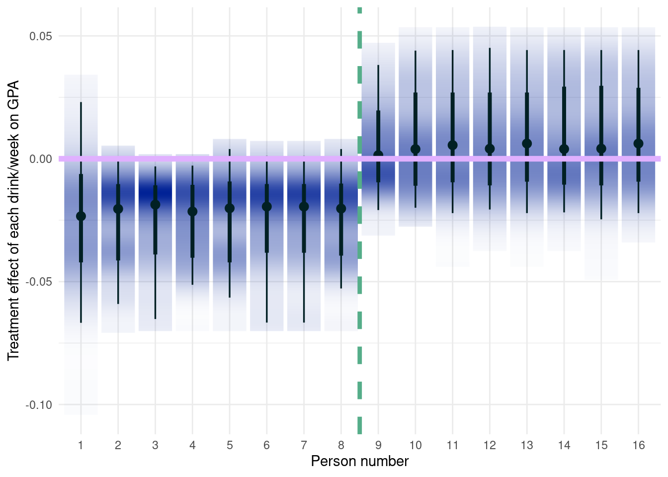
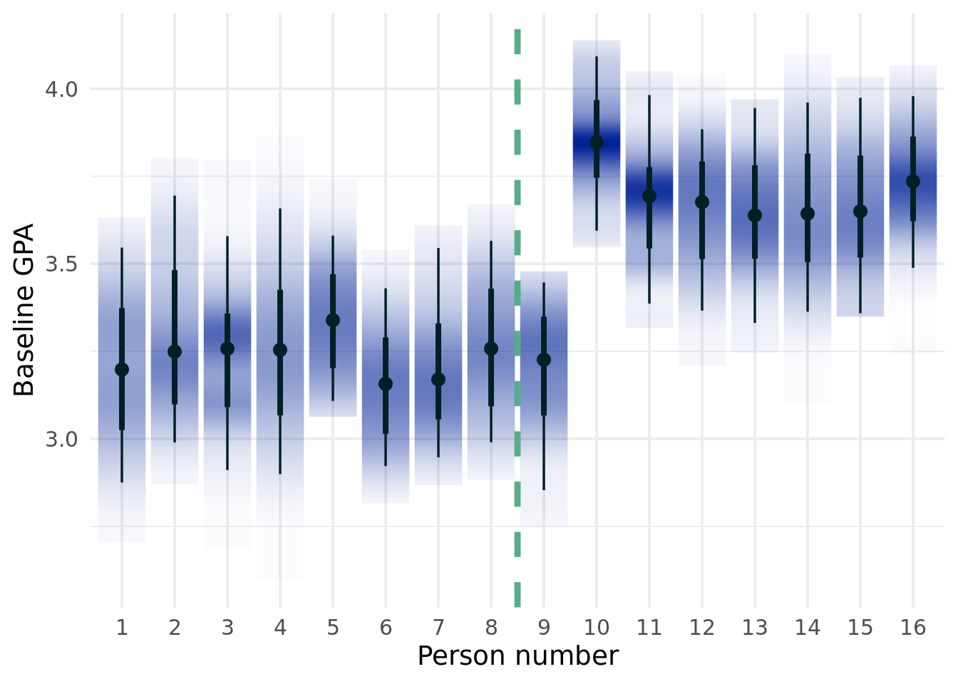
Below, we will show a brief simulated example highlighting the problem. Some terminology is due.
\(Z\)
The treatment effect variable
\(Y\)
The outcome of interest
\(\mathbf{x}\)
The covariates that constitute our confounding (common cause of both the treatment and outcome variables) or prognostic (causes of simply the outcome) variables that we will control for.
\(\pi(\mathbf{x})\)
The propensity score function. The probability of unit will be treated.
\(\tau(\mathbf{x})\)
The treatment effect.
\(\mu(\mathbf{x})\)
The prognostic effect. What would have happened (counterfactually, estimated for units who were and were not actually treated) if there had been no treatment (a baseline case)
Moderating effects
Variables that appear in \(\tau(\cdot)\), but not necessarily the propensity score. Moderating effects are impactful if the treatment effects are heterogenous.
Of course, there are scenarios where we can study the effects of a cause sans statistical inference techniques. If we have no reason to believe that there is confounding information between the treated and control groups (for example in an experiment), then we do not need causal inference. It is actually kind of hard to think of an example where we would expect pseudo-randomization in nature. One might be to look at the causal effect of daylights savings on traffic accidents. We could compare New Mexico and Arizona, which are probably similar in a lot of ways, but Arizona doesn’t do that daylight savings nonsense. Of course, drivers in New Mexico may be systematically different than Arizonans and are also well aware of the DST change due to public messaging.
The curious case of bollards. Keeping the morbid trend of studying automobile accidents, how about studying the causal effect of adding bollards to storefronts on reducing deaths (those are the things in front of store fronts that stop cars from accidentally driving into a store). If a bollard is 100% effective, then there is no question that it is causing a reduction in fatal accidents. Even if bollards are placed in more dangerous parking lots, which would indicate confounding, we would still be able to estimate the sign of treatment effect, since the bollards are 100% effective. The magnitude may still be wrong however (since the most dangerous areas were more likely to get the 100% effective bollards). So even though we know (hypothetically) that bollards are guaranteed to prevent a car from causing fatalities into a storefront, the estimate of how many lives it saves in the U.S. is confounded. So we still need to adjust for the systematic differences between which storefronts implements the bollards and which did not!
8.4.1 Another “fun” example
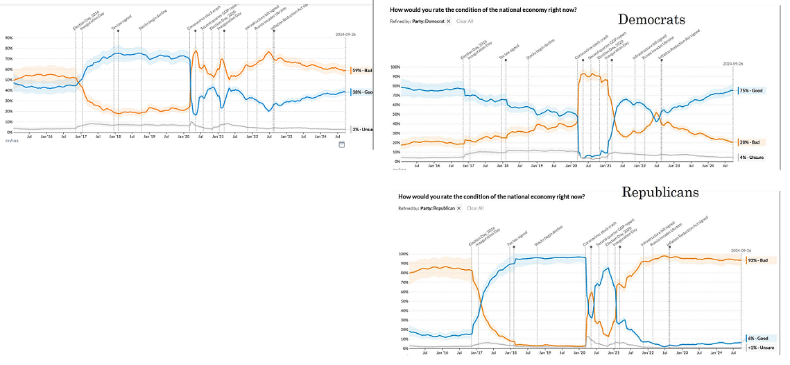
The figure below provides a misleading headline that really emphasizes why we need to “think causal”. Might there be something emotionally different about those who sleep earlier? I’d guess very likely yes. Kids who are less emotionally stable (genetically or due to environmental reasons) probably can’t fall asleep as easily, for example.
Welp
8.4.2 Structural models
You might ask about why people in applied math and physics consider their modeling “causal” if they are not using a lot of the methods we talk about above. How can this be?? Well, in those fields, modeling involves “structural models”. In contrast to “reduced form” models, which model systems purely in terms of observable variables, structural models include latent variables, see Richard Hahn’s post. The upshot of that is that a structural model, while defining everything in a system explicitly, does have a “trust me on this” vibe. These models construct latent, or unobserved variables, to define the system they are describing, which would be very beneficial in certain contexts where you are familiar with the underlying mechanisms, but generally requires a large leap of faith that cannot be verified with observed data! A nice approach is to build a “reduced form model”, estimate parameters based on observed data, and then map those estimates to the latent structural parameters, as in (Papakostas et al. 2023).
For a concrete example, in causal inference, we care about estimating potential outcomes, which as we discussed above are inherently un-observable (see the fundamental problem of causal inference (Holland 1986)). We can relate \(\underbrace{E(Y^1 - Y^0\mid Z)}_{\text{unobserved}} = \underbrace{E(Y\mid\mathbf{x}, Z=1)-E(Y\mid \mathbf{x}, Z=0)}_{\text{observables}}\). The right hand side are terms that can be estimated using standard regression techniques, as \(Y\), \(\mathbf{x}\) (the confounding variables), and \(Z\) are all measured.
In the physics world, structural parameters are the “causal” parameters in a model. So called structural models encode the couplings between variables explicitly. “Endogenous” variables are those that are caused by “exogenous” variables, and this relationship is explicitly specified. The relationships between the exogenous variables do not to be modeled. Basically, this is saying the confounders are accounted for when the model is written down.
A nice example of this is the SIR model. (Pell et al. 2023) develop a two-strain SIR, with a figure illustrating the dynamics of the model below. The equations they posit explain how the variables (\(S\), \(I_1\), \(I_2\), and \(R\)) interact with one another. Endogeneity is captured in the model formulation (i.e. the confounding is specified). In other words, the mechanism determining the outcomes (“treatment effects”) can be measured since the common causes of the mechanism that make it endogeneous are written down. The estimated parameters are thus “structural”, but unfortunately since they do not correspond to any observable quantity, there is no way to confirm them.
The SIR, and structural models in general, can be described as “prescriptive”. If we change this parameter, the outcome will behave in a certain way. If your “prescription” is right, aka the model specification, then this is great. However, the downside is that the model output is driven more by the formulation setup apriori then the data.
That leads us to a big catch. Structural models tend to stipulate strong assumptions about the data generating process. The SIR model carries strong assumptions, such as homogeneous mixing in a population. We also want to make sure the causal variable is actionable. In structural models, like the SIR, the causal parameter \(\beta\) isnt easy to understand in a practical sense. That is, translating some parameters of the SIR model is difficult; we might say “here’s the effects of reducing beta by 10%” but also what does reducing it by 10% even mean in real life. Beta is a weird catchall parameter that is harder to interpret than like, the recovery rate. More problematically, it is inherently something we cannot measure, so there is not really a verification.
Additionally, solving ODE’s can be difficult and parameters are unlikely to be identified. There is a lot of burden on really knowing how the variables relate, versus building a model off observables23. If you are willing to live with these issues, then this type of modeling is a good way to measure causal effects24.
23 Like in BCF where there are confounders \(\mathbf{X}\) which we estimate with an ML approach.
24 Perhaps spoiled by the rich data and modeling tools available to use, we argue that prioritizing learning from observed data is a preferable approach in causal inference. Of course, if the physics or biology of a model are feasibly known, like disease spread occurring when people contact one another (the SIR), then the structural approach may make sense. However, in a more complicated field that deals with human behaviour, designing a reasonable structural model is difficult. One could formulate such a model, but it will probably be difficult to estimate and have many assumptions. Such models, if estimated properly, provide immediate causal gratification. However, the if in that statement is doing heavy lifting.
So in summary, structural models have some appealing benefits. They offer a direct “causal” interpretation of the parameters. But there are some issues:
Structural models tend to be too prescriptive. This time, we are concerned that too much of the model’s potential behavior is set in stone from the setup of the model. The implied assumptions of the model can be too restrictive to model realistic behaviour.
Identification issues. There are some structural models that do not permit identification of the parameters in the model! This means we cannot estimate it the parameter reliably, since multiple values of the model give rise to the same distribution (see this nice stackoverflow question/answer exchange).
a) Structural identifiability: No matter how much data we have, we will never be able to uniquely determine a parameters value. Say \(y=ax_1+bx_2\). Now say that \(x_1\) and \(x_2\) are identical (or very nearly so). Then the model can be rewritten as \(y=(a+b)x_1\), meaning we cannot estimate the value of the parameter on \(x_1\) or \(x_2\) since there are infinite combinations that can work.
b) Practical identifiability: This refers to the scenario where we theoretically could estimate the parameters, but practically cannot due to issues with our estimator. Say we again have a linear regression model \(y=ax_1+bx_2+\varepsilon\). If \(\varepsilon\) implies a very low signal to noise ratio, or if we have a small sample size, or a large \(p\) (number of features) to \(n\) ratio for example, OLS estimators will not consistently estimate \(a\) or \(b\) well or the same value. The script below illustrates this.
Sensitivity to model mis-specification. Just because a model is mis-specified, does not necessarily mean you are in trouble. A big theme of these notes are to simulate if a method will hold up under less than optimal conditions, and when to know the limits of your model. Particularly troubling is when a model can still yield good fits to data even when mis-specified, but poor parameter estimates. In a prediction problem, this is less pernicious since we tend to only care about the conditional mean (aka the “signal”) and are not always interested in the meaning of the parameters. In causal or structural models, the causal implications of the parameters are vital. (Nikolaou 2022) (with link here) provide an interesting example of model specification issues . If the true data generating process is an SEIR model with a delay but the an SEIR is fit instead (with no delay), then the data can still be fit reasonably well. However, estimates of \(R_0\), of crucial importance to SIR based mod els and epidemiology writ large, can be too large by a factor of two (using standard fitting procedures)!
Even if 1) and 2) and 3) are not issues, it can be hard to translate the parameters into actionable insights. What exactly does lowering the contact rate by 10% mean in the real world?
8.4.3 What to control for?
We define some additional terms from the causal graph literature. This section should serve as a guide for when to adjust for what variables in applications.
Canonical causal graphs
Mediators are of the form \(Z\longrightarrow M \longrightarrow Y\). In this case, \(M\) is a mediator, such that the effect of \(Z\) on \(Y\) is impacted by an intermediate variable, \(M\). If we want to estimate the total effect of \(Z\) on \(Y\), then we do not want to control for mediators, as a mediator “blocks” the effect of \(Z\) on \(Y\). This means we will get what is often referred to as “overcontrol bias’’ (Cinelli, Forney, and Pearl 2021). Causal mediation analysis typically consists of calculating a total effect of a treatment variable on an outcome, both from”direct effects” (the effect of the treatment absent the mediator) and effects through the intermediary mediating variable path. Since we care about the effect absent the mediator meaning we have to do what we always do when we want to ignore a variable: average (or marginalize). This unfortunately means we have to integrate out the mediator.
Example: For a concrete example, suppose we are interested in studying the effects of concussions/injuries in teenage years on the probability of adverse health outcomes in one’s 20s. A mediating variable could be exercise level, as let us assume people with concussion history are less likely to exercise, which then could lead to adverse health outcomes. Controlling for exercise level to achieve conditional ignorability in this setting would be unwise. That being said, we would want to utilize causal mediation analysis tools to study the mediating effect of exercise (given high school injury history as a treatment) on adverse health outcomes.
Colliders (aka common effects)}: Conditioning on a collider induces an (unwanted) association between the variables with arrows pointing into the collider, as this introduces an unexpected bias called “collider bias’’ when estimating the treatment effect of \(Z\) on \(Y\). Example: This is the most difficult to conceptualize, but we aren’t weak. Let’s take the following example. Imagine in the general population there is no association with having lung cancer and having COVID-19. However, assume both cause inflammation in the lungs. Then, if we study a group of people who have inflammation, we would see an induced association between COVID-19 and cancer, even though there is not in the general population. Colliders are kind of a pain, because they are a big part of the reason you cannot just throw any variable you want into your regression to adjust for potential confounding.
Generally, do NOT condition on colliders. (Pearl 2009), (Pearl 2022) approach causal inference through a graph perspective. Pearl devised the “back-door criterion”, an algorithm to help guide choice of control variables if you can draw the plausible paths between variables. Satisfying the conditions of the algorithm yields the conclusion that the only association between \(Z\) and \(Y\) must be causal and not anything else. One big takeaway from Pearl’s work is that collider bias is problematic. Without going into the details of the back-door algorithm, conditioning on a collider (or varialbles influenced by the collider) alone results in failure to satisfy the back-door algorithm. We would need to condition on other variables that cause both the collider and the treatment and/or outcome. Interestingly, (P. Richard Hahn and Herren 2022) found that even when controlling for other variables that make including a collider okay, bias from machine learning regularization may still occur. (P. Richard Hahn and Herren 2022) also detail how machine learners can potentially “feature engineer” a collider from combinations of non-colliders.
Confounders, aka Forks, aka common causes: In our previous nomenclature, these are “confounders” \(X\) is a fork, and we want to condition on forks to allow us the possibility of causal interpretation of \(Z\) on \(Y\). We must control for these variables if we have them. Example: Common causes are probably the easiest to study. For example, if we want to study how drinking coffee affects productivity, we would want to presumably control for morning energy levels, as if you are low energy, you may be less productive, but because you are low energy you then would want to drink more coffee. This example could be flawed in that coffee levels may also effect energy levels, in which case we do not have an acyclic graph and the distinction between cause and effect is blurred, which would be problematic.
Another example is to that is has been found that people who sleep longer tend to die earlier. This is a classic example of an association not equating to a causation, and we know have the tools to understand why. The health status of a person influences how much they sleep, but it also influences the mortality of a person. Then, it is impossibly to disambiguate the effect of sleeping on mortality, unless we account for the health conditions that are common causes in some way.
Moderator: In contrast to a mediating variable (which is similar), the moderator is a variable that affects the direction and or magnitude of the treatment on the outcome. Example: A researcher is interested in studying the effect of blue-light glasses on sleep. They find that for people over 40, the effect is larger. The variable age is thus an effect modifier on the treatment (through its interaction with the treatment). Moderators appear in \(\tau(\cdot)\), as an effect on the treatment (and potentially a confounder, but not necessarily).
Instruments: An instrument is a variable \(D\) which affects \(Y\) only through its effect on \(Z\). We do not want to condition on an instrument as a control (due to variance inflation), although we can use instruments for a causal studies via instrumental variable regression, but that is its own beast (which we will not discuss in these notes). Example: The price of cigarettes in a state could be an instrument if the treatment is cigarette smoking percentage and the outcome is cancer rates. \(D\), the price of cigarettes in a state, is plausibly only associated with \(Y\) because of its effect on the smoking rate in a state.
Prognostic Variable: A variable that only affects the outcome, i.e. \(Z\longrightarrow Y\), \(P\longrightarrow Y\). This is something we want to control for in certain instances. While controlling for prognostic variables is not necessary for deconfounding, failing to account for strong prognostic variables can lead to estimates of \(\tau(\cdot)\) that have high variance (P. Richard Hahn and Herren 2022).
Example: If we do a traditional variable selection and choose a prognostic variable in place of a confounder (fork/common cause), we will bias our estimate via RIC (P. R. Hahn et al. 2016). However, if the prognostic variable is strongly associated with the outcome and we already controlled for confounders, controlling for prognostic variables can lower variance of estimates (P. Richard Hahn and Herren 2022)25. Example: When studying the effect of a state’s vaccination rate on their mortality rates (for example with COVID-19, the inherent severity of the disease certainly affects a states mortality rate, but is less likely to be associated with vaccination rates.
Noise variables: Variables that are related to neither the treatment or the outcome. Controlling for noise variables does not give us any additional information to satisfy the unconfoundedness assumption, so including these variables simply adds variance to any estimation.
25 However, controlling for both prognostic and instrumental variables can lead to a form of synthetic collider bias(P. Richard Hahn and Herren 2022)
(Cinelli, Forney, and Pearl 2021) provides some examples for what variable to control and which to not control for in certain graph situations, although this resource is not an exhaustive list.
What we need to control for (in the case where the confounding variables are independent) are variables \(\mathbf{x}\) that appear in the propensity function, \(\pi(\mathbf{x})\), and either, or both, of the treatment (\(\tau(\cdot)\))and prognostic function (\(\mu(\cdot)\)).
HOWEVER… a note of caution is warranted. Following (P. Richard Hahn and Herren 2022), we explore a scenario where the \(\mathbf{X}\) variables depend on one another. The example illustrates that just because variables are sometimes prognostic or instrumental, does not mean they are always! The figure below illustrates. Using Pearl’s backdoor criterion, a valid conditioning set can be \(\{X_1, X_4\}\)…or \(\{X_2, X_3\}\)…or \(\{X_1,X_2,X_3,X_4\}\) (amongst others). The point is that if the set is \(\{X_1,X_4\}\), then both \(X_1\) and \(X_4\) are confounding variables. But if the set of variables we are controlling for is \(\{X_1,X_2,X_3,X_4\}\), then \(X_1\) is an instrument and \(X_4\) is a prognostic variable. Generally, controlling for instruments is not a great idea, so including \(X_1\) is a bad idea even if it technically satisfies the back-door criterion.
From [@hahn2022feature].
8.4.4 Assumptions for causal effect identification
First, we mathematically denote a potential outcome as \(Y_i^1\) for the “treated” counterfactual and \(Y_i^0\) for the non-treated counterfactual. By the “consistency assumption”, we can write the observed outcome as \[Y_i = Y_i^1Z_i+Y_i^0(1-Z_i)\] This assumption stipulates that a unit’s potential outcome is determined through their treatment assignment, which assumes no “defiers” or “non-compliers” (individual units who do not follow their treatment assignment).
The average treatment effect is \[
\overline{\tau} = E(Y^1-Y^0)
\] and we make the following assumptions to identify this effect.
1. Conditional uncounfoundedness: This says that \(Y_i^1, Y_i^0\) are independent of \(Z_i\mid \mathbf{X}_i\) (equivalently, the treatment is independent of the potential outcomes if we control for the correct covariates, \(Z_i\text{ independent of }(Y_{i}^1,Y_{i}^0\mid \mathbf{X}_i)\) . To conceptualize this, consider first a randomized experiment. Say Riley, a businessman and avid reader, and Joe, a guitar player with a passion for stars, are placed into a trial studying the effect of a new toothpaste on plaque buildup. Based on a coin flip, Riley gets the new toothpaste, and Joe the control toothpaste. Knowing that Riley is using the new toothpaste offers no information as to what his potential outcome would have been had he not received the treatment, or how his plaque levels will react to the toothpaste, because of the random assignment. So Riley is not treated/not treated based on features that would confound the study, meaning the potential outcomes are not corrupted by “selected” treatments. Equivalently, his potential outcomes are not considered when he is assigned treatment. Of course, the observed outcome does depend on the treatment assignment through the potential outcomes (the consistency assumption). In the absence of randomization, we can consider the case where if we account for factors that would make treatment assignment more or less likely as well as those that affect the outcome, then knowledge of our treatment level should garner no insight into potential outcomes. For example, if we know that people who are older are more likely to take heart medicine because their age makes heart disease more likely, then conditioning on someone’s age can serve to deconfound. Knowing (and assuming age is the only confounding variable) someone’s treatment status, given we know their age, means we will not know how they will react to the treatment (or lack their of).
Positivity/overlap:\(0<\Pr(D_i=1\mid \mathbf{X}=\mathbf{x}_{i})\) for all \(x\in \mathcal{X}\). This is a common support (or overlap) assumption between the treated and untreated groups, that, if met alongside ignorability, satisfies the strong ignorability assumption.
Stable unit treatment value assumption: No interference between units in our study, i.e. \((Y^{1}_{i}, Y^{0}_{i})\) are independent of \(D_j\) for all \(i,j \in \{1,\ldots, n\}\) and \(i\neq j\). With this assumption, we now have \(2\) potential outcomes (for the binary treatment case) instead of \(2^n\). This is also known as SUTVA. Here is a nice blog post. Broadly speaking this implies no “interference”. The “consistency” assumption, stated previously, is typically included as part of the SUTVA, which states that different versions of the treatment don’t lead to different potential outcomes. A violation of this part could include drinking coffee as a treatment, but the coffee has wildly different quality which could impact the potential outcomes.
Of course, there are reasonable scenarios where all three of these may be violated.
The first assumption could be violated if we do not measure all variables that affect both \(D\) and \(Y\). The second assumption could be violated in scenarios where there is a possibility that an individual may never receive treatment or is guaranteed too. This assumption can be problematic because it is plausibly violated a lot. To borrow an example from Drew Herren, Richard Hahn, and Jared Murray, if a treatment effect is truly very large for elderly people and not useful for young people, then all older people will take the drug and few young people will take it, violating the overlap assumption. Another area where overlap is frequently violated is in “panel data” settings, where data lie on other sides of a cutoff (such as in regression discontinuity designs) or rely on studying one unit over time. An example is studying the true causal impact of a basketball player on team winning. It is often the case two players may never play together. If bench players play with weaker players, its not really fair to compare them with starters who play with a stronger cast for example. Overlap/positivity says the counterfactuals must at least be plausible, i.e. the treated/non-treated groups given some input covariates cannot be too different.
Finally, the third assumption is also at times violated. Imagine studying the impact of mask mandates on the spread of COVID-19 at the county level in Kansas in 2020. Plausibly, a mandate being instituted in one county could lower spread in an adjacent county, thus constituting a “spillover” effect and violating the SUTVA assumption.
8.4.5 Distinction between conditional average treatment effects (CATE) and individual treatment effects (ITE)
The CATE, \(E(Y\mid Z=1, \mathbf{X})-E(Y\mid Z=0, \mathbf{X})\) certainly can look like an individual treatment effect. However, they are different and confusing them will make you look like a fool! This is because \(\tau\), the average treatment effect, can be identified by controlling for all the confounding variables. However, there can be other variables that are either unobserved or not accounted for another reason that only effect treatment effect individually but not on average. From (P. Richard Hahn and Herren 2022), write
Taking the expectation will zero out the error terms (in this case unobserved variables that would point only into the outcome in the graphs above)26. In econometrics terms, \(\varepsilon_{y,\#}\) represents exogeneous (or non-confounded) variation. The takeaway is that the errors may be different for individuals if they are treated or not.
26(P. Richard Hahn and Herren 2022) also describe the case where the error terms are the same for both treated and untreated potential outcomes for a unit, in which case the ITE=CATE. They also describe a separate error term for the prognostic function and the treatment function. So there may be error in the prognostic function that is independent of the error in the treatment function.
As a conceptual example, say we control for all confounders, which in this case is just age. The treatment is having taken typing lessons and the outcome is speed of typing as an adult. Say in this hypothetical world, typing lessons became common around the time computers were more available for children. Then a person’s age would be a confounder, as they likely got typing lessons around the time they had access to computers. Therefore, we’d expect them to have taken typing lessons as a child growing up with computers, whereas an older person will have taken typing lessons after having little computer access prior in life.
We estimate the average treatment effect for our data to be \(10\), and a conditional average treatment effect for 27 year old Samantha to be \(4.5\). Unfortunately, we report Samantha’s ITE to be \(4.5\) to our boss. Our boss replies that we should have included gender and education and points us where to find these data. While gender and education are not confounding the problem27, we now include both variables and re-run our regression adjustment model. Getting a PhD impacts a student with previous typing lessons treated hypothetical differently than their untreated hypothetical, for whatever reason. Our average treatment effect is still \(10\), as expected, but now the CATE for a 27 year old woman with a PhD is \(8.5\)! But we had reported Samantha’s treatment effect as \(4.5\)…how can she have multiple treatment effects? Well, we messed up earlier that’s how. Now we have to send a follow email to our boss apologizing for confusing the concepts.
27 The oracle, who is us as authors, knows that those two variables are not confounders.
In code, here is an example of conducting a causal analysis where a naive estimate of the treatment effect will be badly biased.
As we can see, there is a strong selection effect, because as the propensity score increases, the prognostic score increases. They clearly depend on one another strongly! For an example, the people who were most likely to take the treatment who were most likely to have a high prognosis. This is indicative of strong confounding.
Assignment (8.1)
You can code a dgp with massive association and no causal effect and no association but a causal effect (contrary to the flip quote at the top of the section). Please come up with a simulated example for both scenarios. For the second task, where there is a causal effect between two variables but no association between them present in the data, look up “causal faithfulness” to help your simulation study.
This is a stylized example, to be sure, but does showcase things we need to be cautious of. So how should we approach this problem from a methodological point of view?
8.4.6 Bayesian causal forests (BCF)
We will focus on BART based approaches for causal effect estimation, which were spearheaded by (Hill 2011). That paper noticed that a BART prior could be used to model the treatment effect, \(\tau=E(Y\mid Z=1, \mathbf{x})-E(Y\mid Z=0, \mathbf{x})\). (Hill 2011) accomplish this by including the treatment variable alongside \(\mathbf{x}\) in a BART model, that is \(E(Y\mid Z, \mathbf{x})\), i.e. \(Z\) is included into \(\mathbf{x}\) which is “tested” on a dataset with \(Z=1\) and \(Z=0\), and the difference of those two models is the treatment effect. A different model is two train a BART (or any machine learning model) on the treated group of data and the control data separately, test on the data \(\mathbf{x}\) (not including the treated variable), and then take the difference of the expected value of each.
Unfortunately, using BART for causal inference is complicated further by regularization induced confounding(P. R. Hahn et al. 2016). This phenomenon is true of either approach outlined above. Basically, by using a machine learning method, which naturally includes regularization mechanisms to aid in reducing generalization error and to avoid overfitting between training and testing sets in prediction problems, actually leads to unexpectedly inaccurate (biased) results of the treatment effect.
The Bayesian causal forest (BCF) model of (P. Richard Hahn, Murray, and Carvalho 2020) addresses these issues. The paper tackles regularization induced confounding by including a propensity score estimate into the estimate of the treatment effects. It also specifies the following formulation:
\(\mu(\cdot)\) and \(\tau(\cdot)\) are estimated using BART priors. While \(\mu()\) and \(\tau()\) are estimated using the powerful BART model, this is still a linear model with \(\mu()\) representing the “intercept” and \(\tau()\), the “slope”, albeit now the intercept and slope are functions estimated non-parametrically from data. This formulation is important because it allows for separate priors to be placed on \(\mu()\) and \(\tau()\). This is valuable because typically the treatment effect is typically smaller and simpler than the prognostic effect28, and it already has an interaction baked in because it is multiplied by \(z\), so it is important to encode this prior information into the model.
28 If treatment effects were large or extremely complex, then policy analysis and drug studies would be conducted extremely differently. In particular, if a treatment effect were very large for everyone, then there probably would not be a lot of confounding, making causal inference methods sort of unnecessary. If the effect were exponentially effective for already at risk people, then overlap would be violated. So it goes.
With the BCF formulation, a more detailed explanation of how to mitigate RIC is warranted. In the case of strong selection effects, the propensity function and the prognostic function, \(\pi()\) and \(\mu()\) respectively, are strongly associated. People take a heart medication because they are worried about their heart health. Since \(\pi()\) is the function that returns the probability of \(z\) (being treated), then \(\mu()\) and \(z\) are associated. BARTs regularization priors (to whom it partly owes its stellar predictive track record), avoid deep trees to avoid overfitting. Splitting on \(z\) rather than the \(\mathbf{x}\) that determine \(\mu(\mathbf{x})\) can still help predict \(y\) well due to the association between \(\mu()\) and \(z\). The misattribution of the prognostic effect to the coefficient on \(z\) means the estimate of \(\tau\) is wrong (biased)!
The solution is to include \(\pi()\) as a covariate in the estimate of \(\mu()\). Since \(\pi()\) is a one dimensional summary, BART is far less likely to shy away from splitting on \(\pi()\) then it was on \(\mathbf{x}\)! If \(\mu()\) is only a function of \(\pi()\), this should be sufficient! If not, then we can write \(\mu(\mathbf{x},\pi(\mathbf{x}))\), the remaining effect of the \(\mathbf{x}\) in \(\mu(\mathbf{x},\pi(\mathbf{x}))\) should be able to be accounted for by BART since (ideally) the \(\pi()\) covariate is split on instead of \(z\).
The BCF model thus has two major contributions to the causal effect estimation literature. The first is a solution to mitigate RIC. The second is explicit regularization of the treatment effect, which being a contrast, is tricky to do with traditional S or T-learner approaches29.
29 S-learner: (Hill 2011). Include the treatment as a covariate in the training model, predict \(Y^1\) as if everyone were treated and \(Y^0\) as if no one were treated. That is \(\tau=Y^1-Y^0=f(\mathbf{x}, 1)-f(\mathbf{x},0)\) and \(Y_{\text{obs}}=zY^1+(1-z)Y^0\). \(f=\text{BART}(\mathbf{x},z)\) or any model you want, but BART is a good default. No explicit regularization on \(\tau\), even if we include the propensity score in the training of \(f\). Not directly regularizing the coefficient on \(z\) could lead to unpredictable bias due to BART “favoring” \(\mathbf{x}\) or \(z\).
T-learner: Train \(f_1=f(\mathbf{x}\mid z==1)\) and \(f_0=f(\mathbf{x}\mid z=0)\) and then \(\tau=Y^1-Y^0=f_1(\mathbf{x})-f_0(\mathbf{x})\). This is a high variance estimator because the tree splits are different in the two models, which can lead to overfitting.
30 The procedure to test this is to train a BCF model on \(M\) distinct Monte Carlo simulations of a data generating process. For each run, the covariates, \(\mathbf{X}\) are fixed, which consequently fixes the values of \(\mu(\mathbf{X})\), \(\tau(\mathbf{X})\),and \(\pi(\mathbf{X})\). For each Monte Carlo repetion, \(Z\) and \(\varepsilon\) are drawn anew (albeit with the same mean and variance for \(\varepsilon\) and the same \(\pi(\mathbf{X})\) for \(Z\)). Have a “hold out” set \(\tilde{\mathbf{X}}\) that has a large sample size (say about 10,000 or more) that we test the BCF model on (to make sure we are looking at population effects and not sample to sample differences). Both \(\mathbf{X}\) and \(\tilde{\mathbf{X}}\) are fixed before starting the Monte Carlo loop. The intervals for the average treatment effect are taking by taking the 0.025 and 0.975 quantiles across the posterior draws for \(\hat{\tau}\) (averaging across the individuals per posterior draw, meaning we have \(N_\text{posterior}\) draws of \(\hat{\tau}\), and then we count for each of the \(M\) Monte Carlo experiments (which are themselves individually Monte Carlo simulations) how often this interval contains the true \(\tau\). Ideally, 95/100 of these should. We should also look at the size of the intervals to ensure they are not too wide. We can also do a similar procedure for conditional average treatment effects. For each Monte Carlo draw, we would count how many of the \(x_i\) observations have BCF intervals that include the true treatment, which again should be 95% across all the draws, due to the nature of the noise term, \(\varepsilon\).
More colloquially, the BCF model says that the outcome is what would have happened with no treatment plus the treatment effect multiplied by whether or not the unit actually received the treatment. Together, the counterfactual for an individual with covariates \(\mathbf{x}_i\) is created; \(\mu(\mathbf{x}_i)\) is \(Y^{0}\) and \(\mu(\mathbf{x}_i)+\tau(\mathbf{x}_i)\) is \(Y^{1}\), or the potential outcome had the unit received the treatment. \(\tau(\mathbf{x}_i)\) is called the conditional average treatment effect, or the treatment effect for someone with those particular \(\mathbf{x}_i\). Because this is a Bayesian method, we get “automatic” uncertainty quantification for the treatment effects (based on the BART posterior samples). While Bayesian methods do not provide the same coverage guarantees as frequentist methods, BCF intervals tend to be pretty close to the truth in simulation studies30. Additionally, as we discussed above, BART has well known mixing problems, so that is another consideration for the researcher.
Because we never observe both counterfactuals, we never really know if a causal method “works” in the real world. Unlike out of sample validation with prediction problems, we have to rely on well thought out simulation studies conducted to get an idea how a method like BCF will play out in practice. Admittedly, this is a drawback of the field, and means we should always interpret results of a causal study with heavy scrutiny.
We will now show two fun examples with real data.
8.4.7 A binary treatment
We start with a binary treatment: whether or not having previous calculus experience caused students to have better grades in their economics course, from (Woolridge 2010) and the “wooldridge” R package. The tale here is one we’ve heard. Students who had already taken calculus likely also had other advantages which explain why they had already taken calculus and also could be the cause for why they had better grades in their economics course. Let’s see how this plays out:
Click here for full code
options(warn=-1)suppressMessages(library(readxl))suppressMessages(library(tidyverse))suppressMessages(library(stochtree))suppressMessages(library(RColorBrewer))suppressMessages(library(plotly))suppressMessages(library(gt))suppressMessages(library(ggdist))suppressMessages(library(wooldridge))data(econmath)X = econmath[,c("age", "work", "study", "econhs", "colgpa", 'hsgpa', 'acteng', 'actmth', 'act', 'mathscr', 'male', 'attexc', 'attgood', 'fathcoll', 'mothcoll') ]Z = econmath$calculusy = econmath$score# set up BCFnum_gfr =10num_burnin =0num_mcmc =100pi_train =bart(X,0.25*(2*as.numeric(Z) -1))pi_train =rowMeans(pnorm(pi_train$y_hat_train))bcf_model_warmstart =bcf(X_train = X, Z_train = Z, y_train = y, #propensity_train = pi_train, num_mcmc=num_mcmc,num_gfr = num_gfr, num_burnin = num_burnin, prognostic_forest_params=list(sample_sigma2_leaf = F, verbose=T), treatment_effect_forest_params=list(sample_sigma2_leaf = F, verbose=T))# Plot how strong the confounding is:ggplotly(data.frame(mu =rowMeans(bcf_model_warmstart$mu_hat_train),propensity = pi_train, Z =as.factor(Z))%>%ggplot(aes(x=mu, y=propensity, color=Z))+geom_point()+labs(col='Calculus previously')+xlab('Baseline score without calculus')+ylab('Probability of taking calculus')+scale_color_manual(values =c('#080E4B', '#D4A017'))+theme_minimal())
Cool.
Below, we see some strong selection effects, because people with a higher propensity score (meaning they have a higher probability of having taken calculus before) also were the students who would have done better in the class even if they had not taken calculus before. The plot is basically showing the students who would have done better in the class anyways had the leg up of already having taken calculus.
Click here for full code
# See how well we return y = mu+tau*Zplot(pi_train, rowMeans(bcf_model_warmstart$mu_hat_train), pch=16)
We can also look at how well the BCF model returns the true \(Y\).
Click here for full code
# See how well we return y = mu+tau*Zplot(y, rowMeans(bcf_model_warmstart$y_hat_train), pch=16)
How does this compare to a linear model estimate and the naive estimate?
Finally, let’s look at the strongest and weakest treatment effects and see their posteriors.
Click here for full code
# Top 8 most detrimental on GPA worst =order(rowMeans(bcf_model_warmstart$tau_hat_train))[1:8]best =order(rowMeans(bcf_model_warmstart$tau_hat_train))[(nrow(econmath)-7):nrow(econmath)] p3 =data.frame(mu =c(bcf_model_warmstart$mu_hat_train[c(worst),]), tau =c(bcf_model_warmstart$tau_hat_train[c(worst),]), post_int =as.factor(rep(seq(from=1,to=8), num_mcmc)), Z =as.factor(rep(Z[c(worst)], num_mcmc)))%>%ggplot(aes(x=post_int, y=tau, color=Z))+ ggdist::stat_dotsinterval( dotsize=3,stackratio=.5, fatten_point=1.5)+geom_hline(yintercept=0, lwd=1.25, color='#55AD89')+# geom_vline(xintercept=8.5, lwd=1.25, lty='dashed',color='#55AD89')+scale_color_manual(values=c('#012296', '#FD8700'), labels=c('No', 'Yes'))+ylim(c(-10,15))+xlab('Person number')+ylab('Effect of calculus experience on econ final grade')+ggtitle('Least impacted')+theme(plot.title=element_text(hjust=0.5, size=12))+theme_minimal() p4 =data.frame(mu =c(bcf_model_warmstart$mu_hat_train[c(best),]), tau =c(bcf_model_warmstart$tau_hat_train[c(best),]), post_int =as.factor(rep(seq(from=1,to=8), num_mcmc)), Z =as.factor(rep(Z[c(best)], num_mcmc)))%>%ggplot(aes(x=post_int, y=tau, color=Z))+ ggdist::stat_dotsinterval( dotsize=3,stackratio=.5, fatten_point=1.5)+geom_hline(yintercept=0, lwd=1.25, color='#55AD89')+# geom_vline(xintercept=8.5, lwd=1.25, lty='dashed',color$='#55AD89')+scale_color_manual(values=c('#012296', '#FD8700'), labels=c('No', 'Yes'))+ylim(c(-10,15))+xlab('Person number')+ylab('Effect of calculus experience on econ final grade')+ggtitle('Most impacted')+theme(plot.title=element_text(hjust=0.5, size=12))+theme_minimal() gridExtra::grid.arrange(p3,p4, nrow=1)
Click here for full code
p1 =data.frame(mu =c(bcf_model_warmstart$mu_hat_train[c(worst),]), tau =c(bcf_model_warmstart$tau_hat_train[c(worst),]) , post_int =as.factor(rep(seq(from=1,to=8), num_mcmc)), Z =as.factor(rep(Z[c(worst)], num_mcmc)) )%>%ggplot(aes(x=post_int, y=mu, color=Z))+ggdist::stat_dots( dotsize=3,stackratio=.5, fatten_point=1.5)+scale_color_manual(values=c('#012296', '#FD8700'), labels=c('No', 'Yes'))+#geom_vline(xintercept=8.5, lwd=1.25, lty='dashed',color='#55AD89')+ ylim(c(40,90))+xlab('Person number')+ylab('Baseline GPA for the least impacted students')+ggtitle('Least impacted')+theme(plot.title=element_text(hjust=0.5, size=12))+theme_minimal(base_family ="Roboto Condensed", base_size =14)p2 =data.frame(mu =c(bcf_model_warmstart$mu_hat_train[c(best),]), tau =c(bcf_model_warmstart$tau_hat_train[c(best),]) , post_int =as.factor(rep(seq(from=1,to=8), num_mcmc)), Z =as.factor(rep(Z[c(best)], num_mcmc)) ) %>%ggplot(aes(x=post_int, y=mu, color=Z))+ggdist::stat_dots( dotsize=3,stackratio=.5, fatten_point=1.5)+scale_color_manual(values=c('#012296', '#FD8700'), labels=c('No', 'Yes'))+#geom_vline(xintercept=8.5, lwd=1.25, lty='dashed',color='#55AD89')+ ylim(c(40,90))+xlab('Person number')+ylab('Baseline effect for the most impacted students')+ggtitle('Most impacted students')+theme(plot.title=element_text(hjust=0.5, size=12))+theme_minimal()gridExtra::grid.arrange(p1,p2, nrow=1)
Click here for full code
# Look at the most and least impacted people data.frame(tau=rowMeans(bcf_model_warmstart$tau_hat_train)[c(worst,best)],econmath[c(worst,best),] ) %>%# mutate(id=seq(from=1, to=16))%>%gt() %>%data_color(columns=vars(tau), colors=c('#E0B0FF', '#f9f8fa'))
tau
age
work
study
econhs
colgpa
hsgpa
acteng
actmth
act
mathscr
male
calculus
attexc
attgood
fathcoll
mothcoll
score
id
0.5166332
20
0
4.0
0
2.4464
2.463
16
19
17
10
1
1
0
1
1
1
61.48
1
0.6262052
19
0
2.0
0
2.3214
2.911
27
28
29
6
1
1
0
1
1
1
63.11
2
0.6325383
21
0
12.0
0
1.9607
2.510
15
16
18
5
1
1
0
1
1
1
47.66
3
0.6704896
21
15
40.0
0
2.6057
2.650
23
29
25
7
1
1
0
1
1
1
74.59
4
0.6734598
19
0
10.0
0
2.3928
3.586
29
29
26
8
1
1
0
1
1
1
66.41
5
0.6908571
20
10
6.0
0
2.0769
2.778
15
21
15
9
1
1
0
1
1
1
44.53
6
0.6988868
19
0
20.0
0
1.4666
3.150
24
19
22
6
1
0
0
1
1
1
46.72
7
0.7071371
19
0
2.0
0
3.8448
3.714
31
28
31
10
1
0
0
1
1
1
94.53
8
6.0128322
19
8
22.5
1
3.6607
3.575
27
21
23
9
0
0
1
0
0
0
79.51
9
6.0223927
20
8
6.0
1
3.2968
3.744
22
22
22
9
0
0
1
0
0
0
86.72
10
6.0317682
19
0
20.0
1
3.5000
3.810
25
28
25
9
0
1
1
0
0
0
82.03
11
6.0328158
19
0
10.0
1
3.4833
4.000
NA
NA
NA
8
0
0
1
0
0
0
70.49
12
6.0377034
20
36
12.0
1
3.6290
3.850
21
19
22
7
0
1
1
0
0
0
75.00
13
6.0664912
19
10
15.0
1
3.7321
3.865
24
26
25
10
0
1
1
0
0
0
83.61
14
6.1414037
18
5
14.0
1
3.4464
3.500
21
19
23
9
0
1
1
0
0
0
95.31
15
6.1425521
20
13
5.0
1
3.2954
4.021
24
24
24
8
0
1
1
0
0
0
79.51
16
8.4.8 A continuous outcome
The data here look at the effect of the number of drinks of alcohol per week have on a students GPA, from (Onyper et al. 2012) &
The difference here is the treatment is continuous (the effect of 1 more drink per week on GPA). Luckily, Drew Herren’s stochtree package accommodates this change! We add one section here and fit a tree to the treatment effects to see which subgroups of our covariates have the largest effects (a clever way of looking at treatment effect moderation from (Woody, Hahn, and Murray 2020))
# Plot intervalsqm2 =apply(bcf_model_warmstart2$tau_hat_train,1, quantile, probs =c(0.025, 0.975))DF2 =data.frame(mu=rowMeans(bcf_model_warmstart2$mu_hat_train), tau =rowMeans(bcf_model_warmstart2$tau_hat_train), LI = qm2[1,], UI = qm2[2,], Z=Z2) myPalette =colorRampPalette(rev(brewer.pal(11, 'PuOr')))#ggplotly( DF2 %>%ggplot(aes(x=mu, y=tau, color=Z))+geom_errorbar(aes(ymin=LI, ymax=UI), color='#55AD89', width=0.01, size=1, alpha=0.75)+geom_point(size=2.25)+scale_colour_gradientn(colours=myPalette(24), limits =c(0,24))+geom_smooth(color='#FD8700', method='lm', se=F)+xlab('Baseline GPA with no drinks')+ylab('Effect of 1 drink per week on GPA')+theme_minimal()
`geom_smooth()` using formula = 'y ~ x'
Click here for full code
#)DF2%>%ggplot(aes(x=tau))+geom_histogram(aes(y=..count../sum(..count..)),fill='#012024', bins=40 , color='white')+geom_vline(aes(xintercept=mod_lin$coefficients[2]), color='#55AD89', lwd=2)+ylab('Density')+ggtitle('BCF conditional average treatment effects (CATE), green line is linear estimate')+theme_minimal()
Click here for full code
# Top 8 most detrimental on GPAworst2 =order(rowMeans(bcf_model_warmstart2$tau_hat_train))[1:8]best2 =order(rowMeans(bcf_model_warmstart2$tau_hat_train))[(nrow(data)-7):nrow(data)]data.frame(mu =c(bcf_model_warmstart2$mu_hat_train[c(worst2,best2),]), tau =c(bcf_model_warmstart2$tau_hat_train[c(worst2,best2),]), post_int =as.factor(rep(seq(from=1,to=16), num_mcmc)), Z =as.factor(rep(Z2[c(worst2,best2)], num_mcmc)))%>%ggplot(aes(x=post_int, y=tau, label=Z, color=Z))+ggdist::stat_gradientinterval(fill='#012296', color='#012024')+geom_hline(yintercept=0, lwd=2, color='#E0B0FF')+geom_text(y=0.075,check_overlap = T, color='#012024')+geom_vline(aes(xintercept=8.5), color='#55AD89', lwd=1.55, lty='dashed')+xlab('Person number')+ylab('Treatment effect of each drink/week on GPA')+theme_minimal()
The final two plots are split with the green dashed line. To the left are the 8 people with the smallest treatment effects, and to the right are those who were most impacted.
8.4.9 A short note on treatment effect heterogeneity
We explored the idea that the treatment effect can vary for people with different covariates. The picture below is an interesting plot exploring the differences in the effect of “Inauguration Day” on views of the U.S. economy for American adults. There is an obvious discontinuity for both Republicans and Democrats on their economic views, but in opposite directions.
Also an illustration of Simpson’s paradox.
Assignment (8.2)
From the photo above (found here from civiqs), “digitize” the data using this web-digitizer link. This is a way to convert an image to data points. These are rich data, and can be studied in a lot of ways.
Several universities in the 90’s and 2000’s “gamed” the US news ranking system. That is, they guessed the outcome of interest that U.S. news valued in their college ranking system and predicted where they’d end up given their surrogate model of the US news equation. Perhaps they even isolated a treatment variable of interest, estimated its value, and performed inference on that estimate. For now, let’s just focus on predicting where our university of interest would rank in the U.S. news output31.
In the dataset “colleges.csv” (sourced from (Gareth et al. 2013), with link here), covariates about U.S. schools from U.S. news 1995 rankings are given, but no outcome. Since we don’t know the outcome, come up with your own equation and see if you can predict it properly out of sample using BART! Make a complicated function and do some research on the gaming and make a quick fun presentation.
These data provide an interesting precursor to chapter 10. We could probably cluster the data with obvious clusters for expensive private schools and cheaper public schools. But perhaps that is not what US news cared about. Maybe their clustering to predict school quality favored cheaper private schools and expensive public schools as indicators of a “good school”, whereas cheaper public schools and expensive private schools were rated lower. The point is, the clustering algorithm is agnostic to the U.S. news outcome, which is really what we care about if we want to predict where our hypothetical school would rank. We care about \(y\mid \mathbf{x}\), not just \(\mathbf{x}\).
31 The causal question would certainly be more interesting. For example, cutting our tuition 5% will increase our score by 10 points in the U.S. news outcome, corresponding to a 10 school rank increase. The prediction perspective doesn’t permit us to say a change in the tuition will change the outcome by this much. Barring controlling for an exhaustive list of confounders, a careful consideration of the causal graph structure, and designating a treatment variable to vary while holding “all else equal”, we cannot conclude causation from any one variable. That is, we can predict different outcomes for hypothetical Arizona State University (with new covariates across the board) vs real Arizona State University, but cannot attribute those differences to a difference in tuition in the hypothetical new school. While new ASU is a counterfactual, we cannot say how much any of the changes in each of the covariates impacted the results. However, if all we care about it what we expect to see given our new covariates, then this is a fine approach.
8.5 Heteroskedastic BART
So far we have assumed that the error term, \(\sigma^2\), is constant in the BART model. What if that were not the case? This could be problematic for a couple reasons.
If we do account for \(\sigma^2\) to vary, we may see problems in the estimation of the mean function, the bread and butter we promised that BART would deliver.
Additionally, the solid uncertainty quantification that usually accompanies BART could be poor if the error (noise term) were mis-specified. The posterior predictive intervals could be poor, in addition to the degradation of the mean function estimate.
If \(\sigma^2\) were a function of \(\mathbf{x}\), this is potentially of interest in its own right. We may ahead of time except heteroskedacity for some variables, i.e. \(\sigma^2=\sigma^2(\mathbf{x}_{\text{subset}})\). For this reason, stochtree actually allows different \(\mathbf{x}\) to potentially be used for the variance forest and the mean forest (like with the prognostic and treatment forests in the BCF model), which could be useful in allowing the researcher to bestow further prior knowledge on the problem. Or, finding where heteroskedacity might exist could be of scientific/use case interest and is greatly aided by a model like BART over searching with the eye.
The following code illustrates how to use the heteroskedastic BART specification with stochtree. The data arise according to the following DGP:
where \(x\) is an evenly spaced grid from 0 to 10. We will fit \(y\mid x\) with a regular BART model and one with a mean and variance forest, where the variance forest is modeled with a log-normal BART prior. Stochtree utilizes the work of (Murray 2021) who model the log of the outcome (in this case the variance (\(\sigma^2\)) by a sum of trees. That is:
Where \(s_i\) is a tree model with the leaf parameter parameterized by an inverse gamma prior on the exponentiated mean value in the leaf. That is, each tree considers the log of the observations that fall in the bottom leaf nodes “buckets”, i.e.
In other words, take the mean of the values in each bucket of the bottom leaf nodes. The indicator function allows this, since it multiplies observations in a bucket by 1, otherwise multiply by zero so they disappear from the sum. The prior on \(\mu_{\ell}\) is modified from the previous BART approach. Now, \(\mu_{\ell}\sim \text{Inverse Gamma}(a,b)\) and Now, \[
s_{i}(\mathbf{x}_{i})=\sum_{\ell \in \text{leaf nodes}}\mathbb{1}\{\mathbf{x}_{i}\in \ell\}\log(\mu_{\ell})
\]
This is particularly useful for modeling the variance term with a log-linear BART prior, since the variance must be greater than 0, that is: \(\sigma^2(\mathbf{x})>0\). A log transform of the outcome means we are then modeling \(\log(y) = f(x)+\sigma^2\) (here with BART estimates for \(f(\mathbf{x})\) and \(\sigma^2\)), which would imply \(\log(y)\sim N(f(\mathbf{x}, \sigma^2)\). Exponentiating back means \(y=\exp\left(f(\mathbf{x}+\sigma^2)\right)\), which in turn implies that \(y\sim \text{lognorm}(f(\mathbf{x}), \sigma^2)\). While this seems much easier to model (just use rlnorm(BART(x), HETBART(x))), we cannot have our cake and eat it too. We need \(\sigma^2\) to be positive, not \(y\).
All of this to say that we need a modified BART to consider a likelihood when splitting that ensures only possitive outcomes. The log-linear formulation allows this and is a feature of stochree. Placing a BART prior on \(\sigma^2(\mathbf{x})\) can account for dependence of \(\sigma^2\) on \(\mathbf{x}\). Here is an arxiv link of this excellent paper. (Pratola et al. 2020) also model heteroskedasticity in \(\sigma^2\) using multiplicative trees (which are also constrained to be greater than 0 since they are multiplied together).
For the sake of it, we include a multivariate leaf regression. The data look fairly smooth, so we may as well. We include a “Fourier basis” and a “radial basis function” in the leaves by including an intercept term a bunch of different multiples on the inside of either sins/cosines (Fourier), or exponential functions (radial basis). See the code for a clearer example of this (the W_fourier and W_radial functions). A base BART approach probably makes more sense here, but from a visual inspection the data look fairly smooth and periodic, so the Fourier leaf regressions don’t seem too extreme. The sufficient statistics used to evaluate splits in the presence of a multivariate regression in the leaves with heteroskedastic error were derived and included in the stochtree implementation. Anyways, let’s just try it and see what comes of it. We compare the results of fitting a homoskedastic and heteroskedastic BART below. One thing to note is that since we are doing a leaf regression, we set the minimum number of leaves in the mean forest to be 20, so that the regressions in the leaves do not have to small a sample size.
Comparing heteroskedastic to non-heteroskedastic BART outputs in presence of noise truly depending on x’s.
Comparing heteroskedastic to non-heteroskedastic BART outputs in presence of noise truly depending on x’s.
plot2_homosked
Comparing heteroskedastic to non-heteroskedastic BART outputs in presence of noise truly depending on x’s.
#ggplotly(plot2_homosked)
The orange lines indicate 95% posterior intervals for the function posterior and the green dashed lines represent the conditional mean estimates. Of course, this is driven by the changes in trees in addition to the error term, but the heteroskedastic forest gives significantly better uncertainty quantification.
Now, we show the code to replicate the above analysis in an interactive Shiny app to illustrate this example. We follow this stackoverflow answer. The app works by allowing the user to drag the points they care about and see the distribution of the variance term! Some notes:
The shiny app might be quite slow.
For the homoskedastic BART model, the posterior draws of \(f(\mathbf{x})=E(y\mid \mathbf{x})\) still exhibit some covariate dependence on \(\mathbf{x}\) since the trees vary from MCMC draw to draw. Due to the variation in the forests (which are randomly sampled every iteration), BART uncertainty intervals may not be fully constant, even if \(\sigma^2\) is modeled as a constant.
expand for full code: not run
options(warn=-1)suppressMessages(library(tidyverse))suppressMessages(library(dplyr))suppressMessages(library(stochtree))suppressMessages(library(Cairo)) # For nicer ggplot2 output when deployed on LinuxsuppressMessages(library(shiny))# https://stackoverflow.com/questions/32251987/interactive-hovering-shiny-graphsui <-fluidPage(fluidRow(column(width =8, class ="well",h4("Drag box to see different estimated variance distributions. Double click to reset"),radioButtons("which_model", "Display:",c('Heteroskedastic BART', 'Homoskedastic BART'),selected ="Heteroskedastic BART",inline =TRUE ),# Heteroskedastic BARTconditionalPanel(condition ="input.which_model == 'Heteroskedastic BART'",fluidRow(column(width =6,plotOutput("plot2", height =300,brush =brushOpts(id ="plot2_brush",resetOnNew =TRUE ),#add the hover optionshover =hoverOpts(id ="plot2_hover",nullOutside =TRUE ) ) ),column(width =6,#the second plot will be hidden if the user's mouse is not on the first oneplotOutput("plot3", height =300) ) ),fluidRow(plotOutput('plot4')) ), # end condition of heteroskedastic# Homoskedastic bartconditionalPanel(condition ="input.which_model == 'Homoskedastic BART'",fluidRow(column(width =8,plotOutput("plot2_homosked" ) ) ) ) # end condition of homoskedastic ) ))server <-function(input, output) { ranges2 <-reactiveValues(x =NULL, y =NULL) num_gfr <-20 num_burnin <-200 num_mcmc <-500 num_samples <- num_gfr + num_burnin + num_mcmc N =400 X =seq(from=0, to=10, length.out=N) var_term = .5*exp(-X/3+0.2)#rev(X*sin(2*X)^2+0.05)/3#plot(var_term, type='l', col='#073d6d', lwd=2,# xlab='X', ylab='Variance term') y =1*cos(4*X)+rnorm(N, 0, var_term)#plot(X, y, pch=16, col='#073d6d')# Fourier basis W_fourier =cbind(rep(1,N), sin(X), cos(X),sin(X/4), cos(X/4),sin(X/2), cos(X/2), sin(2*X), cos(2*X), sin(4*X), cos(4*X) )# Radial basis function W_radial =cbind(rep(1,N), exp(X^2),exp((-X)^2), exp((-2*X)^2),exp((-3*X)^2),exp((-4*X)^2), exp((-X/2)^2),exp((-X/3)^2), exp((-X/4)^2) ) bart_params_mean =list(num_trees =50, alpha_mean =0.95, beta_mean =2,min_samples_leaf =5,sample_sigma2_leaf = F) bart_params_variance =list(num_trees =20, alpha =0.95, beta =1.25,min_samples_leaf =5) bart_model_warmstart <- stochtree::bart(X_train =as.matrix(X), y_train = y, X_test =as.matrix(X),leaf_basis_train =as.matrix(W_fourier), leaf_basis_test =as.matrix(W_fourier),general_params =list(sample_sigma2_global = F),mean_forest_params=bart_params_mean,variance_forest_params = bart_params_variance,num_gfr = num_gfr, num_burnin = num_burnin,num_mcmc = num_mcmc ) bart_model_warmstart_homosked <- stochtree::bart(X_train =as.matrix(X), y_train = y, X_test =as.matrix(X),leaf_basis_train =as.matrix(W_fourier), leaf_basis_test =as.matrix(W_fourier),mean_forest_params = bart_params_mean,num_gfr = num_gfr, num_burnin = num_burnin,num_mcmc = num_mcmc ) output$plot4 <-renderPlot({ plot(X,var_term, type='l',lwd=2, col='#073d6d',ylab ='Variance term')lines(X,rowMeans(bart_model_warmstart$sigma2_x_hat_test),col='#55AD89', lwd=4)legend('topright', c('True variance', 'BART fitted variance'), col=c('#073d6d','#55AD89'),lty=c(1,1), lwd=c(2,2)) }) yhats <- bart_model_warmstart$y_hat_train[, num_burnin:num_mcmc] + bart_model_warmstart$sigma2_x_hat_train[,num_burnin:num_mcmc]*rnorm(length(X)*(num_mcmc-num_burnin)) qm =apply(yhats,1, quantile,probs=c(.025,.975)) df =data.frame(X=X, y = y,bart =rowMeans(bart_model_warmstart$y_hat_test[, num_burnin:num_mcmc]),LI = qm[1,],UI = qm[2,]) output$plot2 <-renderPlot({ggplot(df, aes(x=X, y=y)) +geom_line(aes(x=X,y=bart), color='#55AD89', lwd=2)+geom_line(aes(x=X, y=LI), color='#d47c17', lwd=1.25,alpha=0.75, lty=1)+geom_line(aes(x=X, y=UI), color='#d47c17', lwd=1.25,alpha=0.75,lty=1)+geom_point(color='#073d6d')+theme_minimal() }) yhats <- bart_model_warmstart_homosked$y_hat_train[, num_burnin:num_mcmc] + bart_model_warmstart_homosked$sigma2_global_samples[num_burnin:num_mcmc]*rnorm(length(X)*(num_mcmc-num_burnin)) qm_hom =apply(bart_model_warmstart_homosked$y_hat_test[, num_burnin:num_mcmc],1, quantile,probs=c(.025,.975))# repeat for homoskastic df_hom =data.frame(X=X, y = y,bart =rowMeans(bart_model_warmstart_homosked$y_hat_test[,num_burnin:num_mcmc]),LI = qm_hom[1,],UI = qm_hom[2,])# repeat for homoskedastic df_hom =data.frame(X=X, y = y,bart =rowMeans(bart_model_warmstart_homosked$y_hat_test[, num_burnin:num_mcmc]),LI = qm_hom[1,],UI = qm_hom[2,]) output$plot2_homosked <-renderPlot({ggplot(df_hom, aes(x=X, y=y)) +geom_line(aes(x=X,y=bart), color='#55AD89', lwd=2)+geom_line(aes(x=X, y=LI), color='#d47c17', lwd=1.25,alpha=0.75, lty=1)+geom_line(aes(x=X, y=UI), color='#d47c17', lwd=1.25,alpha=0.75,lty=1)+geom_point(color='#073d6d')+theme_minimal() }) df2 =data.frame(X=X, y = y,bart =c(bart_model_warmstart$sigma2_x_hat_test[, num_burnin:num_mcmc])) output$plot3 <-renderPlot({ df2 %>% dplyr::filter(dplyr::between(X, ranges2$x[1], ranges2$x[2]))%>%ggplot(aes(x=X, y=bart))+ ggdist::stat_dots( dotsize=.25,stackratio=1,fatten_point=.05, fill='#012296', color='#012296')+scale_color_manual(values=c('#012296'))+#coord_flip()+#coord_cartesian(xlim = ranges2$x, ylim = ranges2$y)+theme_minimal() })# When a double-click happens, check if there's a brush on the plot.# If so, zoom to the brush bounds; if not, reset the zoom.observe({ ranges2$x <-c(X[1], X[2], X[3]) ranges2$y <-c(y[1], y[2], y[3]) brush <- input$plot2_brushprint(input$plot2_hover)if (!is.null(brush)) { ranges2$x <-c(brush$xmin, brush$xmax) ranges2$y <-c(brush$ymin, brush$ymax) } else { ranges2$x <-c(X[1], X[2], X[3]) ranges2$y <-c(y[1], y[2], y[3]) } })}shinyApp(ui, server)
8.6 Custom BART model in stochtree
For this example, we will follow demo 4 of this stochtree vignette closely.
\(f(\mathbf{X})\) will have a BART prior placed on it. The prior on \(\beta\) is \(\mathcal{N}(0,\tau)\) and \(\sigma^2\) has an inverse gamma prior. The stochtree vignette aims to study this additive model (where the linear regression term, \(\mathbf{W}\beta\), is added to the BART term, \(f(\mathbf{X})\)) and we build an Gibbs sampler that samples the trees in the BART forest using the usual methods and \(\beta\) according to the standard Bayesian linear regression equations32. The \(\beta\) terms are then subtracted off from the outcome (the partial residual updating step) and then the BART forest is sampled from. This repeats for the number of MCMC iterations of interest. This is meant to showcase how you can build a Gibbs sampler with iterative updates between your BART prior and the other aspects of the model that need to be updated via the “Bayesian crank” in stochtree. Since both the linear part and BART part need to be updated one after another in each iteration of the Gibbs sampler, it would be difficult to do so prior to stochtree, as previous BART softwares did not allow a single update of the BART procedure and then for the outcome to be adjusted after the BART sampling step without making edits in the C++ code.
32 Covered in chapter 9, but here is the wikipedia page if you want to jump ahead)
As experienced modelers, we always ask whether or not there is an easier way to perform the task at hand. A few thoughts come to mind, which we list below.
Subtract off the output using lm() in R (the reference function). This is akin to treating the linear term as a “mean function”.
Include the “time” covariate \(W\) into the BART model as a column.
Include the lm estimate \(\hat{y}\) as a covariate instead of just \(W\). This is sort of like the propensity score adjustment, and serves to facilitate the tree splits that learn the linear trend.
The same as above, but also subtract out the linear term from the outcome and then pass that to BART. Ie, \(y-\hat{y}_{\text{lm}}=\text{BART}(\mathbf{x}, \hat{y}_{\text{lm}})\).
Learn \(W\beta\) and \(f(\mathbf{X})\) concurrently as in the sampling scheme detailed above. This is maybe overkill, but shows us how to do more custom modeling with stochtree in a much easier way than editing C++ code. Additionally, it allows inference on \(\beta\), which is probably useful.
The plot shows the function in green and the observed data with the noise and the linear term (with respect to the variable \(W\)) in navy blue. Play around with ‘beta’ and ‘snr’ to change the impact of the linear term and the signal to noise ratio. There is a different dgp with f_XW2 and beta_W2 if you want to try those as well. You may need to mess with prior choices in later steps to reflect these changes. Also, notice we standardize the outcome as
\(y' = \frac{y-\bar{y}}{\text{sd}(y)}\). This is done by default in the ‘bart’ function, but is important to do in the custom steps. While BART (and trees in general), is scale invariant with respect to the covariates (meaning we do not to log-transform really large inputs for example), BART is sensitive to the scale of the outcome. Something to keep in mind.
The following step sets parameters for the forest and variance parameters.
The next step creates the objects needed, calling the C++ code we do not want to write.
options(warn=-1)# Dataif (leaf_regression) { forest_dataset <-createForestDataset(X, W) outcome_model_type <-1 leaf_dimension <- p_W} else { forest_dataset <-createForestDataset(X) outcome_model_type <-0 leaf_dimension <-1}outcome <-createOutcome(resid)# Random number generator (std::mt19937)rng <-createCppRNG()# Sampling data structuresforest_model_config <-createForestModelConfig(feature_types = feature_types, num_trees = num_trees, num_features = p_X, num_observations = n, variable_weights = var_weights, leaf_dimension = leaf_dimension, alpha = alpha_bart, beta = beta_bart, min_samples_leaf = min_samples_leaf, max_depth = max_depth, leaf_model_type = outcome_model_type, leaf_model_scale = leaf_prior_scale, cutpoint_grid_size = cutpoint_grid_size)global_model_config <-createGlobalModelConfig(global_error_variance = global_variance_init)forest_model <-createForestModel(forest_dataset, forest_model_config, global_model_config)# "Active forest" (which gets updated by the sample) and # container of forest samples (which is written to when # a sample is not discarded due to burn-in / thinning)if (leaf_regression) { forest_samples <-createForestSamples(num_trees, 1, F) active_forest <-createForest(num_trees, 1, F)} else { forest_samples <-createForestSamples(num_trees, 1, T) active_forest <-createForest(num_trees, 1, T)}# Initialize the leaves of each tree in the forestactive_forest$prepare_for_sampler(forest_dataset, outcome, forest_model, outcome_model_type, mean(resid))active_forest$adjust_residual(forest_dataset, outcome, forest_model, ifelse(outcome_model_type==1, T, F), F)
The first step of the fitting procedure is to run the “grow from root” sampler of XBART (He and Hahn 2023a). This is the recursive grow all trees based on the BART marginal likelihood strategy we discussed about earlier. Growing the trees this way is slightly slower per iteration, but strong candidate trees are found in usually 20-40 steps, as opposed to over a 1,000 MCMC iterations for the standard BART algorithm. In other words, the XBART algorithm empirically shows significantly quicker mixing33. The drawback is trees grown this way are not “properly” sampled, meaning they do not generate a valid Bayesian procedure and probabilties for \(f(y\mid \mathbf{X})\). Fear not…these trees can still be used as starting points for the traditional BART MCMC sampler, a “data informed prior” as (He and Hahn 2023a) say. They call this procedure “warm start” and find that starting trees here allows for minimal burn-in draws to achieve strong predictive performance and coverage statistics. You can think of these trees sort of as a substitute for the “burn in” trees of the regular BART sampling procedure, although you can burn in more iterations after if you want. The MCMC draws are then used for uncertainty analysis. The XBART trees have been found to grow a little deeper in practice than the default BART trees.
33 By mixing, we refer to the idea that we have found the “correct” (stationary) posterior distribution of \(f\) in the amount of iterations we specify. This means we want to stochastically hover around the true distribution of \(f\). In practice, this means we want “good” exploration of the posterior space of the parameters (the trees in particular) and not get “stuck” in certain tree configurations. Eventually, by the theorems from chapter 4, the MCMC will converge to the stationary distribution.
From the original BART paper, “when only single tree models are considered, the MCMC algorithm tends to quickly gravitate toward a single large tree and then gets stuck in a local neighborhood of that tree” (H. A. and Chipman, George, and McCulloch 2012). Of course, giving the enormous expanse of possibilities of tree configurations, this distribution is very difficult to find. The standard BART sampler likely does not mix particularly well (a well known issue that leads to heuristic approximations like XBART). Nonetheless, it is actually quite remarkable that the BART sampler can mix at all, and tends to do a reasonably good job at achieving strong uncertainty quantification according to simulation studies.
# Run the XBART algorithmfor (i in1:num_warmstart) {# Initialize vectors needed for posterior sampling# the forest for f(X)if (i ==1) { beta_hat <- beta_init yhat_forest <-rep(0, n) partial_res <- resid - yhat_forest } else { yhat_forest <- forest_samples$predict_raw_single_forest(forest_dataset, (i-1)-1)# set up the partial residual by subtracting out the linear term partial_res <- resid - yhat_forest# Add the linear term to the prediction from the BART forest outcome$add_vector(W %*% beta_hat) }# Sample beta from bayesian linear model with gaussian prior# These posterior updating equations can be found on wiki sigma2 <- global_var_samples[i] beta_posterior_mean <-sum(partial_res*W[,1])/(sigma2 +sum(W[,1]*W[,1])) beta_posterior_var <- (sigma2*beta_tau)/(sigma2 +sum(W[,1]*W[,1])) beta_hat <-rnorm(1, beta_posterior_mean, sqrt(beta_posterior_var)) beta_samples[i+1] <- beta_hat# With the draw of beta, we can then subtract it from our estimate of y# Update partial residual before sampling forest outcome$subtract_vector(W %*% beta_hat)# Sample forest# We now are letting the BART forest essentially estimate y_hat-Wbeta_hat# Sample forest forest_model$sample_one_iteration( forest_dataset, outcome, forest_samples, active_forest, rng, forest_model_config, global_model_config, keep_forest = T, gfr = T )# Sample global variance parameter current_sigma2 <-sampleGlobalErrorVarianceOneIteration( outcome, forest_dataset, rng, nu, lambda )# Sample global variance parameter# to complete the Gibbs sampler global_var_samples[i+1] <- current_sigma2 global_model_config$update_global_error_variance(current_sigma2)}
These are the “initialized trees” from the XBART algorithm. Conveniently, stochtree allows us to kickoff the BART sampler anytime we want, so we will go ahead and do that.
options(warn=-1)for (i in (num_warmstart+1):num_samples) {# Initialize vectors needed for posterior samplingif (i ==1) { beta_hat <- beta_init yhat_forest <-rep(0, n) partial_res <- resid - yhat_forest } else { yhat_forest <- forest_samples$predict_raw_single_forest(forest_dataset, (i-1)-1) partial_res <- resid - yhat_forest outcome$add_vector(W %*% beta_hat) }# Sample beta from bayesian linear model with gaussian prior sigma2 <- global_var_samples[i] beta_posterior_mean <-sum(partial_res*W[,1])/(sigma2 +sum(W[,1]*W[,1])) beta_posterior_var <- (sigma2*beta_tau)/(sigma2 +sum(W[,1]*W[,1])) beta_hat <-rnorm(1, beta_posterior_mean, sqrt(beta_posterior_var)) beta_samples[i+1] <- beta_hat# Update partial residual before sampling forest outcome$subtract_vector(W %*% beta_hat)# Sample forest forest_model$sample_one_iteration( forest_dataset, outcome, forest_samples,active_forest, rng, feature_types, outcome_model_type, leaf_prior_scale, var_weights, 1, 1, global_var_samples[i], cutpoint_grid_size, gfr = F )# Sample global variance parameter global_var_samples[i+1] <-sample_sigma2_one_iteration( outcome, forest_dataset, rng, nu, lambda )}
So this sampler gives us posterior samples of \(\hat{\beta}\) and \(f(\mathbf{X})\). We can get our outcome by adding these terms together and re-scaling, since we were predicting the standardized \(y'\) not \(y\).
options(warn=-1)# Linear model predictionslm_preds <- (sapply(1:num_samples, function(x) W[,1]*beta_samples[x+1]))*y_std# Forest predictionsforest_preds <- forest_samples$predict(forest_dataset)*y_std + y_bar# Overall predictionspreds <- forest_preds + lm_preds# Global error variancesigma_samples <-sqrt(global_var_samples)*y_std# Regression parameterbeta_samples <- beta_samples*y_std
How about we run all these in one script:
Click here for full code
# Generate the data#rm(list=ls())set.seed(122)# Generate the datan <-500p_X <-10p_W <-1X <-matrix(runif(n*p_X), ncol = p_X)W <-matrix(runif(n*p_W), ncol = p_W)beta_W2<-c(1)f_XW2 <- (3*abs(sin(X[,1]^X[,1])/2^((X[,1]^X[,1]-pi/2)/pi)))lm_term <- W %*% beta_W2snr =8noise_sd <-sd(f_XW2) / snrbeta_W =c(5)f_XW <- ( ((0<= X[,1]) & (0.25> X[,1])) * (-3) + ((0.25<= X[,1]) & (0.5> X[,1])) * (-1) + ((0.5<= X[,1]) & (0.75> X[,1])) * (1) + ((0.75<= X[,1]) & (1> X[,1])) * (3))lm_term <- W %*% beta_Wy <- lm_term + f_XW +rnorm(n, 0, 1)#*noise_sd# Standardize outcomey_bar <-mean(y)y_std <-sd(y)resid <- (y-y_bar)/y_stdalpha_bart <-0.9beta_bart <-1.25min_samples_leaf <-1max_depth <-10num_trees <-100cutpoint_grid_size =100global_variance_init =1.tau_init =0.5leaf_prior_scale =matrix(c(tau_init), ncol =1)nu <-4lambda <-0.5a_leaf <-2.b_leaf <-0.5leaf_regression <- Ffeature_types <-as.integer(rep(0, p_X)) # 0 = numericvar_weights <-rep(1/p_X, p_X)beta_tau <-20# Data# Dataif (leaf_regression) { forest_dataset <-createForestDataset(X, W) outcome_model_type <-1 leaf_dimension <- p_W} else { forest_dataset <-createForestDataset(X) outcome_model_type <-0 leaf_dimension <-1}outcome <-createOutcome(resid)# Random number generator (std::mt19937)# Random number generator (std::mt19937)rng <-createCppRNG()# Sampling data structuresforest_model_config <-createForestModelConfig(feature_types = feature_types, num_trees = num_trees, num_features = p_X, num_observations = n, variable_weights = var_weights, leaf_dimension = leaf_dimension, alpha = alpha_bart, beta = beta_bart, min_samples_leaf = min_samples_leaf, max_depth = max_depth, leaf_model_type = outcome_model_type, leaf_model_scale = leaf_prior_scale, cutpoint_grid_size = cutpoint_grid_size)global_model_config <-createGlobalModelConfig(global_error_variance = global_variance_init)forest_model <-createForestModel(forest_dataset, forest_model_config, global_model_config)# "Active forest" (which gets updated by the sample) and # container of forest samples (which is written to when # a sample is not discarded due to burn-in / thinning)if (leaf_regression) { forest_samples <-createForestSamples(num_trees, 1, F) active_forest <-createForest(num_trees, 1, F)} else { forest_samples <-createForestSamples(num_trees, 1, T) active_forest <-createForest(num_trees, 1, T)}# Initialize the leaves of each tree in the forestactive_forest$prepare_for_sampler(forest_dataset, outcome, forest_model, outcome_model_type, mean(resid))active_forest$adjust_residual(forest_dataset, outcome, forest_model, ifelse(outcome_model_type==1, T, F), F)outcome <-createOutcome(resid)num_warmstart <-20num_mcmc <-500num_samples <- num_warmstart + num_mcmcbeta_init <-0global_var_samples <-c(global_variance_init, rep(0, num_samples))leaf_scale_samples <-c(tau_init, rep(0, num_samples))beta_samples <-c(beta_init, rep(0, num_samples))for (i in1:num_samples) {if (i <= num_warmstart){ gfr_flag = T }else{ gfr_flag=F }# Initialize vectors needed for posterior samplingif (i ==1) { beta_hat <- beta_init yhat_forest <-rep(0, n) partial_res <- resid - yhat_forest } else { yhat_forest <- forest_samples$predict_raw_single_forest(forest_dataset, (i-1)-1) partial_res <- resid - yhat_forest outcome$add_vector(W %*% beta_hat) }# Sample beta from bayesian linear model with gaussian prior sigma2 <- global_var_samples[i] beta_posterior_mean <-sum(partial_res*W[,1])/(sigma2 +sum(W[,1]*W[,1])) beta_posterior_var <- (sigma2*beta_tau)/(sigma2 +sum(W[,1]*W[,1])) beta_hat <-rnorm(1, beta_posterior_mean, sqrt(beta_posterior_var)) beta_samples[i+1] <- beta_hat# Update partial residual before sampling forest outcome$subtract_vector(W %*% beta_hat)# Sample forest forest_model$sample_one_iteration( forest_dataset, outcome, forest_samples, active_forest, rng, forest_model_config, global_model_config, keep_forest = T, gfr = gfr_flag )# Sample global variance parameter current_sigma2 <-sampleGlobalErrorVarianceOneIteration( outcome, forest_dataset, rng, nu, lambda ) global_var_samples[i+1] <- current_sigma2 global_model_config$update_global_error_variance(current_sigma2)}# Linear model predictionslm_preds <- (sapply(1:num_samples, function(x) W[,1]*beta_samples[x+1]))*y_std# Forest predictionsforest_preds <- forest_samples$predict(forest_dataset)*y_std + y_bar# Overall predictionspreds <- forest_preds + lm_preds# Global error variancesigma_samples <-sqrt(global_var_samples)*y_std# Regression parameterbeta_samples <- beta_samples*y_std
Let’s see how we did:
Click here for full code
hist(beta_samples[(num_warmstart+1):num_samples], col='#d47c17', 40, freq=F, main =paste0('Histogram of ', expression(beta)), xlab=expression(beta))abline(v=beta_W, lwd=4,lty=2, col='#073d6d')
Click here for full code
par(mfrow=c(1,2))plot(rowMeans(preds[,(num_samples/2):num_samples]), y, pch=16, cex=0.65, xlab ="pred", ylab ="actual", main='With linear term')abline(0,1,col="#55AD89",lty=2,lwd=3.5)plot(rowMeans(forest_preds[,(num_warmstart+1):num_samples]), y, pch=16, cex=0.65, xlab ="pred", ylab ="actual", main='No linear term')abline(0,1,col="#55AD89",lty=2,lwd=3.5)
Awesome! The first plot shows the distribution of \(\hat{\beta}\), which is cool. We run 500 MCMC iterations and 250 burn ins to give the linear term a better chance to converge to true distribution. The second compares the BART estimates with and without the linear term. To be fair, we should compare to an implementation that includes the \(W\) covariate. So, let’s try alternatives 1,2, and 3 then.
(Albert and Chib 1993) provide the blueprint for a probit BART. This is useful if you want to “classify” a yes/no binary outcome. For a binary outcome:
The latent \(Y^*\) variables are drawn \(N(f(\mathbf{x}),1)\), so the variance parameter \(\sigma^2\) is now fixed at 1. Therefore, \(\Pr(Y=1\mid \mathbf{x})=\Phi(f(\mathbf{x}))\), where \(\Phi\) is the standard normal CDF. So we observe \(y_i\) as 1’s or 0’s, but do not observe \(z_i\), the latent variable for which the classification of \(y_i\) is determined.
The Gibbs scheme looks like this:
The BART forest is sampled given the latent outcome \(Z_i\). The means from the forests are referred to as \(\eta_{1}\) and \(\eta_{0}\).
The latent outcome \(Z_i\) terms are sampled from normal distributions given the observed outcome and the \(\eta_{1}\) (if \(y=1\) and \(\eta_{0}\) (if \(y=0\)) terms.
Let’s do a quick simulated example. Imagine we are interested in whether or not a student with certain attributes (given by \(x_1, x_2, x_3, \text{ and } x_4\)) will be admitted to their graduate program. The first plot will show the probability of “” visualized by a waffle plot. The waffle plot is preferable to a pie chart which shows the same type of data, as people do not visualize radial bars particularly well. The design was inspired by this blog on the r-graph gallery. The second shows the posterior distribution for that sample, with the correct generating probability signified by the green line.
Click here for full code
set.seed(12024)suppressMessages(library(waffle))# Generate the simulated dataN =1000x1 =runif(N)x2 =runif(N)x3 =runif(N)x4 =rbinom(N, 1, 0.4)pi_x <-0.8*pnorm(0.75*cos(1*x1)-0.8*x2 -2*sqrt(abs(x3))+1)+0.2*x4y =rbinom(N, 1, pi_x)X <-cbind(x1,x2,x3,x4)# Split into training and testingtest_set_pct <-0.25n <- Nn_test <-round(test_set_pct*n)n_train <- n - n_testtest_inds <-sort(sample(1:n, n_test, replace =FALSE))train_inds <- (1:n)[!((1:n) %in% test_inds)]X_test <-as.data.frame(X[test_inds,])X_train <-as.data.frame(X[train_inds,])y_test <- y[test_inds]y_train <- y[train_inds]pi_x_test <- pi_x[test_inds]# Set number of iterationsnum_warmstart <-0num_burnin <-1250num_mcmc <-2000num_samples <- num_mcmc# Set a bunch of hyperparameters. These are ballpark default values.alpha <-0.95beta <-2min_samples_leaf <-1max_depth <-20num_trees <-100cutpoint_grid_size =100global_variance_init =1.tau_init =0.5leaf_prior_scale =matrix(c(tau_init), ncol =1)nu <-3lambda <-0.5a_leaf <-2.b_leaf <-0.5leaf_regression <- Fp_X =ncol(X)feature_types <-as.integer(c(rep(0,3), 2)) # 0 = numeric, 2 = binary# 1 feature# x4, is binaryvar_weights <-rep(1,p_X)/p_Xprobit_BART <-function(X,y, Xtest){ n =nrow(X)#Data forest_dataset <-createForestDataset(X) outcome_model_type <-0 leaf_dimension <-1# Random number generator (std::mt19937) rng <-createCppRNG(012296)# initialize the latent outcome zed n1 <-sum(y) zed <-0.25*(2*as.numeric(y) -1) outcome <-createOutcome(zed)# Sampling data structures forest_model_config <-createForestModelConfig(feature_types = feature_types,num_trees = num_trees, num_features = p_X,num_observations = n,variable_weights = var_weights,leaf_dimension = leaf_dimension,alpha = alpha, beta = beta,min_samples_leaf = min_samples_leaf,max_depth = max_depth,leaf_model_type = outcome_model_type,leaf_model_scale = leaf_prior_scale,cutpoint_grid_size = cutpoint_grid_size )# Sampling data structures global_model_config <-createGlobalModelConfig(global_error_variance = global_variance_init) forest_model <-createForestModel(forest_dataset, forest_model_config, global_model_config)# Container of forest samples forest_samples <-createForestSamples(num_trees, 1, T) active_forest <-createForest(num_trees, 1, T)# In a probit model the variance parameter is fixed to 1 global_var_samples <-c(global_variance_init,rep(1, num_samples))# Initialize the leaves of each tree in the forest active_forest$prepare_for_sampler(forest_dataset, outcome, forest_model, outcome_model_type,0) active_forest$adjust_residual(forest_dataset, outcome, forest_model,ifelse(outcome_model_type==1, T, F), F)# Should be set to TRUE, set to FALSE due to personal PC issues gfr_flag <- Ffor (i in1:num_samples) {# The first num_warmstart iterations use the grow-from-root algorithm of He and Hahnif (i > num_warmstart){ gfr_flag = F }# Sample forest forest_model$sample_one_iteration( forest_dataset, outcome, forest_samples, active_forest, rng, forest_model_config, global_model_config,keep_forest = T,gfr = gfr_flag )# get the current means eta <- forest_samples$predict_raw_single_forest(forest_dataset, i-1)# Sample latent normals, truncated according to the observed outcome y U1 <-runif(n1,pnorm(0,eta[y==1],1),1) zed[y==1] <-qnorm(U1,eta[y==1],1) U0 <-runif(n - n1,0, pnorm(0,eta[y==0],1)) zed[y==0] <-qnorm(U0,eta[y==0],1)# Propagate the newly sampled latent outcome to the BART model outcome$update_data(zed) forest_model$propagate_residual_update(outcome) } forest_dataset_test <-createForestDataset(as.matrix(Xtest))# Forest predictions preds_00 <-pnorm(forest_samples$predict(forest_dataset_test))return(preds_00)}preds =probit_BART(X=as.matrix(X),y=y,Xtest = X_test)groups =rep(c('Yes', 'No'),4)vals =c(round(100*rowMeans(preds[,num_burnin:num_mcmc])[1]), 100-round(100*rowMeans(preds[,num_burnin:num_mcmc])[1]),round(100*rowMeans(preds[,num_burnin:num_mcmc])[100]), 100-round(100*rowMeans(preds[,num_burnin:num_mcmc])[100]),round(100*rowMeans(preds[,num_burnin:num_mcmc])[200]), 100-round(100*rowMeans(preds[,num_burnin:num_mcmc])[200]),round(100*rowMeans(preds[,num_burnin:num_mcmc])[250]), 100-round(100*rowMeans(preds[,num_burnin:num_mcmc])[250]))plot_1 =ggplot(data.frame(groups,vals, person=c(rep(paste0('Person 1: ', vals[1], '%'),2), rep(paste0('Person 100: ', vals[3], '%'),2), rep(paste0('Person 200: ', vals[5], '%'),2), rep(paste0('Person 250: ', vals[7], '%'),2)), percent =c(rep(vals[1],2), rep(vals[3],2),rep(vals[5],2),rep(vals[7],2))), aes(fill = groups, values = vals))+geom_waffle(na.rm=TRUE, n_rows=5, flip=F, colour ="white")+facet_wrap(~reorder(person, -percent),ncol=1,strip.position ="left")+# coord_equal()+scale_fill_manual(name='Admittance',values=c("#012296","#E3C0D3"))+theme_void()+theme(legend.position ="bottom", plot.background =element_rect(fill='#f8f9fa',#e6f1f7', color=NA))#"#f3f3f3",color=NA ))df_hist =data.frame(posteriors =c(preds[1,num_burnin:num_mcmc], preds[100,num_burnin:num_mcmc], preds[200,num_burnin:num_mcmc], preds[250,num_burnin:num_mcmc]), person =c(rep(paste0('Person 1 : ', vals[1], '%'),num_mcmc-num_burnin+1), rep(paste0('Person 100 : ', vals[3], '%'),num_mcmc-num_burnin+1),rep(paste0('Person 200 : ', vals[5], '%'),num_mcmc-num_burnin+1),rep(paste0('Person 250 : ', vals[7], '%'),num_mcmc-num_burnin+1)),percent =c(rep(vals[1],num_mcmc-num_burnin+1), rep(vals[3],num_mcmc-num_burnin+1),rep(vals[5],num_mcmc-num_burnin+1),rep(vals[7],num_mcmc-num_burnin+1)),truth =c(rep(pi_x_test[1],num_mcmc-num_burnin+1),rep(pi_x_test[100],num_mcmc-num_burnin+1),rep(pi_x_test[200],num_mcmc-num_burnin+1),rep(pi_x_test[250],num_mcmc-num_burnin+1)))orders =unique(data.frame(df_hist%>%arrange(-percent))$person)order_numbers =read.table(text = orders, fill =TRUE)[[2]]person_values =c(1,100,200,250)plot_2 = df_hist %>%ggplot(aes(x=posteriors))+facet_wrap(~reorder(person, -percent),ncol=1,strip.position ="left", scales='free_y')+geom_histogram(fill='#073d6d', color='#f8f9fa',bins=50,aes(y=(..count..)/tapply(..count..,..PANEL..,sum)[..PANEL..]))+geom_segment(aes( y=0,yend=0.12,x=truth,xend=truth), color='#55AD89', lwd=1.25, lty=1)+theme_classic()+ylab('')+xlab('Posterior probability of admittance')+theme(axis.text.y =element_blank(),#axis.ticks = element_blank(),strip.text.y =element_blank(),plot.background =element_rect(fill='#f8f9fa', #e6f1f7', color=NA))#"#f3f3f3",color=NA ))gridExtra::grid.arrange(plot_1, plot_2, nrow=1, widths =c(7,5))
For that same test point, we can examine the posterior probabilities. They vary a decent bit. The blue squares signify “no admittance” and the pink signify “admittance”. The green line signifies the actual probability \(\pi\): \(y\sim \text{Bernoulli}(\pi)\).
An example on real data. We try and classify if a Taylor Swift song was written before 2020.
SAS documentation provides a thorough run through of this sampler as well.
Assignment (8.3)
Redo the BCF model using the custom sampling approach. There is an example on the stochtree vignettes if you get stuck.
Try and turn the waffle plot from the classification example into the NYT needle graphic, somehow. That would be a cool and powerful data visualization. Can make it using flourish.
New York Times needle
The code below (not run) makes a comparison table between BART and other methods on simulated data. Replace the simulated data with 8 datasets you find online, with a 75%,25% train/test split.
expand for full code: not run
options(warn=-1)options(warn=-1)library(stochtree)library(randomForest)library(glmnet)library(MetBrewer)suppressMessages(library(reactablefmtr))library(dplyr)RMSE <-function(m, o){ sqrt(mean((m - o)^2)) }compare_methods =function(snr,n){set.seed(012024) n = n p =8 k =4 B =matrix(c(0.99, 0.95, 0.90,0.75, 0.50, 0.40,0.25, 0.05),p,k) Sigma =diag(c(0.10,0.25,0.40,0.50,0.75,0.90,0.95,1)) f =matrix(rnorm(k*n),k,n) # k factor loadings Psi =sqrt(Sigma)%*%matrix(rnorm(p*n),p,n)# The factor model is given by X = Bf+eps X = B %*% f + Psi# Make sure X is n x p X =t(X)t(X)%*%X X =cbind(X, rbinom(n,1, 0.25)) X =cbind(X, rbinom(n,1,0.7)) snr = snr f_XW =1.5*X[,1]-0.75*sin(X[,4])*max(X[,2], X[,3])-0.25*X[,9]*X[,8] noise_sd <-sd(f_XW) / snr y <- f_XW +rnorm(n, 0, 1)*noise_sd# Split data into test and train setstest_set_pct <-0.2n_test <-round(test_set_pct*n)n_train <- n - n_testtest_inds <-sort(sample(1:n, n_test, replace =FALSE))train_inds <- (1:n)[!((1:n) %in% test_inds)]X_test <-as.data.frame(X[test_inds,])X_train <-as.data.frame(X[train_inds,])W_test <-NULLW_train <-NULLy_test <- y[test_inds]y_train <- y[train_inds]# BARTstart.time <-Sys.time()bart_fit = stochtree::bart(X_train, y_train = y_train,X_test = X_test)end.time <-Sys.time()BART_runtime <-round(end.time - start.time,3)# Lassostart.time <-Sys.time()#perform k-fold cross-validation to find optimal lambda valuecv_model <-cv.glmnet(as.matrix(X_train), y_train, nfolds=5,alpha =1)#find optimal lambda value that minimizes test MSEbest_lambda <- cv_model$lambda.minlasso_fit =glmnet(as.matrix(X_train), y_train,alpha =1,lambda = best_lambda)end.time <-Sys.time()LASSO_runtime <-round(end.time - start.time,3)#lmstart.time <-Sys.time()X_lm =data.frame(y_train, X_train)lm_mod =lm(y_train~V1+V2+V3+V4+V5+V6+V7+V8+V9+V10, data=X_lm)end.time <-Sys.time()LM_runtime <-round(end.time - start.time,3)# random foreststart.time <-Sys.time()RF_mod =randomForest(x = X_train,y = y_train)end.time <-Sys.time()RF_runtime <-round(end.time - start.time,3)RF_RMSE =RMSE(predict(RF_mod, as.matrix(X_test)), y_test)LM_RMSE =RMSE(predict(lm_mod, data.frame(X_test)), y_test)LASSO_RMSE =RMSE(predict(lasso_fit, as.matrix(X_test)), y_test)BART_RMSE =RMSE(rowMeans(bart_fit$y_hat_test), y_test)RF_RMSE_rel = RF_RMSE/min(RF_RMSE,LM_RMSE, LASSO_RMSE, BART_RMSE)LM_RMSE_rel = LM_RMSE/min(RF_RMSE,LM_RMSE, LASSO_RMSE, BART_RMSE)LASSO_RMSE_rel = LASSO_RMSE/min(RF_RMSE,LM_RMSE, LASSO_RMSE, BART_RMSE)BART_RMSE_rel = BART_RMSE/min(RF_RMSE,LM_RMSE, LASSO_RMSE, BART_RMSE)return(data.frame(method=c('LM', 'LASSO_CV', 'Random forest','BART'),Relative_RMSE =c(LM_RMSE_rel, LASSO_RMSE_rel, RF_RMSE_rel, BART_RMSE_rel),total_RMSE =c(LM_RMSE, LASSO_RMSE, RF_RMSE, BART_RMSE),runtime =c(LM_runtime, LASSO_runtime, RF_runtime, BART_runtime)))}n_1000_snr_2 =compare_methods( snr=2, n=1000)n_1000_snr_3 =compare_methods( snr=3, n=1000)n_500_snr_3 =compare_methods(snr =3, n=500)n_2500_snr_2 =compare_methods( snr=2, n=2500)n_2500_snr_3 =compare_methods( snr=3, n=2500)n_5000_snr_2 =compare_methods(snr=2, n=5000)n_5000_snr_3 =compare_methods(snr=3, n=5000)compare =data.frame(rbind(t(n_500_snr_3[,'Relative_RMSE']),t(n_1000_snr_2[,'Relative_RMSE']),t(n_1000_snr_3[,'Relative_RMSE']),t(n_2500_snr_2[,'Relative_RMSE']),t(n_2500_snr_3[,'Relative_RMSE']),t(n_5000_snr_2[, 'Relative_RMSE']),t(n_5000_snr_3[, 'Relative_RMSE'])))compare =cbind(c('n=400,snr=3','n=800,snr=2','n=800,snr=3','n=2000,snr=2','n=2000,snr=3','n=4000,snr=2','n=4000,snr=3'), compare)colnames(compare) =c('DGP', 'LM', 'LASSO_CV', 'Random forest','BART')total =data.frame(rbind(t(n_500_snr_3[,'total_RMSE']),t(n_1000_snr_2[,'total_RMSE']),t(n_1000_snr_3[,'total_RMSE']),t(n_2500_snr_2[,'total_RMSE']),t(n_2500_snr_3[,'total_RMSE']),t(n_5000_snr_2[, 'total_RMSE']),t(n_5000_snr_3[, 'total_RMSE'])))runtimes =data.frame(rbind(t(n_500_snr_3[,'runtime']),t(n_1000_snr_2[,'runtime']),t(n_1000_snr_3[,'runtime']),t(n_2500_snr_2[,'runtime']),t(n_2500_snr_3[,'runtime']),t(n_5000_snr_2[, 'runtime']),t(n_5000_snr_3[, 'runtime'])))total =rbind(total, runtimes)total =cbind(c('n=400,snr=3','n=800,snr=2','n=800,snr=3','n=2000,snr=2','n=2000,snr=3','n=4000,snr=2','n=4000,snr=3'), total)colnames(total) =c('DGP', 'LM', 'LASSO_CV', 'Random forest','BART')total$extra =c(rep('total RMSE', nrow(total)/2),rep('runtime (s)', nrow(total)/2))total =as.data.frame(total)reactable( compare,theme =fivethirtyeight(font_color='#012024',header_font_color ="#999999"),#theme=default(header_font_size = 16),style=list(background='#f8f9fa',background_color='#f8f9fa',margin=0),borderless=F,compact =TRUE,pagination = T,showSortIcon = T,#fullWidth = F,searchable=T, # Change if compelleddefaultSorted ="DGP",defaultSortOrder ='desc',defaultColDef =colDef(maxWidth =120,cell =color_tiles(compare,number_fmt = scales::label_number(accuracy =0.01),colors = MetBrewer::met.brewer('Morgenstern',8),text_size =22, span =TRUE,tooltip=F) ),columns =list(DGP =colDef(maxWidth =100) ),onClick ="expand",details =function(index) { data_sub <- total[total$DGP==compare[index,'DGP'],c('extra','LM', 'LASSO_CV', 'Random forest', 'BART') ]reactable(as.data.frame(data_sub),style=list(background='#BBCFCF',background_color='#BBCFCF'),defaultColDef =colDef(maxWidth =115,cell =color_tiles(as.data.frame(data_sub),number_fmt = scales::label_number(accuracy =0.01),colors = MetBrewer::met.brewer('Kandinsky',8),text_size =22, span =TRUE,tooltip=F) ),columns =list(extra =colDef(maxWidth =150) ))})%>%google_font(font_family ="Roboto") %>%add_title('Relative RMSE to best method', background_color='#f8f9fa') %>%add_subtitle(html("Dropdown for actual RMSE. Topline shows relative RMSE to best method for DGP"),font_weight ="normal", font_size =16,background_color='#f8f9fa' )%>%add_source('Demetrios Papakostas',background_color='#f8f9fa')
In physics, the concept of a “reference function” refers to a known physical term you subtract out from your data. You then pass the residualized outcome to your machine learner or whatever algorithm/model your heart chooses. The idea is that some things are known but there are extra effects we cannot derive from first principle.
Trees, and BART in particular, are very good at picking up secondary effects. So the idea of passing into BART the residualized outcome is smart. What is even smarter? Including \(\hat{y}_{\text{reference}}\) as a column into BART! Why?
If the reference function really is a main effect, then including it as a column will facilitate better splits. The trees can split on the extra column and then “find” the residual signal. Since BART has strong regularization priors, it avoids deeper trees which can be problematic for more complicated signals, so this should help with that. If the basis your reference function symbolizes is not a good representation of the underlying data generating process, then youre not married to it … BART should split on the other variables and find the true main effect.
The procedure is then:
Fit (or specify) \(\hat{y}_{\text{reference}}\).
Fit \(y-\hat{y}_{\text{reference}}\) with a BART\((\mathbf{x}, \hat{y}_{\text{reference}})\) forest.
For some recommendations on how to proceed, we suggest the following:
As a default, including an OLS estimate for \(\hat{y}_{\text{reference}}\) makes a lot of sense. There probably is main linear effect and an OLS estimate will pick that up. Additionally, linear functions can be difficult to learn with trees, as they require a lot of splits to approximate, which BART regularizes against. Try learning \(y=mx+\varepsilon\) with BART to see for yourself!
If \(p\) is large, off the shelf OLS may not be advisable. A variable selection version of OLS may be preferable here (see chapter 9).
OLS is not the only reference function you are beholden too! If you know there is a periodic term, include a Fourier basis expansion as the first stage \(\hat{y}_{\text{reference}}\).
Or… include multiple columns with different potential main effects! One way to do this is to include as columns different BART models with different leaf bases. That is, fit \(y\) independently with different types of BART priors, so you have \(\hat{y}_{\text{Fourier leaf}}\), \(\hat{y}_{\text{radial basis leaf}}\), etc passed in as multiple extra columns to the final prediction of \(y\). In this case, only subtract the OLS fit off from \(y\) and now the extra BART fits.
Finally, the variable_weights option in the stochtree::bart call, which is passed as general_params=list(variable_weights=c()), is a natural way to “pressure” BART into splitting on the reference column more often. Typically, each tree is equally likely (a priori) to split on any variable in \(\mathbf{x}\). Some are kept more often than others through the acceptance/rejection step in the MCMC sampling. But, the reference column could be upweighted so that it is more likely to be split on than the other variables. If \(p\) is large, this could help reduce many redundant MCMC draws, as if many of the \(p\) variables are meaningless, few proposed new trees will be kept if the choice of variables to split on is done uniformly.
Albert, James H, and Siddhartha Chib. 1993. “Bayesian Analysis of Binary and Polychotomous Response Data.”Journal of the American Statistical Association 88 (422): 669–79.
Brozak, Samantha J, Sophia Peralta, Tin Phan, John D Nagy, and Yang Kuang. 2024. “Dynamics of an LPAA Model for Tribolium Growth: Insights into Population Chaos.”SIAM Journal on Applied Mathematics 84 (6): 2300–2320.
Chase, Elizabeth C, Jeremy MG Taylor, and Philip S Boonstra. 2024. “Modeling Basal Body Temperature Data Using Horseshoe Process Regression.”Statistics in Medicine 43 (5): 817–32.
Chiles, Jean-Paul, and Pierre Delfiner. 2012. Geostatistics: Modeling Spatial Uncertainty. Vol. 713. John Wiley & Sons.
Chipman, Hugh A and, Edward I George, and Robert E McCulloch. 2012. “BART: Bayesian Additive Regression Trees.”Annals of Applied Statistics 6 (1): 266–98.
Chipman, Hugh, Edward George, Richard Hahn, Robert McCulloch, Matthew Pratola, and Rodney Sparapani. 2014. “Bayesian Additive Regression Trees, Computational Approaches.”Wiley StatsRef: Statistics Reference Online, 1–23.
Cinelli, Carlos, Andrew Forney, and Judea Pearl. 2021. “A Crash Course in Good and Bad Controls.”Sociological Methods & Research, 00491241221099552.
Driscoll, Michael F. 1973. “The Reproducing Kernel Hilbert Space Structure of the Sample Paths of a Gaussian Process.”Zeitschrift für Wahrscheinlichkeitstheorie Und Verwandte Gebiete 26: 309–16.
Duvenaud, David. 2014. “Automatic Model Construction with Gaussian Processes.” PhD thesis.
Gareth, James, Witten Daniela, Hastie Trevor, and Tibshirani Robert. 2013. An Introduction to Statistical Learning: With Applications in r. Spinger.
Geweke, John. 1991. “Efficient Simulation from the Multivariate Normal and Student-t Distributions Subject to Linear Constraints and the Evaluation of Constraint Probabilities.” In Computing Science and Statistics: Proceedings of the 23rd Symposium on the Interface, 571:578. Fairfax, Virginia: Interface Foundation of North America, Inc.
Görtler, Jochen, Rebecca Kehlbeck, and Oliver Deussen. 2019. “A Visual Exploration of Gaussian Processes.”Distill 4 (4): e17.
Gramacy, Robert B. 2020. Surrogates: Gaussian Process Modeling, Design, and Optimization for the Applied Sciences. Chapman; Hall/CRC.
Hahn, P Richard, and Andrew Herren. 2022. “Feature Selection in Stratification Estimators of Causal Effects: Lessons from Potential Outcomes, Causal Diagrams, and Structural Equations.”arXiv Preprint arXiv:2209.11400.
Hahn, P Richard, Jared S Murray, and Carlos M Carvalho. 2020. “Bayesian Regression Tree Models for Causal Inference: Regularization, Confounding, and Heterogeneous Effects (with Discussion).”Bayesian Analysis 15 (3): 965–1056.
Hahn, P. R., D. Puelz, J. He, and C. M. Carvalho. 2016. “Regularization and Confounding in Linear Regression for Treatment Effect Estimation.”Bayesian Analysis. https://doi.org/10.1214/16-BA1044.
He, Jingyu, and P Richard Hahn. 2023a. “Stochastic Tree Ensembles for Regularized Nonlinear Regression.”Journal of the American Statistical Association 118 (541): 551–70.
———. 2023b. “Stochastic Tree Ensembles for Regularized Nonlinear Regression.”Journal of the American Statistical Association 118 (541): 551–70.
Hill, Jennifer L. 2011. “Bayesian Nonparametric Modeling for Causal Inference.”Journal of Computational and Graphical Statistics 20 (1): 217–40.
Hoff, Peter D. 2009. A First Course in Bayesian Statistical Methods. Vol. 580. Springer.
Holland, Paul W. 1986. “Statistics and Causal Inference.”Journal of the American Statistical Association 81 (396): 945–60.
Linero, Antonio R. 2022. “SoftBart: Soft Bayesian Additive Regression Trees.”arXiv Preprint arXiv:2210.16375.
Murray, Jared S. 2021. “Log-Linear Bayesian Additive Regression Trees for Multinomial Logistic and Count Regression Models.”Journal of the American Statistical Association 116 (534): 756–69.
Nikolaou, Michael. 2022. “Revisiting the Standard for Modeling the Spread of Infectious Diseases.”Scientific Reports 12 (1): 7077.
Onyper, Serge V, Pamela V Thacher, Jack W Gilbert, and Samuel G Gradess. 2012. “Class Start Times, Sleep, and Academic Performance in College: A Path Analysis.”Chronobiology International 29 (3): 318–35.
Papakostas, Demetrios, P Richard Hahn, Jared Murray, Frank Zhou, and Joseph Gerakos. 2023. “Do Forecasts of Bankruptcy Cause Bankruptcy? A Machine Learning Sensitivity Analysis.”The Annals of Applied Statistics 17 (1): 711–39.
Pearl, Judea. 2009. Causality. Cambridge university press.
———. 2022. “Causal Diagrams for Empirical Research (with Discussions).” In Probabilistic and Causal Inference: The Works of Judea Pearl, 255–316.
Pell, Bruce, Samantha Brozak, Tin Phan, Fuqing Wu, and Yang Kuang. 2023. “The Emergence of a Virus Variant: Dynamics of a Competition Model with Cross-Immunity Time-Delay Validated by Wastewater Surveillance Data for COVID-19.”Journal of Mathematical Biology 86 (5): 63.
Pratola, Matthew T, Hugh A Chipman, Edward I George, and Robert E McCulloch. 2020. “Heteroscedastic BART via Multiplicative Regression Trees.”Journal of Computational and Graphical Statistics 29 (2): 405–17.
Shah, Amar, Andrew Wilson, and Zoubin Ghahramani. 2014. “Student-t Processes as Alternatives to Gaussian Processes.” In Artificial Intelligence and Statistics, 877–85. PMLR.
Shi, Yuge. 2019. “Gaussian Processes, Not Quite for Dummies.”The Gradient.
Starling, Jennifer E, Jared S Murray, Carlos M Carvalho, Radek K Bukowski, and James G Scott. 2020. “BART with Targeted Smoothing: An Analysis of Patient-Specific Stillbirth Risk.”
Swiler, Laura P, Mamikon Gulian, Ari L Frankel, Cosmin Safta, and John D Jakeman. 2020. “A Survey of Constrained Gaussian Process Regression: Approaches and Implementation Challenges.”Journal of Machine Learning for Modeling and Computing 1 (2).
Whitehead, Thomas M. 2025. “Beyond What’s Normal: Bimodal and Heaviside Alternatives to Gaussian Process Regression.”Machine Learning 114 (12): 286.
Williams, Christopher KI, and Carl Edward Rasmussen. 2006. Gaussian Processes for Machine Learning. Vol. 2. 3. MIT press Cambridge, MA.
Woody, C., S. Carvalho, P. R. Hahn, and J. Murray. 2020. “Estimating Heterogeneous Effects of Continuous Exposures Using Bayesian Tree Ensembles: Revisiting the Impact of Abortion Rates on Crime.”Arxiv Preprint.
Woolridge, J. 2010. Econometric Analysis of Cross Section and Panel Data. Cambridge, Massachusetts: Massachusetts Institute of Technology.
Yang, Xiu, Guzel Tartakovsky, and Alexandre Tartakovsky. 2018. “Physics-Informed Kriging: A Physics-Informed Gaussian Process Regression Method for Data-Model Convergence.”arXiv Preprint arXiv:1809.03461.
Zhou, Shuang, P Giulani, J Piekarewicz, Anirban Bhattacharya, and Debdeep Pati. 2019. “Reexamining the Proton-Radius Problem Using Constrained Gaussian Processes.”Physical Review C 99 (5): 055202.
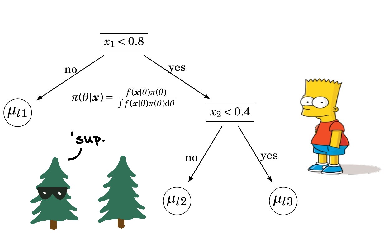
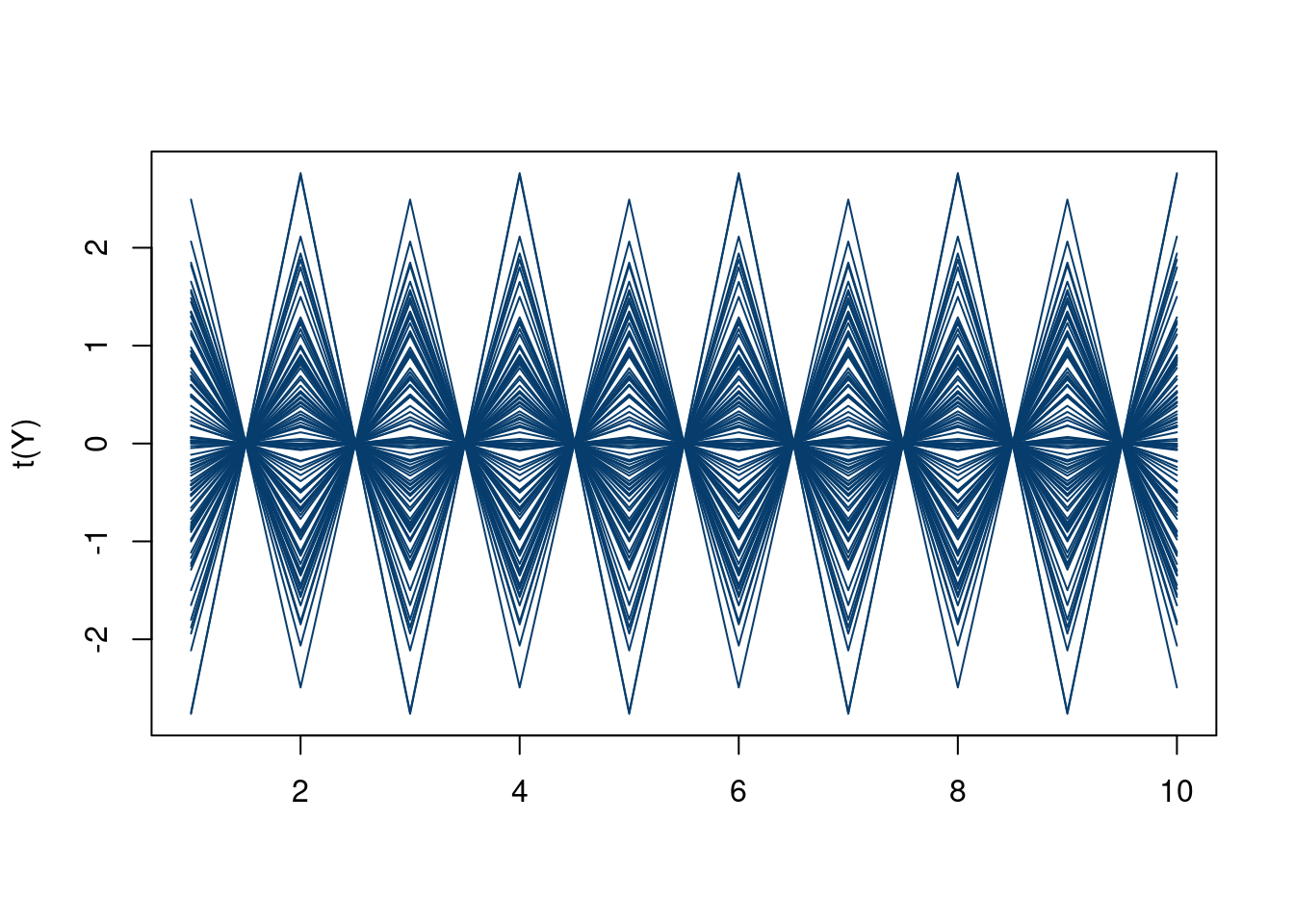
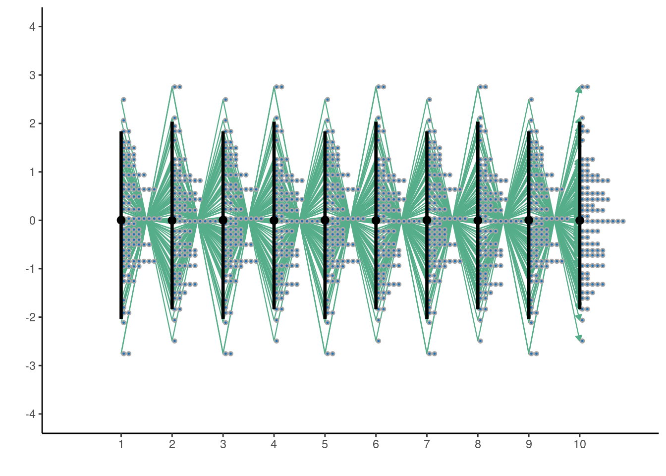
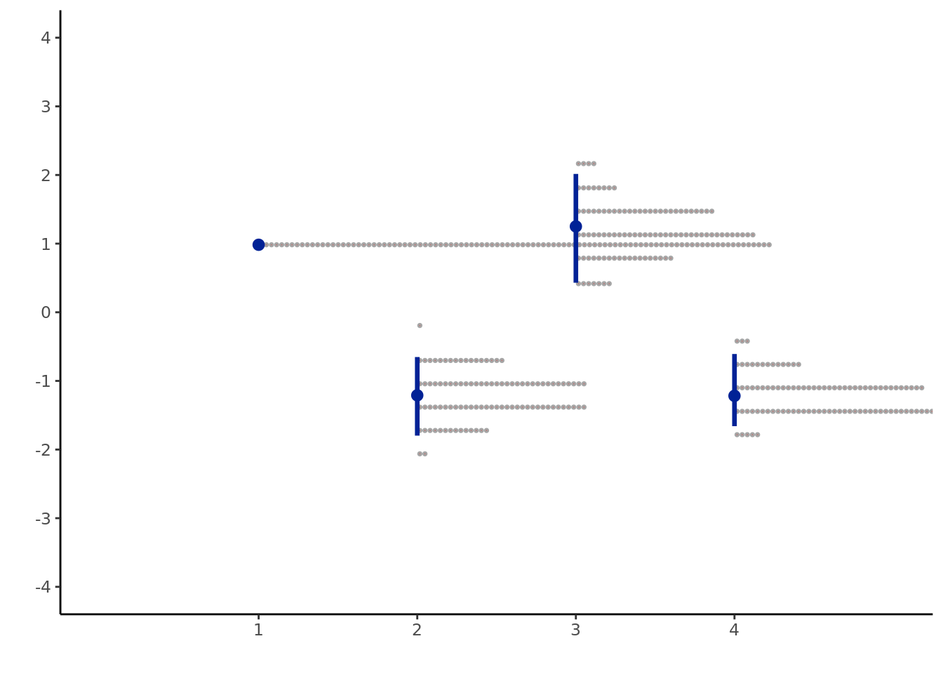
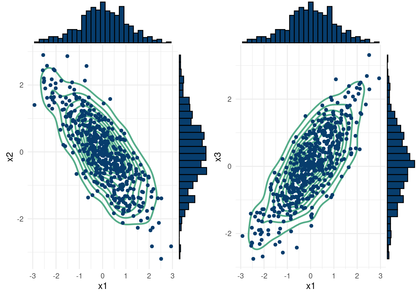
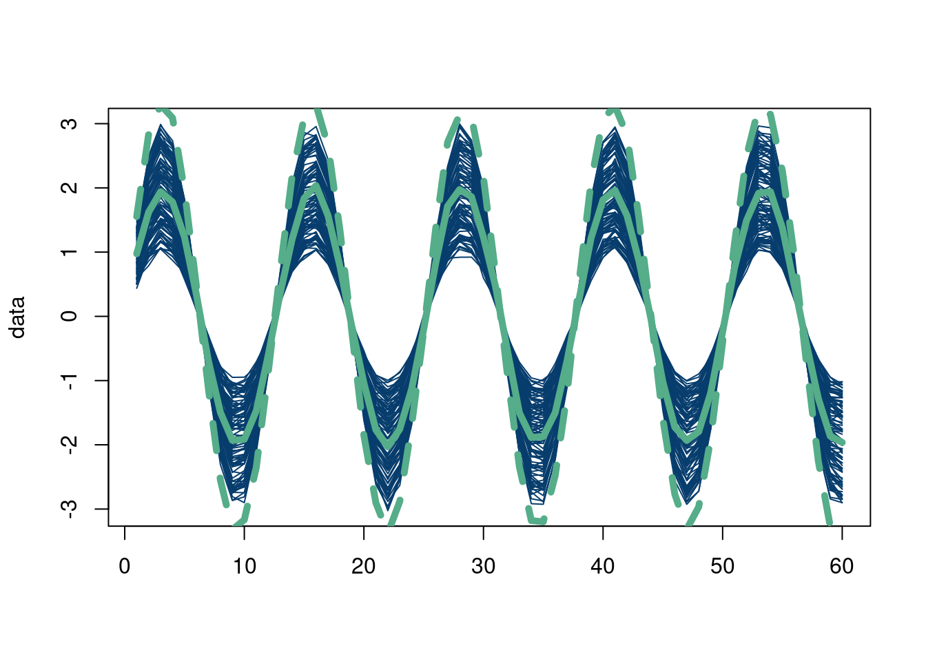
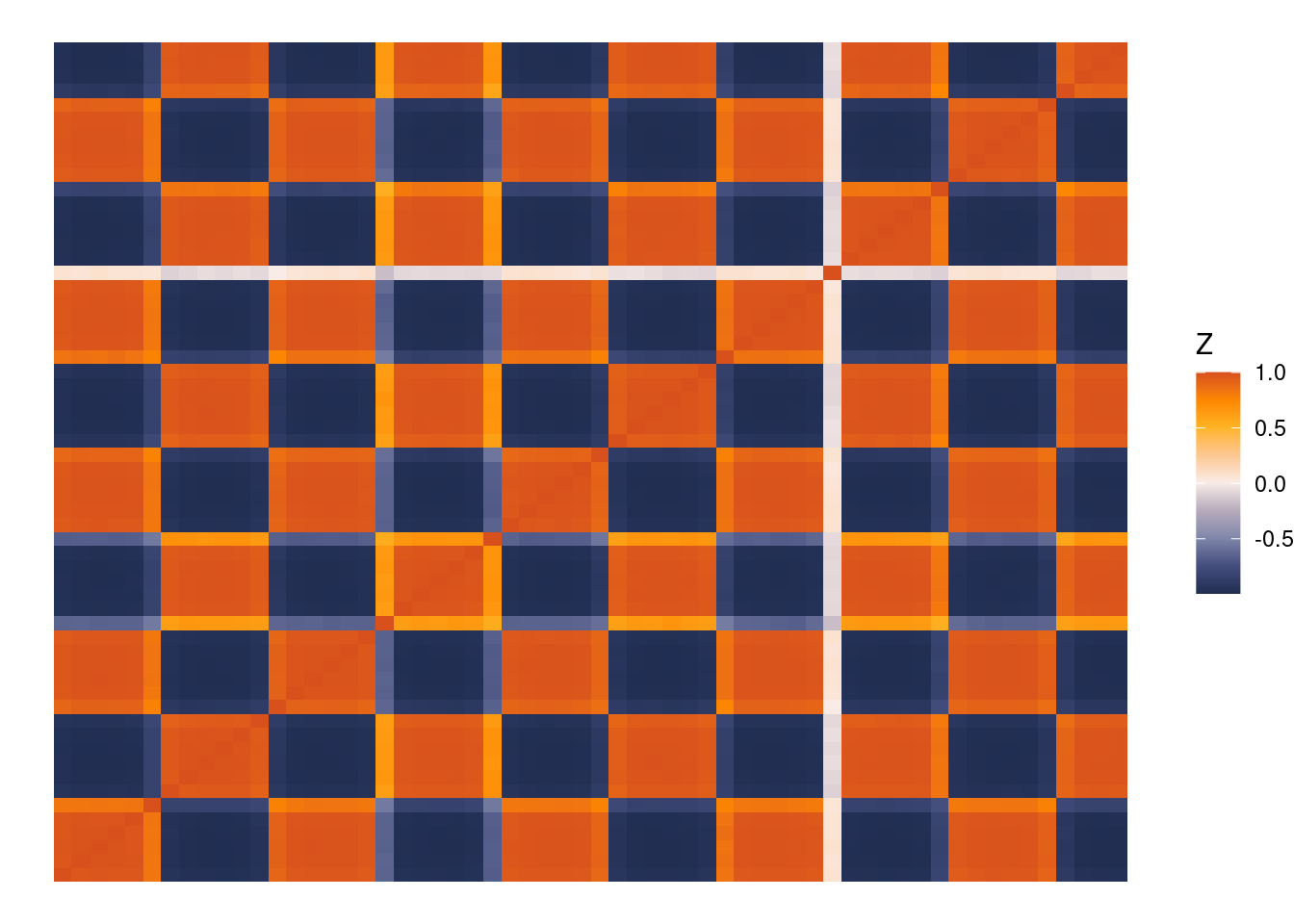
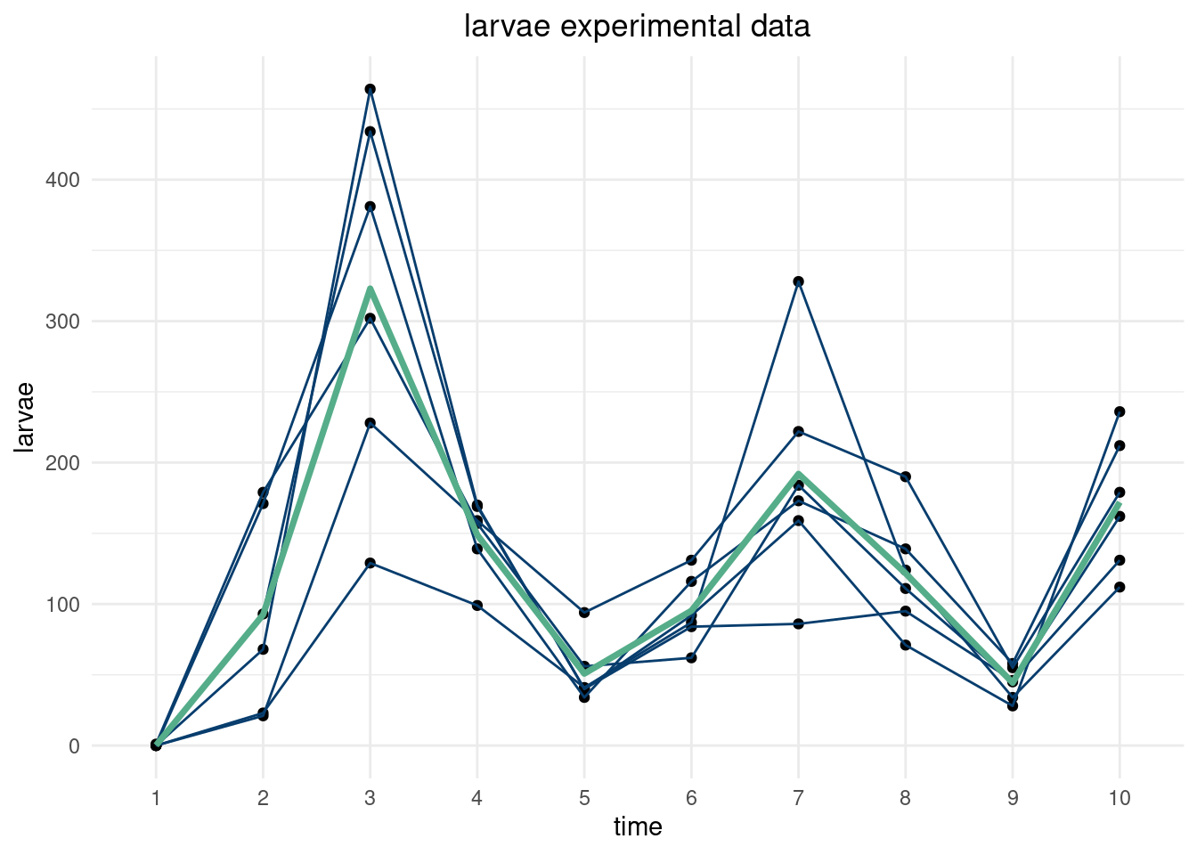
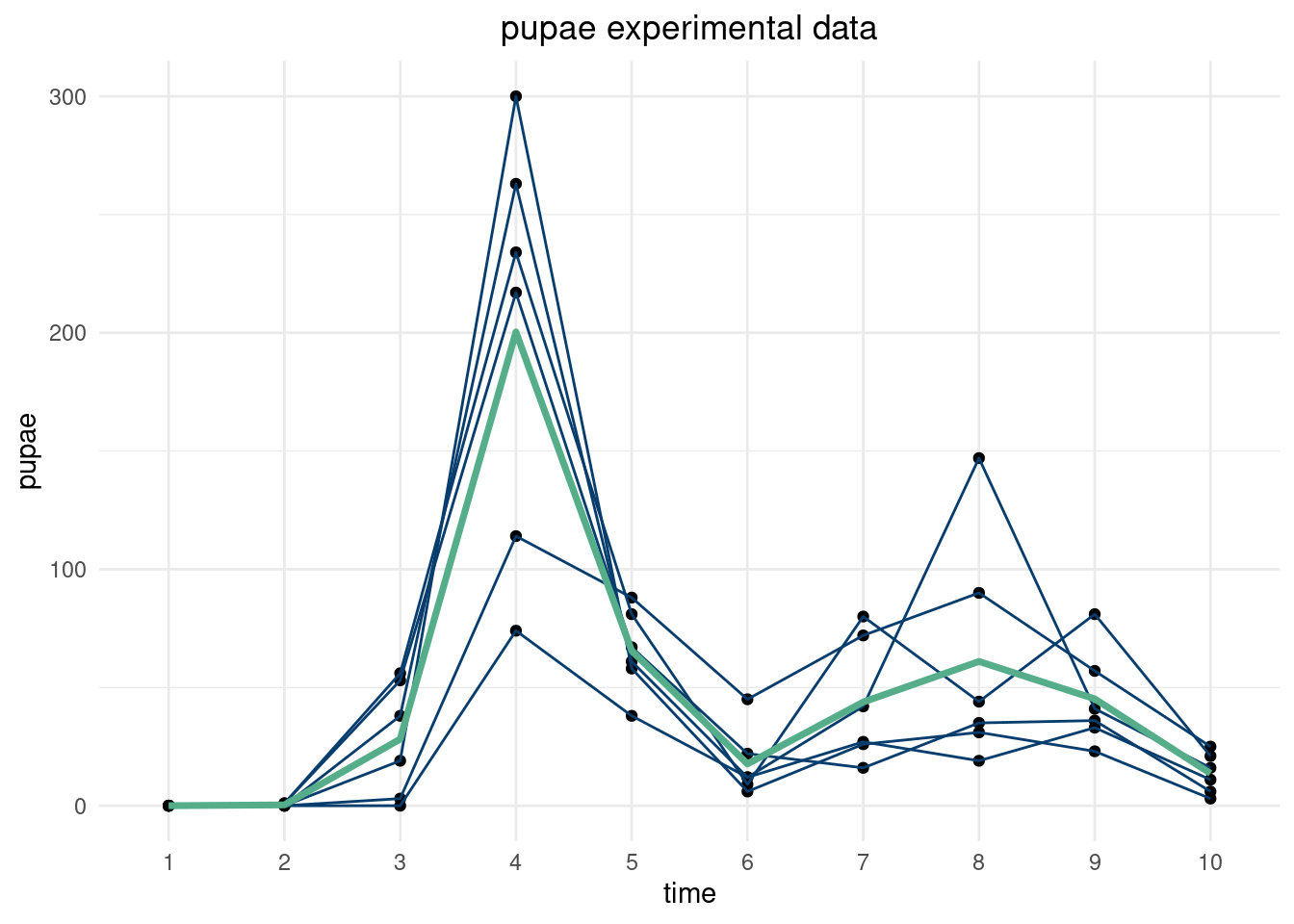
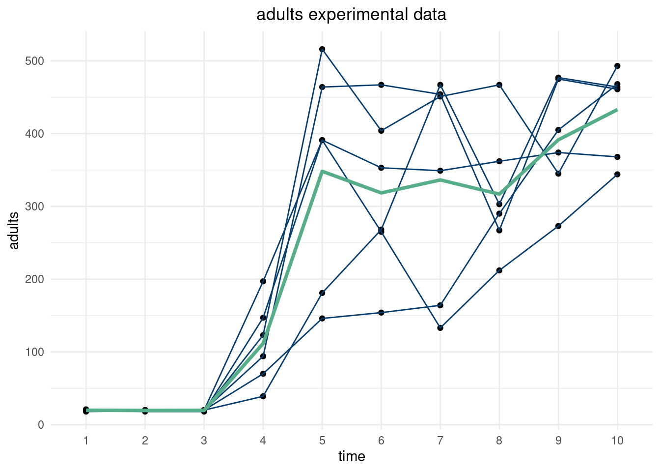
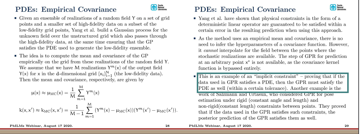
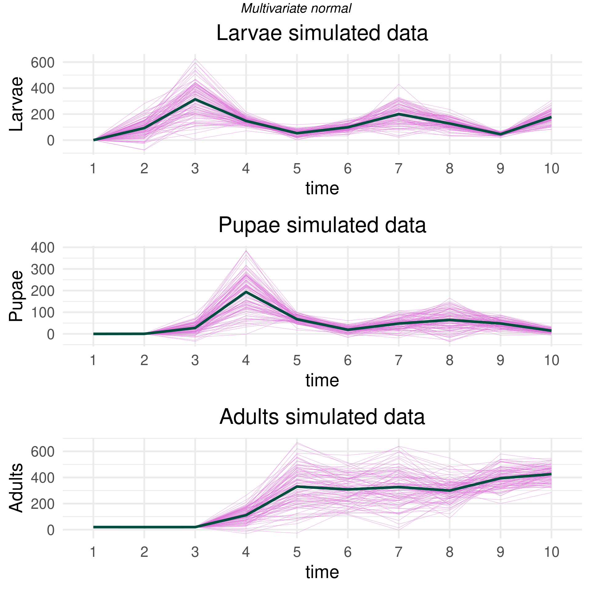
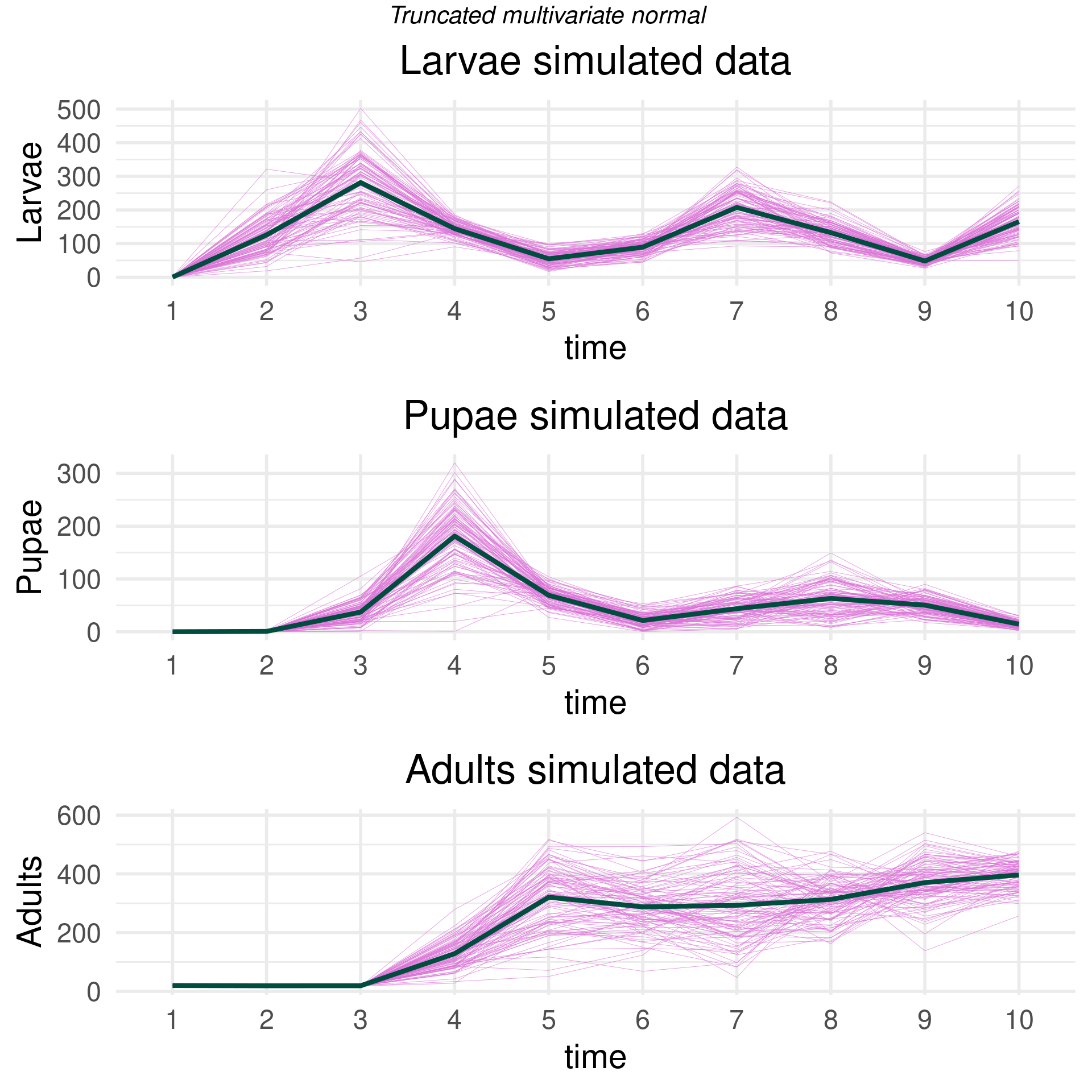
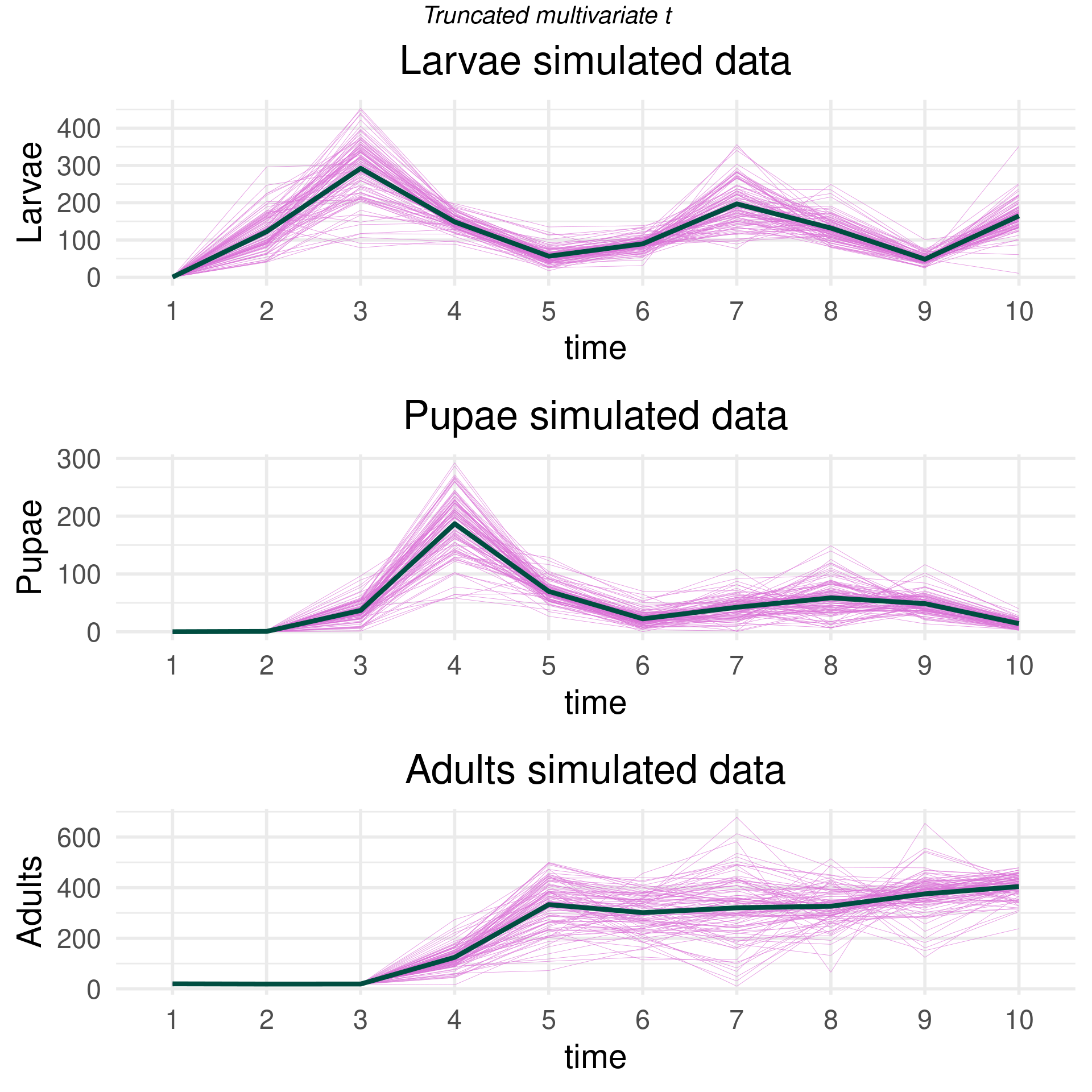
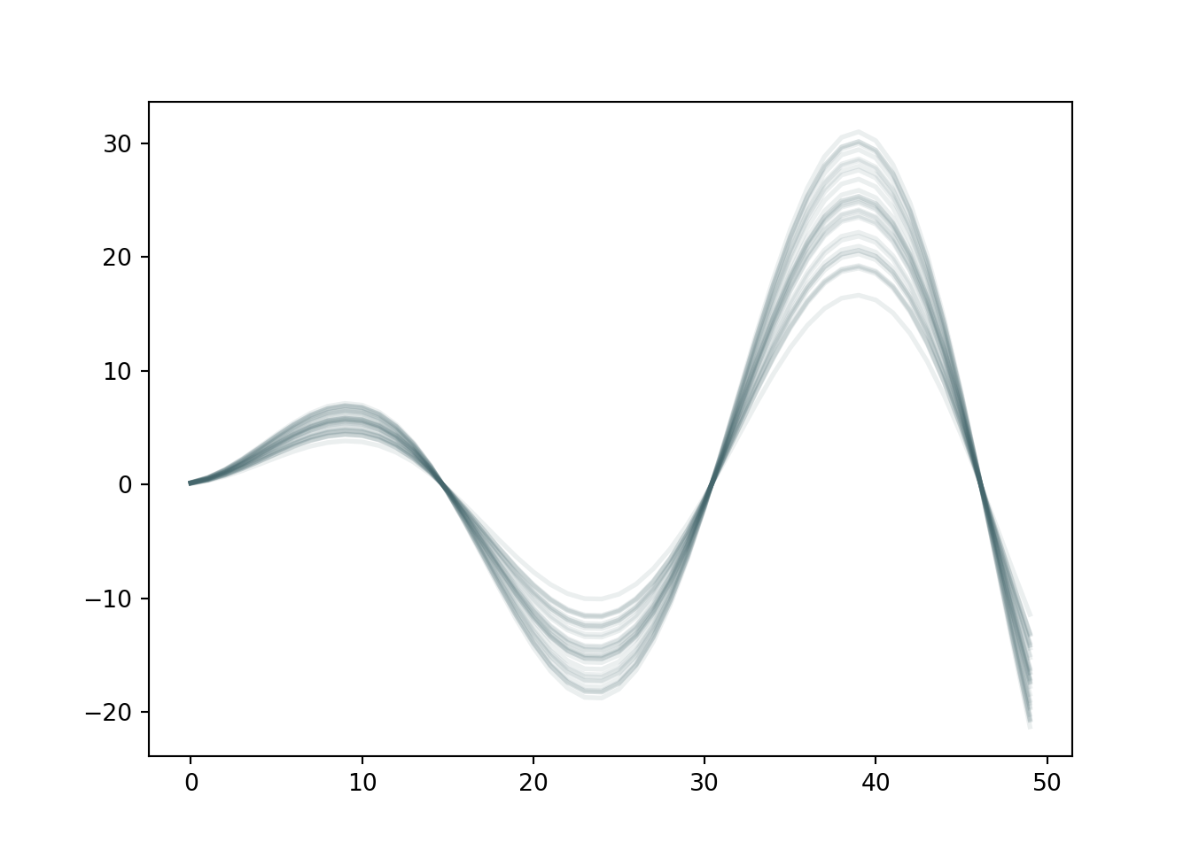
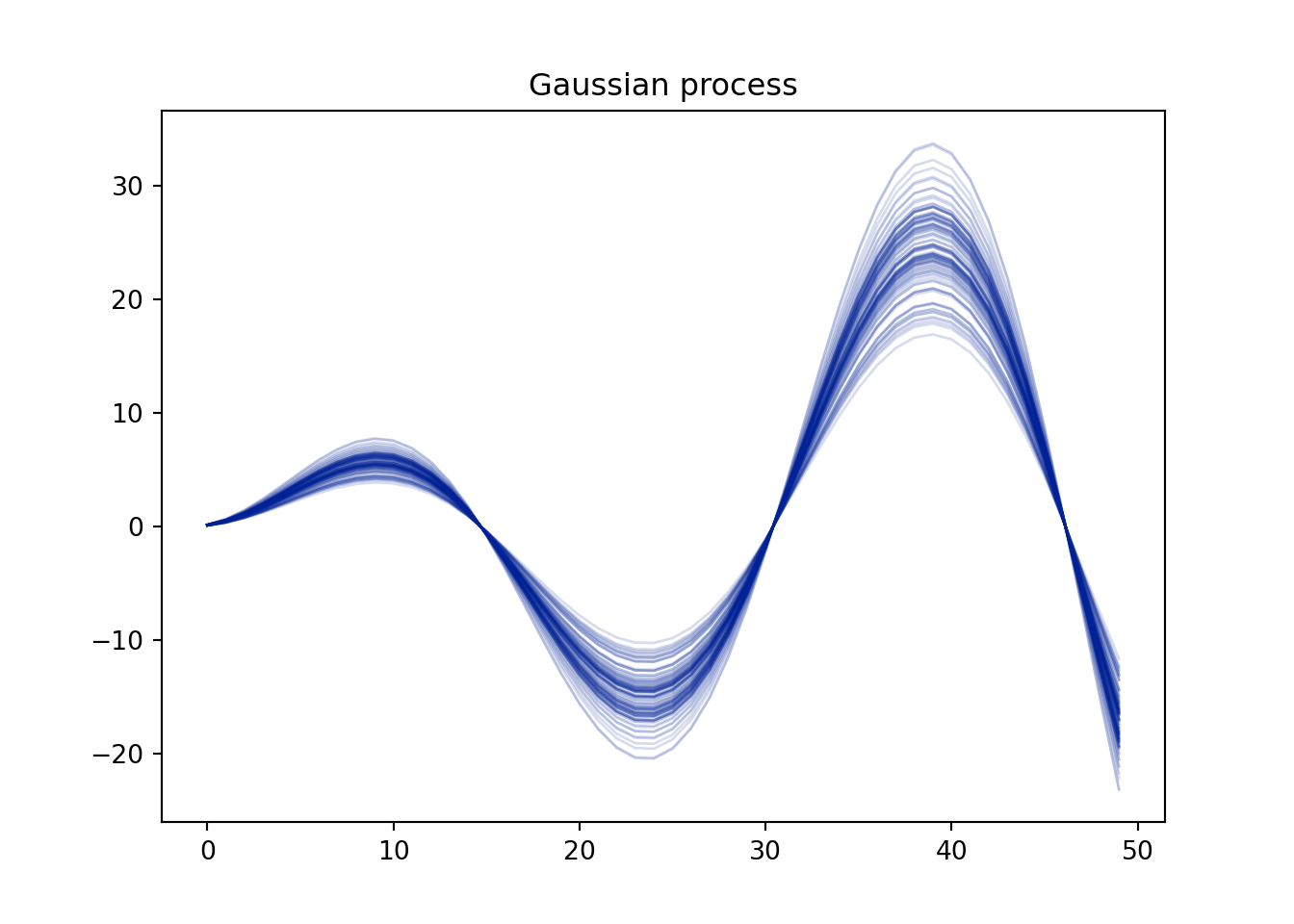
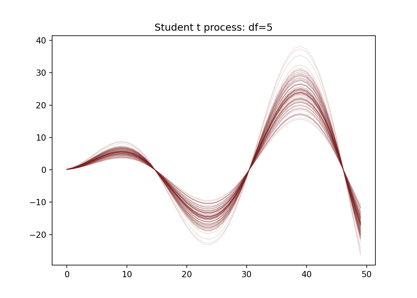
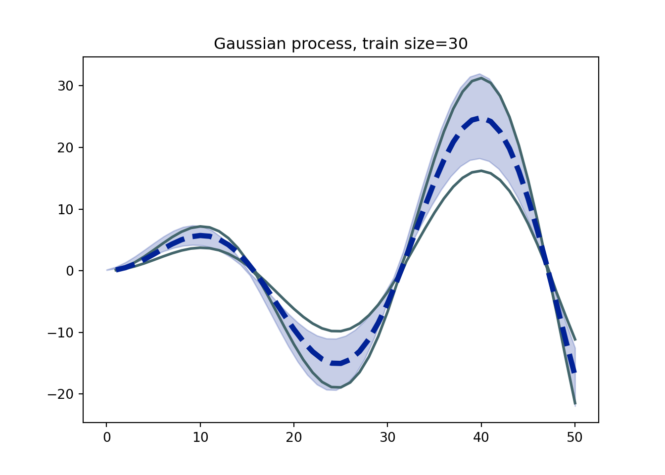
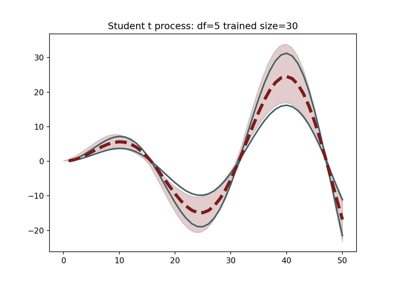
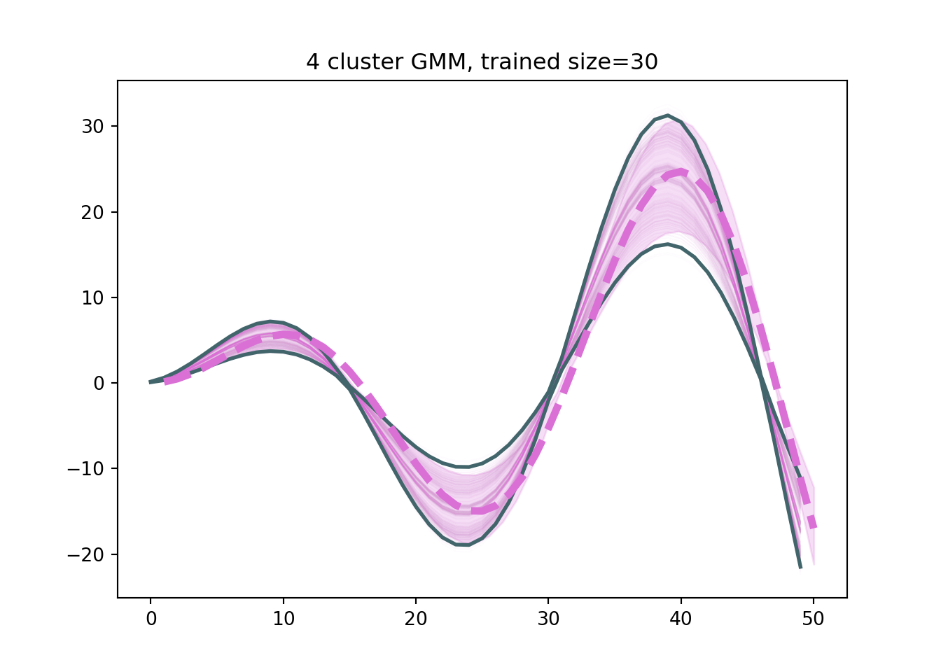
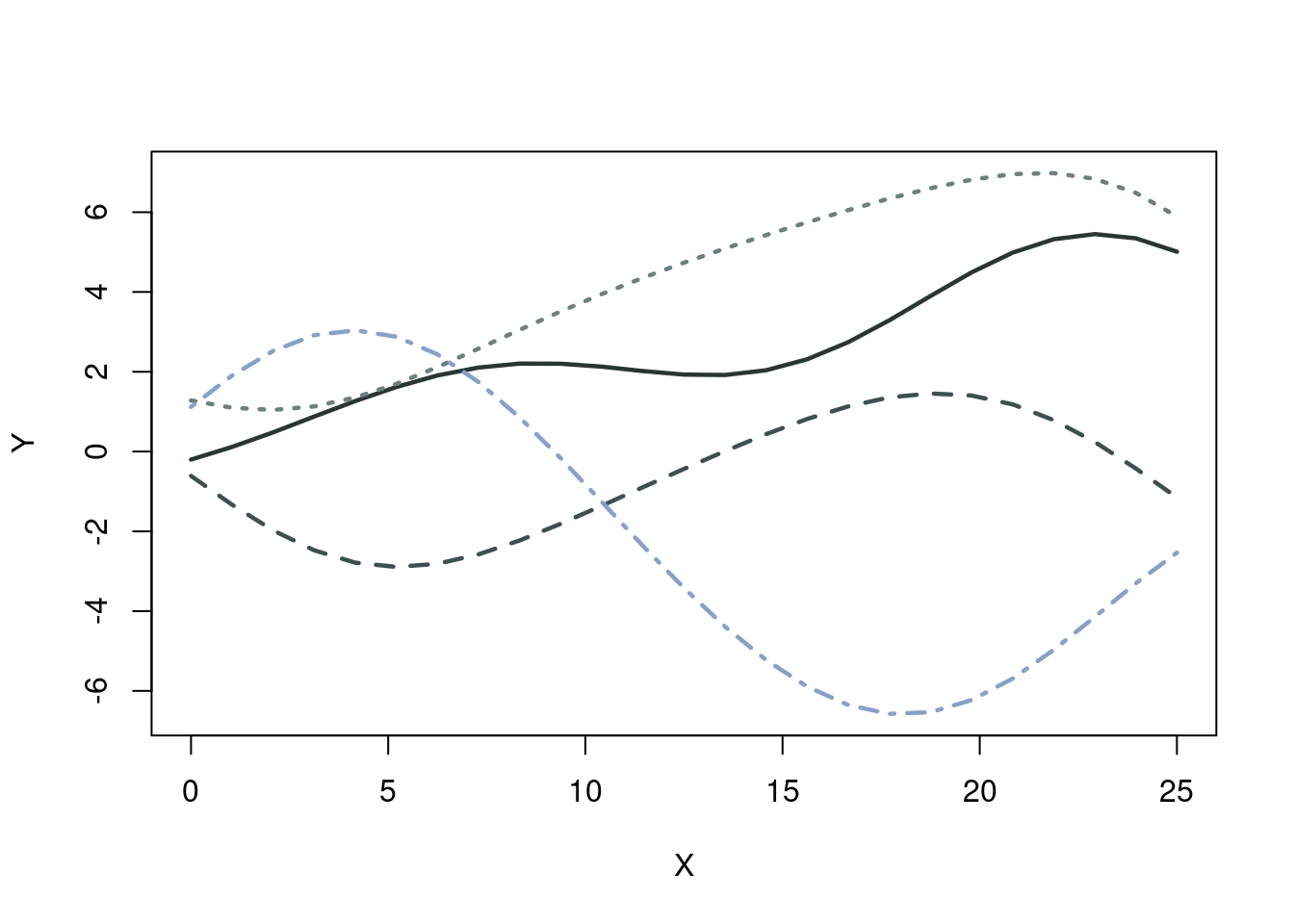
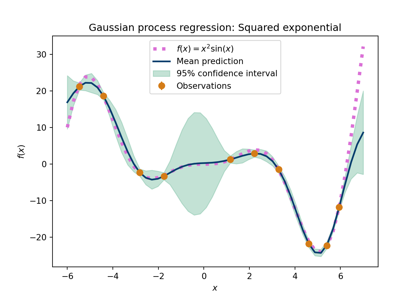
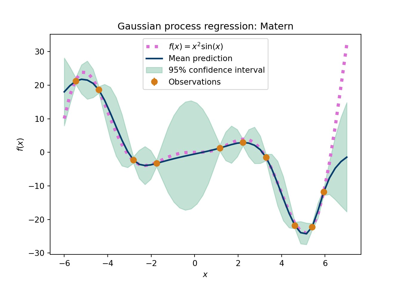
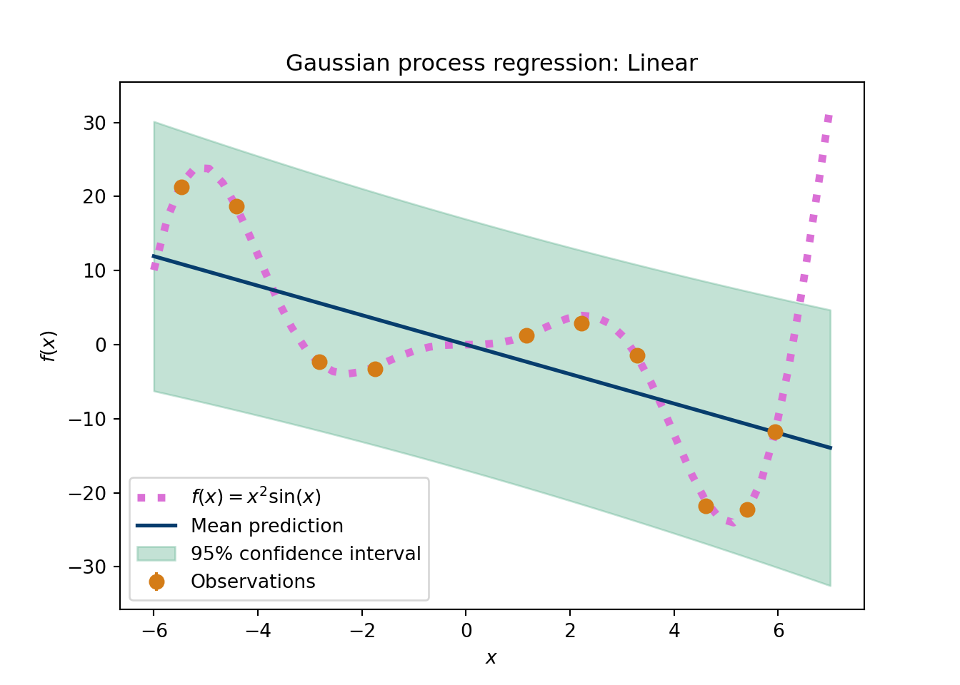
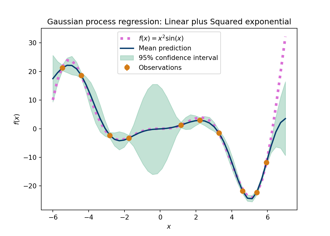
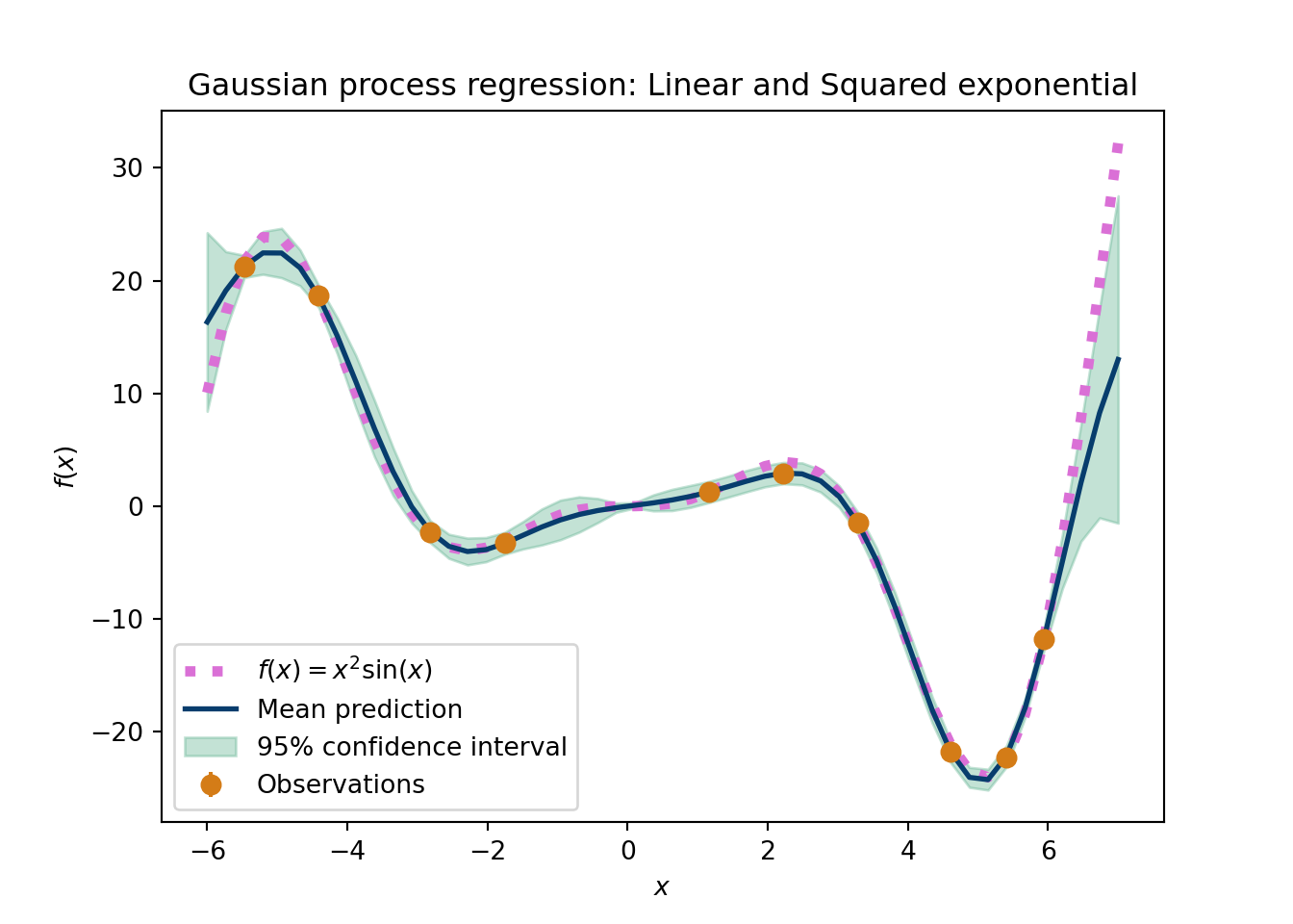

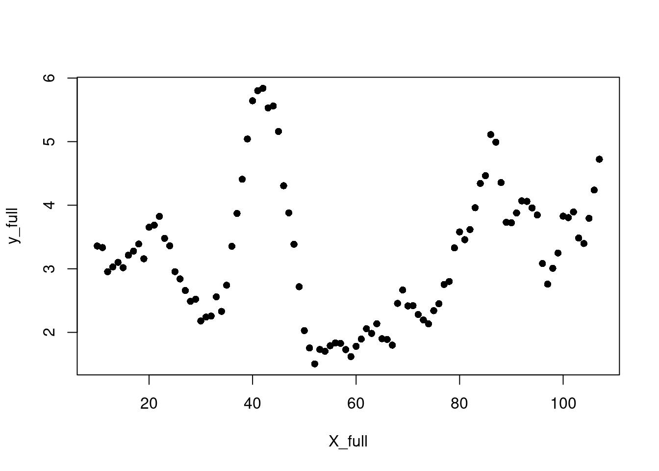
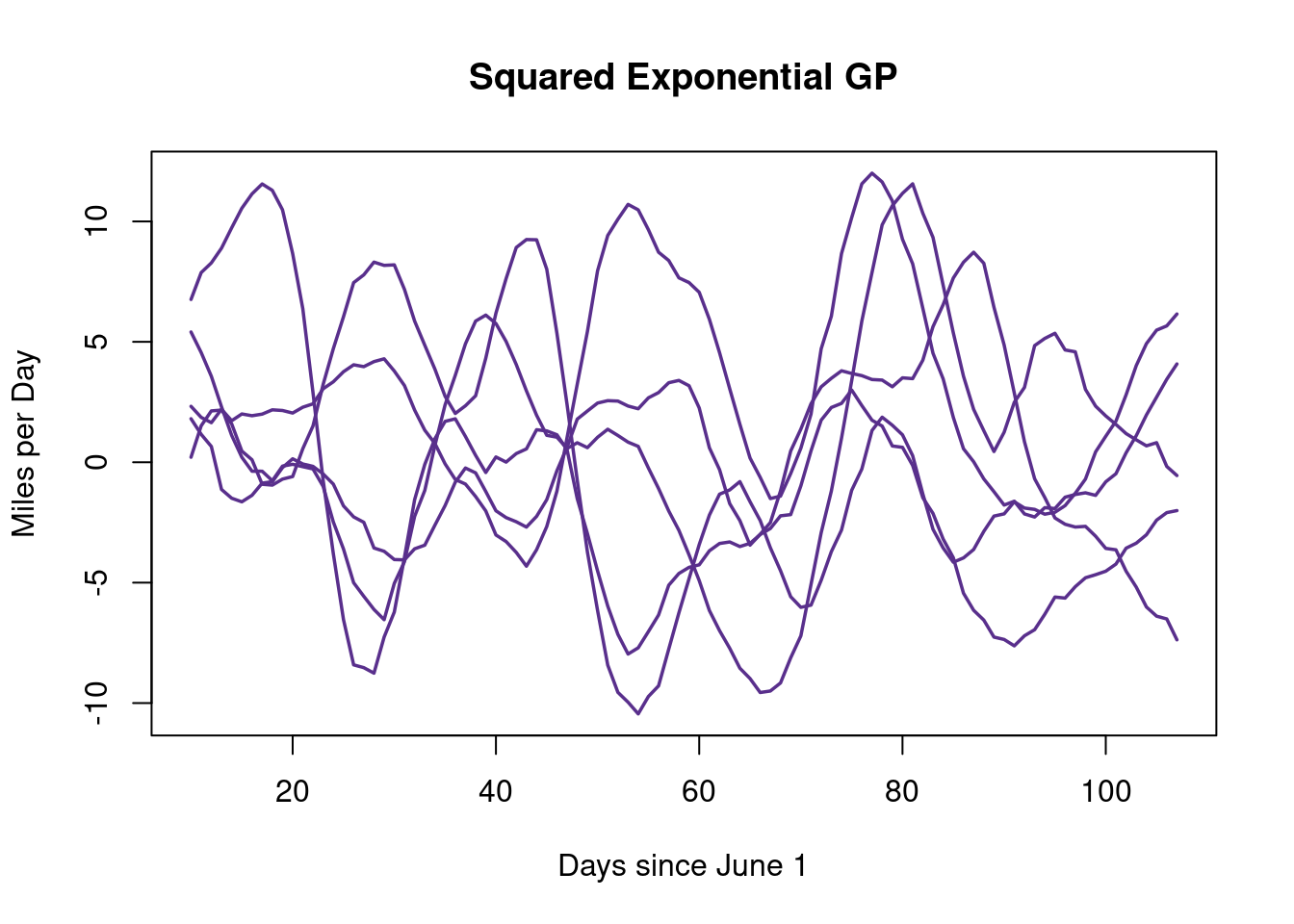
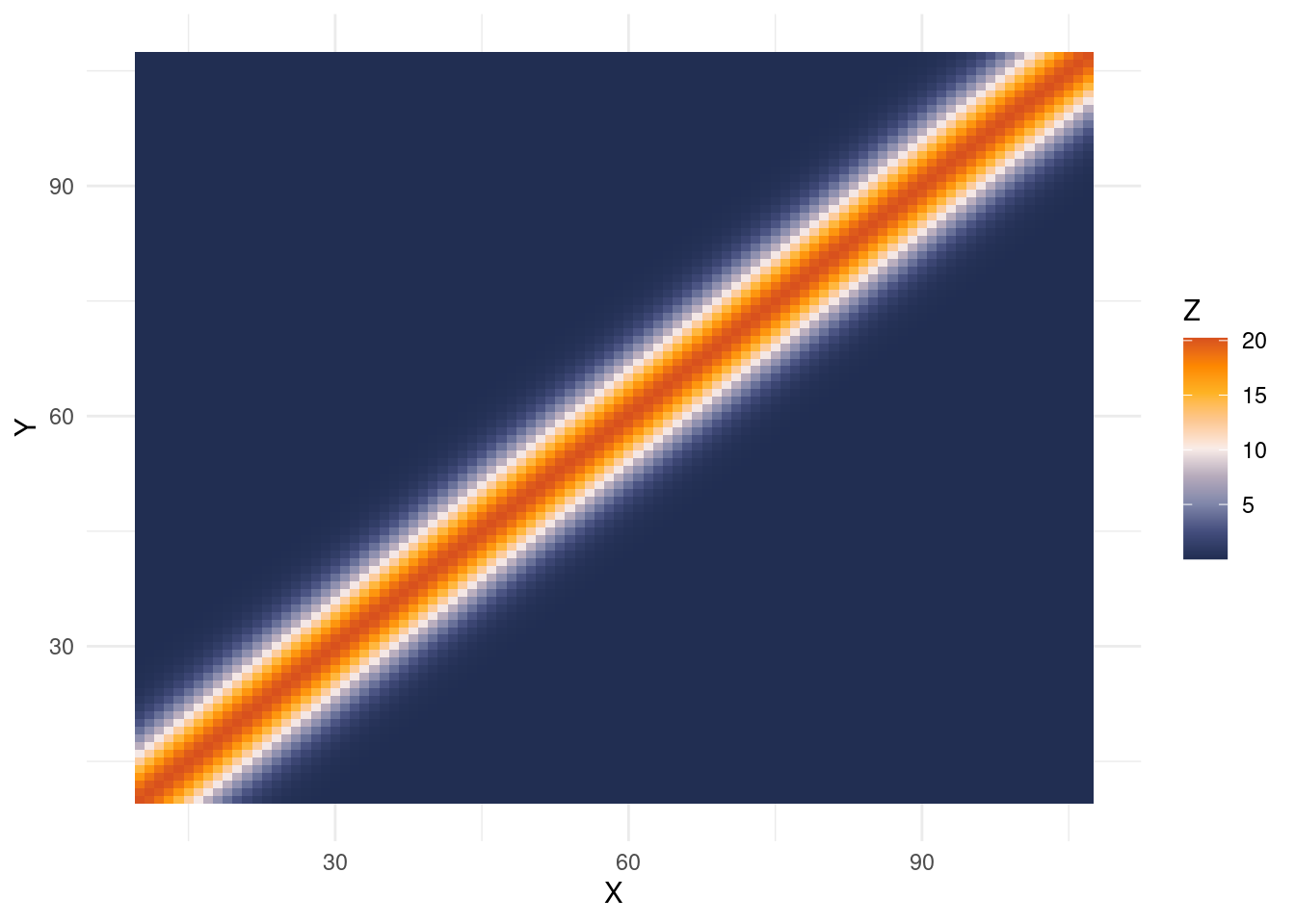
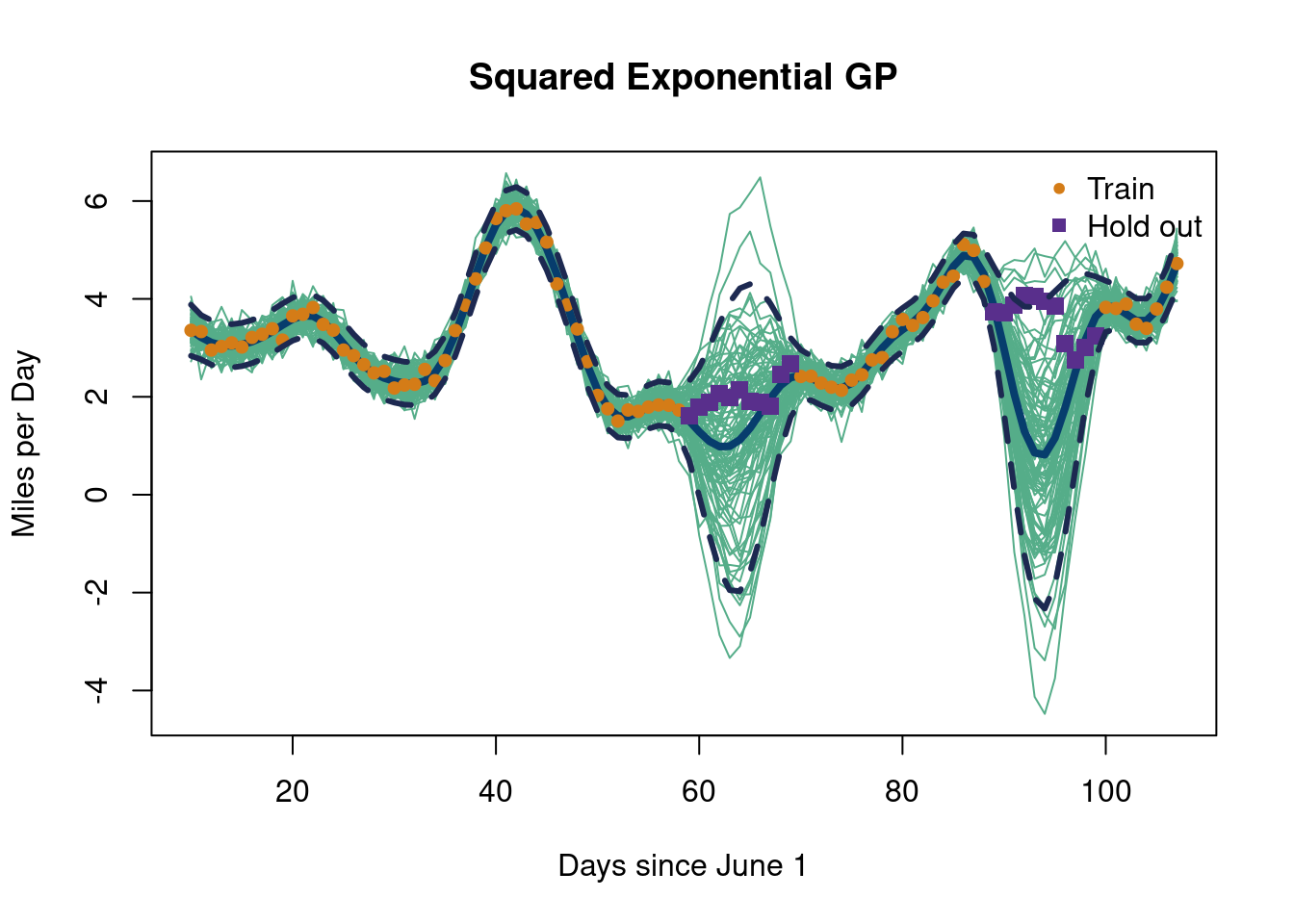
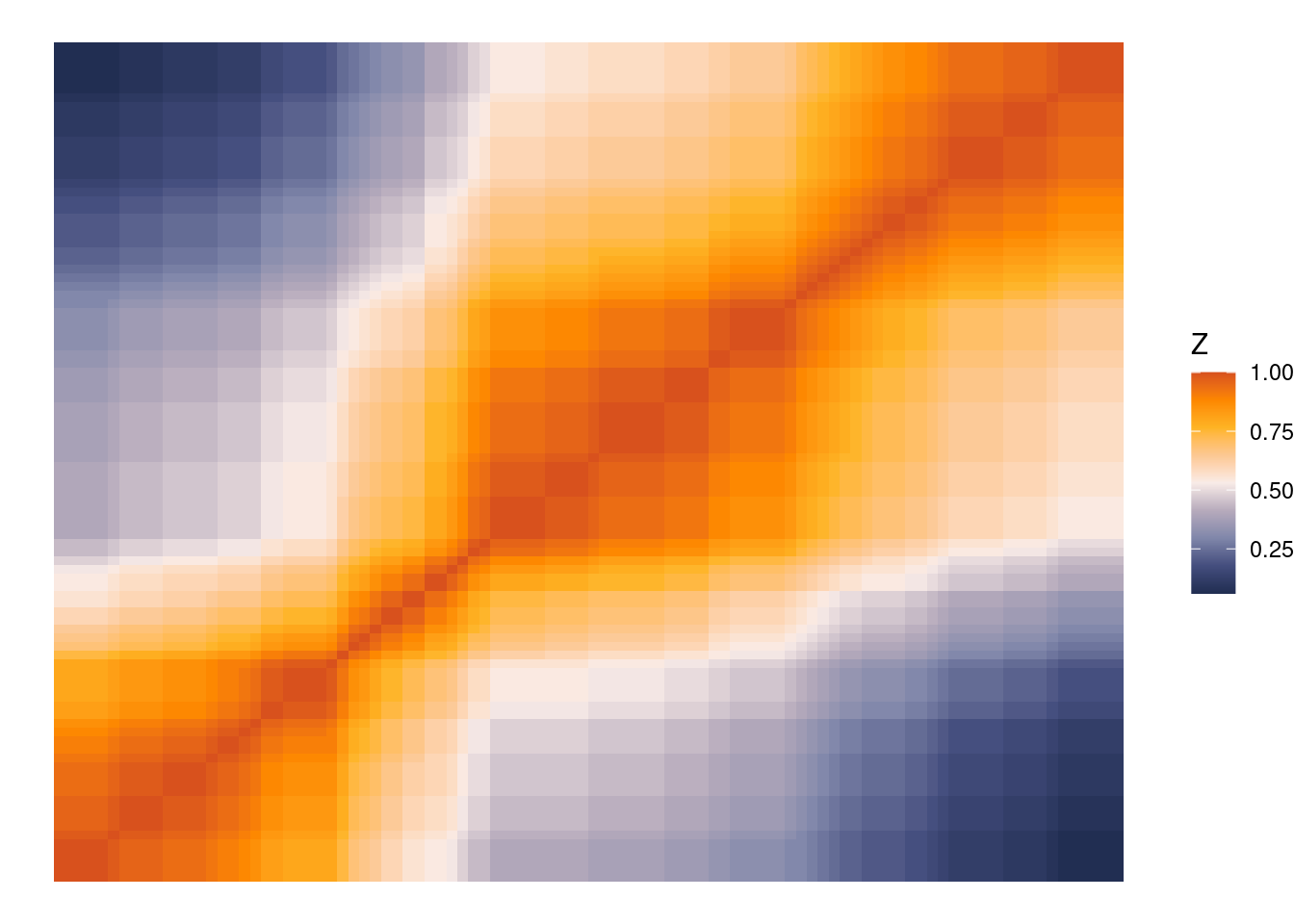
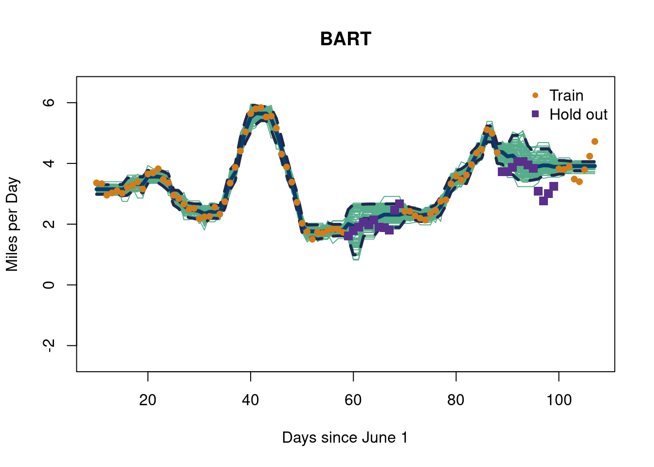
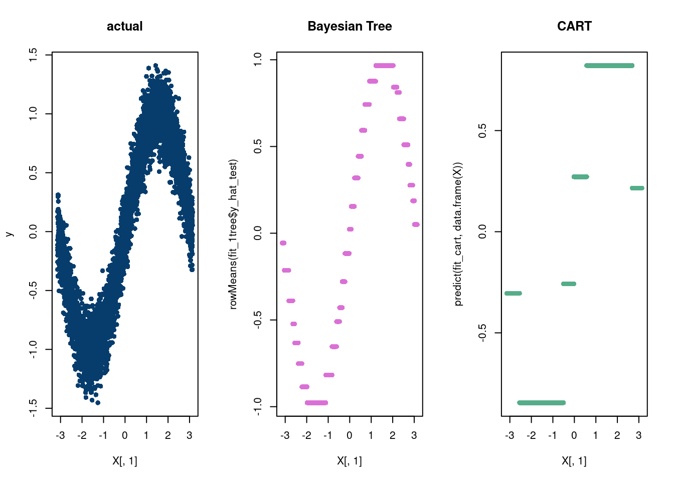
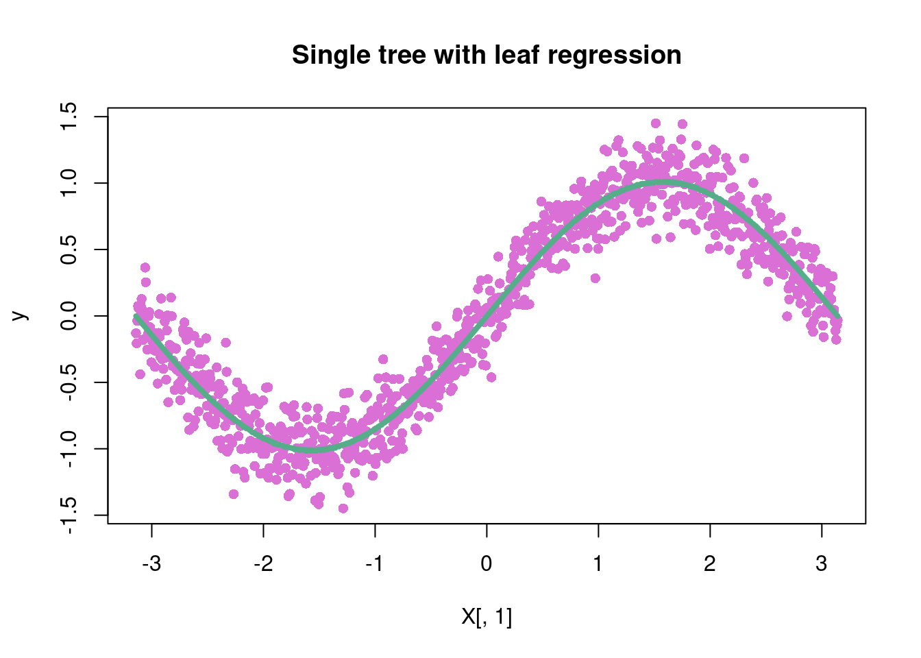
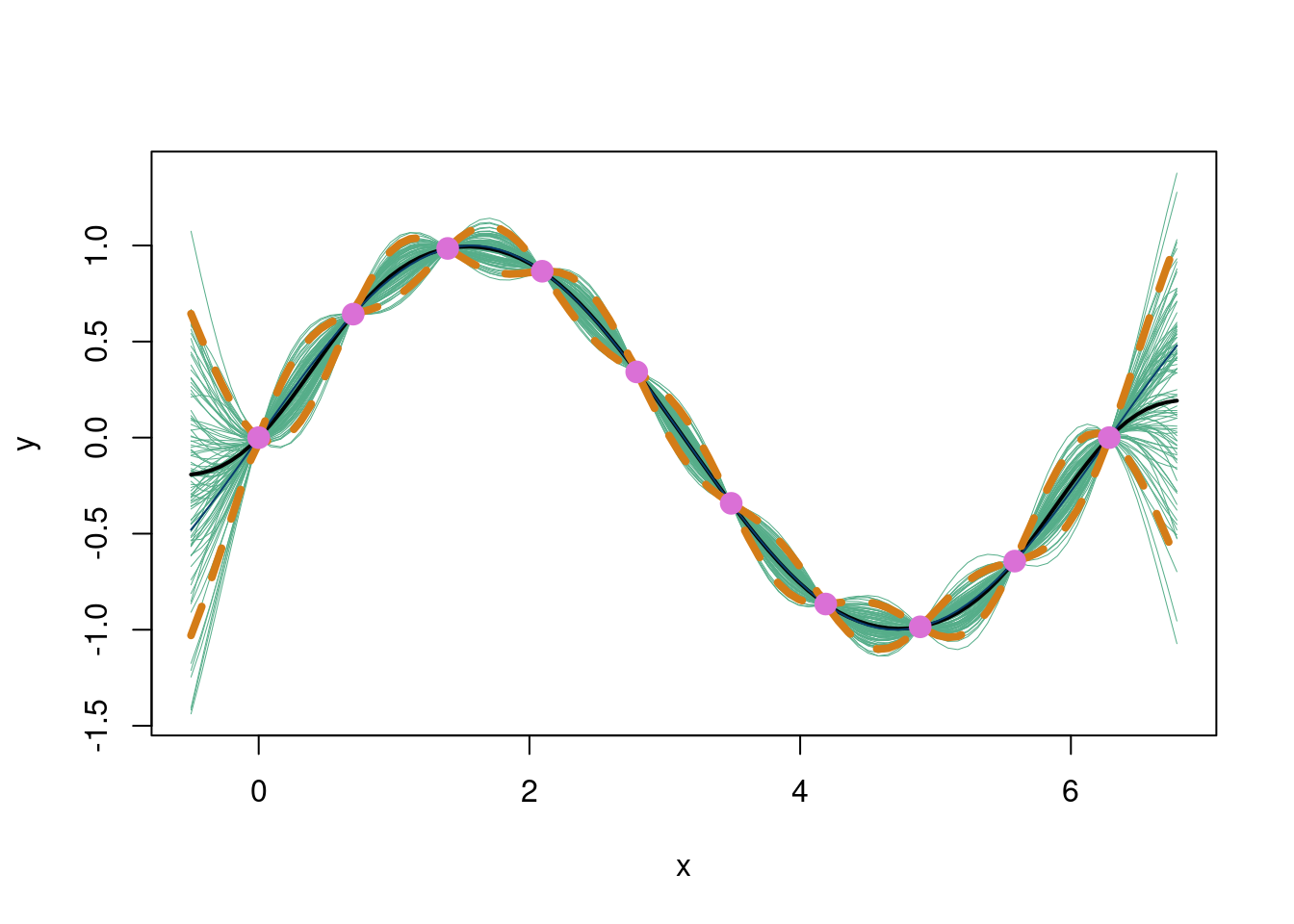
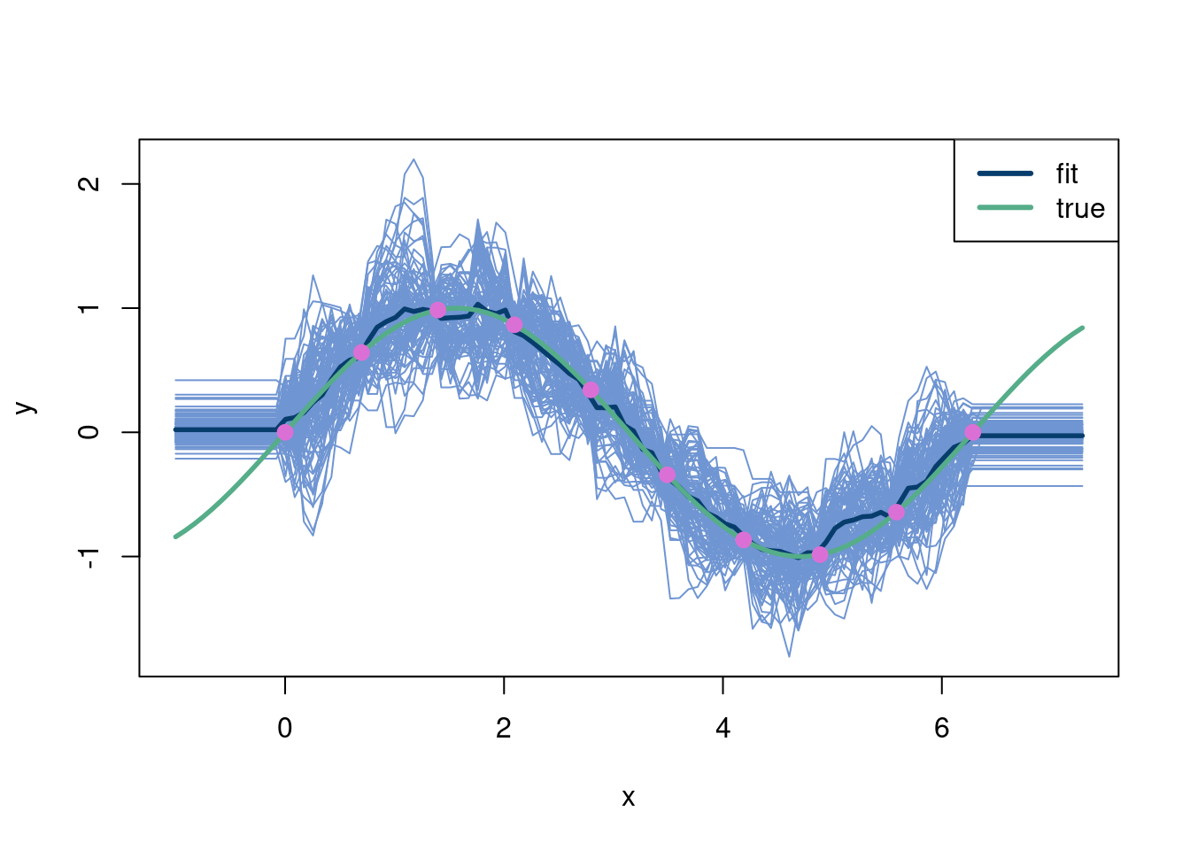
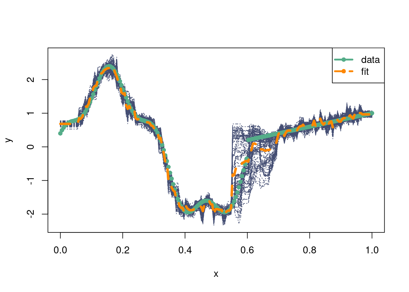

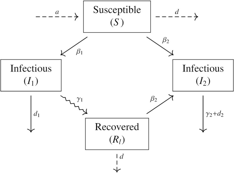
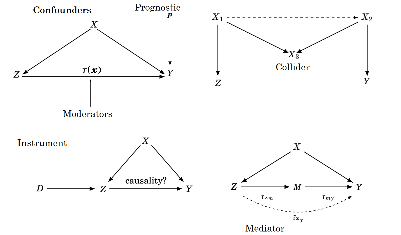
![From [@hahn2022feature].](images/box_causal_drew.png)