When I formally retire . . . I do not plan to stop thinking or working. I plan to continue to provide both new techniques and new annoying-but-true statements- John Tukey
The best thing about being a statistician is that you get to play in everyone’s backyard. John Tukey
*But sometimes “get to” is replaced with “have to”, depending on your customer.
An appropriate answer to the right problem is better than an optimal answer to the wrong problem. John Tukey
I’m not interested in doing research and never have been, I’m interested in understanding, which is quite a different thing. David Blackwell
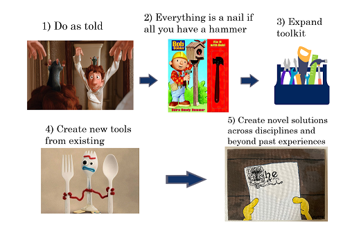
Figure 1.1: The stages of a data science problem
This book is designed to provide material for a capstone course in a data science program. This book is light (but not completely) void of mathematical theory, is very heavy on code, and has a focus on simulated and real data. The contents cover a lot of tools the authors have found to be useful in careers in data science from an industrial research perspective.
A couple of over-arching themes that we want the reader to keep in mind while reading this book(down).
Themes
You will be normally wrong: This is a statistical pun, but also true. It is based off the idea of the ubiquity of normal errors in statistical models. Be wary and cognizant of model assumptions:”If your model assumes “X” must be work, did you really show “X” works?” SB. We want to also “hammer home the importance of calibrating errors when they are correlated with one another” SB.
If you cannot reliably predict a system, DON’T: Sometimes doing nothing at all is less harmful than doing something probably wrong. If you need to make assumptions that are impossible to justify, then abandon ship.
a) Simply stating your assumptions is not enough! This is a cop-out, not a panacea.
b) What constitutes a useless statistic? If the statistic or metric you develop will deliver a wrong estimate of what you are trying to measure, and it is wrong in unpredictable ways, then do not use it! For example, early in the COVID pandemic, cases were a poor proxy for the state of the pandemic as few people had access to tests and those who did were not representative of the population at large. Further, as the disease spread more aggressively, the proportion of missed cases (at least circa spring 2020) varied depending on the point of the infection curve you were on. Were a higher proportion of cases caught when there was little spread or when there was more spread and more of a focus on testing? Or are testing systems overwhelmed at peaks? In this example, we know our statistic is an undercount, but we do not know how much of an undercount and if that undercount is consistent over time. Other examples might be biased in both magnitude and direction, so we do not even know if we are under or overcounting the true thing we want to measure!
c) Do you really need to model your data? If plotting the data is sufficient, so be it. If patterns are simple enough to learn without the aid of a mathematical or statistical model, then why use one? If they are too complex or noisy, the same question arises. If you do not suspect selection biases exist, then why jump through hoops to tackle them in a sophisticated way? To summarize, while you can model yourself out of trouble, you can also model yourself into trouble…
It’s all about the errors: This leads to a lot of fascinating questions. Why is my model wrong? Am I not predicting the signal correctly, or is my intuition on what the noise should look like wrong? If I have errors in my Michigan election forecast, will I probably be similarly wrong in Wisconsin? If noise is understood as the “leftover” portions of an outcome after the important stuff is accounted for, then we should have some confidence our noise is truly representing idiosyncratic things. If instead the noise is due to not measuring an important input variable (and thus miss signal), then our modeling exercise is far from over.
Prediction != Insight: Quote from Vincent Mutolo. Knowing how to build a machine learning model, no matter how fancy, does not matter if you don’t know what you are estimating or why it matters. Scrutinizing your data, your methods, and gaining a deeper understanding of the question at hand will offer more insight than training 20 different variations of a neural network.
In other words, be take great care in defining a proper estimand (what you are trying to actually estimate). Of course, still scrutinize your estimator (your tool that gives you an estimate of your estimand) thoroughly, but without a meaningful estimand an analysis is doomed from the start.
For example, say we are interested in guessing how much career wealth (on average) going to a top university makes a student. That is our estimand. We compare the average of the 10 students we know who went to top colleges versus 17 who did not. That is our estimator. We find the effect is $17,000. That is the estimate. We will learn later this estimator is bad because it does not account for the fact that students going to top colleges are fundamentally different than those who do not in ways that may also affect their career earnings (by socio-economic status for example). Additionally, maybe measuring career earnings over a lifetime isn’t super useful. Maybe we care about 90th percentile earnings by the age of 30…or median career satisfaction. Maybe top universities are in places with higher inflation so higher earnings is less meaningful. This needs to be discussed in detail! Many people only care about the final number, but the estimator and estimand in our opinion are more important.
When we talk about intepretability later, we will argue interpretability of your estimand is more important than an “interpretable” estimator. Coefficients of a linear model are not super intepretable because they are not necessarily causal. Even though the linear model is easier to understand and an ordinary least squares estimator of the coefficients is “interpretable”, the enterprise is a little dubious if people misunderstand the meaning of the quantities being estimated. Due to its tangential relation, please read the following: Why is it so hard to know if you’re helping? and Parametric estimation vs identification.
You are not beholden to your own innovations\(\longrightarrow\) This is mostly aimed at the academics in the audience. Just because something is new does not mean it is useful or better than existing techniques.
The delicate tango between simplicity & better performance
My esteemed colleague Rob McCulloch once quipped that restricting the models you use to the ones you have formal theory for is like riding a bicycle instead of a car on the grounds that you don’t know how to fix the car yourself.
Riding a bike instead of a car is stubborn in one way, using a Lamborghini as a family sedan is another kind of misjudgement
Feature engineering and outcome construction are a big part of the day: “A million dollar move ain’t nothing without a 5 cent finish” - Chris S. Proposing interesting hypothesis and creating features from plausible mechanisms can add a lot of value. Pamper your data!
Be a Bayesian: Caveat —> Frequentist thinking is still very useful, particularly in simulations. Repetitions of a method and checking the method matches the coverage it promises is a “frequentist” approach and is very valuable! The bootstrap is also a good idea, though we won’t talk about in these notes.
When in doubt: simulate
How do we know if a method is “correct”? What exactly are we trying to estimate? In some cases, the answer is more straightforward. for example, in prediction problems, testing out of sample prediction with well established metrics such as mean squared error is a tried and true method. however, even in this case, we recommend not defaulting to easy benchmark real data, and designing a simulation study with many knobs as a stress test of a method. In causal inference, where the treatment effect is never observed, simulation studies with many knobs and variations are the way to go. In unsupervised learning, or variable selection, the goal of those modeling endeavors are less well defined and it is not always clear how to establish “goodness” of a model. Therefore, we recommend more adhoc and heuristic evaluations. in some types of models, such as agent based models, statistical inference and parameter evaluation is not even feasible, cutting off any connection between the model and any hypothetical data, rendering the approach as purely “scenario” based, meaning it can be used exclusively as a simulation. An interesting take on this from Richard Hahn on Linkedin.
AND … this is important, make sure your “bakeoffs” are fair! If one model uses significantly more compute resources, it’s not a fair fight. Equal compute allocation
Build out your toolbox: A good data scientist needs to wear a lot of hats. Most of your job will be writing SQL queries and cleaning, which we conveniently do little of in these notes. Having a good grasp of statistical methodologies can help you decipher which problems are worth investing time in and which are dead ends. Being familiar with R and Python can help decipher when the data just are not up to par much easier than sifting through excel spreadsheets.
Bonus: Get your victories. Take the W where you can!
1.1 The state of data science: 2024 edition
Data science has struggled to keep its 2010’s momentum due to a) being a very low risk, low reward enterprise (the insights have been found) or b) being a role without a well defined goal. In the latter, disorganization and confusion rules, with data scientists relegated to either wild goose chases to find signal in a large dataset, or making slides (or hopefully) dashboards ad-nauseam until they are laid off. Ideally, clever solutions that are specific to the company/school/team are made which add clear value. For a company that’s product is itself a data science tool (like Spotify), this is easier. For the former, a career of maintenance and small improvements in rmse may seem a little bland, but still requires innovation and feature engineering skills. We will talk about the evolution of the field in baseball, an early adopter of statistical ideas that is emblematic of some (but not all) issues plaguing the industry at the moment.
Here is a really excellent article called the “Data driven delusion” discussing many of these themes. The title says it all.
1.1.1 “Run the numbers”
For less analytically inclined co-workers, the role of the data scientist can probably be described as being a “run the numbers” person. What this means, no one knows. However, data science is hot and people want someone to find some insights from the enormous amounts of data they are now storing. So they hire you to “run the numbers”. If this is the case, stop at just “run”.
1.1.2 Beyond Moneyball: A lesson on why predictive modeling isn’t everything
On the other end of the spectrum, there are many data science jobs where data science tools are still used and properly respected. Somewhere in between those are jobs where the industry has become too focused on prediction, which we will highlight through the lens of baseball.
The Moneyball era in baseball consisted of team’s finding value in players that others did not see. Their main tool for this was to use statistical analyses to sift through noisy data that can confuse the human eye, and create proper evaluation of players to quantify their values. The next step was to create projection systems to predict a player’s value in upcoming seasons. This meant taking guys without the usual body shape or guys with “ugly girlfriends” and “no confidence”. The Athletics were good enough at this to get a movie made about their GM’s adoption of linear regression and a Jonah Hill apprentice. However, eventually (most) every team found out how to find players they were previously ignoring. So this era burned out due to every team (even public sites like fangraphs, baseball prospectus, and baseball savant among others offer projection systems) having similar methods and outputs.
This era was replaced with a new one focused on changing the way your players play the game, using more advanced statistical techniques to search for patterns that are difficult to distinguish to even the most trained human eye1. However, even those more advanced statistical techniques (and arguably more logical approach to improving your team and bettering your players) is not immune to the structure of the game. If players on every team are taught to swing with more of an uppercut, then pitchers are taught to pitch up to exploit that. Eventually, you get to a sort of check-mate that has plagued the game (according to some) in the late 2010’s and 2020s. So teams are left to contend with the fact they are competing against other statistically literate teams, which should (but does not necessarily) change their calculus. The point of this example is that modeling isn’t enough. The world is not a vacuum and we need to consider coupled systems, feedback loops, and how the thing we are trying to forecast may change while we are trying to forecast it. Another example may be the COVID pandemic, where 2020, 2021, and 2022 were all drastically different environments and required different modeling approaches and considerations.
1 Even if say a scout does pick up on the patterns better than an algorithmic or probabilistic approach, they are unlikely to do so as fast and with the ability to store as much in their memory.
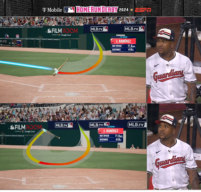
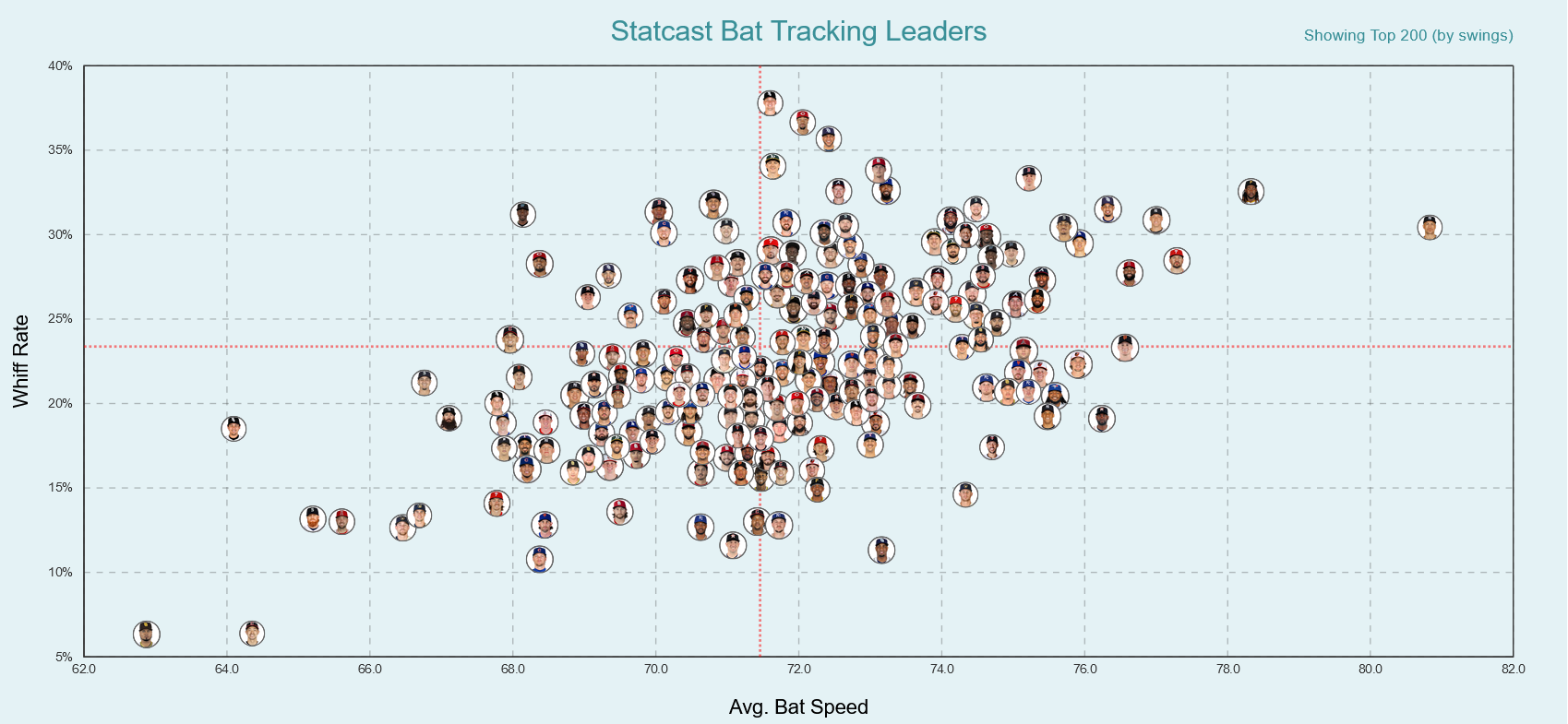
In the previous paragraph, we focused on the case where we modeled things well but things outside the model prevented it’s widespread use and adoption. But what if the modeling itself wasn’t up to snuff? And not in an obvious way that you could learn in a course? Instead, we want to emphasize that the modelling stage of an analysis may cause active harm! With an over reliance on predictive modeling (machine learning) and a sometimes lacking understanding of the underlying situation, erroneous results can spurt. For example (courtesy of Demetri’s time in Houston), this fangraphs article estimates the effect of swing speed on players strike-out rates. A preliminary analysis shows that average bat speed correlates strongly with strikeout rates. Cool insight! Right? Not so fast. This is not accounting for the fact that the bat slows down when a player makes contact, so well yeah! To complicate things further, even when accounting for that, players who swing harder do whiff more! See Figure 1.2 and Figure 1.3.
Figure 1.2
Figure 1.3: From August 3, 2024
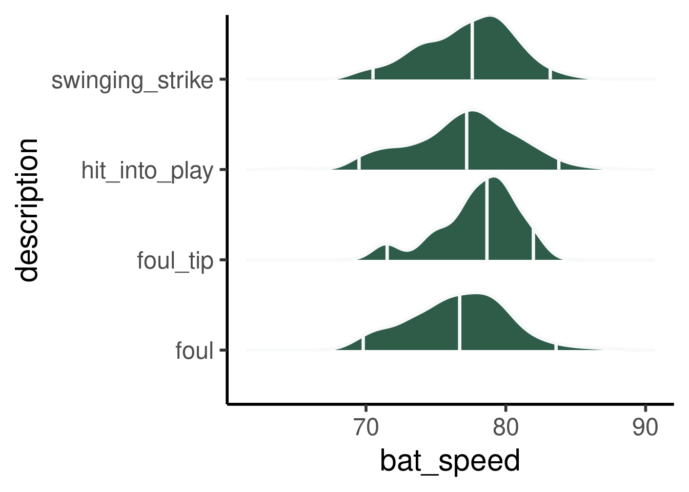
How about a per swing look? The data are from baseball savant and encompass Aaron Judge’s swings for 2025. You can use their site and download the data yourself easily! What makes this problem even more interesting is that when a player hits the ball well, it is usually because they had a good swing, one that was well located with good speed. If they whiff, they may have misjudged the pitch location and pulled back on the swing to try and adjust to the ball. So this counteracts the lack of a loss of velocity from not hitting the ball.
R code to fit initial model
options(warn=-1)suppressMessages(library(ggridges))suppressMessages(library(tidyverse))suppressMessages(library(dplyr))df =read.csv(paste0(here::here(),"/data/592450_judge_data.csv"))# Confounding --> even with competitive swings, could be "fooled" on swinging strikes# Try and find "close" swingsdf %>% dplyr::filter(bat_speed!='NA')%>%group_by(description)%>% dplyr::filter(n()>25) %>%ggplot(aes(y=description, x=bat_speed))+stat_density_ridges(quantile_lines=T,quantiles=c(0.025, 0.50, 0.975),calc_ecdf =TRUE,scale =0.93, fill='#073D27', alpha=0.84, color='#f8f9fa', linewidth=1.16)+theme_classic(base_size=22)
Picking joint bandwidth of 0.96
We see similar distributions for contacts and whiffs, but would need to subset on near whiffs for a fuller story.
The following three articles are interesting takes (through the lens of baseball) about the state of data science.
By this we mean if everyone is using a similar forecasting system, it may make sense to break from the “optimal” suggestions from the common forecasting model. This is a game theoretic approach, and is often see in sports like football, where Bill Belichick famously often “zigged while others zagged”. In football in particular, where many teams (through employees leaving for separate teams) were drafting off the same model, this can be a very useful break from predictive modeling optimizing for maximum accuracy. In fact, behavioural economics has studied this exact question: Bill Belichick: The economist?
With great models comes great responsibility
Good projection models incorporate some sort of shrinkage (a statistical concept we will become well acquainted with, don’t you worry), and tend to on average project most player’s careers reasonably well. However, almost by design, they tend to miss out on extremes. This is a problem because in most US competitive sports superstars or horrible players are extra important. Therefore, the “best” model is quite subjective and should be subject to a lot of careful scrutiny.
“Nobody goes there nowadays, it’s too crowded” - Yogi Berra
While seemingly paradoxical, Yogi leaves us an interesting insight. In the data science world, if an obvious solution exists, it probably would have been implemented already.
Numbers don’t lie, but statistics might
Reporting of data on its own can certainly be misleading, or at times simply uninteresting.
It’s an example of a measurement that’s literally true, but quite meaningless. It’s true in the sense that people probably due spend millions of hours, collectively sitting at traffic lights or traveling more slowly because of congestion. It’s meaningless, because there’s not some real world alternative where you could build enough road capacity to eliminate these delays.
So it is often advised to do more than just report data, and to take a deeper dive. Typically, this involves some model of the data, ranging from simple to complex, that requires making assumptions.
Okay, great. But where can statistics lie? We saw that statistics can be misleading in the baseball example, which was a nuanced example that was pointed out to Demetri and is not obvious at all. Let’s now consider a scenario that is, potentially, slightly more nefarious.
Say you are presenting a finding to colleagues and used a statistical learning model in your research. If you chose a model that has performed well in diverse simulation settings and/or real world data applications, and your diagnostics of the particular model output do not raise any red flags, then by all means have that model in your corner. However, if your model implies consequentially false assumptions, or has a flimsy track record, or did not perform well according to train/test diagnostics for this task2, using that model’s output to back up your suggestions is not a good idea. We suspect in many industrial settings the latter case is more common, which may be why the machine learning revolution hasn’t really transpired as expected.
2 Among other potential issues
Only train on variables you’ll be able to test on
Sounds simple, but is important. Sometimes including variables in a model will help its predictive power, but you may not be able to measure them when it comes time to deploy! Caution urged.
Beyond averages
Whenever I read statistical reports, I try to imagine my unfortunate contemporary, the Average Person, who, according to these reports, has 0.66 children, 0.032 cars, and 0.046 TVs. Kato Lomb
When we look at averages we lose important insights. For example, say Demetri has 2 hour sleep cycles. Sam has 1 hour sleep cycles. Science says that waking up at the end of a sleep cycle is a good idea, and during a cycle a bad idea. The average from a study says that people’s sleep cycles are 1 and a half hours long and you should have 5 of them, meaning the average person should wake up after 7.5 hours of sleep. But for Demetri and Sam, waking up at 7.5 hours would be in the middle of a sleep cycle, which means the science must be wrong right? No! We are just giving advice for the individual when we should only be giving license to do so for the average person.
For a data example, consider the following situation. The data are from the National Oceanic and Atmospheric Administration (noaa) government site and describe the percentage ice coverage Lake Erie achieves in a given year. Specifically, the following link will bring you directly to the .txt file on noaa’s site. Un-commenting the first few lines below will show how to load and save the data (instead of pulling it from your local folder). The point of this plot is to show that year by year, Lake Erie’s ice coverage look very different, but the average is actually quite smooth! Double click on the legend to isolate individual years. See Figure 1.4
Click here for full code
options(warn=-1) suppressMessages(library(dplyr))suppressMessages(library(tidyverse))suppressMessages(library(plotly))suppressMessages(library(NatParksPalettes))#d2 = data.table::fread("https://www.glerl.noaa.gov/data/ice/glicd/daily/eri.txt", sep = " ", skip = 0)#colnames(d2)[1] = 'Date'#write.csv(d2, paste0(here::here(), '/data/erie_ice_coverage.csv'), row.names = F)erie_ice =read.csv(paste0(here::here(), '/data/erie_ice_coverage.csv'))#pal <- natparks.pals("Acadia", n=50)#pal <- natparks.pals('Yosemite', n=50)#acadia_sub <- pal#[c(1:12,20:32)]# https://stackoverflow.com/questions/53472578/how-to-shift-the-starting-point-of-the-x-axis-in-ggploterie_plot =ggplotly(erie_ice %>% tidyr::pivot_longer(cols =starts_with('X'),names_to ='Year' ) %>%mutate(Date =format(as.Date(Date, format ='%B-%d')))%>%mutate(Date =format(as.Date(Date), "%y-%m-%d"))%>%mutate(month = lubridate::month(as.Date(Date, '%y-%m-%d'),label = F), day = lubridate::day(as.Date(Date, '%y-%m-%d'))) %>%mutate(plot_date =case_when( # use "real" date axis and wrap-around month >=10~as.Date(sprintf("2023-%02s-%02s", month, day)),TRUE~as.Date(sprintf("2024-%02s-%02s", month, day)) # account for leap year(s) )) %>%mutate(year =gsub('X', '', Year))%>%ggplot(aes(x=plot_date, y=value, group=year, color=year))+geom_line(color='#073d6d', lwd=0.16, alpha=0.63)+xlab('Date')+ylab('% of Lake Erie surface that is frozen')+scale_x_date(breaks =seq.Date(from =as.Date('2023-10-01'), to =as.Date('2024-09-30'), by ="2 weeks")) +scale_color_manual(name='Year',#values= met.brewer('Veronese', 52, 'continuous'))+values =natparks.pals("Yosemite", ncol(erie_ice)-1))+stat_summary(aes(x=plot_date,y=value, group=F),fun ="mean",colour ='#d47c17', lwd=1.5,alpha=1, geom ="line", lty=1)+theme_minimal()+theme(axis.text.x=element_text(angle=60, hjust=1), legend.position='none'))erie_plot
Figure 1.4
Surely Ted Williams knows how to swing a bat
In the excellent book “Swing Kings”(Diamond 2020), Jared Diamond highlights how legendary ball player Ted Williams offered his advice for how to swing a baseball bat for decades after his retirement. Being one of the best, if not the best, hitter to ever play, it may be surprising that people ignored his advice for over a half century! The logic was that Ted Williams was too talented so what works for him won’t work for anyone else. People are different and averages are a not a great tool, that is true. But, at some point ignore anecdotes at your own peril and listen to people who know what they are saying. Some other similar examples:
But they’ve been eating sushi in Japan for millenia: Sushi was advised against for pregnant woman for many years, despite ample evidence in Japan of there being no harms. Perhaps the populations in Japan and the U.S. are different, or perhaps our analyses conflating correlation and causation are to blame. Trust your eyes! Read this piece on Emily Oster for further commentary.
But bees do fly…
“Aerodynamically, a bumblebee should not fly. Luckily, the humble bee does not know this. Nor does it care.”
This is an interesting example of the physics being correct but the model being wrong.
How do we know that’s what dinosaurs actually looked like?
From Richard Hahn, this John Mullaney bit is actually quite enlightening. The Megalodon has been recreated from teeth fossils and some vertebrae, with the rest being filled in (“extrapolated”) from similar animals where the full record exist.
Mathematics solved traffic … remember this the next time you are stuck at a traffic light.
Which brings us to assumptions: In data modeling, we have to assume some things. Some assumptions are warranted and even invited: what is physics but just a set of assumed rules? On her study of beetles, Samantha Brozak said:
Well, I think it’s fairly safe to assume the beetles aren’t gathering weekly to discuss PTO usage.
Restricting our model to the confines of reasonable takes of the world is smart. At the same time, we need to be cautious against imposing unrealistic restrictions. We really do not understand the world very well; it is both very complex and stochastic.
1.3 Statistical fallacies
There are many such situations in statistics where we can accidentally make incorrect conclusions if we are not aware of potential fallacies. To name a few:
Ecological Fallacy: When inferences about an individual are gathered from inferences about the group, we get issues. For example, wealthier states (like California and New York) tend to vote democratic in U.S. presidential election, but individuals who are wealthy tend to vote republican.
Simpson’s Paradox: The most famous “ecological fallacy”, Simpson’s paradox states that trends for individual groups may disappear or reverse when combined. This is a fun wikipedia read. Basically are we conditioning on the right thing. For example, Derek Jeter had a lower batting average in both 1995 and 1996 than David Justice but had a higher batting average over 1995 and 1996 combined. This is due to the number of at bats both players had. Another baseball example: Billy Bluetooth, a slick hitting lefty of the 2028-2029 Boston Red Sox, dropped the following splits:
Year
Avg vs Righties
Avg vs Lefties
Overall Avg
2028
0.300 (100)
0.100 (100)
0.200
2029
0.250 (180)
(0.00) (20)
0.225
So Billy actually gets worse against both lefties and righties in 2029, but has a better overall season. This is because he faces less lefties because its a well known weakness, showing this isn’t really a paradox. The team adapted to his strengths and actually made him more valuable despite his declining play.
So this isn’t really a “paradox” per se, but rather an exercise in making sure you control for the correct information.
Regularization Induced Confounding: In causal inference, machine learning models can actually bias your estimates unexpectedly without careful care taken!
Collider Bias: In causal inference, typically you want to account for things that have a causal effect on both the treatment and the outcome, but if you control for a variable C that a variable A and variable B both cause, you now artificially have a relationship between A and B! This can lead to bad decision making by not carefully choosing which variables to control for.
Selection Biases: People more at risk for heart disease are more likely to take heart medicine. Planes that were not shot down during war were less likely to have been hit near the engine.
Confounding: There are things that cause both the intervention you may wanna study and the outcome, special care must be taken!
Model Endogeneity: The greatest bane of the applied statistician (really just an example of confounding). When a trend is discovered in baseball, then it’s utility is already on its last legs. For example, swinging with more of an uppercut leads pitchers to adapt (a coupled system!).
Goodhart’s Law: “When a measure becomes a target, it ceases to be a good measure”.
The hot hand fallacy fallacy:(Miller and Sanjurjo 2018) provide an explanation rebuking the famous “hot hand fallacy”. This is more in line with what many athletes have suggested, that there is indeed a hot hand and it not just a statistical artifact. See this great link for an explanation. Another nice explanation from the original authors!
Monty Hall problem: Relatedly, the famous Monty Hall problem. This sparked a lot of controversy. While the problem and solution were posed by Steve Selvin in 1975, the problem received renewed attention from a solution by Marilyn vos Savant’s solution in Parade magazine in 1990. A
An intuition building case is to imagine the same problem with 100 doors3. If the host opens 98 doors, knowing none had a car, and there is no car, then there is a 99% chance of a car in the next door and a 1 percent chance in your door. There was a 1% chance of a car when you initially chose the door and a 99% chance the car was in the other doors, and the host, importantly, knew not to open the correct door. Simulate it in R!
If the host did not know the door, then theoretically there would be a 50/50 chance of the car being in your door or the other. The host is no longer adding any information. However, in that case, the 98 consecutive door situation is extremely unlikely (calculable using as \((1-\Pr(\text{car}))^{98}=\Pr(\text{Goat})^{0.98}=(0.99)^{0.98}\approx 0\)), as the host would have to by chance select the door without the car every single time.
Least eigenvalue problem: When using PCA (an unsupervised approach where we do not have a labeled outcome that we will discuss later) for dimension reduction, sometimes people will then use the top factors as predictors in a regression problem (i.e. we may go from \(p\) variables to \(k\) linear combinations of the \(p\) variables). However, because the PCA (and all unsupervised learning methods) do not see the outcome ( \(y\) ), the “top” features are not well defined! Typically, the top “feature” is the linear combination of the \(p\) variables that explains the most variance in the inputs, \(\mathbf{X}\), but this approach could actually be completely useless in predicting \(y\). This is called the “least eigenvalue problem”. Variations of it affect all sorts of unsupervised learning techniques and motivates why results from unsupervised learning should be taken with a grain of salt.
(-) Computational speedbumps: This is low hanging fruit but having more covariates (meaning higher dimensional data) makes the computational burden higher.
(-) Data blindspots: In the situation where we have few samples and a lot of covariates, we may simply just not have data for certain regions of certain covariates, see (Berisha et al. 2021). As (Berisha et al. 2021) point out, this really limits how generalizable a model trained in the “small \(n\), large \(p\)” regime will be, particularly when the relationship between \(y\) and the different \(\mathbf{X}\)’s is more complex. Worse yet, you cannot “cross-validate” your way out of this one, due to the different blind spots in different validation data sets.
(-) Inadequacy of distance functions: In high dimensions, distance measures, like the Euclidian distance, become meaningless. Different pairs of points eventually become equally far apart, rendering methods like “nearest-neighbor” searches more or less useless.
(+) Kernel trick: While high-dimensionality can have some downsides, in some instances it is very useful. For example, projecting your data into a higher dimension can sometimes lead to new decision boundaries that are much more evident, see https://en.wikipedia.org/wiki/Kernel_method.
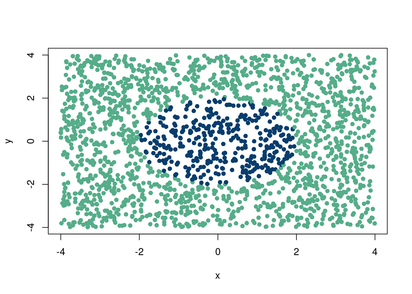
r =4N =2000inside <-numeric(N) #only zeroes removed , x <-runif(N, min =-r, max = r) # removed ,y <-runif(N, min =-r, max = r) # removed ,inside <-ifelse(x^2+ y^2<= r, 1, 0)colorz=ifelse(inside==1, '#073d6d', '#55AD89')plot(x, y, col=colorz, pch=16)
A linear classifier (to choose the correct “color”) does not exist. However, if we project to 3 dimensions \(z=xy+x^2y^2\), we can easily find the separating line:
Click here for full code
options(warn=-1)suppressMessages(library(plotly))z = x*y+x^2*y^2fig <-plot_ly(mtcars, x = x, y = y, z = z, color = colorz, colors =c('#073d6d', '#55AD89'))fig <- fig %>%add_markers(size=1)fig
3 The intuition is opposite of the hot hand fallacy fallacy, where \(n=1\) is the most intuitive case, not \(n\) large.
1.4 More data = more problems
“Hubris is the greatest danger that accompanies formal data analysis…Let me lay down a few basics, none of which is easy for all to accept…[Firstly], the data may not contain the answer. The combination of some data and an aching desire for an answer does not ensure that a reasonable answer can be extracted from a given body of data.” –John Tukey
Historically, statistics was about learning from limited data and trying to generalize expected errors. In the age of big data, it is the authors opinions that statistics still serve a vital role. Instead of something clever about limited ingredients, the focus shifts to searching for a needle in a haystack, with an emphasis on efficient ways to find the needle. we know the needle exists and will find it eventually with brute force methods, but we can be more sophisticated. next paragraph
A large portion of statistics (and optimization and numerical integration) is to take a whole collection of data and permutations of that data and summarize it as succintly as possible. Sure trying every possible scenario (grid search) is great if you have all the time in the world, but that is one if that we know we dont have. instead, investigating a plausible region of the problem you are interested in probabilistically offers a glimmer of hope in the face of nearly infinite possibilities. And if done sensibly, our statistical models should then resemble a decent proxy for the real world system we are trying to emulate.
Larger and larger datasets have led many people to speculate that the era of statistics is over and the need for traditional tools has passed. However, we disagree with that statement. Sure, some things like t-tests and an over-reliance on p-values should perhaps be retired, but the need for statistics remain strong. For example, more data do not make the bias-variance tradeoff disappear. There could still be strong over-fitting to a training dataset that do not generalize to the testing set. There also just might not be a lot of signal. Bigger and fancier models are just doing your electricity company a favor. A third example is in causal inference where by definition we can never see the counterfactual data of what would have happened if the world were different.
1.5 The good stuff going in data science
While some of the previous paragraphs have focused on where a data science project may go awry, we now want to consider situations where the enterprise can be incredibly rewarding.
Non-prediction based insights
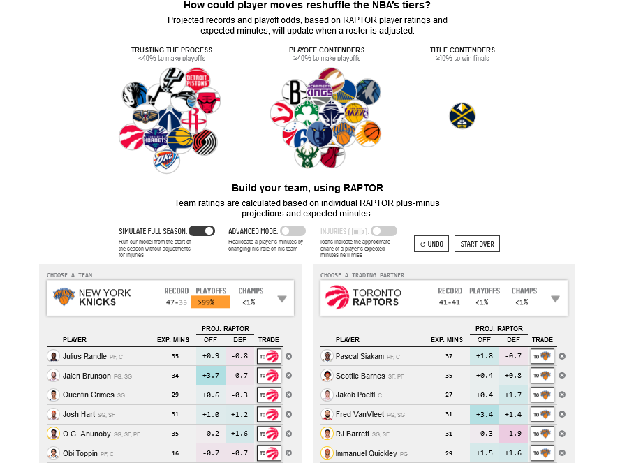
Prediction isn’t everything. In particular, studies of causation are really important and you should not scoff at experimentation. In fact, encourage it. We should be thinking counterfactually. We do not just care what happened, but what would have happened had the world been different? How would it have been different for New Hampshire versus Arizona? The OG effect. OG Anunoby was a good player on a bad team, was traded to a decent team for a similarly paid good player, and he became a good player on great team. Basketball is hard and involves a lot of complicated interactions, meaning OG Anunoby is a far more valuable with New York than he was in Toronto. Context matters a lot, between team chemistry and skill overlaps, among other factors. While a beautiful visualization and interactive tool, this fivethirtyeight NBA trade machine is limited in that it does not account for the correct adjustments needed to perform a causal analysis that a trade machine implies4. Experimentation is the easiest way to study these effects, but many sports teams are resistant to in-season experimentation (save maybe the Celtics). We won’t really delve into causal inference in this book, but the final chapter will give some references of where to start.
Replicating the OG Anunoby Knicks trade.
Loss Functions: Of course, loss functions are extremely important technically, and clever uses of them lead to really cool things (see Physics Informed Neural Networks for example). However, here I am talking about from a decision perspective. Different actions are performed based on different utility underneath the hood. People need to be upfront and hopefully on the same page about this!
Careful evaluation metrics. We talk about averages a lot in statistics. For example, in regression, we are interested in expectations of an outcome given an observed covariate, which can informally be thought of as the “typical” values we expect to see. How to define “typical”, and what typical is in respect to, is a lot harder than it sounds and a part of the nuances of statistics that make the discipline both fascinating, but also very frustrating. For example, in baseball it was found that the 90th percentile of a minor league player’s exit ball off bat velocity was far more predictive than the much more intuitive average velocity or max velocity. So in a sense, stick to the basics! Descriptive statistics are still worth a lot, and many jobs are very into clever construction of metrics, so this is a good skill to learn.
4 By causal analysis, we mean that this trade will cause, or make, this team this much better/worse.
Different perspectives help
Sticking with the baseball theme, incorporating knowledge about the physics of the game is the next great frontier in the game. This is a concept a statistician or applied mathematician gradually becomes well acquainted with in their careers. Physical constraints,or biological realism, are needed in a good modeling exercise.
It’s the features, stupid
Part of the problem with an overfocus on prediction (or more generally, modeling \(Y\mid \mathbf{X}\)) is the idea that we are just a different machine learning model away from solving our problem. STUFF+ developed by Maxwell Bay, provides a real life example of a different way of thinking. Broadly speaking, STUFF+ is a tool designed to evaluate a given pitch based on different characteristics, creating a statistic that can then be used in a prediction model, or simply as an evaluation statistic. As its prediction engine, the model uses XGBoost, which is a well maintained modern machine learning software. However, other machine learning regression tools could also be used (with similar capability) to capture relationships between the \(\mathbf{X}\) covariates.
The STUFF+ model is cool, in our opinion, for two reasons. First, because it introduces a unique covariate called “axis differential” “a statistic that attempts to describe the difference between the movement expected by spin alone and the observed movement affected by the phenomenon described as seam-shifted wake.” By including a physical characteristic like this, the model provides a more useful “grade” of a pitch. The act of creating the grade is another interesting problem that requires care when comparing pitchers.
Second, the mere act of “grading” a pitch based on how difficult it should be to hit is a really clever idea! As a concept it is a very powerful tool for a baseball team to have, as it gives a lot of information to both pitchers and hitters for every single event in a game.
1.6 Summary
At the basis of data science is data. A profound insight indeed. However, as we have seen, the data can fool you in multiple ways. Visualizations and exploratory associative analyses can easily fall victim to common statistical fallacies. Predictive modeling is not the end all be all: not all data have the information or “fingerprints” you need. You cannot machine learn your way out of this problem. If they don’t exist, they don’t exist. Studies of causation are difficult and require great care.
Aside from promoting caution and encouraging great thought about how to use data to study the problems you care about, we want to break down the type of work we’d expect you to perform as a data scientist. Broadly, there are three types of data work that you’d find yourself doing. They are:
Descriptive: Data visualization & dashboards
Predictive: Machine learning, regression
Prescriptive: Causal inference:
This blog is fantastic, and they provide the best primer on causal inference these eyes have ever seen. To borrow an example from the writing, let’s investigate how ice cream sales “cause” shark attacks.
From the excellent nothing so practical blog.
Let’s think of causation studies this way: if we observe some data and just wanna predict given those data, then whatever who cares about confounding. if we want to intervene, ie hold all else constant but the variable of interest (see the “do calculus” of (Pearl 1987)), then we do care. Shark attacks go up with ice cream sales because of warm weather driving both ice cream and shark activity (link to blog). if we hold warm weather constant and only change ice cream sales without changing the weather concurrently, the pattern in reality would not hold. but by just comparing the number of shark attacks at different ice cream sales levels, wed come to a very different and wrong conclusion! all to say, we need to be wary of looking at predictions at one value of a variable vs another and treating them as caused by that variable, because if we believe in a causal effect, we’d make decisions based on changing that variable with all else constant.
Sure, “butts, high ice cream sales today were gonna see a lot of shark attacks” is fair. “well, we better quit selling ice cream” is not wise statistically. not without also controlling the weather, or at least figuring out how warm weather is driving both ice cream sales and shark attacks… Chapter 8 will discuss how to do this.
So it all boils down to is the variable we are looking at actually causing the other one, or is it a proxy for the true cause?
Berisha, Visar, Chelsea Krantsevich, P Richard Hahn, Shira Hahn, Gautam Dasarathy, Pavan Turaga, and Julie Liss. 2021. “Digital Medicine and the Curse of Dimensionality.”NPJ Digital Medicine 4 (1): 153.
Diamond, Jared. 2020. “Swing Kings: The Inside Story of Baseball’s Home Run Revolution.”(No Title).
Miller, Joshua B, and Adam Sanjurjo. 2018. “Surprised by the Hot Hand Fallacy? A Truth in the Law of Small Numbers.”Econometrica 86 (6): 2019–47.
Pearl, Judea. 1987. “Embracing Causality in Formal Reasoning.” In Proceedings of the Sixth National Conference on Artificial Intelligence-Volume 1, 369–73.