Variable selection is an important topic in statistics. In general, having a lot of variables in a model brings with it a lot of difficulties. If we can reduce the number of variables under study and still predict well with that subset, than we should absolutely try and do so. Common approaches to do so are somewhat dubious, so we will focus on some nice “fit the fit” approaches in this chapter.
(Hahn and Carvalho 2015), in addition to introducing the concept of decoupling shrinkage from variable selection (which we will discuss later), provide a really excellent review of Bayesian variable selection, linked here. The paper does a great job relating the two concepts and is a highly recommended read. First, let’s recall a few concepts.
Regularization: In Bayesian statistics, shrinkage priors are used for regularization. As we have discussed, regularization refers to the idea that we want to bias an estimate. Doing so can help us avoid chasing noise and focus on the signal in the data. In other words, the biased estimate will have lower variance. This is particularly useful when we have a large number of predictors, many of which that are not contributors to \(y\).
Sparsity:
Bayesian model selection: The basic idea behind Bayesian model selection is to compare the marginal likelihoods of different potential models. We can use Bayes theorem a couple times and find:
where \(\tilde{f}(\mathbf{X}\mid \mathcal{M}_{i})\) is the marginal likelihood of the model \(\mathcal{M}_{i}\)1, which is equal to \(\int \tilde{f}(\mathbf{X}\mid \mathcal{M}_{i}, \theta_{i})\Pr(\theta_{i}\mid \mathcal{M}_{i})\text{d}\theta_{i}\), and \(\Pr(\mathcal{M}_i)\) is the prior for the model. In the context of Bayesian variable selection in linear regression, we establish the vector \(\phi = \{\phi_{1}, \ldots, \phi_{p}\}\) indicate a vector of 0’s and 1’s, which correspond to whether a column of the design matrix (of which there are \(p\) variables) is included as a predictor in the regression. In other words, for a particular \(\phi\), we have:
where \(\tilde{f}(\mathbf{Y}\mid \mathcal{M}_{\phi_{j})\) is the marginal likelihood of the model \(\mathcal{M}_{\phi_{j}}\), which is equal to \(\int \tilde{f}(\mathbf{Y}\mid \mathcal{M}_{\phi_{j}}, \beta_{\phi_{j}}, \sigma^2)\Pr(\beta_{\phi_{j}}, \sigma^2\mid \mathcal{M}_{\phi_{j}})\text{d}\beta_{\phi_{j}}\text{d}\sigma^2\). \(\pi(\mathcal{M}_{\phi_{j}})\) indicates the prior on the model itself, which in the case of variable selection is usually one that says some coefficients will be zero and others will not. In a different example, we could look at regression models with varying degrees of complexity, such as a polynomial regression of higher orders or a regression with interaction terms. See (Chipman et al. 2001) for a great read on Bayesian model averaging. Another excellent resource is (Hoeting et al. 1999), with link here.
1 You may be wondering why we are looking at the marginallikelihood and the not the likelihood. This is because we are conditioning on the model, which is itself comprised of a set of parameters. So we want to look at the likelihood of the data given the model, averaged over the possible parameter values of said model. For example, if we are doing a variable selection procedure and have a model that includes some variables but not the others, we still must consider the slopes on the included variables and the variance term, which themselves have prior distributions.
9.1 Why do we care?
This question is loaded. To motivate, we will first consider the scenario where the number of predictor variables in a model is similar to (or greater than) the number of observations and discuss statistical issues associated with this situation. The second situation is arguably of more practical significance but more difficult to define properly. Given a set of predictor variables, which are the most important to your model output, particularly if your estimator is a non-parametric or adaptive basis model. Can we interpret how important variables are? Were this a well posed problem, then we could theoretically allow an analyst to ask questions such as “is a job applicant’s ethnicity an important variable in their probability of receiving a job according to our machine learning model’s output?”. Unfortunately, great care is needed in defining the importance of a variable and we will discuss that in detail later.
To study the question from the first perspective, we first turn to the linear model. For the model \(\mathbf{y} = \mathbf{X}\beta + \varepsilon\) it is common to use the ordinary least squares (OLS) estimator \(\hat{\beta} = (\mathbf{X}'\mathbf{X})^{-1}\mathbf{X}'\mathbf{y}\), which has a nice closed form solution and is also the maximum likelihood estimate for \(\beta\) when \(\varepsilon\) is normally distributed. However, in the scenario where the dimension of \(\mathbf{X}\), which is \(n\times p\) is described by a \(p\) to \(n\) ratio that is near \(1\)2. Even in the case where $p\approx n $, there simply is not enough data to reliably estimate the coefficients of \(\beta\). See (Hoff 2009) who use this example as a motivator for Bayesian statistical thinking, where one can proceed by including a prior that assumes some coefficients are zero or close to it. Even for more flexible regression models, if there is the issue that there simply may not be enough observations to observe different combinations in the feature space with many variables \(p\). In this case, we are prone to “overfit”, since it is likely there will be a test set that had not been explored yet. Careful regularization, as we have seen on numerous occasions, is needed to ensure reliable prediction on yet unseen data in these scenarios.
2 If \(n\) is less than \(p\), the standard OLS estimate will not permit a unique solution since \((\mathbf{X}'\mathbf{X})\) is not invertible, meaning there are infinite solutions for \(\hat{\beta}\).
9.2 What about variable importance?
Jumping off the other aspect of variable selection that is often discussed, what does it mean for a variable to be “important”? Do we care about the marginal importance of a variable? Is the variable important in the context of another variable or in conjunction with them? Do we just care about variables that are active in the DGP versus those that are inactive? What if variables are strongly correlated, does the notion of “importance” really even mean anything? Pardon us for belaboring this point throughout these notes, but there are a lot of ill-defined concepts in modern statistics that make it difficult to assess effectiveness and usefulness of different methods.
For a quick toy example as to why “variable importance” is a fuzzy concept, consider the following. Say our outcome is a mortality metric, and our inputs are age, having the flu, and owning a car. For all people, the effect on mortality is dominated by age, and there is a small impact that comes with owning a car, and a smaller impact that comes with having the flu. However, if you are old and have the flu, then all of a sudden the flu has an outsized effect on your mortality. So flu status is a major variable to consider when it interacts with certain age groups, but otherwise is “less important” than owning a car.
Our goal in this section then will be to provide a view of variable importance we think makes sense and why common alternative do not quite align with this view. The general framework we will suggest here is a “fitting the fit” type approach, advocated by (Carvalho et al. 2021), which holds its roots in the decision theoretic approach of distilling posterior distributions (Hahn and Carvalho 2015), which was expanded for non-linear models in (Woody, Carvalho, and Murray 2021).
Even with these approaches, we still can run into problems. Consider the case when our variables follow a “factor model” structure. Say we have 3 distinct clusters of variables, but in each cluster the variables are very correlated. Even the approach we advocate for may not consistently return the same order of variables in terms of their ability to “fit the fit”, as any of the very correlated variables would suffice. Does that mean the non-highly ranked variables are not important? Even if the variable order isn’t consistent (for example different correlated variables within a cluster may trade places for which is “important” and which is not), we still can predict well with the chosen variables, so isn’t that enough? These are the difficult questions that make variable importance a difficult subject. More detail to come…
9.3 Common approaches
In classic linear regression models in statistics (add the Hoff stuff about variable selection motivator for Bayesian statistics). Given these statistical issues in the \(p\approx n\) situation, devising methods that can deal these issues seems like a smart avenue to stroll down. We will introduce a few such methods and describe some pros and cons of each in the following sections.
Notice, however, that the motivating example in the previous paragraph is motivated purely by trying to avoid statistical roadblocks; it does not at all provide any notion of what “variable important”. Methods motivated by trying to provide an ailment for … Instead, thinking of variable selection as a way to quantify how well subsets of variables can return your overall fit. The main approach is to disentangle the “modeling” stage & the “selection” stage, following the script from “Decoupling Shrinkage and Selection” (Hahn and Carvalho 2015). This chapter will continue to elaborate then on so-called variable importance, setting up the takeaway message of how we propose one to deal with this in practice.
9.4 The LASSO
The LASSO is a very famous and widely used method in statistics. From the blog of Richard Hahn comes this interesting point:
Unrealistic assumptions about the data. To take a high-profile example of unrealistic assumptions, consider the LASSO method for performing variable selection in linear regression models. The LASSO is one of the most highly cited applied mathematics papers of all time. Tracing its intellectual history provides some illuminating context for evaluating the LASSO’s merit. The LASSO has its roots in an earlier method called compressed sensing, which was effectively a result in the design of experiments. It explained that to perfectly reconstruct an image, one needed only a logarithmic number of observations, provided that the original signal was sparse in a certain sense and if the observations were (essentially) taken at random. In this application, the first condition was an explicit, but plausible assumption, and the second condition was achievable by the researcher!
When this mathematical result is ported over to the applied statistics context, and applied to observational data, the first assumption is more dubious and the second condition is flat out preposterous! As such, with inapplicable theory behind it, the LASSO isn’t any better than older heuristic approaches such as forward selection, which are more straightforward to motivate and teach and which exhibit comparable empirical performance.
The comparison to compressed signal processing will be explained now, with a nice stackoverflow link provided here. The LASSO can be written as:
\[
\| y-\mathbf{X}\beta\| +\lambda \|\beta\|_1
\]
Where \(\| \|_1\) indicates the 1-norm (the absolute value). This is a form of regulariztion (similar to what we saw in chapter two) where we purposely add some bias to reduce the variance of our estimator of the coefficients in our linear regression model.
In the signal processing sense, regularization proceeds via:
It’s the same thing3! Except now \(\beta\) are not regression coefficients, but the full image/signal and \(y\) is the reconstructed image. The design matrix, \(\mathbf{X}\), is usually chosen to be a random matrix. The applied statistician is usually given what they are given, as the design matrix represent observed covariates. Random vs fixed is not really the point however, it is simply meant to illustrate in the signal sensing sense, the researcher chooses the design matrix. The applied statistician (or data scientist) likely will not. Having the freedom to select their design matrix, in the signal sense the matrix \(\tilde{\mathbf{X}}\) is usually chosen to be orthogonal (which implies \(\tilde{\mathbf{X}}'\tilde{\mathbf{X}}\) is diagonal). In the case of image reconstruction, this implies collecting data points at random on an image. This is done for the theoretical guarantees. In the statistical regression sense, it is uncommon for the covariates in the design matrix to be from an orthogonal design. Additionally, sparsity in the signal is usually assumed in the signal world for mathematical reasons (which as Richard points out, is not unreasonable in signal analysis). Thus, the theoretical guarantees that accompany LASSO regularization in signal processing world probably won’t hold in statistics world as the assumptions are unlikely to be met. Empirically, the results usually are not fantastic either, and the difference in motivation can help explain that. For a more thorough explanation in the context of signal processing, read this(Zhang 2021).
3 Tikhonov regression in applied mathematics is essentially the same as ridge regression in statistics. So it goes.
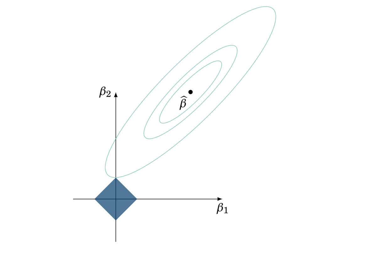
In statistics, the LASSO is commonly used for “variable selection”. Why? This is usually explained with the following image:
The blue square on the bottom symbolizes the absolute value of the sum of the two coefficient terms which we add to the usual objective function (the sum of squares \((y-\hat{y})^2\) typically) to help regularize. The \(X\) and \(Y\) axis in the graph represent possible combinations of \(\beta_{1}\) and \(\beta_{2}\). The diamond represents areas where the solution cannot lie (that’s the bias we add on for the sake of regularization). The shape is a diamond because we are adding on the absolute value, which takes that shape. Ridge regression admits a circle, since the equation for \(L_2\) norm regularization is a circle.
If the value of one of the coefficients touches one of those corners, than one of the \(\beta\) has to be zero. For example, the “12 O’Clock” corner means \(\beta_{1}\) is 0 and \(\beta_{2}\) is whatever that value is (which will depend on the choice of the constant \(\lambda\) as well). This is nice, theoretically, if we have a lot of variables in our design matrix (many independent variables) and some are truly useless. Without the regularization, we may assign small coefficients due to numerical issues with small sample sizes (few observations, \(n\), of \(y\) and \(\mathbf{X}\)), which will cause issues in our estimation.
We have discussed theoretical shortcomings of the LASSO in the applied statistics regime as well as the use. We will briefly describe some “pros” and “cons” of practical implementation of the LASSO.
Pros
Easy implementation in R
With sufficient data, and if the DGP is truly a linear model with many zero coefficient \(\beta\), then the LASSO (with a certain choice of the \(\lambda\) parameter) can zero out the truly zero coefficients.
Cons
1) In order to return the correct non-zero coefficients, the LASSO requires the model to be additive (or the interactions to be pre-specified correctly), have sparsity in the coefficients, and is still dependent on the user chosen \(\lambda\).
2) 1) is a pretty massive caveat, not sure more is needed here.
3) Doesn’t help a lot in prediction problems, per the authors experience.
where \(\delta\) is the Dirac function which equals zero everywhere except at 0. This is the “spike”. In practice, this is done by placing a \(N(0, \sigma_{1}^2)\) prior on \(\delta_{0}\), where \(\sigma_{1}^2\) is close to 0. \(w_j\) is a latent variable that corresponds to \(1\) if variable \(j\) has a coefficient that contributes to the model (i.e. \(\beta_{j}\neq 0\)) and \(0\) otherwise.
The second part is a weight times a normal distribution with a zero mean and some variance. That is, the “spike” zeroes out the coefficient and the slab gives it some non-zero value. Therefore, the prior on \(w_j\) represents our belief in the probability that coefficient should be zero, i.e. \(\Pr(\text{variable is included})=\Pr(w_j=1)=p_j\). If \(w_j=1\), i.e. the variable is presumably “active”, we draw from a \(N(0, \tilde{\sigma}^2)\) distribution. If \(w_j=0\), we draw from the \(\delta_0\) term, which is veryt strongly centered at zero, meaning we assign a value to \(\beta_j\) of zero or very close to it.
This formulation yields a posterior distribution over the parameter values for all the slopes, the residual error term \(\sigma^2\), and, importantly, the indicator latent variables which say whether or not the variables are probable to be included. Of course, a posterior boils down to essentially4 a likelihood times a prior. Although prior to seeing data we assume most variables do not contribute to the final model (i.e. many coefficients should be zero and therefore inactive), likelihood contributions could over-ride these prior stipulations. Say we somehow know true data generating process and that \(x_1\) is a very “influential” variable in the hypothetically known data generating process. If a model that does not include \(x_1\), the likelihood of that model, essentially how well the predicted values “fit” the observed values.
4 Save for a pesky constant, which unfortunately is necessary, but also cumbresome to calculate.
For example, with a normal likelihood and independent observations that are identically drawn (iid in the parlance), the data are assumed to be drawn from \(f(y_1, \ldots , y_n\mid \mu, \sigma^2) = \prod_{i=1}^{n}f(y_i\mid \mu, \sigma^2) = \left(\frac{1}{2\pi\sigma^2 } \right)^n/2\exp(-\frac{\sum_{i}^{n}(y_i-\mu)^2}{2\sigma^2})\). The \(\sigma^2\) value, in the linear regression case, is the error residual term, and the \(\mu\) term is the \(\mathbf{X}\beta\) value from the \(\beta\) value we draw. If the contribution from this term suggests that omitting some \(\beta_j\) term is a bad idea (i.e. the evaluated number when plugging in for \(f(\cdot)\) is small), then this can easily over-ride prior distributions. And this is driven by the data! This can be seen from the \(\sum_{i}^{n}(y_i-\mu)^2\) term in the numerator of the exponential, which is a way to evaluate if \(\mu\) (\(\mathbf{X}\beta\) in this case) is a good parameter for your model, or if your model is any good (through the updating of \(\Pr(w_j=1)\)).
Notice that this approach accounts for uncertainty in both the parameters and the model. This is because depending on the value of \(w_j\) sampled in the posterior, the model will be different! \(y=\beta_1x_1+\varepsilon\) and \(y=\beta_1x_1+\beta_2x_2+\varepsilon\) are fundamentally different models, not just different in their estimates of the respective \(\beta_j\)’s.
9.5.1 Visualizing different forms of uncertainty
The model, or the probability distribution we sample from (Hoff 2009), includes an error term, \(\varepsilon\)5. Different samples from the model, aka different hypothetical data, will represent uncertainty through the random draws taken from the distribution of \(\varepsilon\). However, the slope (and intercept) themselves can be considered to have their own uncertainty as well, with distributions assigned to the parameters before seeing any data (the priors).
5(Doss and Linero 2024) have a nice discussion on different types of uncertainty in modeling exercises, which is a worthwhile read.
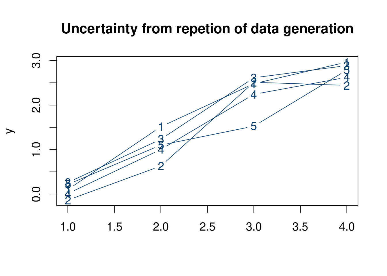
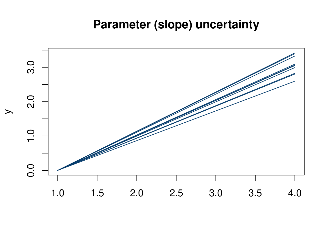
The plot below (hopefully) helps elucidate this distinction. The top plot shows realization of data from the linear model with a normal error term. The second show uncertainty in the slope parameter (a priori). Notice in the first plot Figure 9.1 the connected dots do not constitute a straight line, as they show a realization of data corrupted by noise. The second plot, Figure 9.2 shows the uncertainty in what the slope of the linear model might be.
Click here for full code
N =4t =seq(from =0, to =1, length.out=N)y =3*t+rnorm(N, 0, 0.25)y =sapply(1:5,function(k)3*t+rnorm(N, 0, 0.25) )par(mfrow=c(1,1), cex=1.25)matplot(y, col='#073d6d', type='b', lty=1, cex=1, main ='Uncertainty from repetion of data generation')
Of course, there is uncertainty in the selected models as well, as discussed above, but this is more difficult to visualize.
9.6 Implementation
The implementation is done via a Gibbs sampler. As usual, assume we have \(n\) observations with \(p\) input variables in \(\mathbf{X}\). One would think you could just run every model combination of the \(\beta\)’s and the \(w_j\)’s attached, but there would be \(2^p\) combinations of yes’s/no’s for variable inclusion in the model. One of the most important innovations of (George and McCulloch 1993) then is to develop an algorithm for efficiently sampling from the posterior distribution without having to
The approach is conceptually a Gibbs sampler:
Sample \(\beta_j\) given the rest of the parameters and the data. \(w_j\) is a Bernoulli random variable drawn from \(\Pr(w_j=1)\), which is updated in the next step of the Gibbs sampler.
Sample \(\Pr(w_j=1)\) given the rest of the parameters (including the updated \(\beta\)’s) and the data.
Sample \(\sigma^2\) given the \(\beta_j\) and \(w_j\) and the data.
So what we are left with is a probability distribution for the all the \(\beta_j\)’s and all the \(w_j\)’s. If \(w_j\) is frequently made to be \(0\), that \(\beta_j\) will draw from a distribution near the “spike”, which will be very close to zero, by design. Instead of looking at \(2^p\) possible combinations of input variables \(x_j\) and their coefficients \(\beta_j\), this procedure dials in on the more probable models by sampling the posterior of \(\Pr(w_j=1)\) through the stochastic Gibbs algorithm.
9.6.1 Traditional Bayesian linear regression
EXPLAIN!!
The idea is to update the residuals in the Gibbs loop.
We have to set prior parameters \(\mathbf{V}_0^{-1}\), which we set as the identity matrix with \(p\) entries and \(\beta_{0}\), which we set to be a length \(p\) vector of \(1\)’s. Finally, we set \(a=b=1\) for the \(\sigma\) prior. \[
\begin{align}
\mathbf{V}_1 &= \left(\frac{\mathbf{X}'\mathbf{X}}{\sigma^2}\right)^{-1}+\mathbf{V}_{0}^{-1}\\
\beta_{1}&=\mathbf{V}_1\left(\frac{\mathbf{X}'\mathbf{y}}{\sigma^2}+\mathbf{V_0}^{-1}\beta_{0}\right)
\end{align}
\]
We then update \(\beta \sim \mathcal{N}(\beta_{1}, \mathbf{V}_1)\). Finally, we can update \(\sigma=\tilde{S}\), where \(\tilde{S}\sim \text{inverse gamma}(a+\frac{n}{2}, b+\sum_{i=1}^{n}\frac{r^2}{2})\).
9.6.2 Stochastic search variable selection
While we described the stochastic variable selection problem above, we omitted most details. At some point, we’re all told we can’t play the game anymore. We begin by calculating the residual removing just one variable, indexed by \(j, j=1,2, \ldots, p\), i.e.
\[ \mathbf{r} = \mathbf{y}-X_{-j}\beta_{-j} \]
With \(\beta\) in hand, we calculate the residuals \(\mathbf{r}=\mathbf{y}-\mathbf{X}\beta\)
FINISH THIS LATER.
Pros
1) Does allow us to compare permutations of variables being active/inactive
2) Unlike the algorithmic Lasso, this is a model based approach, allowing for inference. That is, we can look at the posterior probabilities of inclusion for certain covariates, rather than just seeing if they are zero or not.
Cons
1) Takes a longer time to run
2) Do not explore the entire posterior space. That would require \(2^p\) models to be looked at (because we would have to look at every combination of variables turning on/off).
3) Like the LASSO, still imposes the assumption that many coefficients are zero (is also meant for linear regression), this time through the choice of prior.
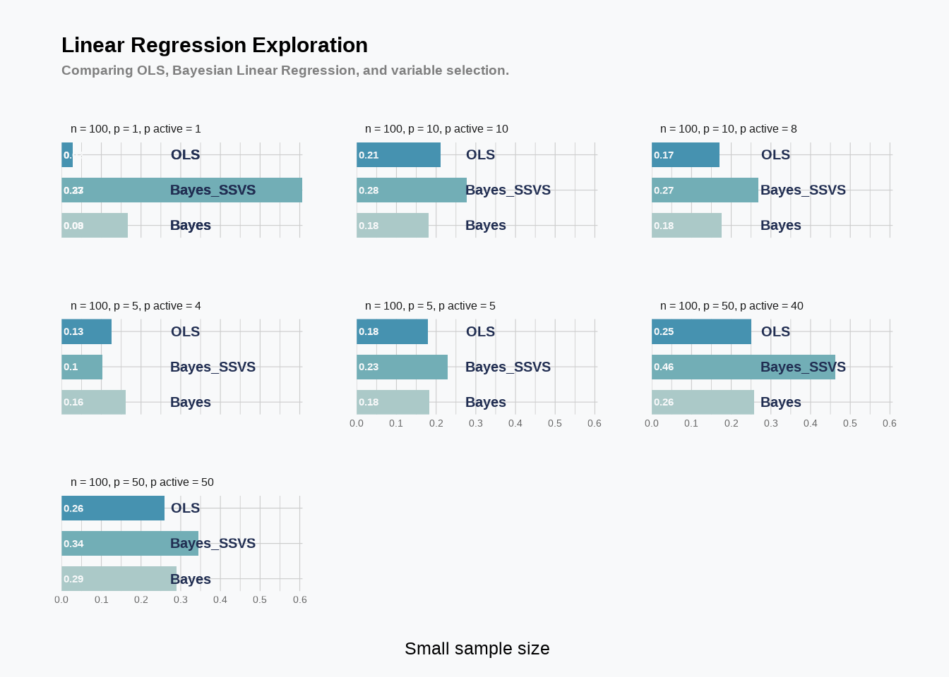
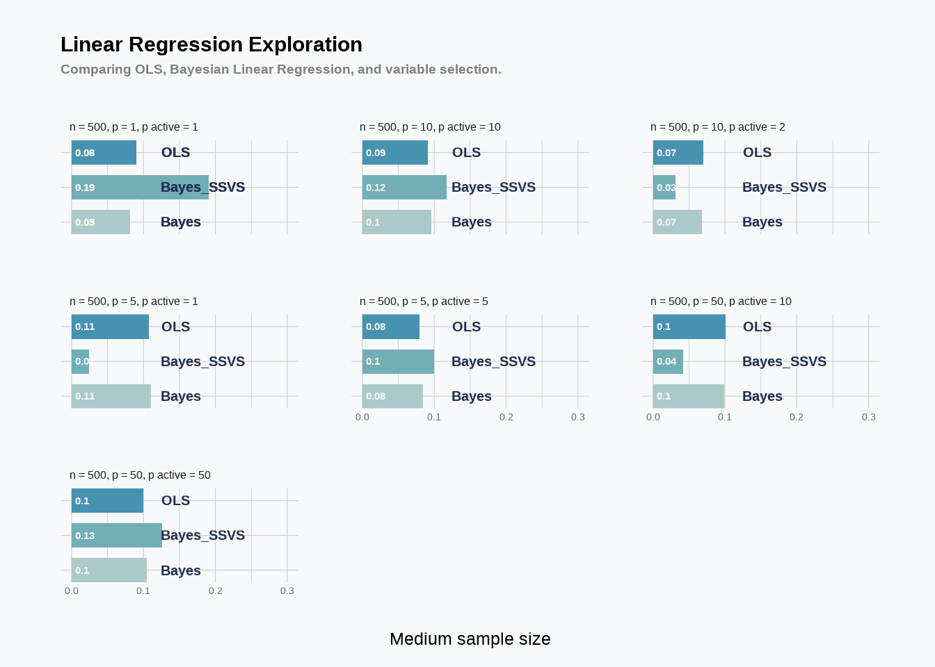
Note, in the code before we only use 250 monte carlo draws so that when you copy this code it runs in a reasonable amount of time (as we loop through 24 simulations). In the simulation we run normal linear regression, bayesian linear regression (where we place priors on the \(\beta\) coefficients and the error term \(\varepsilon\), and the stochastic variable selection search described above. Our metric of success is the value of the coefficient predicted for \(\beta\) (i.e. \(\hat{\beta}\)) vs the truth. We perform this simulation over various settings, including settings where there are no zero coefficients in the truth (all variables matter) and the case where most variables are actually zero. We do this for different sample sizes, different number of variables, and varying the ratio between those two things. As usual, crank up the number of MCMC posterior draws.
Click here for full code
options(warn=-1)suppressMessages(library(dplyr))suppressMessages(library(tidyverse))#library(tidytuesdayR)#library(tidyverse)suppressMessages(library(showtext))suppressMessages(library(MetBrewer))suppressMessages(library(hrbrthemes))suppressMessages(library(gt))RMSE <-function(m, o){sqrt(mean((m - o)^2))}# generate synthetic data to test our code withbayesregress=function(p, n, sig.true, beta.true, beta_compare_flag=T){ X =matrix(rnorm(n*p),n,p) y = X%*%beta.true + sig.true*rnorm(n)# Gibbs sampler for Gaussian linear regression mc =250# preallocate containers for our posterior samples betas =matrix(NA,p,mc) sigmas =rep(NA,mc)# initialize parameters beta =rep(0,p) sigma =2# precompute X'X XX =t(X)%*%X Xy =t(X)%*%y# specify prior parameters V0inv =diag(1,p,p) beta0 =rep(1,p) a =1 b =1# main Gibbs loopfor (iter in1:mc){# sample beta, given sigma V1 = MASS::ginv(XX/sigma^2+ V0inv) beta1 = V1%*%(Xy/sigma^2+ V0inv%*%beta0)#update beta beta = MASS::mvrnorm(1, beta1, V1)# sample sigma, given beta r = y - X%*%beta#from the conjugate prior wiki sigma =1/sqrt(rgamma(1,a+n/2,b+sum(r^2)/2))# save samples betas[,iter] = beta sigmas[iter] = sigma } fit =lm(y~X-1) beta.bar =rowMeans(betas) beta.hat = fit$coefficients betas_var =matrix(NA,p,mc) sigmas_var =rep(NA,mc) qs =rep(NA,mc)# initialize parameters beta_var =rep(0,p) sigma_var =1 q =0.1# specify prior parameters V0inv_var =diag(1/100,p,p) beta0_var =rep(0,p) a_var =1 b_var =1# use uniform Beta(1,1) prior on q# main Gibbs loopfor (iter in1:mc){# sample beta, given sigmafor (j in1:p){# residualize wrt known values of beta r = y - X[,-j]%*%beta_var[-j]#r ~ N(X_j*beta_j,)#V1 = solve((1/sigma^2)*XX + V0inv) v1_var =1/(XX[j,j]/sigma_var^2+ V0inv_var[j,j]) beta1_var = v1_var%*%((1/sigma_var^2)*t(X[,j])%*%r + V0inv_var[j,j]%*%beta0_var[j]) beta.temp = beta1_var +sqrt(v1_var)*rnorm(1) q.post = q/(q + (1-q)*dnorm(0,beta1_var,sqrt(v1_var))/dnorm(0,beta0_var[j],1/sqrt(V0inv_var[j,j]))) gamma =rbinom(1,1,q.post) beta_var[j] = gamma*beta.temp + (1-gamma)*0 }# sample sigma, given beta r = y - X%*%beta sigma_var =1/sqrt(rgamma(1,a_var+n/2,b_var+sum(r^2)/2))# sampling q h =sum(beta_var !=0) q =rbeta(1,1+h,1+p-h)# save samples betas_var[,iter] = beta_var sigmas_var[iter] = sigma_var qs[iter] = q } beta.bar_var=rowMeans(betas_var)#print(rbind(beta.bar,beta.hat))if (beta_compare_flag == T){return(data.frame(beta.true, beta.hat, beta.bar, beta.bar_var)) }else{ OLS_RMSE <-RMSE(y, fit$fitted.values) bayes_RMSE <-RMSE(y, X%*%rowMeans(beta)) bayesvar_RMSE <-RMSE(y, X%*%rowMeans(betas_var))return(data.frame(OLS_RMSE, bayes_RMSE, bayesvar_RMSE)) }}#### Repeat with just varying n, p, and num_zeroes ##### sample sizes of 100, 500, 1000 for four different "p"n_tot =2p_tot =4n <-c(rep(100, p_tot), rep(500,p_tot))# Number of variablesp <-rep(c(1,5,10, 50), n_tot)# create the betas uniform -1,1 for eachbeta.true =lapply(1:(n_tot*p_tot), function(j)runif(p[j], -1, 1))# These are the number of non-zero coefficientsnon_zero =c(ceiling(0.8*p[1:4]), ceiling(0.2*p[5:8]))#, #ceiling(0.1*p[9:12]))# make the betas non-zero for the number of non-zeroes, zero otherwisebeta.true_sparser =lapply(1:(n_tot*p_tot), function(j)c(beta.true[[j]][1:non_zero[j]], rep(0, p[j]-non_zero[j])))# make all the betas into a listbeta.true =c(beta.true, beta.true_sparser)# repeat n for the sparse and non sparse regressionn <-rep(n,2)# Number of variablesp <-rep(p,2)sig.true =rep(2, 2*(n_tot*p_tot))Output<-c()BAYES<-c()OLS<-c()BAYES_var<-c()for (j in1:length(n)){ Output[[j]]<-bayesregress(p[[j]],n[[j]],sig.true[[j]], beta.true[[j]], beta_compare_flag = T)# If beta_compare_flag=F#OLS[[j]]<-Output[[j]]$OLS_RMSE#BAYES[[j]]<-Output[[j]]$bayes_RMSE#BAYES_var[[j]]<-Output[[j]]$bayesvar_RMSE OLS[[j]]<-RMSE(Output[[j]]$beta.true, Output[[j]]$beta.hat) BAYES[[j]]<-RMSE(Output[[j]]$beta.true, Output[[j]]$beta.bar) BAYES_var[[j]]<-RMSE(Output[[j]]$beta.true, Output[[j]]$beta.bar_var)}non_zero =c(p[1:(n_tot*p_tot)], non_zero)df_analysis =data.frame(n,p,sig.true,non_zero, BAYES=round(unlist(BAYES),3), BAYES_var=round(unlist(BAYES_var),3),OLS=round(unlist(OLS),3))%>%mutate(winner=ifelse(BAYES_var<OLS&BAYES_var<BAYES, 'BAYES_var', #bayes_var is bestifelse(BAYES_var<BAYES&BAYES_var>OLS, 'OLS', #ols, bayes_var, bayesifelse((BAYES_var>BAYES)&(BAYES_var<OLS), 'BAYES', 'ols'))) ) #bayes, bayes_var, ols#else is ols, bayes, bayes_vardf_analysis_long =data.frame(n=rep(n,3),p=rep(p,3),sig.true=rep(sig.true,3),non_zero=rep(non_zero,3), RMSE=c(round(unlist(BAYES),3), round(unlist(BAYES_var),3),round(unlist(OLS),3)), name =c(rep('Bayes',length(unlist(BAYES))), rep('Bayes_SSVS',length(unlist(BAYES_var))),rep('OLS', length(unlist(OLS))) ))df_analysis_long$n_p =paste0('n = ', n, ', p = ', p, ', p active = ',non_zero)df_analysis %>%gt()%>%data_color(columns=c(winner), palette=c('#012296', '#A3A7D2'))
Scale for x is already present.
Adding another scale for x, which will replace the existing scale.
Click here for full code
showtext_opts(dpi =63) plot_1
Click here for full code
plot_2
Assignment: Add the Lasso & Ridge regression and compare the results.
Add the LASSO and RIDGE models as comparisons.
Turn on the “RMSE” flag, and compare the RMSE of the predictions of the methods above with BART as well.
(Linero and Yang 2018) present a sparsity inducing Dirichlet prior which encourages less variables to be used in a BART modeling procedure. This is more in line with the “spike and slab” approach from earlier in the chapter. Try and read the paper and run the Dirichlet BART model using this BART package on the simulated data above.
9.7 On to non-linear models
9.7.1 Fitting the fit based approaches
Common variable important techniques in BART models include counting how often a variable appears across the tree. Other popular importance measures in random forest and XGBoost are similarly defined. This isn’t a great indicator of how variables interact, and just because a variable appears in a tree does not mean it is contributing a whole lot to the overall fit.
9.7.1.1 Posterior summarization
The ideas originated in “Decoupling shrinkage and selection” (Hahn and Carvalho 2015) and expanded upon in (Woody, Carvalho, and Murray 2021) provide an interesting idea to build off. The idea in those papers is as follows:
Fit a flexible Bayesian model for to approximate the true function, that is: \(f(x)= E(Y\mid \mathbf{x})\longrightarrow \hat{f}\). Just use BART here it fit well off the shelf and automatically gives posterior samples, meaning
Fit the posterior of the BART fit, \(\hat{f}\), with a simpler model. This is done by finding the optimal linear model according to a loss function describing the summarization
Where \(\mathbf{\tilde{x}}\) just indicates the the locations of the data used for prediction here do not need to be the same as those fit in the first stage. The details of the loss function can be found in (Woody, Carvalho, and Murray 2021) (here is an arxiv link).
Evaluate how well the simpler model fits the posterior, and pick a more complicated model if need be. Iterate.
This idea is interesting because even if a linear model is a mis-specification for the outcome, that is not a major issue here because the conditional expectation of the outcome given the covariates is modeled with the more flexible BART model. Finding the best linear fit to the posterior draws of \(\hat{f}\) can then be interpreted as the average partial effect of the variables included in the linear model. For inference on the conditional expectation of \(y\mid \mathbf{x}\) or for out of sample prediction given new \(\mathbf{x}\), the BART model fit from the first stage does the heavy lifting. For “interpretability”, the procedure of (Woody, Carvalho, and Murray 2021) makes a lot of sense.
Below, we’ll do a really quick simulation to help illustrate the value of the above idea. We will simulate from a linear model (part of the benefit of this paper is that they do not directly fit a mis-specified outcome to the model, but rather to the conditional expectation\(E(Y \mid \mathbf{x})\) estimated by specifying a BART prior. Additionally, for this example, we simply focus on a point estimate for a linear summary, which assumes that the loss function specified in 1) is the mean squared error loss. In this case, we look at the posterior mean, \(\tilde{f}\), and find the “best” linear model summary of \(\tilde{f}\) (using OLS). This simulation does not necessarily illustrate a useful application of posterior summarization, as there is only one input variable, the true DGP is already a linear model with additive Gaussian noise, we do not look at imposing sparsity in the loss function (we are basically ignoring the decision theory aspect of this), we do not take advantage of looking at different locations of \(\mathbf{x}\) in the summary stage, and we are not looking at the posterior distributions of the summary model.
The first stage BART fit “de-noises” the data, which of course any flexible conditional mean model will do (say a random forest or a neural network). Because However, BART provides posterior draws of \(f\), meaning we can propagate uncertainty into the second stage in addition to the benefits of modeling the conditional expectation with the flexible BART and the (likely mis-specified if modeling the outcome) linear model for “interpretability”.
To summarize, there are a few nice things about this approach:
Inference (and prediction) are separated from the “interpretability” stage. A linear regression may not be a great model for prediction (particularly if the date generating process is not linear), but if we just want to estimate the average partial effect6, then we are okay! Of course, the average partial effect may be a silly thing to want to know if we believe that holding other variables constant is a poor assumption…but this is testable and we still have our powerful predictive tool and don’t have to refit our whole model (just find a better estimand for “interpretability”).
To complicate the matter even more, an assumption does not need to be correct to be useful (or at least, not actively harmful). George Box’s oft-quoted slogan “all models are wrong, some are useful” conveys this essential fact, but its pithiness obscures an important nuance: the same model can be useful for one task and useless for another! For example, linear regression is a suitable method even if the true conditional expectation isn’t linear, provided that the estimand of interest is the average partial effect of a particular variable (and assuming other conditions are satisfied). This is more-or-less the vantage point championed by Joshua Angrist in his popular econometrics textbook Mastering ’Metrics. On the other hand, if the goal is out-of-sample prediction, then a linear model would be inferior to a more flexible one if the conditional expectation is, in fact, nonlinear. Thus, modeling assumptions within a culture are driven by matters of use-specific adequacy as well as matters of subject-specific fact.
The penalty for “interpretability” (i.e. for smoothness or sparsity) is well motivated since you are explicitly looking for the best simpler model that satisfies that constraint/penalty. It doesn’t matter so much if it doesn’t predict as well, and if that is a consideration, evaluation metrics on the projection can still be performed.
Since the first stage model fits the conditional mean, the second stage projection may have more narrow uncertainty bars due to a less noisy version than the raw data. Also could see shrinkage of the estimate compared to OLS (for the linear projection) due to the BART shrinking prior properties.
Uncertainty is propagated throughout automatically!
6 The average partial effect is the partial derivative of \(\hat{f}\) with respect to one variable while holding the rest constant.
9.7.2 CHM approach
(Carvalho et al. 2021) present the following steps for their variable selection approach.
Fit a flexible Bayesian model for to approximate the true function, that is: \(f(x)= E(Y\mid \mathbf{x})\longrightarrow \hat{f}\). Just use BART here it fit well off the shelf and automatically gives posterior samples, allowing for uncertainty quantification later.
Fit the posterior of the BART fit, \(\hat{f}\), with subsets of the data. This can be done by fitting a tree to every possible combination of variables and selecting the variables which explain the most variance in the fit (this depends on the loss function of interest, the default is the \(r^2\) so we will stick with that here). If there are too many variables, a greedy stepwise search method can be used, which starts with one variable, then adds a second, then a third and so on. The idea is that we fit a large tree to \(\hat{f}\) and the variable \(X_{\text{top}}\) that fits \(\hat{f}\) the best (based on some evaluation criterion) is now the “most important variable”. The procedure is repeated by fitting a tree with \(X_{\text{top}}\) and the variable that in conjunction with \(X_{\text{top}}\) explains the most variance in the fit of \(f\). This is then repeated with as many variables as the user wants, typically chosen until the subset of variables selected creates a useful “surrogate” for \(\hat{f}\). Note, like in the posterior summarization, the \(\mathbf{X}\) chosen here does not have to be the same as the training \(\mathbf{X}\), and can be any \(\mathbf{X}\) we are interested in, such as a test hold out set.
Because this procedure is Bayesian, uncertainty quantification can be studied by looking at the posteriors of the selected surrogate (by re-running BART with just the selected variables).
The beauty of this approach comes from the fact that it looks at variable selection through a “loss/utility” lens. By looking at the subset of variables that minimize a loss function between the subset model and \(\hat{f}\), the authors do not need to impose a sparsity inducing prior or make any assumptions about the relation between the inputs, \(\mathbf{X}\) and the response, \(y\). The stepwise approach for “ranking” variables is not strictly necessary. If the goal is the find the “5 most predictive” variables, we could also try every combination of 5 variables and give those (in no-particular order) as the 5 “most important” for \(r^2\) (or whatever distance metric chosen) consideration. This can become expensive very quickly and feels a little more arbitrary than the variable ranking approach.
Another cool thing this approach does is take advantage of the benefits of a deep regression tree without running into the common pitfalls of overfitting. That is because they are fitting the conditional expectation, approximated by \(\hat{f}\). Remember in our bias variance tradeoff discussion, the conditional expectation represents the “signal” portion of the model. Models like deep decision trees struggled to predict well because they fail to distinguish the signal from the noise. Well here, the big tree is fitting the conditional expectation given by BART (which models the error term in addition to the average response given the covariates), making it another brilliant, yet relatively simple, idea in statistics.
So if we have spent the preceding chapters berating the limitations of predictive models and harping for more causal inference, why advocate for fitting the fit? Well, if prediction is all you need and there is really no potential to intervene on any variables (for example weather forecasting, astronomical observations, or housing prices for a prospective buyer), then prediction is important! And if you have a lot of variables, there are both computational concerns and statistical concerns with a large number of covariates, so being able to reliably predict with a subset of them is a big virtue. Fitting the fit also allows you to run the procedure on any covariate values you’d like, whether it be the training \(\mathbf{X}\), an out of sample testing \(\mathbf{X}\) from your original \(\mathbf{X}\) values, or completely unseen values of your covariates7! This flexibility can be used to test the reliability of your reduced covariate model on a variety of different input values.
7 Albeit with the correct outcome \(y\)’s attached. This is still a supervised learning approach after all.
9.7.3 Data example
The following is an example of “fitting the fit”, with an application to health data from a smartwatch. The data is from an unnamed user (who you can probably guess) and mostly consists of 2023/2024 data. The data can be exported from the “health data” app on an iphone, as well as the “autosleep” app. The autosleep app exports to an “octet-stream” file, which can be saved as a csv in excel/libre office. We will eventually attach the cleaning file, but not right this second. It is unclear how accurate the data are, and there is also the issue of inconsistent useage of the Apple watch SE 1st generation (accompanied with an iPhone 12 mini).
The following (not run) code shows how to generate these data.
Additionally, we use a pretty standard BART fit, just with a smaller number of trees than usual (as recommended by (Carvalho et al. 2021)), but feel free to mess with the BART prior as you see fit.
With the data cleaning done, we transition to some fun EDA (exploratory data analysis)
Click here for full code
suppressMessages(library(NatParksPalettes))# Look at how these features covary togethervals =unique(scales::rescale(volcano))o =order(vals, decreasing = F)cols = scales::col_numeric('PuOr', domain=NULL)(vals)colz =setNames(data.frame(vals[o], cols[o]), NULL)cors =cor((df[,c(covariates, 'asleep', 'quality')]))plot_ly(x=c(covariates, 'asleep', 'quality'), y=c(covariates, 'asleep', 'quality'), z=as.matrix(cors), colorscale=colz, reversescale=T, type='heatmap')
Click here for full code
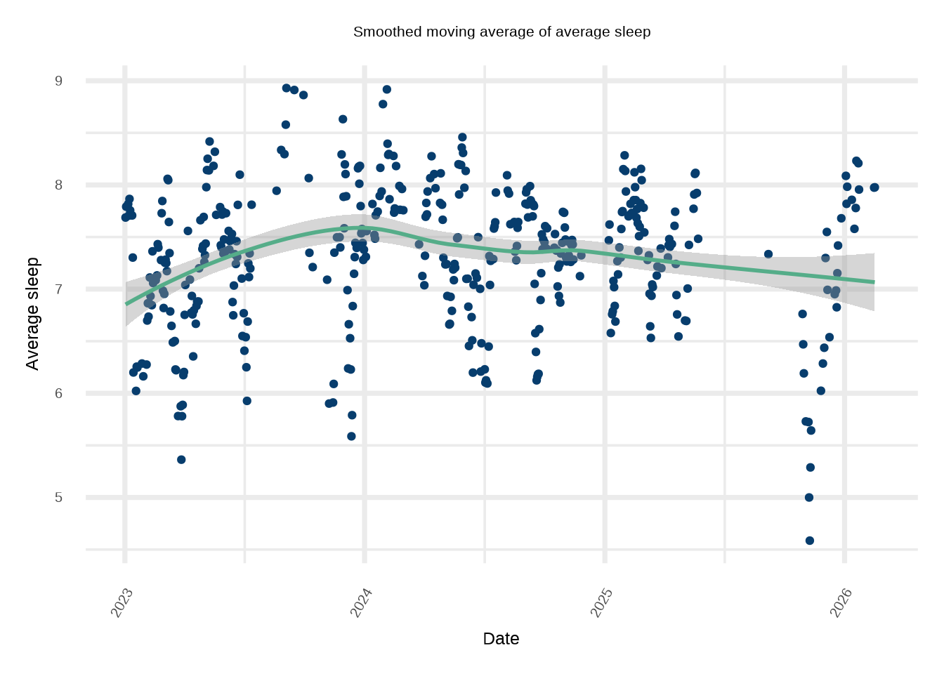
#df_heat = expand.grid(X=c(covariates, 'asleep', 'quality'), Y=c(covariates, 'asleep', 'quality'))#df_heat$Z = c(as.matrix(cors))#ggplot(df_heat, aes(X, Y, fill= Z)) + # geom_tile()+# scale_fill_gradientn(colors=natparks.pals("Acadia"))+# theme_minimal(base_size=32)# Look at rolling average of sleepdf %>% dplyr::mutate(average_sleep = zoo::rollmean(asleep, k =7, fill =NA))%>%ggplot(aes(x=as.Date(date), y=average_sleep))+geom_point(color='#073d6d')+suppressMessages(geom_smooth(color='#55ad89', method='loess'))+ylab('Average sleep')+xlab('Date')+ggtitle('Smoothed moving average of average sleep')+theme_minimal(base_size=28)+theme(plot.title=element_text(hjust=0.5, size=24), axis.text.x =element_text(angle =60, hjust =1))
`geom_smooth()` using formula = 'y ~ x'
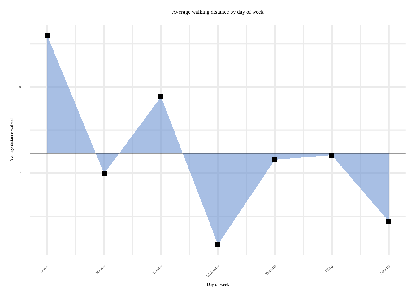
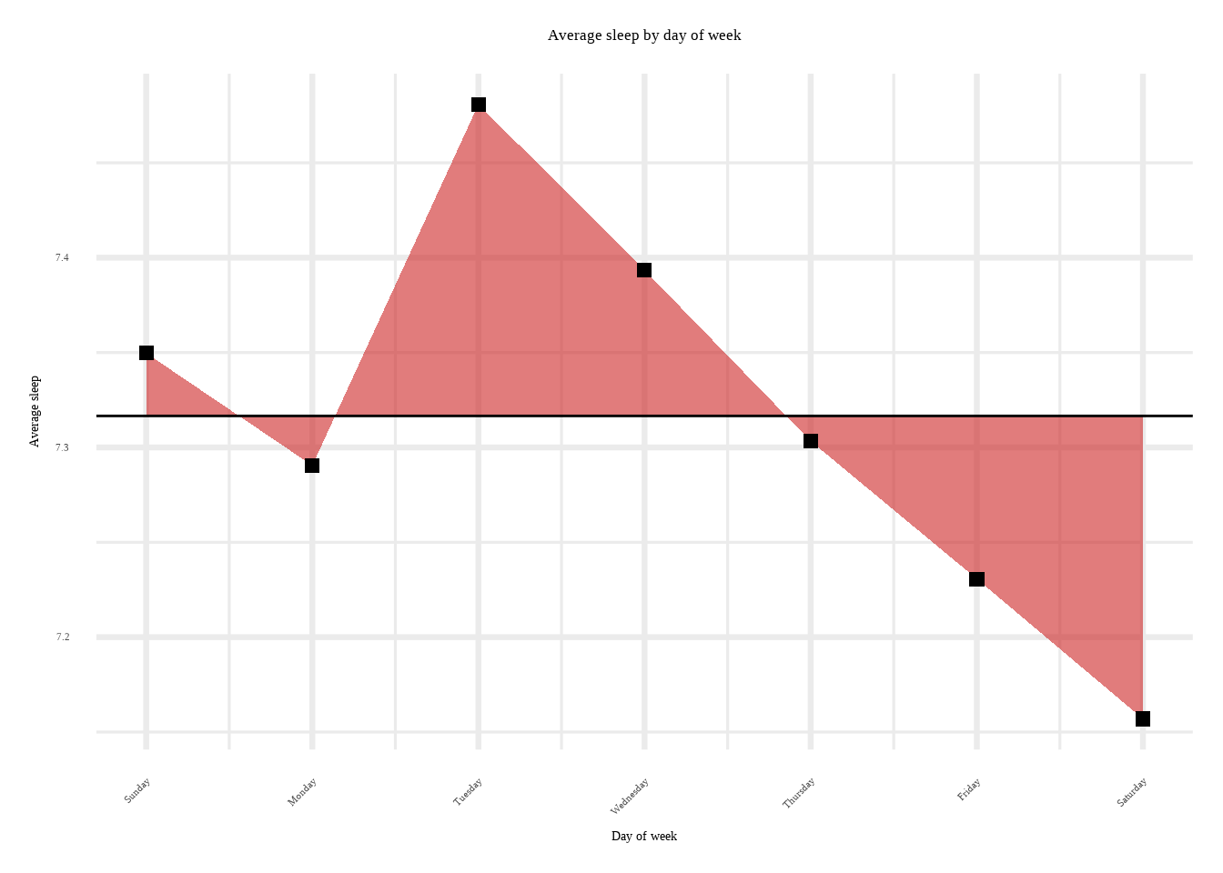
That’s pretty interesting. Play around with the heatmap and see how Demetri’s attributes correlate together. Just for fun (and to motivate our choice of covariates in our prediction exercise) let us see how Demetri’s walking varies by day of week:
df2 %>%ggplot(aes(x=abc, y=mean_sleep))+geom_ribbon(aes(ymin=mean(df$asleep), ymax=mean_sleep), fill='#cd2626', alpha=0.60)+geom_hline(yintercept=mean(df$asleep))+geom_point(size=2.5, shape=15)+ylab('Average sleep')+scale_x_continuous(name='Day of week', breaks=c(1,2,3,4,5,6,7), labels=c('Sunday', 'Monday','Tuesday', 'Wednesday', 'Thursday', 'Friday', 'Saturday'))+theme_minimal(base_size=25)+ggtitle('Average sleep by day of week')+theme(text=element_text(size=16, family="serif"), axis.text.x =element_text(angle =45, vjust =1, hjust=1))+theme(plot.title =element_text(hjust =0.5))
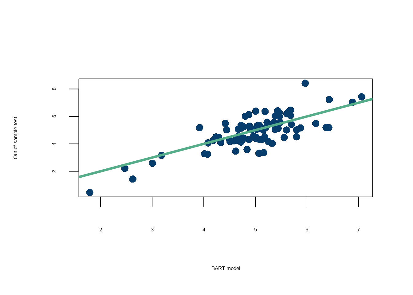
Now, let’s fit a BART model, which we know can pick up on dependencies amongst the variables and account for non-linear relationships between the inputs and the outputs.
print(paste0('The RMSE for the out of sample test is: ',
             round(RMSE(rowMeans(pred_test$y_hat), y_test),3)))
[1] "The RMSE for the out of sample test is: 0.773"
That’s a pretty good fit! Let’s see which variables are contributing the most to that fit.
Click here for full code
vsfr =vsf(X,rowMeans(pred_full$y_hat), pMax=8)
in vsf, on iteration:  1
in vsf, on iteration:  2
in vsf, on iteration:  3
in vsf, on iteration:  4
in vsf, on iteration:  5
in vsf, on iteration:  6
in vsf, on iteration:  7
in vsf, on iteration:  8
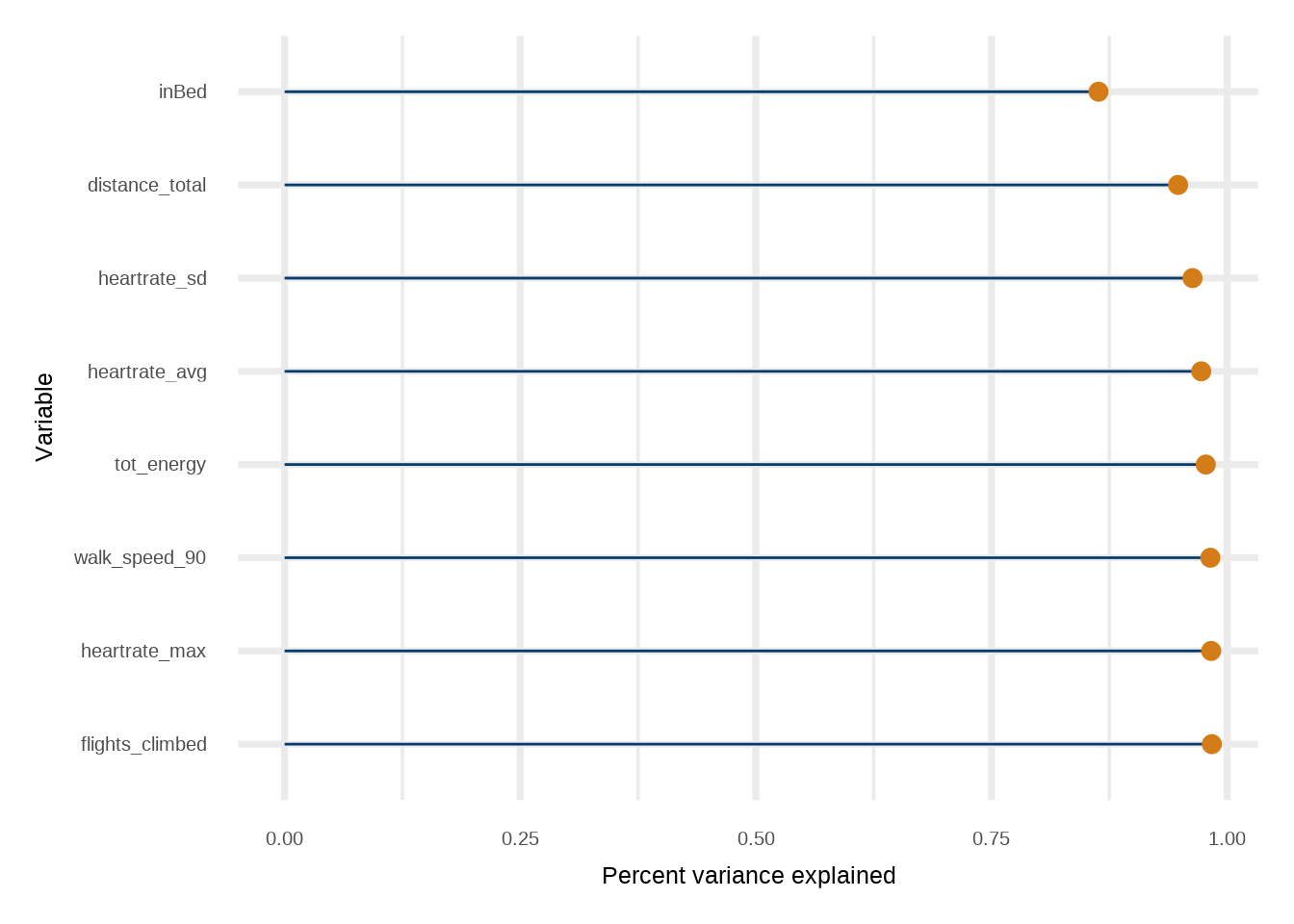
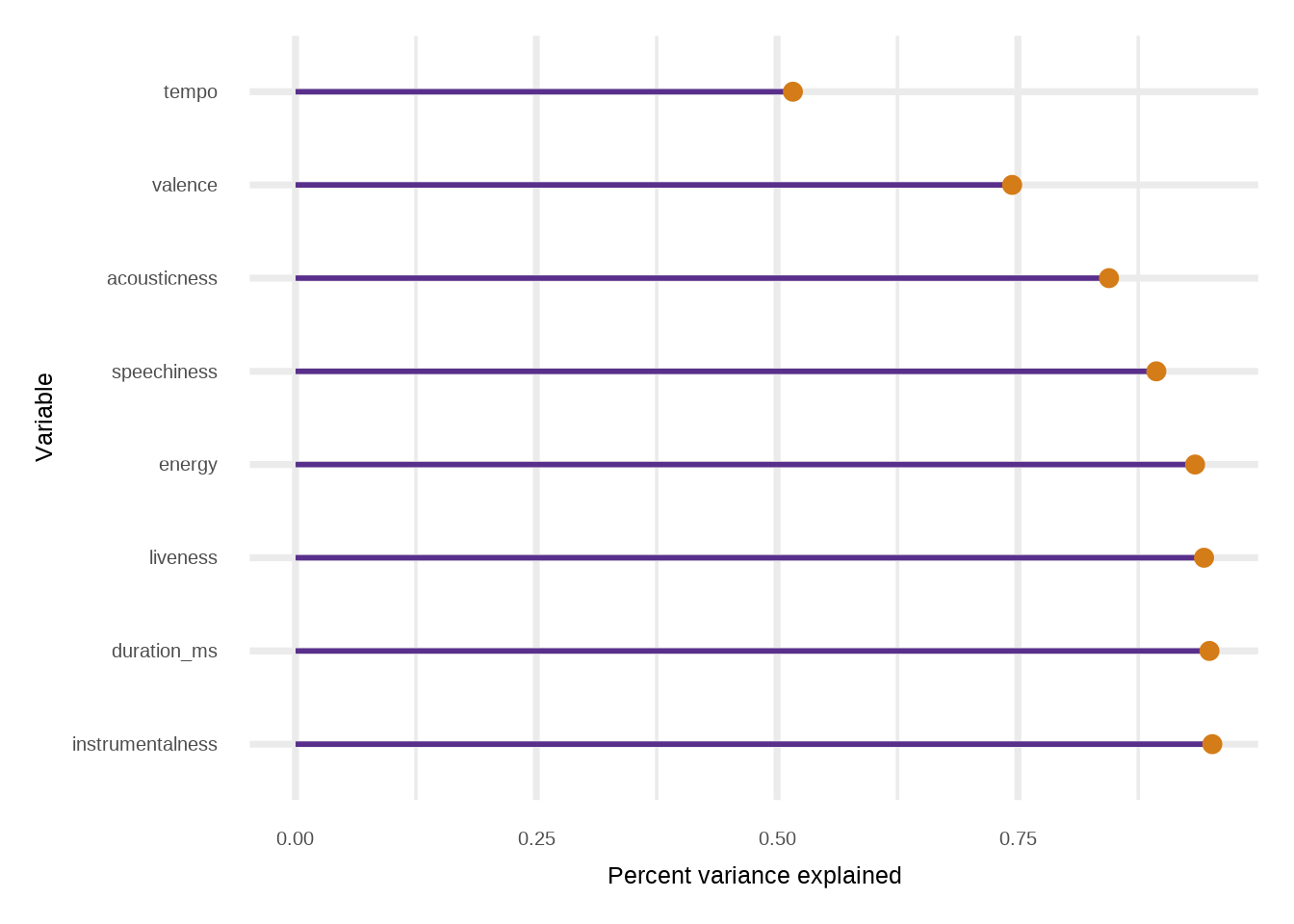
The way to read this plot is the top variable is the most predictive surrogate model when only using one variable. So the “importance” reads top to bottom.
Wow. So almost all of the variance in the fit can be explained away with knowing when the unnamed person went to bed. Was hoping for some more interesting insight, but that is meaningful in its own regard.
9.7.4 Wait hold on … why would we do this?
Variable selection aside, the project here was to predict Demetri’s (unnamed person…) sleep pattern. But…so what? If the goal was to fix his sleep, we did not accomplish that. That would require a study of the causal effects of a variable of interest. Predicting sleep is also not helpful for Demetri. If he knows his covariates and his predicted sleep total for a day, what good does that do him8?
8 Arguably, it may worsen his sleep if he knows his predicted total via a self-fulfilling prophecy mechanism. In which case the test predictions are no longer operating on the same input space as the training covariates. So it goes.
The data this week comes from Spotify via the spotifyr package. Charlie Thompson, Josiah Parry, Donal Phipps, and Tom Wolff authored this package to make it easier to get either your own data or general metadata arounds songs from Spotify’s API. Make sure to check out the spotifyr package website to see how you can collect your own data!
Kaylin Pavlik had a recent blogpost using the audio features to explore and classify songs. She used the spotifyr package to collect about 5000 songs from 6 main categories (EDM, Latin, Pop, R&B, Rap, & Rock).
As is the norm, we first download data from the web, clean it, and save it locally on the off chance it is removed from the git repo. The following script does this, but is not run. Run it if you’d like!
The data describe songs on spotify spanning many decades with information on the artist, track, danceability, energy, valence, key, loudness, acousticness, instrumentalness, chart ranks, and other features. We only look at songs from 2000 on.
Click here for full code
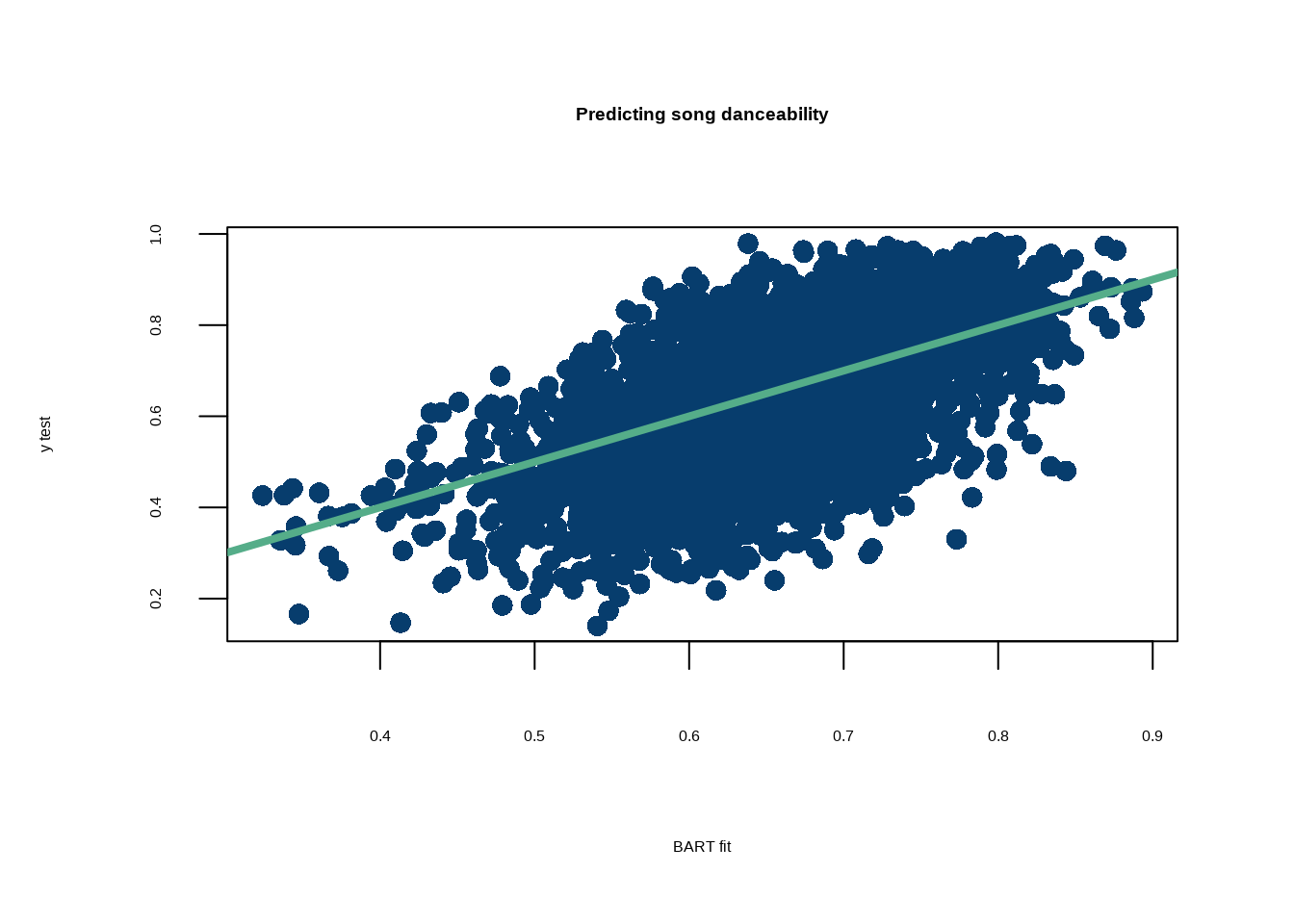
options(warn=-1)# Install from https://www.rob-mcculloch.org/ at Fitting the fit section#install.packages("nonlinvarsel_0.0.1.9001.tar.gz", repos = NULL, type="source")suppressMessages(library(nonlinvarsel))suppressMessages(library(stochtree))suppressMessages(library(plotly))suppressMessages(library(tidyverse))normalize <-function(x, na.rm=T){return((x-min(x))/(max(x)-min(x)))}#### Alternative ##### Predict song popularity# https://github.com/rfordatascience/tidytuesday/blob/master/data/2020/2020-01-21/readme.md#spotify_songscsvspotify_songs <-suppressMessages(read.csv(paste0(here::here(),'/data/spotify_songs.csv')))X <- spotify_songs[, c('track_popularity', 'playlist_genre','valence', 'energy', 'key', 'loudness', 'mode', 'speechiness', 'acousticness', 'instrumentalness', 'liveness', 'tempo', 'duration_ms', 'year')]#Xa2 =model.matrix( ~ playlist_genre -1, data = X)#spotify_songs%>%group_by(track_artist)%>%# summarize(v=mean(valence))%>%arrange(-v)#spotify_songs%>%group_by(year)%>%# summarize(v=mean(valence))%>%arrange(-v)# Drop songs with missing yearX$year <-as.character(spotify_songs$year)year_na <-which(is.na(X$year))X <- X %>% tidyr::drop_na()a2 =model.matrix( ~ year -1, data = X)a2 =as.data.frame(a2)%>%drop_na()#X$year <- as.numeric(spotify_songs$year)X_cat <-as.matrix(cbind(X$mode, X$year))X <- X %>% dplyr::select(c(-playlist_genre, -year))X_cont <- X%>%select(-mode)X =cbind(a2, X%>%drop_na())#X$t_swift = ifelse(spotify_songs$track_artist=='Taylor Swift',1,0)#X$drake = ifelse(spotify_songs$track_artist=='Dr')# the outcome is the "valence"--> how happy the song is# See if we can predict this spotify contrived quantity# instead of popularity of a song!y <- spotify_songs$danceability# Train/test split## 90% of the sample sizesmp_size <-floor(0.8*nrow(X))## set the seed to make your partition reproducibleset.seed(12024)train_ind <-sample(seq_len(nrow(X)), size = smp_size)X_train <- X[train_ind, ]X_test <- X[-train_ind, ]y_train = y[train_ind]y_test = y[-train_ind]# Takes a couple minutes to runptm <-proc.time()bart_fit =bart(X_train =as.matrix(X_train), y_train = y_train, X_test =as.matrix(X_test), mean_forest_params =list(num_trees=40))RMSE <-function(m, o){sqrt(mean((m - o)^2))}par(mfrow=c(1,1), cex=1.5)plot( rowMeans(bart_fit$y_hat_test), y_test, pch=16, col='#073d6d',xlab='BART fit', ylab='y test', main ='Predicting song danceability' )abline(a=0, b=1, col='#55AD89', lwd=4)
Click here for full code
print(paste0('The RMSE for the out of sample test set is: ',round(RMSE(y_test, rowMeans(bart_fit$y_hat_test)),3)))
[1] "The RMSE for the out of sample test set is: 0.112"
Click here for full code
# Do the procedure on the X_test locations# Just to show that we canvsfr =vsf(X_test,rowMeans(bart_fit$y_hat_test), pMax=8)
in vsf, on iteration:  1
in vsf, on iteration:  2
in vsf, on iteration:  3
in vsf, on iteration:  4
in vsf, on iteration:  5
in vsf, on iteration:  6
in vsf, on iteration:  7
in vsf, on iteration:  8
Finally, one more fun example with the old Chicago train ridership data from chapter 2. The first code snippet uses the gtExtras package to summarize the data.
The next code snippet does some more data cleaning (including one-hot encoding the input features) and runs a BART model to predict train ridership. From chapter 2, we know that this is an ill-fated task, as we are missing holiday classification as an input and do not encode it in any way for the BART model. However, we still use this example as most of the signal is picked up. We also “fit-the-fit” here, but do not display the graph, as we will in the next chart.
in vsf, on iteration:  1
in vsf, on iteration:  2
in vsf, on iteration:  3
in vsf, on iteration:  4
in vsf, on iteration:  5
in vsf, on iteration:  6
in vsf, on iteration:  7
in vsf, on iteration:  8
Now, let’s use the gtExtras package to make some cool looking table plots. The idea in Figure 9.4 is to run a BART model with the selected variables. This will show how the fit improves with more variables. We may be tempted to see how well the subset variables, \(\mathbf{X}_s\) predict \(y\) with a BART engine, but this sort of defeats the argument laid out in the fit-the-fit schema. One thing to note is that the nonlinvarsel package finds the subset variables using a very large tree fit to the fit, since over-fitting is not a concern as prediction and/or inference is done with the first stage model. The big tree is not designed to learn \(y\), which is (assuming a strong first stage model) a noisy realization of \(f\approx\hat{f}\).
The approach also begs the question of why not just use a BART predictor in the second stage9. The big tree provides an way to learn which variables are most predictive of the “smoothed” estimate of the signal, \(\hat{f}\). The goal is to fit \(\hat{f}\), not \(y\). Predicting \(y\) places us in traditional machine learning regression world, where the noise in the data would vanquish the utility big tree model10. BART, on the other hand, is designed to avoid overfitting, so while a BART fit to \(y\) makes sense in the first stage11, the regularization baked into BART’s design might limit it’s ability to fully approximate the smoothed fit given by the first stage BART fit. All this to say, the selected variables may not predict \(\hat{f}\) with a BART predictor as well as they fit \(\hat{f}\) with a big tree.
9 BARTs all the way down.
10 See bias-variance tradeoff in chapter 7.
11 Where learning \(E(y\mid \mathbf{X})\) in the presence of noisy data is the goal.
Figure 9.4: Plotting graphs inside the table. If you want to include another column of plots, name a new column and follow the syntax in ‘fits’ in the tibble with the plots you want to include in a list and then simply pipe with %>% to another text_transform line and just name the column appropriately.
Carvalho, Carlos M, Edward I George, P Richard Hahn, and Robert E McCulloch. 2021. “Variable Selection and Interaction Detection with Bayesian Additive Regression Trees.” In Handbook of Bayesian Variable Selection, 395–414. Chapman; Hall/CRC.
Chipman, Hugh, Edward I George, Robert E McCulloch, Dean P Foster, and Robert A Stine. 2001. “The Practical Implementation of Bayesian Model Selection.”Lecture Notes-Monograph Series, 65–134.
Doss, Hani, and Antonio Linero. 2024. “Scalable Empirical Bayes Inference and Bayesian Sensitivity Analysis.”Statistical Science 39 (4): 601–22.
George, Edward I, and Robert E McCulloch. 1993. “Variable Selection via Gibbs Sampling.”Journal of the American Statistical Association 88 (423): 881–89.
———. 1997. “Approaches for Bayesian Variable Selection.”Statistica Sinica, 339–73.
Hahn, P Richard, and Carlos M Carvalho. 2015. “Decoupling Shrinkage and Selection in Bayesian Linear Models: A Posterior Summary Perspective.”Journal of the American Statistical Association 110 (509): 435–48.
Hoeting, Jennifer A, David Madigan, Adrian E Raftery, and Chris T Volinsky. 1999. “Bayesian Model Averaging: A Tutorial (with Comments by m. Clyde, David Draper and EI George, and a Rejoinder by the Authors.”Statistical Science 14 (4): 382–417.
Hoff, Peter D. 2009. A First Course in Bayesian Statistical Methods. Vol. 580. Springer.
Linero, Antonio R, and Yun Yang. 2018. “Bayesian Regression Tree Ensembles That Adapt to Smoothness and Sparsity.”Journal of the Royal Statistical Society Series B: Statistical Methodology 80 (5): 1087–1110.
Woody, Spencer, Carlos M Carvalho, and Jared S Murray. 2021. “Model Interpretation Through Lower-Dimensional Posterior Summarization.”Journal of Computational and Graphical Statistics 30 (1): 144–61.
Zhang, Lawrence J. 2021. “A Friendly Introduction to Compressed Sensing.”