What a job as a data scientist would have entailed in 2003.
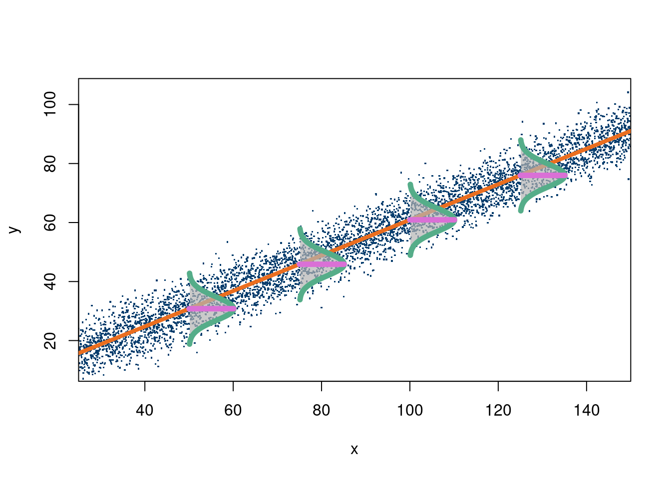
The above picture is obviously well suited to fitting a line
This is ten percent luck, twenty percent skill,
Fifteen percent concentrated power of will,
Five percent pleasure, fifty percent pain,
And a hundred percent reason to remember the name! Fort Minor, “Remember the name” - 2005
This chapter is meant to focus on some traditional techniques from statistics and how, while limited, they actually can be of a lot of use in 2024. The first section is on the “Drake equation”, which is meant to show that a mathematical model can be anything you want it to be, simple, clever, complex, or even stupid. It’s a short read that can be skipped if you want to get to the bones of the chapter starting with linear regression, but we think it showcases how one should build a model and care about their uncertainty propagation, through a fun and interesting example.
2.1 The Drake equation
We begin with the Drake equation, which may seem like an odd place, but it is a really interesting concept and is a fairly simple translation of a mental model to a mathematical one. The Drake equation aims to answer the question of “are we alone in the universe?”
And, to date, we do not know the answer to this question. Granted, there are many, many stories of alien encounters, tales that have become increasingly far fetched over the years, but no proof of extraterrestial life has ever been found. So, despite what many believe, we have no way of knowing for sure whether or not we really are alone in our universe. Hell, we don’t even know if our universe is the only universe. So, can we predict when we will meet our terrestial neighbors, if they do indeed exist? Not really. But we can predict if there is life out there. Well, kind of.
How do we go about predicting the existence of extra-terrestial life? Insert the Drake Equation. We’ll begin our story in 1961 at the Green Bank observatory1, a radio telescope located, rather unsurprisingly, in Green Bank, West Virginia. Green Bank is a town that seems out of place in 2017. For one, the town has a population of 143, and perhaps even more shockingly, the town prohibits the use of cellular devices. Yes, you read that right. If you do ever get the chance to visit, the observatory is in a beautiful part of West Virginia. The town has a no-cell phone radiation rule, so it is a unique way to escape your screens without having to go camping. I have a quite harrowing tale of the drive there during college I always like to share, although no-one seems to believe.
1 Frank Drake hosted a conference in 1961 on the search for extra-terrestial life. Green Bank was an ideal gathering for different astronomers.
The Green Bank observatory was where Frank Drake presented his now famous Drake equation. The equation was presented at a conference and intended to answer the “are we alone’’ question from a probabilistic standpoint, providing a range of the number of intelligent alien species in our galaxy, which can more or less be extended to our universe by multiplying by the number of galaxies in the universe. Furthermore, the question tried to answer not only if there is life, but if there is intelligent life. While this sounds impossible to do with a series of fractions multiplied together, the equation does indeed shed some quantitative light on the question.
In all it’s glory, we have reproduced the Drake equation below:
\(N\) is the number of civilizations in our galaxy that are within our “light cone”. That is, the number of civilizations that we would be able to detect if they do exist. This is an important distinction, as there could very well be civilizations that exist, but if we cannot detect them, we are no closer to our answer than when we started.
\(R\) is the rate of formation of stars, or how long it takes the average star to form in our galaxy. This is important because it typically takes stars billions of years to have the capability of supporting life, and given that the universe is estimated to be around 14 billion years old, this limits the possibilities of life formation dramatically.
\(f_p\) is the fraction of those stars that develop planetary systems, which is an obvious pre-requisite for life (as far we know). Now it is starting to become clearer how the equation works, as we will keep multiplying fractions together to get a final probability, or better a range of probabilities (more on that later).
\(n_e\) is the number of planets in a solar system with an environment suitable for life. In our solar system, there is one obvious answer, Earth, but there are speculations that both Mars and one of Saturns’s moons, Enceladus. Now, if we have life on moons, we have to include this, as nomenclature ultimately does not affect life.
\(f_\ell\) is the fraction of suitable planets that life actually appears. In our solar system, out of the potentially habitable planets, only Earth is known to have life (otherwise this whole endeavor would be a waste of time).
\(f_i\) is the fraction of life bearing planets on which intelligent life emerges. There’s always one wise guy who’ll say zero, but this question is actually quite difficult to answer. Given that there is intelligent life on Earth, our default answer would be 100%, but since only one or few species out of the billions developed intelligence, that this percentage is extremely low, and in fact close to zero. We, as humans, tend to fancy ourselves as the only intelligent beings on Earth, and there is a valid argument to be made for that, but many will argue that other animals, such as dolphins and whales2. exhibit signs of intelligence. This will change the probability of intelligent life existing dramatically.
\(f_c\) is the fraction of civilizations that develop their technology to a point that they can communicate, or at least convey their existence into the galaxy, and thus make themselves detectable. Again, there could very well be life, but if we cannot see it, it is no good to us. Perhaps there are alien creatures in our galaxy asking the same questions, unaware of our existence.
Finally, \(L\) is the length of time that civilizations last, or, more accurately, the length of time they transmit messages into space. As humans, we have been transmitting our electromagnetic waves into space since the late 1800’s with the invention of the radio. Now, that means we have been roughly transmitting our existence for about 100 years, give or take. Therefore, the \(L\) for Earth would be about \(100\). How long will our civilization last? Hopefully a while, we can all probably agree on that. Realistically, however, there is a pretty wide range on how long people think we will last, ranging from the very cynical (less than a hundred years) to the very ideal (millions of years). This range again makes the range on the number of civilizations that could exist in our galaxy fairly dramatic, as we shall shortly see.
2 In case you do not believe this, on the Internet there are videos of whales hunting seals that will probably change your mind
Now, comes the tricky (and fun) part; crunching the numbers. Be warned, the final result will not be a definitive answer as to how many alien civilizations are out there, it will not tell us if they benevolent, nice, maybe even funny good hearted creatures, or cold, malicious monsters hell bent on our destruction. For that, it is probably best to delve into your science fiction collection and decide for yourself. Rather, the Drake equation will yield a wide range of possibilities for the number of civilizations.
While this is a fairly simple model, it actually seems quite reasonable. However, it has some fundamental problems. First, there really aren’t a lot of data on many of the variables, making any estimation difficult. This model also does not leave a ton of room to say how errors in estimation between the variables themselves vary together. If every estimate is a systematic undershoot, the multiplication will make these errors amplify dramatically. For this reason, people tend to give ranges for every estimate, and make the upper bound on the life estimate to be the product of all the upper ranges, and the lower bound the product of the lower ranges. What that yields, unhelpfully, is that the probability of there being extraterrestrial life to be somewhere between 0 and 1!
The reason we introduce the Drake equation is to highlight the importance of uncertainty. While the point estimate from the Drake model is utterly meaningless, the fact that it is meaningless is actually really insightful! The model tells us we really don’t have any idea if there is life out there and should not proceed confidently one where or the other.
2.2 When your gut is right
Famous baseball sabermetrician Bill James posited many a theory in his day. He pioneered the use of many metrics in baseball, helping blaze a new path of statistics in sports. Amongst his most famous was the “Pythagorean expectation”. The idea is fairly simple: a team’s expected win/loss percentage should be their runs scored squared divided by the sum of their runs scored plus their runs allowed. However, for James, this seemed to have been pulled out of thin air with no motivation. Remarkably, this statistic held strong associations with actual performance year over year in baseball (where the 162 game season for 30 teams gives a lot of data)3.
3 Even at this level, some teams are more “lucky” than others. Other factors, such as quality of relievers and “home field” advantage can manifest themselves as teams appearing lucky/unlucky.
4 In baseball the assumption of independent distributions on runs scored and allowed isn’t particularly wacky. (Dayaratna and Miller 2012) (linked here) apply the Pythagorean idea to hockey data and see if it empirically holds, and it seemingly does.
(Miller 2007) provides a theoretical justification for the formula. It turns out if you assumed that a baseball teams run scored and runs allowed follow independent Weibull probability distributions4, the the Pythagorean expectation follows if you calculate \(\Pr(\text{runs scored}>\text{runs allowed})\). Well, more strictly the formula is
The constant \(\alpha\) is usually found from which value corresponds to the best approximation of the function output to actual team win/loss percentages based on their runs scored and allowed. In baseball, the exponent is smaller due to large role chance plays. Even bad teams beat good teams regularly. In basketball, talent disparity often wins out so the exponent is higher.
2.3 Linear regression
The first two examples were more ad-hoc statistical approaches that required specifying some sort of model and then estimating some parameters in that model from data. While neither seem like machine learning, they were meant to be fun examples to begin thinking about inferring things from data. Whether it is the probability of life in the universe as a multiplication of different variables, or the expected value of a team’s performance as a “Pythagorean” function with a tuneable exponent, we began thinking about this in earnest. We will move to a more formal modeling approach, beginning with the simplest model and estimation process, and gradually defining more flexible estimators and complicated model setups.
This chapter will introduce (or review) a lot of topics from linear algebra. The first is the linear regression model, the foundational prediction model in statistics. The model is, in its high school form, simply:
\[
y = mx+b
\]
An output, \(y\), depends on an input, \(x\), through an intercept term, \(b\), and the slope, \(m\). Pictorally, this means that a graph of \(y\) vs \(x\) will yield a straight line, with the \(y-\)intercept being at \(b\).
Since this class assumes some familiarity with linear algebra, we will show the form of the linear regression model we care about. That is (jumping immediately to having more than 1 input variable)
Where \(\mathbf{X}\) is a matrix of \(p+1\) inputs, each with \(n\) entries, and \(y\) is a vector with \(n\) entries. The “design” matrix, \(\mathbf{X}\), has \(p+1\) columns because we include a column of \(1\)’s at the at the beginning to account for the intercept term. Intuitively, this means youre outcome is a weighted sum of the inputs. Maybe your daily sleep is determined 25% by your caffeine intake, 50% by your food intake, 10% by the weather, and the remainder by unobserved variables.
The following code block, in R, shows a visual of this model with a single \(X\):
The following code block illustrates this case (from this stackoverflow link):
Click here for full code
n <-5000a <-1b <-0.6x <-seq(from=25, to=150, length.out=n)y <- b*x + a +rnorm(n, 0, 5)plot(x, y, xlim=c(25, 150), ylim=c(10, 105), xaxs="i", pch=".", cex=1.75, col='#073d6d')mod =lm(y~x)a = mod$coefficients[1]b = mod$coefficients[2]#abline(a=a, b=b, col="#eb6e1f", lwd=4)abline(a=a, b=b, col="#eb6e1f", lwd=4)# make one normal distributionmu <-0sigma <-8nSd <-3xLims <-c(mu-nSd*sigma, mu+nSd*sigma)X <-seq(xLims[1], xLims[2], length.out=98)# the last 2 points are reserved for (mu, dnorm(mu)) and (mu, 0)X[length(X)+1] <- mu # for point (mu, dnorm(mu))X[length(X)+1] <- mu # for point (mu, 0)Y <-dnorm(X, mu, sigma) # y coordinates# scale distribution to different width and heightnxW <- sigma*nSdnyW <-10X <- (X /diff(range(X))) * nxWY <- (Y /diff(range(Y))) * nyWY[length(Y)] <-0# point (mu, 0)# rotate normal distribution 90° clockwiseXY <-cbind(X, Y)ang <- pi/2R <-matrix(c(cos(ang), sin(ang), -sin(ang), cos(ang)), nrow=2)XYr <- XY %*% R# chose a couple of x-coordinates to place rotated normal distributionsptsX <- x[round(seq(1, length(x), length.out=6))]ptsX <- ptsX[-c(1, length(ptsX))]ptsY <- b*ptsX + apts <-cbind(ptsX, ptsY)# move normal distibutions to chosen (x, y)-coords as center and draw themnr <-nrow(XY)XYrt <-vector("list", length(ptsX))for (i inseq(along=ptsX)) { XYrt[[i]] <-sweep(XYr, 2, pts[i, ], "+")polygon(XYrt[[i]][-c(nr, nr-1) , 1], XYrt[[i]][-c(nr, nr-1) , 2], border=NA, col=rgb(0.7, 0.7, 0.7, 0.7))lines(XYrt[[i]][-c(nr, nr-1) , 1], XYrt[[i]][-c(nr, nr-1) , 2], col="#55AD89", lwd=5.5)segments(XYrt[[i]][nr, 1], XYrt[[i]][nr, 2], XYrt[[i]][nr-1, 1], XYrt[[i]][nr-1, 2], col="#DA70D6", lwd=5.5)}
So with a visual in hand, let’s go through the assumptions of the model, which show why it’s limited despite its convenient form, as well as the mathematics (if you so please).
Assumptions of linear regression (the standard linear regression model with standard estimation procedures…these can and are relaxed)
Linearity: The model is correctly specified and that specification is that \(\mathbf{y}\) has a linear relationship with \(\mathbf{X}\). That is, \(\mathbf{y}\) really is an addition of the different \(\mathbf{X}\) variables of the form\(\beta_{1}X_1+\beta_2X_2+\ldots+\)5. As seen in the footnote, if we transform the \(X\)’s and give these transformations as inputs to the OLS equations for coefficient estimates, we can correctly estimate the coefficients, for example, with a model like \(y=b_0+b_1x^2\). That does not imply that $y=b_0+b_1x^2 $ is a linear model, as the relationship between \(y\) and \(x\) is clearly not linear. It just means, if we know to include \(x^2\) instead of \(x\) into the design matrix, we will correctly estimate \(b_1\) with OLS.
The predictors, \(\mathbf{X}\) are assumed to be fixed, and not random variables, meaning we assume their values are what they are, and not from a distribution of possible values due to measurement error (for example).
The variance, \(\sigma^2\), does not change as \(\mathbf{X}\) does. An example where this fails is if for older people there is more variance in their caloric intake. Mathematically, if \(\varepsilon\sim \mathcal{N}(0, \sigma^2\mathbf{I})\), we have homoscedasticity. If not, then the diagonals of the $nn $ covariance matrix of \(\varepsilon\), typically called \(\Sigma\), would each have their \(\sigma_i^2\) term.
Independence of errors. This means the errors are independent across the observations. An example where this is not the case is in election forecasts. If the errors are big in Wisconsin, they have been (in the US 2016 and 2020 presidential elections at least) comprably large in Pennsylvania and Michigan. Mathematically, this means the off-diagonals of the \(\Sigma\) matrix for the error covariance are all 0.
Finally, we assume none of the covariates in \(\mathbf{X}\) are linearly dependent (meaning we cannot write \(X_2\) as some multiple of the other \(X_i\), for example. Mathewmatically, this means \(\mathbf{X}\) is full rank.
5 Technically, we only need this linearity condition with respect to the parameters (when using the traditional OLS estimator)! That means if the relationship is really
\(y =\beta_1x_1^2+\beta_2x_2*x_3+\log(x_4)\)
then we are okay with regards to estimation of the coefficients, as long as we correctly specify those transformations (hint: good luck with that). That’s all to say OLS estimates of the \(\beta\)’s will be correct provided the correct transformations of the \(X'\)s.
First, we will look at the OLS (ordinary least squares) approach to solving the parameters \(\{\beta_0, \beta_1, \ldots, \beta_p\}\). For the simple case, we only consider two parameters, call them \(b_0\) and \(b_1\) because we are not yet dealing with the multiple variable model and want to distinguish such. We take care to note that ordinary least squares is a method to estimate and not an estimand. In other words, OLS is an estimator, and not the model itself. We can use a variety of techniques to estimate the parameters in a linear regression, and can (and will in chapter 5) use OLS to fit coefficients of a different type of model.
The algorithmic approach stipulated by performing OLS is to simply minimize the distance between the observed \(y\) and the stipulated linear model (\(y_i=b_0+b_1x_i\) in the simplest form). That is, we want to begin by looking at:
\[\Delta y_i=y_i-\hat{y}(x_i)=y_i-(b_1 x_i+b_0)\]
We want the sum over all the \(i\) from 1 to \(n\) to be as small as possible. Therefore, it makes sense to minimize \(y_i-(b_1 x_i+b_0)\) right? Well, sorta. Because that term can be negative or positive, we will never find a true local minimum, so we need to make sure the term is always positive. One option is the absolute value, but that function is mathematically trickier for a variety of reasons than taking the square of that value. Instead, then we aim to minimize the function
Where \(N\) is the total number of observations, and \(b_1\) and \(b_0\) are the slope and intercept terms we will solve for. To do this, we set each derivative equal to zero (if you haven’t taken calculus you can skip this part)
where \(\hat{\mathbf{\beta}}\) is the estimator, and \(\mathbf{H}\) in the projection matrix that maps the response values to the fitted values (wikipedia page). Note, the \(\mathbf{\beta}\) and \(\mathbf{y}\) are obvious, but the \(\mathbf{X}\) matrix isn’t:
Where \(X_{i,j}\)\(X_i\) refers to the the ith data point, and \(X_j\) refers to the the “x estimate”. Ie, if we want to predict peoples weight based on their weight and height, \(X_{1,1}\) would be the weight of person 1, \(X_{1,2}\) would be the height of person 1 and so on. We can also use this matrix form to add non linear terms. In the case of a single variate quadratic regression, this would look like
will give us \(\mathbf{y}\), which is \(n\times 1\), \(X\) in this case is \(n\times 3\) and \(\mathbf{\beta}\) is \(3\times 1\). If we are minimizing least square error, ie running a specific regression, \(\mathbf{\beta}\) becomes an estimator, \(\hat{\mathbf{\beta}}\). and for least squares the normal equations in matrix mode are
We also need to show the MLE estimate is the same!
Assume that \(\mathbf{y}\sim \mathcal{N}(\mathbf{X}\beta, \sigma^2\mathbf{I})\), or in other terms \(E(\mathbf{y}\mid \mathbf{X})=\mathbf{X}\beta\) , meaning the “expected” value of \(\mathbf{y}\) is the linear model, with error \(\varepsilon\sim \mathcal{N}(0, \sigma^2\mathbf{I})\) meaning the observations are assumed to be centered around the mean and distributed normally around that “center”. If this is the case, we actually return the same estimates for \(\hat{\beta}\) as the ordinary least squares, which does not assume the “normal” likelihood above.
This is a proof based on the proof from Rencher and Schaalje (2008).
where we used \[
\begin{align*}
&(\mathbf{y}-\mathbf{X\beta})'(\mathbf{y}-\mathbf{X\beta})=\mathbf{y'y}-\mathbf{y'X}\mathbf{\beta}-\mathbf{\beta'X'y}+\mathbf{\beta'X'X\beta}\\
&=\mathbf{y'y}-2\mathbf{y'X\beta}+\mathbf{\beta'X'X\beta}
\end{align*}
\]
Notice, we used the “normal likelihood” model which implies \(\mathbf{y}\sim \mathcal{N}(\mathbf{X}\beta, \sigma^2\mathbf{I}_n\). This corresponds to \(\mathbf{y}=\mathbf{X}\beta+\varepsilon\rightarrow E(\mathbf{y})=\mathbf{X}\beta\).
2.3.1 Implementation
The following code snippets show how to do a linear regression in R.
Click here for full code
options(warn=-1)suppressMessages(library(dplyr))# Generate 100 data points and 10 variablesn <-100p <-10# The X's are all uniformX <-matrix(runif(n*p), ncol=p, nrow=n)# y = x1+2X2+norm(0,1)y <- X[,1]+2*X[,2]+rnorm(n)# Fit the linear model using the excellent base Rmod =lm(y~X)broom::tidy(mod) %>%mutate_if(is.numeric, round, 2)
This does the same thing by hand, using the equation for \(\hat{\beta}=\left(\mathbf{X}'\mathbf{X}\right)^{-1}\mathbf{X}'\mathbf{y}\). Notice that the equation for \(\hat{\beta}\) involves a matrix inversion, which generally can be computationally problematic with large matrix size6.
6 Sort of relatedly, there is a “sufficient statistic” in simple linear regression to calculate the slope (usually called “m”): \[ \hat{\beta}_1 = \frac{\text{Cov}(x,y)}{\text{var}(x)} \]
Here is a nice medium article from Meta (formerly Facebook) detailing how tricks like this help them scale. The point being (despite not being relevant here) that there are tricks to help avoid matrix inverses.
Click here for full code
# Now solve by hand, add a column of 1's to the# X design matrix to account for interceptX <-cbind(rep(1,n), X)# The projection matrixproject_matrix = X%*%solve(t(X)%*%X)%*%t(X)# The fitted betasbeta_hat =solve(t(X)%*%X)%*%t(X)%*%y# A sanity checkmod$fitted_values - project_matrix%*%y
numeric(0)
Finally, the following code block implements a linear regression on a real data set (found here: Tidy Tuesday July 07, 2020). The following link (Koffee github) uses the data to make a really cool visualization in python.
Click here for full code
options(warn=-1)#### Now let's do a linear regression on real data #####coffee_ratings <- read.csv('https://raw.githubusercontent.com/rfordatascience/tidytuesday/master/data/2020/2020-07-07/coffee_ratings.csv')coffee_ratings =read.csv(paste0(here::here('data'),"/coffee_ratings.csv"))colnames(coffee_ratings)
y <- coffee_ratings$total_cup_points# Select only subset of columnsX <- coffee_ratings[, c('aroma', 'flavor', 'aftertaste', 'acidity', 'body', 'balance', 'uniformity', 'clean_cup', 'cupper_points', 'moisture', 'altitude_mean_meters')]X <-as.matrix(X)mod =lm(y~X)DT::datatable(data.frame(coeff=round(mod$coefficients,3), lower_95=round(confint(mod)[,1],3) ,upper_95=round(confint(mod)[,2],3)))
Click here for full code
print(paste0('The R-squared value is: ', round(summary(mod)$r.squared,3)))
[1] "The R-squared value is: 0.981"
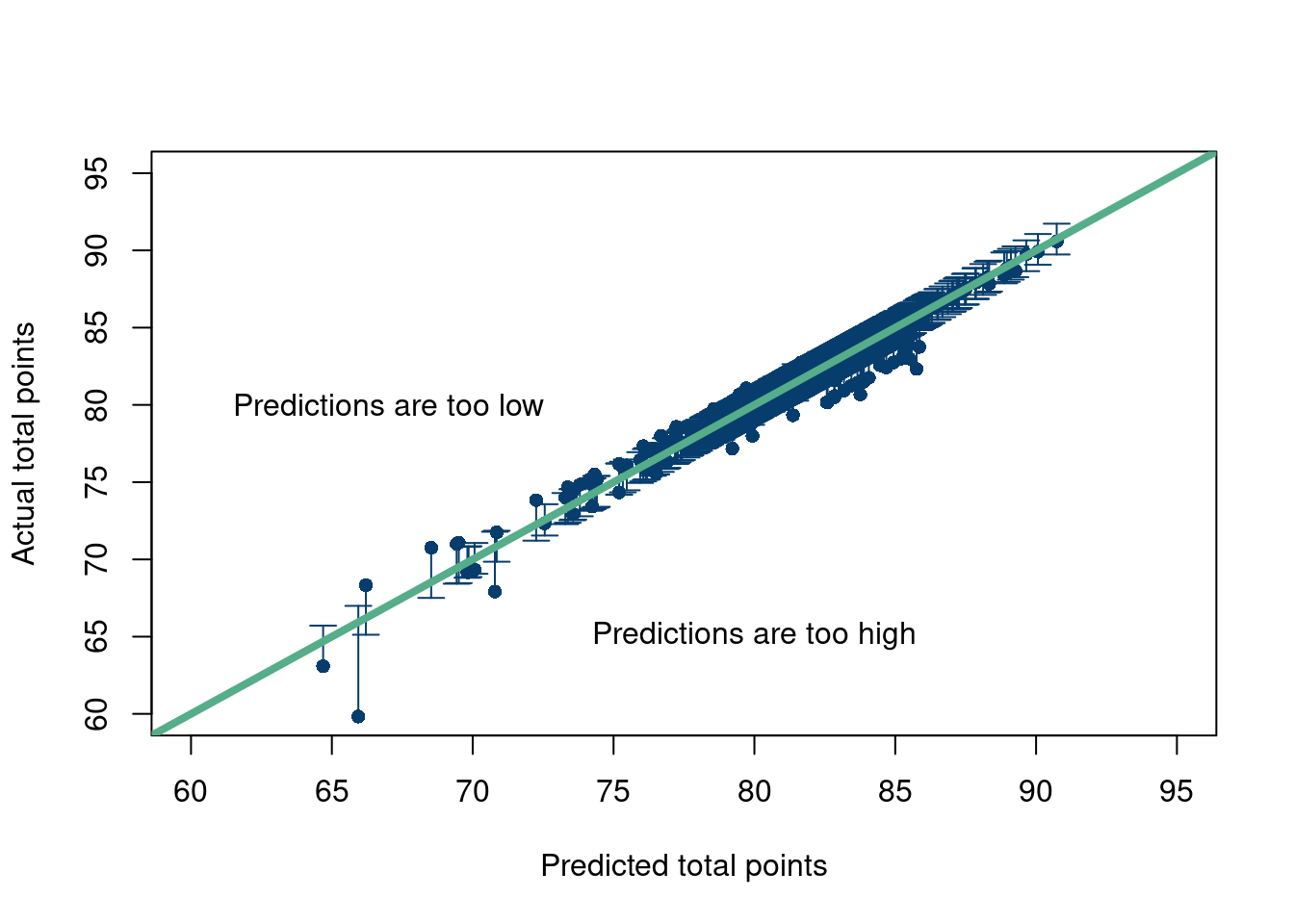
A nice way to look at your model’s predictions is to plot them against the testing set (which in this case is the same as the training data, more on that later). If the points fall roughly along the straight line along the diagonal of the graph, you are doing well. If they systematically predict too high or too low, you can also tell. Of course, the points will not fall perfectly on the line since the observation points are likely corrupted by some noise and the model is theoretically predicting the signal, or the conditional expectation of the outcome (given the covariates). So we will plot the prediction intervals at the observed \(X\) values for \(\hat{y}\) (zooming in where most of the data are).
Click here for full code
options(warn=-1)suppressMessages(library(plotrix))pred_Interval =predict(mod, as.data.frame(X), se.fit=TRUE, interval="prediction", level=0.95)plotCI(x=pred_Interval$fit[,1], y=y, ui=pred_Interval$fit[,3], li=pred_Interval$fit[,2], pch=16,xlab='Predicted total points', ylab ='Actual total points', col='#073d6d', ylim=c(60,95),xlim=c(60,95))abline(a=0, b=1, col='#55AD89', lwd=4, cex=.2)text(x =80, y =65, # Coordinateslabel ="Predictions are too high")text(x =67, y =80, # Coordinateslabel ="Predictions are too low")
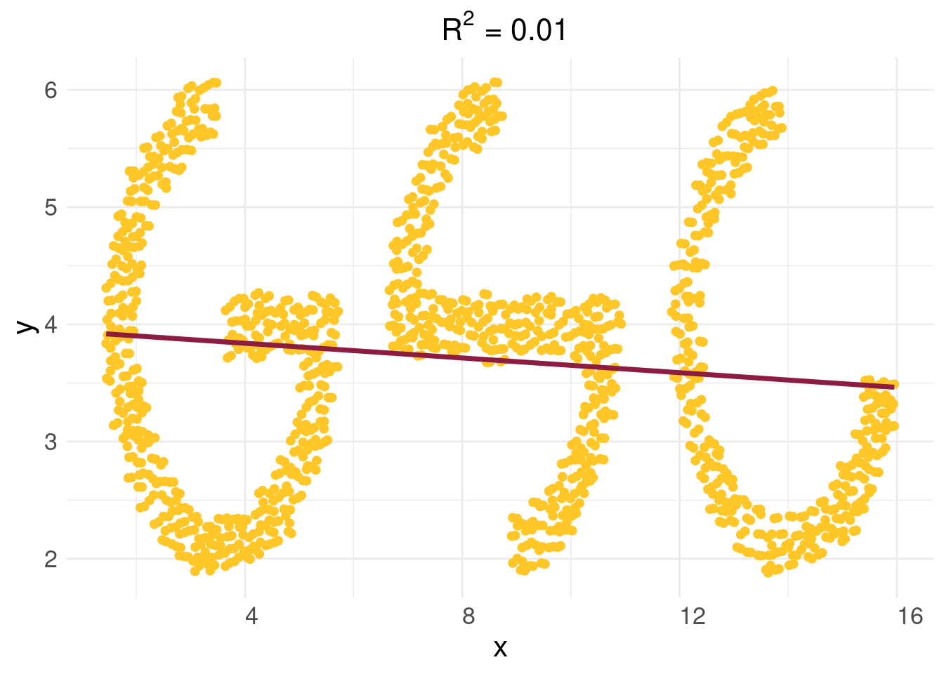
Here is a fun example. The data are from ASU’s graduate statistics club logo, courtesy of Samantha Brozak (with inspiration from Nikolay Krantsevich’s original design).
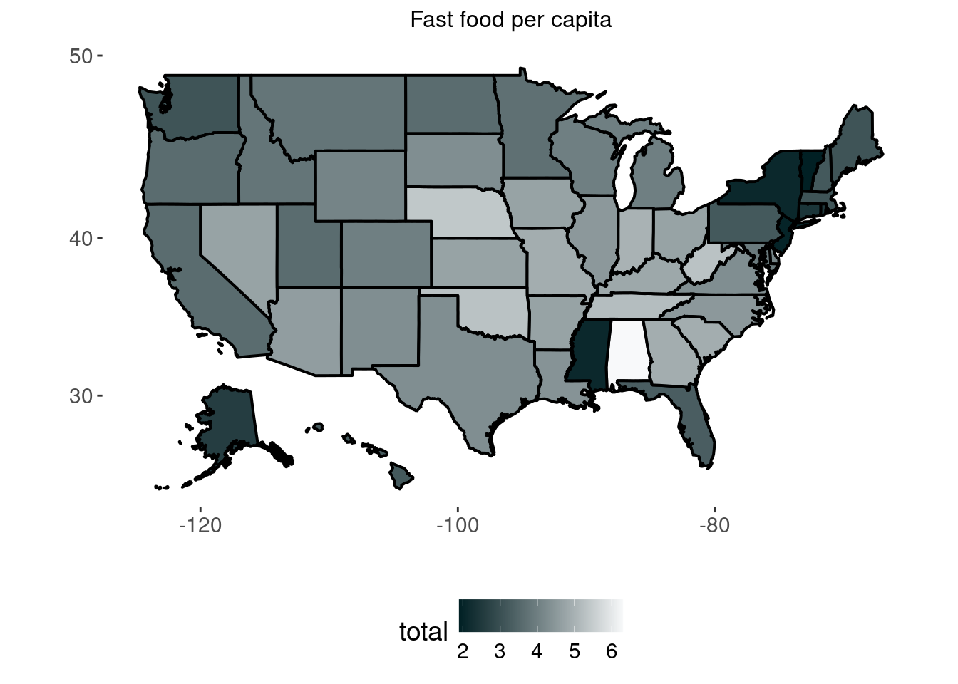
Data from Business insider data and the census. The outcome is fast food restaurants per 10,000 people, and the inputs are a states population (log), income (log transformed as well), and the region of the country the state is in.
Click here for full code
options(warn=-1)suppressMessages(library(readxl))suppressMessages(library(tidyverse))suppressMessages(library(fiftystater))suppressMessages(library(plotly))data('fifty_states')fast_food =read.csv(paste0(here::here(),'/data/fast_food.csv'))fast_food$STATE = fast_food$codefast_food$state <-tolower(fast_food$state)# map_id creates the aesthetic mapping to the state name column in your data p =ggplot(fast_food, aes(map_id = state)) +# map points to the fifty_states shape datageom_map(aes(fill = total),color='black',lwd=0.7, map = fifty_states) +expand_limits(x = fifty_states$long, y = fifty_states$lat) +coord_map() +#scale_x_continuous(breaks = NULL) + #scale_y_continuous(breaks = NULL) +scale_fill_gradientn(colours =c( "#012024",'#f8f9fa'))+labs(x ="", y ="") +ggtitle('Fast food per capita')+#scale_fill_gradient2theme(legend.position ="bottom",plot.title=element_text(hjust=0.5, size=12), panel.background =element_blank(), text=element_text(size=14)) p
OKAY! That’s a lot of linear regression. Let’s quickly discuss the pros and cons of the model.
Pros
Easy implementation in R. This is a huge pro. In one line, lm(), you can fit a whole model with well established model diagnostics and plots.
There has been extensive theoretical and applied work on the linear regression model, meaning there are many resources available, as well as modifications to the model for where the assumptions are not met.
The model is “interpretable”. One change in the \(X_i\) unit corresponds to \(\beta_{1}\) changes in \(y_i\). You really cannot beat that if you only care about prediction. Although, once you add interaction terms and transformations, which are often necessary, this becomes more cumbresome.
Cons
1) You saw the assumptions right? Those are gnarly.
Of particular note is the linear weights assumption and how that limits predictive usefulness of the linear model. Sure, having an output be a weighted sum of input factors is compelling, but what if those factors impact the output in different ways in the presence of each other (interactions). Ex) Demetri generally sleeps well when it rains and when it is cold, but on days where it cold and rainy, he does not. What if the weights vary over different regions of a predictor input variable? Ex) Housing prices tend to go up proportionally with house square footage, but at some point, the amount of people who can afford a very expensive home diminishes and the price vs house size curve plateaus. In this case, the weight was originally positive, but eventually approaches 0 and is thus non-linear.
2) Does not tend to do well in a lot of our practical problems at hand, particularly in prediction.
3) Off of 2), the model isn’t really interpretable.Or, at least, people interpret regression coefficients wrong on the regular. The unit change in \(X_i\) to \(y_i\) is not causal without further assumptions (just wait…), meaning if you were to change your \(X_i\) value by one unit, you are not allowed to say that would make \(y_i\) change by any amount, as the classic linear regression model is merely an associative relationship. And while sometimes people only care about prediction, in those cases, you’d likely be better suited using a more flexible model.
Assignment 2.1
Read chapter 2 of “Linear models in statistics”, Rencher and Schaalje (2008). This will be a nice pre-cursor for later topics.
Test every assumption of linear regression one at a time by making a data generating process that violates each.
2.4 Prediction
We have introduced the main driver of prediction models through much of the 20th century (largely driven by lack of computing resources and people’s obsessions with theoretical guarantees). Therefore, we want to take the time to give a rundown of how to predict in a practical setting, as these tools will come in handy the rest of the notes. We first want to discuss “cross validation”, which should help plant the idea that we really care about data we have not yet seen, and then “regularization”, a handy statistical concept that will make predicting on unseen data less of a challenge.
2.5 Uncertainty quantification
What is uncertainty quantification? Like most buzzwords, the definition is context dependent. We give a very brief rundown here, but will discuss these topics at more length throughout the notes.
Frequentism: Think of the data you observe as one replicate of many in a hypothetical world. There are a sequence of worlds that would play out in a certain way if you see them. Frequentist uncertainty quantification is usually achieved through theoretical means (confidence intervals derived pencil to paper) or through bootstrapping. Bootstrapping will be covered later, but the idea is to take your observed data and resample all the observations with replacement to get a fake replicate world (where certain points are omitted and others appear more than they did in the real data).
Bayesianism: If the world cannot be repeated, there still exists some probabilities of things happening. Here comes Bayesianism, where probabilities exist irregardless if the world can be replicated. A key tenet of this worldview is that there exists a probability of the underlying parameters prior to seeing data (specified by the researcher) that is combined with the data to update probabilities post data investigation. In an ideal world, this posterior probability can be calculated by hand, but often involves computer integration.
2.5.1 What set of parameters can describe the world?
However, not everything falls neatly into these two categories. Obviously, the world can’t always be replicated. Choosing priors for extremely complex systems is difficult and perhaps too many degrees of freedom for a researcher, not even to mention potential computational nightmares. So what does uncertainty mean when these two approaches are inapplicable?
One such example is weather forecasting. Much of the uncertainty in weather forecasts comes from extreme sensitivity to initial conditions. Hurricane cones of uncertainty typically run through a set of slightly perturbed initial conditions to quantify where we expect the path of the storm to go.
Another example is with curve fitting. In curve fitting, we assume data are generated from some function (or curve in lower dimensions), but we do not know the parameters of the function. For example, we assume \(y=mx+b\), but we need to guess \(m\) and \(b\). One could specify a Bayesian model, where the parameters on the curve that is fit to the data have their own prior distributions. However, what we really want are values of parameters that give reasonable fits of \(y\). For complicated functions, this could be done heuristically by running different iterations of a solver. Maybe different parameters of \(y_{\text{fit}}\) give similar “predictive performance”. This could occur if there exist many different local minima of an objective function (such as \((y-y_{\text{fit}})^2\)). One would proceed by trying to fit their model with different combinations of parameters, whether through varying initial guess for an optimization solver, or through a grid search, and then keep different combinations that return similar fits. The approach described here is not wildly different than the approach in weather forecasting, but the parameters vary rather than the initial conditions, which represent data at a certain point in time (the state). Of note, this approach could backfire wildly.
If the objective function is convex, such as if the fit is a linear function, you will understate uncertainty. Whether through a grid search or via different initial guesses, there is a global minima in this objective function, so the optimization routine to find the parameters of interest will yield the same parameters every time!
Ensuring you find different local minima is tricky. It is hard to evaluate if the solver is really traversing parameter space. A grid search then may be preferable, but even then it is hard to know if your grid is sufficient. Maybe you need to allow for a larger range of parameter values? Maybe the points we attempt to sample on the grid are not granular enough and we miss potential important parameter combinations. Finally, the reason grid search is usually passed over for optimization techniques (like gradient descent) is that it would take forever to evaluate every combination of parameters!
2.5.2 Signal vs noise
So far, we have discussed uncertainty broadly. The view of which parameters could generate the observed data could be described as uncertainty in the signal parameters. But we must also discuss uncertainty due to noise. Noise can be interpreted as variability in data (for example an outcome \(y\)) that cannot be learned from the data (such as \(f(x)\)). This noise could be meaningful, meaning we should keep measuring more input data variables, or it could just be idiosyncratic things we don’t care about. Perhaps I cannot predict how well I sleep because I am not including dietary information in my model, or maybe there are just random night noises beyond my control that I do not need nor want to measure.
Quantifying uncertainty then should include some model of what we expect the variation in the data to look like. Typically, this means every observed \(y_i=f(x_i)+\varepsilon_i\), where \(f(x)\) is the signal, and \(\varepsilon\) represents the noise/error. Essentially, \(f(x)\) represents where the typical value (the signal) lies and \(\varepsilon\) models the variance, or the “wiggle”, around the typical value.
The simplest model is to assume \(y_i\) on average equals \(f(x_i)\) plus a draw from a normal distribution with zero mean and a fixed variance. We saw this in the linear regression example, where we expect our outcome to lie on the line, but individual observations will vary depending on the noise level. More complicated noise modeling, such as for non-normal errors, or if every observation has a unique variation, or if the error terms are functions of the other error terms, will be discussed later.
2.5.3 Case study: a deeper dive into residuals
We will present a case study of how to differentiate noise from hitherto unobserved signal by studying the residuals of a model. To quote Jim Albert from the course notes of “Course in Exploratory Data Analysis” (Albert 2022):
In many situations, we will see that a careful investigation of the residuals may be more interesting than the fit.
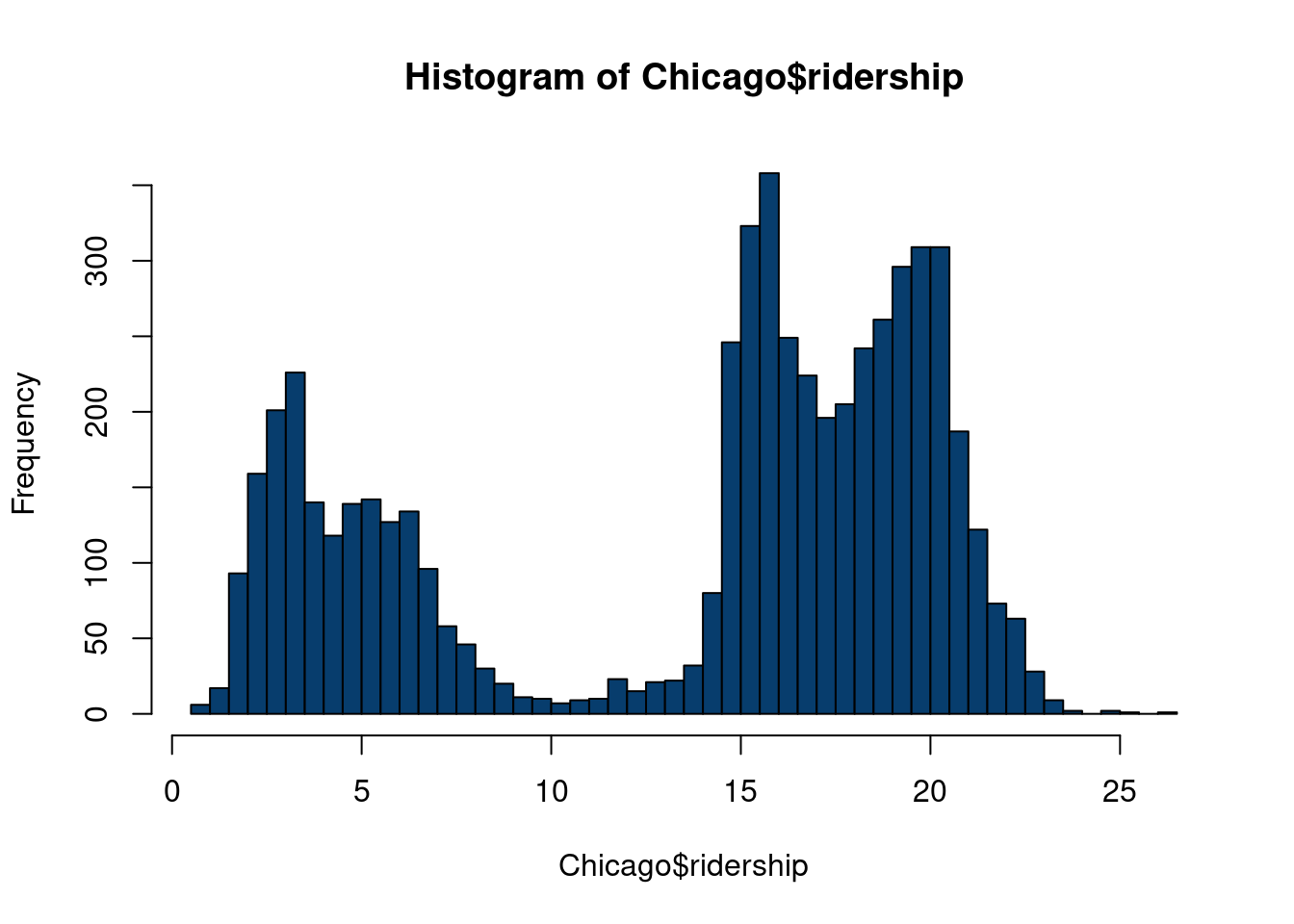
To illustrate our residual study, we study data from the Chicago dataset from the modeldata R package, itself derived from (Kuhn and Johnson 2019). From the webpage:
These data are from Kuhn and Johnson (2020) and contain an abbreviated training set for modeling the number of people (in thousands) who enter the Clark and Lake L station.
The date column corresponds to the current date. The columns with station names (Austin through California) are a sample of the columns used in the original analysis (for file size reasons). These are 14 day lag variables (i.e. date - 14 days). There are columns related to weather and sports team schedules.
The station at 35th and Archer is contained in the column Archer_35th to make it a valid R column name.
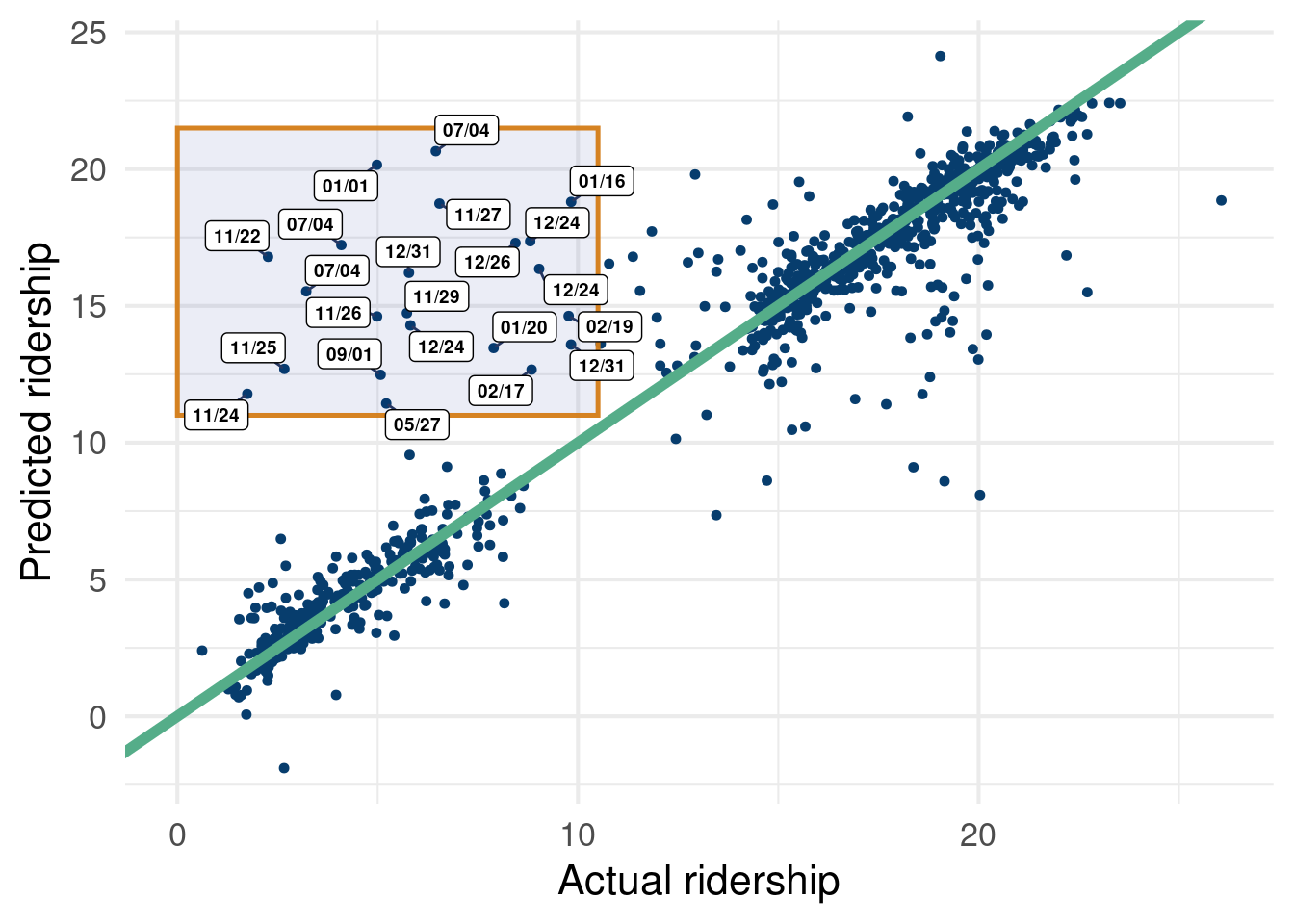
Given a set of inputs, we’d be satisfied to get a prediction of how many riders will be on the train today. Understanding how the model spit out those predictions isn’t necessarily that interesting, but we will discuss practical approaches to study this question in chapter 10. Of more interest in this example is to study where the model flubs in its predictions. To do so, we look at the residuals of the model, i.e. the predictions minus the observed values. If residuals follow unusual patterns, further inspection is warranted. As we will see, this can be key for uncovering a “hidden signal” that sends us back to the data preparation lab.
We want to predict ridership data based on weather data, whether or not there is an NBA, NFL, MLB, or NHL home game, and time effects7. We use a cool Bayesian machine learning algorithm to learn the patterns between outcome (ridership) and the inputs described above.
7 These include year, day of week, and month of year.
Data example to visualize unique model residuals
options(warn=-1)suppressMessages(library(stochtree))suppressMessages(library(dplyr))suppressMessages(library(caret))suppressMessages(library(tidyverse))suppressMessages(library(ggrepel))X = Chicago[, c('temp_min', 'temp', 'temp_max','temp_change','dew', 'humidity','pressure', 'pressure_change', 'wind', 'wind_max', 'gust', 'gust_max', 'percip', 'percip_max', 'weather_rain', 'weather_snow', 'weather_cloud', 'weather_storm', 'Blackhawks_Home','Bulls_Home', 'Bears_Home', 'WhiteSox_Home', 'Cubs_Home', 'date')]X$day =weekdays(as.Date(X$date))X$year =format(as.Date(X$date, format="%d/%m/%Y"),"%Y")X$month =format(as.Date(X$date, format="%d/%m/%Y"),"%m")X_copy = XX = X %>% dplyr::select(-date)one_hot =suppressMessages(dummyVars(" ~ .", data=X))X_new =data.frame(predict(one_hot, newdata=X))cat_cols_chicago =colnames(X_new)[19:ncol(X_new)]for (col in cat_cols_chicago) { X_new[,col] <-factor(X_new[,col], ordered = F)}y = Chicago$ridershipn =nrow(X_new)test_set_pct <-0.175n_test <-round(test_set_pct*n)n_train <- n - n_testtest_inds <-sort(sample(1:n, n_test, replace =FALSE))train_inds <- (1:n)[!((1:n) %in% test_inds)]X_test <-as.data.frame(X_new[test_inds,])X_train <-as.data.frame(X_new[train_inds,])y_test <- y[test_inds]y_train <- y[train_inds]variance_forest_params =list(num_trees=50)model = stochtree::bart(X_train =as.data.frame(X_train), y = y_train, num_gfr=20, num_burnin=10,num_mcmc =400,general_params =list(num_chains=1, verbose=F))preds =predict(model, X_test)fit =rowMeans(preds$y_hat)full_pred =predict(model, X_new)df =data.frame(fit=fit, y=y_test, date = X_copy[test_inds,]$date)df %>%ggplot(aes(x=y, y=fit))+geom_point(size=1.25, color='#073d6d')+geom_abline(a=0, b=1, lwd=2, color='#55ad89')+# geom_point(data=subset(df, fit < 11 | y > 10.5),# aes(x=y,y=fit,label=date), size=1.05, color='#073d6d')+annotate(geom ="rect", xmin =0, xmax =10.5, ymin =11, ymax =21.5,fill =alpha('#012296', 0.08), color =alpha('#d47c17', 0.95), linewidth =0.88 )+geom_label_repel(data=as.data.frame(subset(df, fit >11& y <10.5)),aes(x=y,y=fit,label=format(as.Date(date, format="%d/%m/%Y"),"%m/%d")), label.padding =unit(0.22, "lines"), # Rectangle size around labelbox.padding =0.10, # Adjust padding around labelsmin.segment.length =0, # Ensure all segments are drawnsegment.color ="#263762", # Color of the connecting segmentssegment.size =0.5, # Thickness of the connecting segmentssize=2.5, fontface='bold')+ylab('Predicted ridership')+xlab('Actual ridership')+theme_minimal(base_size=16)
Figure 2.2: We see some consistent errors in the top left highlighted region.
Figure 2.2 shows how we can fit a BART model (much more detail on that later). Overall, it fits pretty well… however, there are some pesky points off the reference line that we are not particularly psyched about. Luckily, this example was chosen to show that sometimes errors are meaningful.Figure 2.2, despite not being easy to read per-se, shows that we were missing pivotal data… holidays! We did not have an indicator for if the data were on, or near, a holiday, where train service is usually disrupted. What we initially construed as an error term was actually just the consequence of missing a very intuitive and important variable.
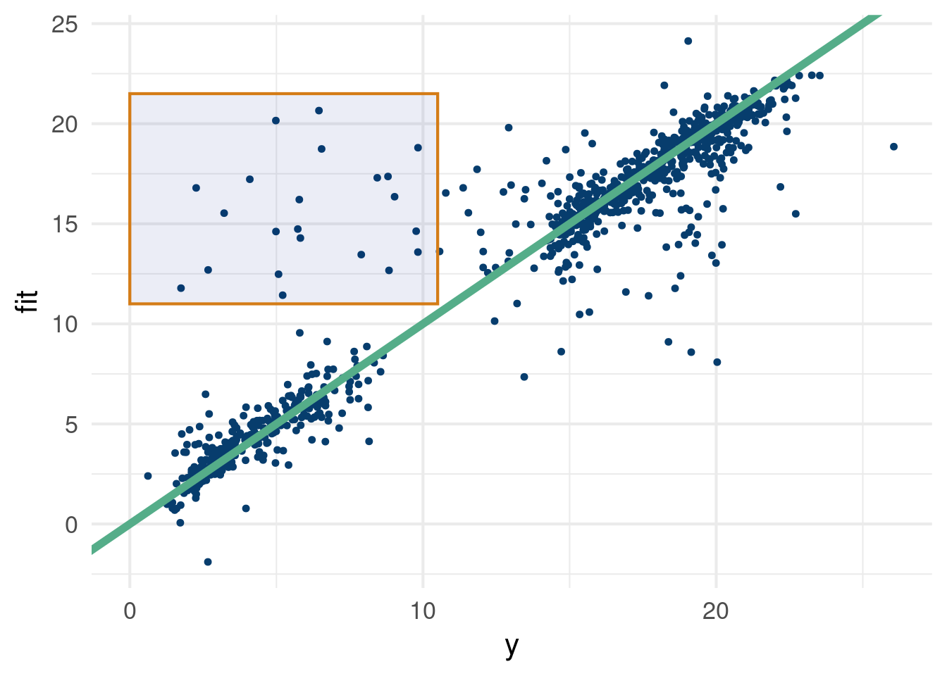
This stackoverflow link was pretty helpful in making Figure 2.2. In case the graph is difficult to read, see the table below:
Click here for full code
Missing = X_copy[which(rowMeans(full_pred$y_hat)>11& y<10),]Missing = Missing %>%mutate(across(where(is.numeric), round, digits=3)) # What data are we missing??DT::datatable(data.frame(date=Missing$date, y=y[which(rowMeans(full_pred$y_hat)>11& y<10)], Missing)%>%dplyr::arrange(y), rownames = F)
Click here for full code
# Holidays!
The main takeaway here is what we thought was unobserved fluctuations that we do not care about, were actually meaningful unobserved signals. If we include data indicating if a day were a holiday, or near a holiday, we probably do not drastically over-predict ridership for the highlighted regions in Figure 2.2. Lesson learned.
2.5.4 Stochasticity vs limited data
We can also consider breaking down uncertainty into two distinct notions:
Aleatoric uncertainty: This is basically what we have called “noise” so far and describes inherent randomness/stochasticity in the observed data. On average, someone might sleep 8 hours a night on the weekdays and 9 hours on the weekends, but there will be random fluctuations.
Epistemic uncertainty: On the other hand, we can have uncertainty based on a lack of knowledge of a system. If we only observe someones sleep hours for two nights, we do not have enough observations (data) to be certain of the underlying signal.
2.6 Cross validation
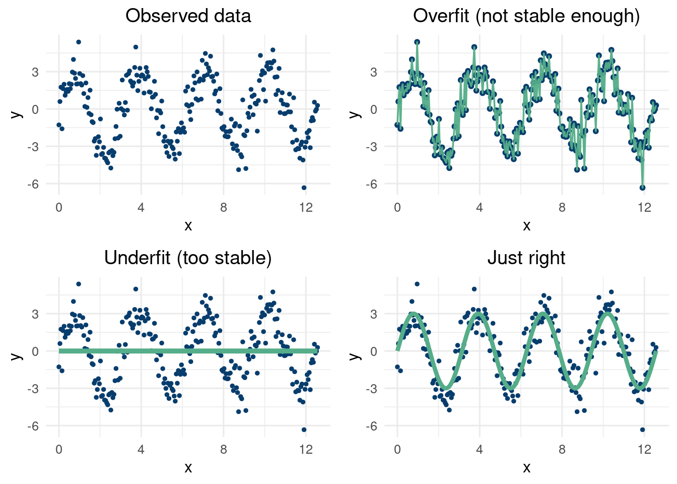
While cross validation is not a panacea of a technique, it can provide a way to try and minimize generalization error and avoid overfitting. Many methods are “universal approximators”, including high order polynomials, deep perceptron neural networks, and a child connecting dots on a graph. However, learning a pattern that is both indicative of the patterns in the data but also predictive of patterns where data has yet to be observed is very difficult. Interpolating in a region where we have data on “either side” of the missing region is a difficult, but attainable goal. Prediction where there is no “sandwiching” data around is called extrapolation and is a far harder problem. Our thesis here is proceed skeptically when seeing extrapolated results and study the underlying model closely.
At first glance, we would think with the advent of machine learning, we would like to model any function with as complicated a model as feasible. After all, if the world is complex and non-linear, shouldn’t we accomodate that possibility. Yes! But, we also must be cautious to not chase noise. If we play “connect the dots” with our input to output data relationship, we will have highly unstable predictions. When we go to use our model to guess what will happen with new input data, we will not be pleased with the result.
To further hammer home the point, what if we plotted each of our models predictions with a new set of input values with the exact same input data. What’s new, is that we have better measurement equipment are far less noise on these new measurements.
The plot described above is a staple in the data scientists toolbox. It works by plotting the model predictions on the y-axis of the scatterplot vs the observed \(y\) at the test locations on the \(x\) axis. The line of slope 1 through the origin should intercept the scattered points, meaning we pick up the signal and the variations around the line should correspond to the known noise level. If we do not lie near the line, our model is biased in some way, which is bad (i.e. the model is inaccurate). If the variations around the center of the line are egregiously large, are models predictions vary to much to be reliable (i.e., they are not precise). A common metric to study this the Root mean squared error (RMSE).
We will discuss this in further detail later, but here is a helpful R-function to calculate the RMSE.
RMSE <-function(m, o){ sqrt(mean((m - o)^2)) }
Anyways, to the point at hand, we would like to be able to use a model to “fit” data well while also ensuring we retain an effective fit out of sample. A first guess is to train on some data and test on other hold out data. However, this is highly dependent on the data that happened to be the training data. Cross validation will allow us to train on different subsets of the data, which can help build further confidence in the generalizability of models we build.
2.6.2 How to choose \(k\)?
Building off this discussion, which offers a really excellent answer to this question and studies past literature that can be categorized as misleading.
How do we choose the number of folds? Well, this is actually a tricky question that has garnered much attention for decades(Kohavi et al. 1995). Casting aside worries about computational strain (higher \(k\) means more repetitions of our training model and with more data each time), we still have other statistical worries to consider. On first glance, we would think that training on all but one data point and then looping through all \(n\) data points to serve as the hold out set would be the ideal scenario. This is called Leave-one-out cross validation (LOOCV). This has the benefit of minimizing the impact of training on small datasets, and will have lower bias than using less folds. However, if the \(n-1\) training datasets are sufficiently correlated, then this LOOCV estimator will tend to yield higher variance estimates of the MSE for the left-out data point8. If the different training sets are not correlated, then LOOCV will be a lower variance estimator. If the training sets are sufficiently correlated, which is likely as they differ by just 1 training point, then the variance will be higher. This is because (and also the second answer here, which is derived from (Bengio and Grandvalet 2003))the sum of \(n\) correlated variables has the following equation:
8 This can be verified by repeating a simulated experiment \(M\) times.
For each trial, calculate the error between the left out data point and the truth for the \(n\) left-out data points. Average this error over the \(n\) data points (train with \(n-1\) points, test on the remaining point).
Repeat the procedure above for each of the \(M\) repetitions.
Look at the distribution of the error terms over the \(M\) repetitions.
Where \(e_i\) represents the prediction errors on the test sample given the \(K\) folds trained on, \(n\) is the total sample size9. If we have 2 folds, there is no overlap in \(e_i\) and \(e_j\). If we are doing LOOCV, then \(e_i\) and \(e_j\) differ by only one point (the single hold out data point differs for the two). So if the variables have more covariance, we expect more variance, as in the LOOCV case. However, the diagonal elements will likely be smaller due to having more training points. This link helps explain the Bengio and Grandvalet paper well.
9(Bengio and Grandvalet 2003) further decompose the variance into components of the covariance describing correlation of the training sets and properties of the predictive model itself.
ADD TO THIS!
On the other hand, in practice, lower number of folds can themselves be higher variance estimators due to the smaller training data size. 2-fold cross validation yields the smallest training size (\(n/2\)), but also the most likely for the datasets to be independent.
Cross validation and train test splitting are done to ensure your model is not overfitting. At the end of the day, you still want to model all the data10, but these procedures provide a principled way to ensure your predictions are not just fitting noise and missing signal. Colloquially, ensuring a model’s predictions generalize well out of sample is pre-requisite for faith in said model. The next topic we discuss, regularization, provides a blueprint for finding balance in the bias-variance trade-off and over/underfitting.
10 i.e. you want to predict on the entire data set, train and test combined, after ensuring you predict well on unseen data.
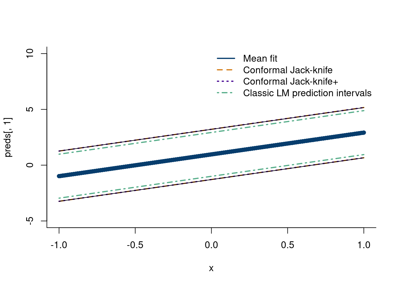
2.6.3 The Jackknife estimator
Explain the jack-knife. (EFRON 1979). (Barber et al. 2021) introduce the jackknife+, this paper. The two methods are similar, but the jackknife+ centers the interval around the predicted point from the leave-one-out model, rather than the jackknife, which centers the interval around the prediction from a model trained on all the data.
Tutorial for jack-knife estimator
n =500x =seq(from=-1,to=1, length.out=n)y =1+2*x +rnorm(n)#rt(n, df=2)mod_lm =lm(y~x)# Train n models with all but one data pointmod =sapply(1:n, function(k) lm(y[-k]~x[-k]))# predict on missing pointfits =sapply(1:n, function(q)sapply(1:n, function(m)as.numeric(mod[,m]$coefficients)[1]+as.numeric(mod[,m]$coefficients)[2]*x[q]))crit_val=0.975resid_jackknife =sapply(1:n, function(j)abs(y[j]-fits[j,j]))alpha =quantile(resid_jackknife, crit_val)# take the quantiles of x-1(-1)+-resid1, x-2(-1)+=resid2, and so on# sapply does this for (-1), (-2), etc.LB_jackknife_plus =sapply(1:n, function(j)quantile(fits[,j]-resid_jackknife, 0.025))UB_jackknife_plus =sapply(1:n, function(j)quantile(fits[,j]+resid_jackknife, 0.975))fits_med =sapply(1:n, function(m)median(fits[,m]))preds =predict(mod_lm, newdata =data.frame(x), interval ='prediction')plot(x, preds[,1], col='#073d6d', pch=16, bty='ln', ylim=c(-5,10))lines(x,preds[,1]+alpha, col='#d47c17', lwd=2, lty=2)lines(x,preds[,1]-alpha, col='#d47c17', lwd=2, lty=2)lines(x,fits_med+alpha, col='#430291', lwd=2, lty=3)lines(x,fits_med-alpha, col='#430291', lwd=2, lty=3)lines(x, LB_jackknife_plus)lines(x, UB_jackknife_plus)lines(x,preds[,2], col='#55ad89', lwd=2, lty=4)lines(x,preds[,3], col='#55ad89', lwd=2, lty=4)legend('topright', legend =c('Mean fit', 'Conformal Jack-knife','Conformal Jack-knife+', 'Classic LM prediction intervals'),col =c('#073d6d', '#d47c17','#430291', '#55ad89'),lty=c(1,2,3,4), lwd=c(2,2,2,2),bty='n')
2.6.4 Regularization
It is not difficult to fit data with arbitrary precision, such as if we fit an n-th order polynomial to our data. However, ensuring our predictions do not simply chase noise, we need to introduce regularization techniques to aid the cause. In other words, everyone is unique, but not that unique.
2.6.5
2.7 The power of linear algebra
2.7.1 Build your own Shazam
Fourier analysis, have code.
The data are sourced from the “seewave” package in R (Sueur, Aubin, and Simonis 2008), which borrows the data from (Hopp, Owren, and Evans 2012). They describe the sound profile of a sheep “baa”-ing (or bleating if you prefer). The following code (not run) saves the data locally.
The Fourier transform can be thus be thought of as the “signature” of your signal. With multiple signals (in our case songs/sounds), we can run independent Fourier transforms on each signal. We can then use some “similarity” metric between the Fourier transforms and see if they are a match. With a large database of songs, we can compare them one by one to the incoming sound (after that sound has been processed and transformed). One such metric is found in the “seewave” package in R. The spectra similarity is given by:
Other similarity metrics exist, such as the Frechet distance. More modern inventions may use a convolutional neural network to classify an incoming song, but more on that later.
2.7.2 Google’s page rank
2.7.3 Singular value decomposition
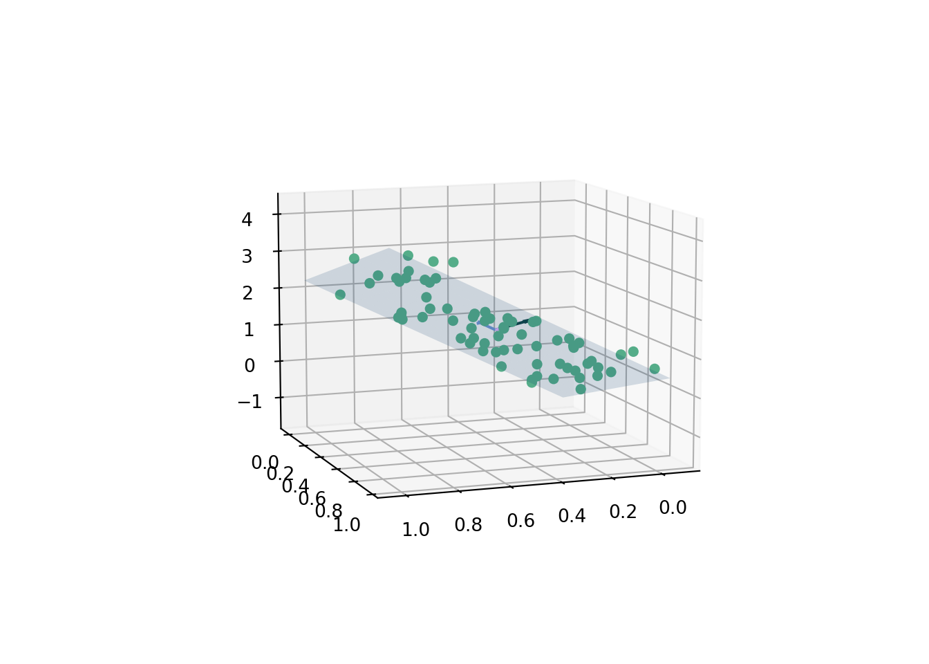
2.7.3.1 Finding the plane of best fit
A plane is given by the equation \(ax+by+cz=d\). The “normal vector”, \(\hat{n}\), is equal to the vector \(\langle a,b,c\rangle\). How do we fit the coefficients? We could re-parameterize11 and use the least squares procedure we learned about earlier, z ~ lm(x+y) in R, which regresses \(z\) on \(x\) and \(y\) in a linear fashion. The intercept is the \(d\) value and the \(a\) and \(b\) coefficients on \(x\) and \(y\) can be used to calculate \(z\). We then plot the corresponding plane, which is the 2-dimensional linear regression analogue to the 1-D line of best fit.
11 Such a useful thing to do! Stay tuned throughout these notes…
On the other hand, this is also a good chance to see how we can use the singular value decomposition we just learned about.
We follow the exposition in (Brown 1976), with a nice visual provided by this stackoverflow link. The procedure described there is as follows for generated data \(z=f(x,y)\).
Subtract the mean value of \(\mathbf{x}\), \(\mathbf{y}\), and \(\mathbf{z}\) from every data point \(x_i,y_i,z_i\)
The transformed data \(\tilde{x}\), \(\tilde{y}\), and \(\tilde{z}\) are stacked into a matrix \(\mathbf{Q}\).
Decompose \(\mathbf{Q}\) using a singular value decomposition, i.e.
\[
\mathbf{Q}=UVD
\]
where the left singular vectors, \(V\), represent a \(3 \times 3\) matrix. The first two dimensions represent basis vectors that lie on the plane of best fit, and the third column represents the “normal vector” to the plane, which corresponds to the coefficients \(a,b,c\) from the plane equation.
Finally, \(d\) can be calculated by taking the dot product of the normal vector and a point on the plane. A point that is for sure on the plane is the “center of mass”, which can be calculated as the average of the data points. That is
\[
d = \langle \hat{n}, \{\bar{x},\bar{y}, \bar{z}\}\rangle
\]
The data are simulated from the equation
\[
3x+2y+z=1
\]
where \(x\sim\text{uniform}(0,1)\), \(y\sim \text{uniform}(0,1)\). The data \(\{x,y,z\}\) are corrupted by noise, \(\varepsilon\sim N(0, 0.22)\). As usual, feel free to mess with the coefficients.12
12 Uncomment the %matplotlib widget line to make the plot interactive on your local window.
Click here for full code
import numpy as npfrom matplotlib import pyplot as pltimport matplotlib.pyplot as pltimport pandas as pd# for creating a responsive plot#%matplotlib widget# importing required librariesfrom mpl_toolkits.mplot3d import Axes3D# generate some random test points m =70# number of pointspoints = np.empty((3,m))d_true =1points[0] = np.random.uniform(0,1, m) # xpoints[1] = np.random.uniform(0,1,m) # ypoints[2] =3*points[0]+2*points[1] -d_true + np.random.normal(0,0.22, m) # z# now find the best-fitting plane for the test pointsm =len(points[0])# subtract out the centroid and take the SVDsvd = np.linalg.svd(points - np.mean(points, axis=1, keepdims=True))# Extract the left singular vectorsleft = svd[0]# the corresponding left singular vector is the normal vector of the best-fitting plane#left[:,2]# its dot product with the basis vectors of the plane is approximately zero#np.dot(left[:, 2], basis)basis_1 = left[:, 0]basis_2 = left[:, 1]norm_vec = left[:,2]# Pick the normal where z is pointing upwardsif norm_vec[2]<0: norm_vec =-1*norm_vec# plot raw dataplt.figure()ax = plt.subplot(111, projection='3d')ax.scatter(points[0], points[1], points[2], s=22,color='#55AD89', alpha=1)# plot planexlim = ax.get_xlim()ylim = ax.get_ylim()xx,yy = np.meshgrid(np.arange(xlim[0], xlim[1], step=.1), np.arange(ylim[0], ylim[1], step=0.1))#points = points - np.mean(points, axis=1, keepdims=True)combined_vector = pd.DataFrame([points[0], points[1], points[2]])c_m = combined_vector.T.sum()/mweights =1/mplane_point = np.array(c_m)d = np.dot(norm_vec,plane_point)# calculate corresponding zz = (-norm_vec[0] * xx - norm_vec[1] * yy + d) /norm_vec[2]origin = np.array([[0, 0, 0],[0, 0, 0]]) # origin point# dividing by unit since's its a unit vectordist_plane = [np.abs(norm_vec[0]*points[0][i]+norm_vec[1]*points[1][i]+norm_vec[2]*points[2][i]+d)/(np.linalg.norm(norm_vec)) for i inrange(len(points[0]))]dist_overall = np.sum(dist_plane)ax.plot_surface(xx, yy, z, alpha=0.16, color="#073d6d")basis_1 /= np.linalg.norm(basis_1)basis_2 /= np.linalg.norm(basis_2)r0 = np.array([xx[0][0], yy[0][0],(-norm_vec[0] * xx[0][0] - norm_vec[1] * yy[0][0] + d) /(norm_vec[2])])r1_x = np.array([xx[0][1], yy[0][1],(-norm_vec[0] * xx[0][1] - norm_vec[1] * yy[0][1] + d) /(norm_vec[2])])r1_y = np.array([xx[1][0], yy[1][0],(-norm_vec[0] * xx[1][0] - norm_vec[1] * yy[1][0] + d) /(norm_vec[2])])basis_1 = r1_x-r0basis_2 = r1_y-r0basis_1 /= np.linalg.norm(basis_1)basis_2 /= np.linalg.norm(basis_2)ax.quiver(c_m[0], c_m[1] , c_m[2], norm_vec[0], norm_vec[1], norm_vec[2], color=['#104547'], normalize=True, length=0.25)ax.quiver(c_m[0], c_m[1] , c_m[2], basis_1[0], basis_1[1], basis_1[2], color=['#6F95D2'], normalize=True, length=0.25)ax.quiver(c_m[0], c_m[1] , c_m[2], basis_2[0], basis_2[1], basis_2[2], color=['#e0b0ff'], normalize=True, length=0.25)ax.view_init(10, 70) plt.show()
A few diagnostics to ensure we indeed calculated a valid plane. The normal vector should be perpendicular to both the basis vectors. This means that both basis vectors lie on the plane, so both should then be perpendicular to the normal vector, which by definition is perpendicular to the plane. This can be done by taking the dot product between the 2 vectors. Check with the following code:
Recall, the singular value decomposition is given by
\[
\text{SVD} \longrightarrow U\Sigma V'
\]
The \(V'\) is a rotation matrix. Rotate to a new basis that “explains” the space better…i.e. make new factors Rotate movie ratings to space where the effects are most pronounced (i.e. directions for action or horror movies for example). These features can be viewed as classifications in a sense.
The \(\Sigma\) matrix scales the inputs in each direction. So the largest eigenvalues indicate which feature is more dominant (i.e. multiplying the action movies are multiplied by an action movie score, same for horror movies). This helps determine how strong effects are in each direction.
Finally, the \(U\) matrix is another rotation that maps the “features” back to “individuals” in the column space. Each column is a “feature” constructed from \(V'\) that then gets amplified/stretched/deformed by \(\Sigma\) then maps to where each row is an individual.
Where does each movie watcher for the projected major directions, like action or horror movies. You can then recommend similar types of movies to those users.
If a matrix is \(n\times p\) , then \(V'\) is \(p\times p\) , \(\Sigma\) is \(p \times p\) and \(U\) is \(n \times n\).
The data are from kaggle. They represent a subset of the famous Netflix million dollar prize data. The following script (not run because the original data set is hundreds of Megabytes!) cleans the data such that we only look at 100 randomly selected movies each with 500 randomly selected ratings. This being a much smaller dataset does change the problem significantly, but there is still a sparsity issue. Many users do not rate every single of the 100 movies, which is the crux of the problem.
expand for full code
suppressMessages(library(readr))suppressMessages(library(dplyr))# Originally had 17,770 movies and 17 million ratings! 250 MB!Netflix_Movie <-suppressMessages(read_csv(paste0(here::here(),"/data/Netflix_Dataset_Movie.csv")))Netflix_Rating <-suppressMessages(read_csv(paste0(here::here(),"/data/Netflix_Dataset_Rating.csv")))# Only look at movies we have ratings forNetflix_Movie = Netflix_Movie[unique(Netflix_Rating$Movie_ID),]# merge the datasetsdf =merge(Netflix_Movie, Netflix_Rating, by=c('Movie_ID'))set.seed('123')rand_sample =sample(unique(df$Movie_ID), 100,replace=F)df = df[df$Movie_ID%in% rand_sample, ]df = df %>%select(-Movie_ID)df = df %>%group_by(Name)%>%slice_sample(n=500)write.csv(df, paste0(here::here(),'/data/netflix_movies.csv'), row.names=F)
So what do the data represent? We have 100 movies which each have 500 ratings from different users. The same users are not necessarily rating the same movies. We want to predict a movie to a user based on the ratings they have given out in the past such that the movie they are recommended are movies we’d expect them to rate similarly. Methods to do this include using similarity metrics (like the cosine similarity) or an algorithm like k-nearest neighbors. The proposed approach here, one of the most successful in the 2009 challenge, is to use the singular value decomposition.
Barber, Rina Foygel, Emmanuel J Candes, Aaditya Ramdas, and Ryan J Tibshirani. 2021. “Predictive Inference with the Jackknife+.”The Annals of Statistics 49 (1): 486–507.
Bengio, Yoshua, and Yves Grandvalet. 2003. “No Unbiased Estimator of the Variance of k-Fold Cross-Validation.”Advances in Neural Information Processing Systems 16.
Brown, Christopher. 1976. “Principal Axes and Best-Fit Planes, with Applications.”
Dayaratna, Kevin D, and Steven J Miller. 2012. “The Pythagorean Won-Loss Formula and Hockey: A Statistical Justification for Using the Classic Baseball Formula as an Evaluative Tool in Hockey.”arXiv Preprint arXiv:1208.1725.
EFRON, B. 1979. “Bootstrap Method: Another Look at the Jackknife Method.”Annals of Statistics 7 (1): 1–26.
Hopp, Steven L, Michael J Owren, and Christopher S Evans. 2012. Animal Acoustic Communication: Sound Analysis and Research Methods. Springer Science & Business Media.
Kohavi, Ron et al. 1995. “A Study of Cross-Validation and Bootstrap for Accuracy Estimation and Model Selection.” In Ijcai, 14:1137–45. 2. Montreal, Canada.
Kuhn, Max, and Kjell Johnson. 2019. Feature Engineering and Selection: A Practical Approach for Predictive Models. Chapman; Hall/CRC.
Miller, Steven J. 2007. “A Derivation of the Pythagorean Won-Loss Formula in Baseball.”Chance 20 (1): 40–48.
Rencher, Alvin C, and G Bruce Schaalje. 2008. Linear Models in Statistics. John Wiley & Sons.
Sueur, Jérôme, Thierry Aubin, and Caroline Simonis. 2008. “Seewave, a Free Modular Tool for Sound Analysis and Synthesis.”Bioacoustics 18 (2): 213–26.