Match a well motivated model to observed data as best we can.
“In theory there is no difference between theory and practice. In practice, there is.”
Yogi Berra
By “motivated curve fitting”, we are going to focus on two different types of motivated curve fitting. The first is a from the ground up modeling approach, where we try and predict what we will see based on what we know about the world. The second is to use more statistical tools to learn from data, with our choice of model being less constricted than the first approach.
For the “ground up approach”, this stems from the idea that we have an underlying mechanism we think exists that motivates the functions we use to match our data. In physics, these mechanisms are derived from “first principles”, which means we logically build a model from the ground up based on what we know about the real world. An example of these are Newton’s laws, derived from a “falling apple” (supposedly).
Alternatively, we could fit a statistical model to some sort of experimental data, using a more broad class of functions. To maintain the “motivated” portion, we would like to maintain some constraints or prior information (such as when modeling a disease spread we cannot have a negative population).
In an ideal world, the former approach can be considered a more interpretable model, as the parameters in the model are causal and derived from first principles. Intervention in a system via changing a parameter will change the output in an expected way. From a more detrimental perspective, the motivated curve fitting paradigm could be viewed as constrained statistical modeling. This view abandons the generosity and grace of the first worldview and looks at parameterized models as constrictions of the data fitting process to only consider certain types of functions. If we know a process should only reside in these spaces, great! If not, well then, to be frank, we have really limited the predictive capabilities of our model for no real good reason. And the causality we infer may not even be accurate. TLDR, interpretability is great, but our model may not be realistic, in which case, sure we understand causality but it may not be right. And constraints are great…again if they are actual constraints!
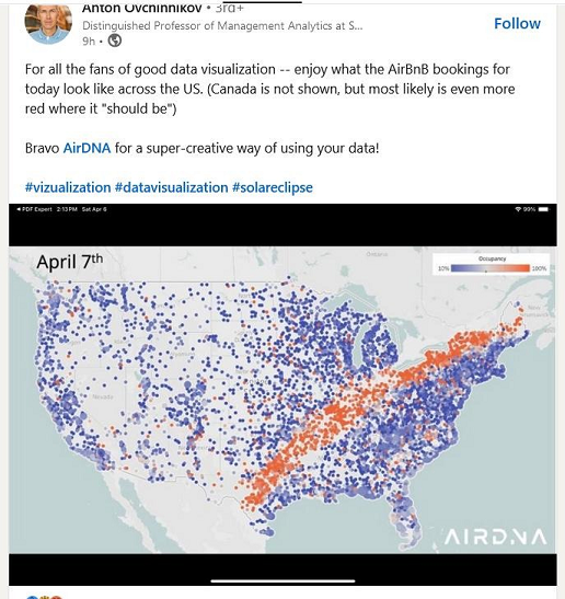
The following fun image helps illustrate these approaches.
The image describes airbnb bookings during the 2024 American solar eclipse. Building a model of the moon’s orbit, even a simplification like Newton’s laws, can predict where the moon will be with great precision. Knowing this led astronomers to relay this information to the greater public, which led to massive public interest in this unique and seemingly biblical event.
On the other hand, if an analyst were studying this data after the fact, they’d probably struggle to explain what was going on. Without knowing which features to include in their model, they may not be able to learn the signal in the data, and would probably not be able to explain the pattern they are seeing. Simply include the location of the moon, an example of clever feature engineering could provide insight into what the pattern is. While the analyst need not be familiar with the detailed physics under the hood, having the intuition to include physical data could provide both increased predictive capabilities as well as explanatory insights to the analyst. Otherwise the job becomes searching for a needle in a haystack.
5.0.1 A word of caution
If a model that dictates a certain functional form relating inputs to outputs is justified, then the approaches suggested here are very useful. For example, we understand governing dynamics in weather patterns fairly well1. However, we do not always know the functional form of interest or anything particularly close. This is part of the reason we tend to advocate for non-parametric models in later chapter. We can still glean statistical properties of certain estimands, whether or not a specific “curve” is pre-specified to fit the data. In the meantime, read this article on non-parametric identification. We replicate some insightful excerpts below:
1 Unfortunately, the systems are non-linear dynamical systems which are subject to chaotic behavior, impeding the ability to forecast out very far with any confidence.
Why does this work? Because we’ve specified a relationship between the behavior of Y conditional on Y being positive and the way Y behaves when it’s negative. The data doesn’t reveal this relationship. Our parametric assumption imposes it.
Maybe this model is motivated by some reasonable model of the world, but it’s probably not. It’s just a functional form. There is a mapping between the data and the parameter of interest because the functional form assumptions fill the gap between the data and what we want to know.
So, let’s look at why nonparametric identification is so important:
When we observe (\(Y,X\)), we are nonparametrically identified. Even if we just run a linear model in estimation, we know that the regression is trying to fit variation that does precisely reveal what we want to know, independent of the functional form assumption.
When we only observe (\(Y*,X\) ), \(t(x)\) (which is the conditional mean \(E(Y\mid X=x)\)) is not nonparametrically identified. Our functional form tells us where the parameter of interest is in the data. If we choose another parametric form, another part of the data will determine the parameter of interest. The functional form determines the variation we use to get at the parameter of interest.
Nonparametric identification matters, and we should doubt analysis based on parametrically identified parameters.
…
Parametric estimation is fine, but our models should not require the specific parametric form for the data to be informative about the parameter of interest.
Zach Flynn
5.0.2 Is the right approach?
While we discuss motivated curve fitting in this section, most of this book will not espouse it as the end all be all. Generally, we will show a strong preference for non-parametric modeling, which we will discuss in more detail later. Why should we prefer a non-parametric approach? 1) We do not always know the rules of how the variables behave together. 2) If we can collect data on more variables that could plausibly be impactful, we should. Just because we cannot derive the rules of the game for these variables, does not mean we should abandon all hope. In fact, this is where letting the “machine” sort out the relationships is a really handy device
5.0.3 The damped harmonic oscillator
Draw a spring going back and forth
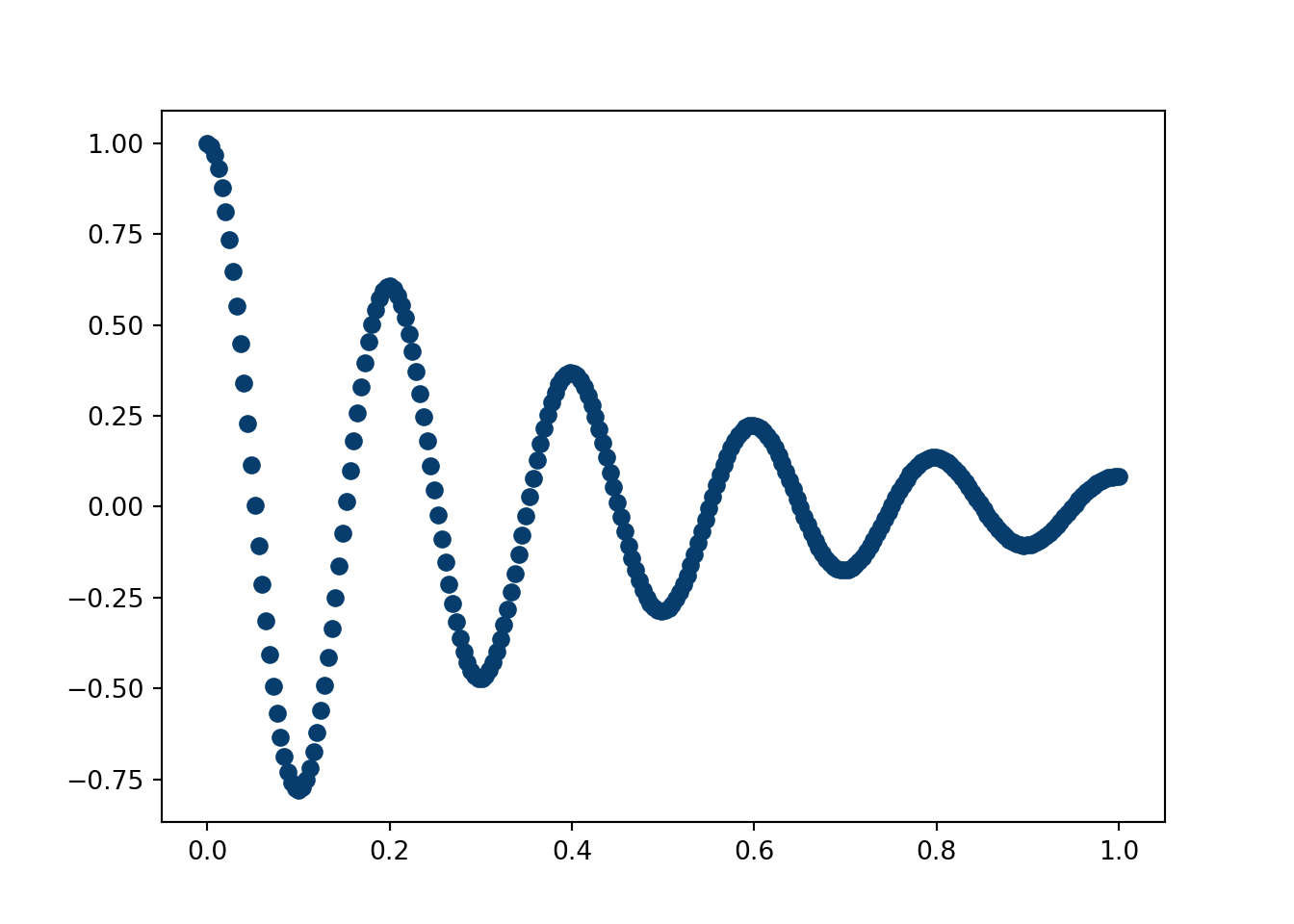
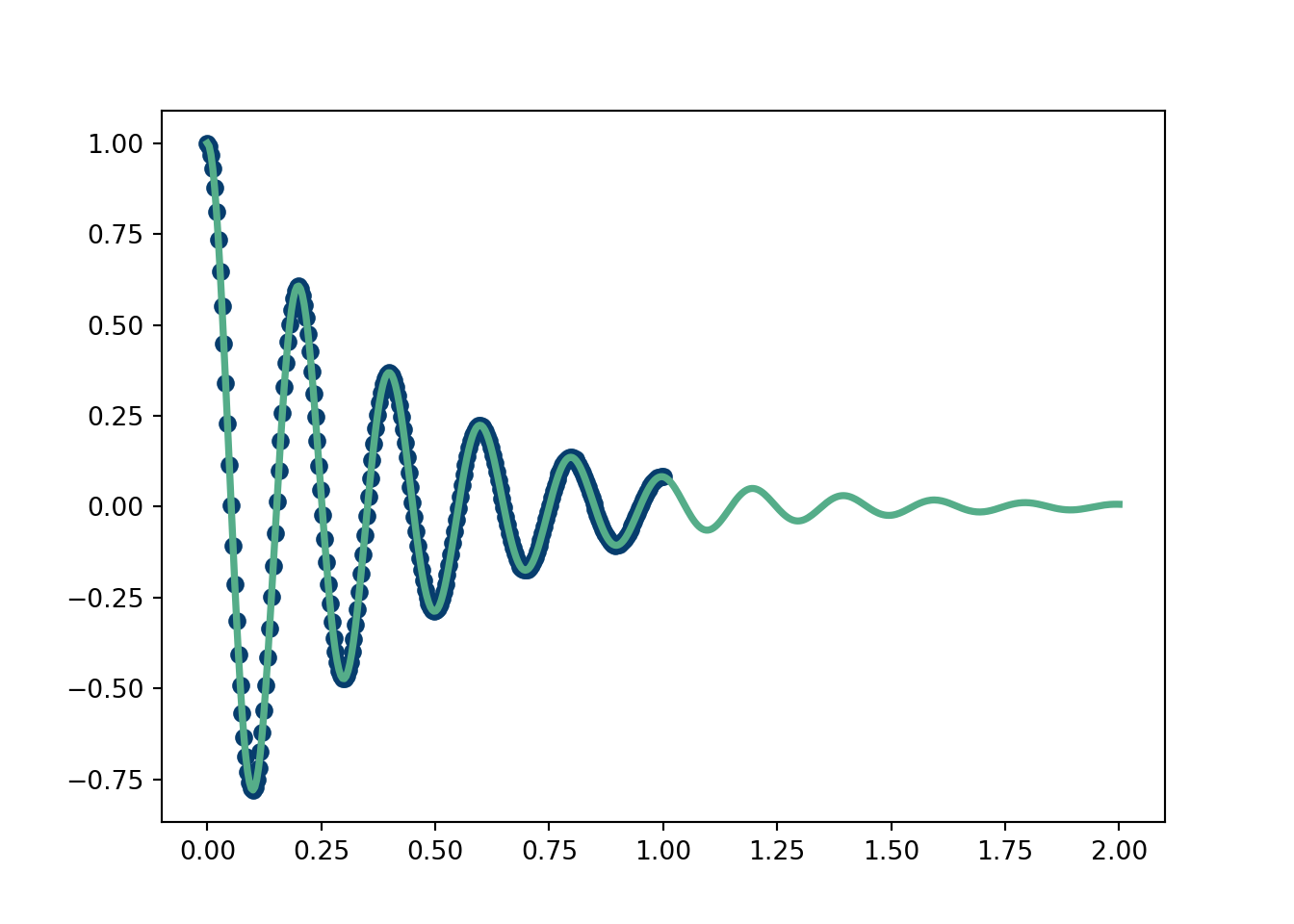
First, simulate a spring that eventually dies out (think a slinky). We then fit the data using an equation derived from a physics model (solved using Green’s functions). Software will pick the parameters that align the fit of the curve to the data as well as possible. In this case, knowing the physics of the model allows us to extrapolate our fit out beyond the “training” region.
Click here for full code
import numpy as npimport matplotlib.pyplot as pltN =250mu =1m =0.2k =200gamma = mu/(2*m)t=np.linspace(0,1,N)t_test=np.linspace(0,2,2*N)def spring_eq(gamma, k, t): w = np.sqrt(k/m) omega = np.sqrt(w**2-gamma**2) phi = np.arctan(-gamma/omega) A =1/(2*np.cos(phi)) x =2*np.exp(-gamma*t)*A*np.cos(phi+omega*t)return(x)plt.scatter(t, spring_eq(gamma, k,t), color='#073d6d')plt.show()
Now, we use “curve fit” from scipy. Of course, we are fitting the actual equation and our measurements are not at all corrupted by noise, so this is very much a proof of concept and a validation of the scipy curve fit software.
Click here for full code
from scipy.optimize import curve_fitdef fit_func(t,gamma, A, phi, omega):return(2*np.exp(-gamma*t)*A*np.cos(phi+omega*t))popt, pcov = curve_fit(fit_func,t, spring_eq(gamma, k,t))plt.scatter(t,spring_eq(gamma, k,t), color='#073d6d')plt.plot(t_test, fit_func(t_test, *popt), color='#55AD89', linewidth=2.75)plt.show()
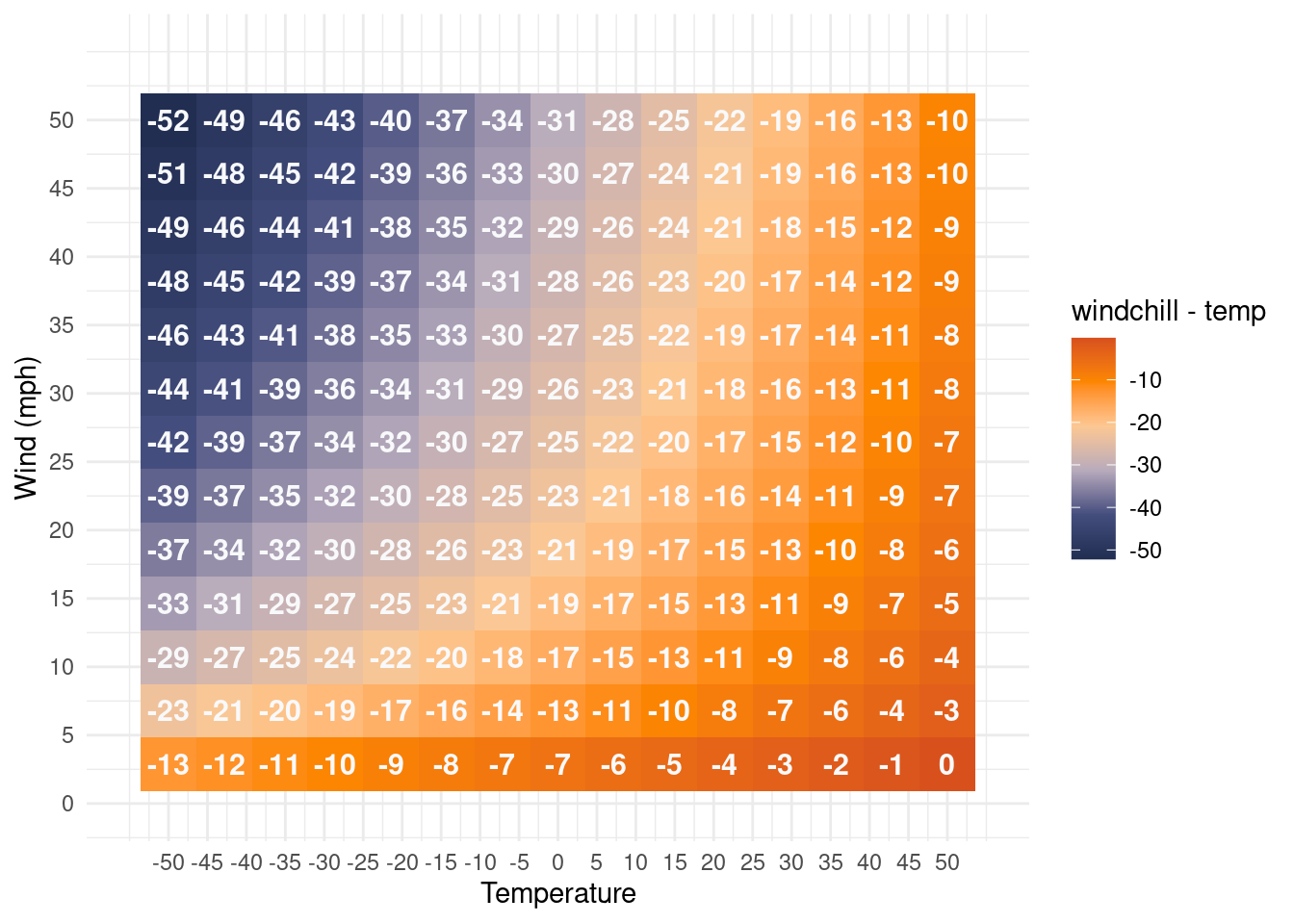
5.1 A weathered equation
A famous example of a curve fitting is the windchill equation. It is the equation that determines what the temperature feels like for someone given how windy it is. This equation is almost certainly not as rigorously derived as the damped harmonic oscillator, which is a well established and tested model which was spun up from first principles. The windchill equation, on the other hand, more resembles a linear regression, but with certain transformations of the input variables included that may or may not be physically motivated. The equation that is used by weather services is (with temperature in Fahrenheit and wind in miles per hour):
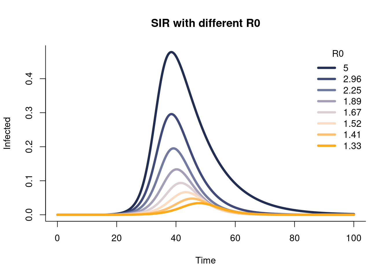
The SIR model, which stands for “susceptible, infected, and recovered” dates back almost 100 years. It’s early uses included modeling the spread of disease in a population, an all too familiar concept in the post 2020 world.
The SIR model is a nice mechanistic model that generally matches our expectation for how a disease would spread. The dynamics of the spread of a various are governed by 3 “compartments” of people in a population, susceptible, infected, and recovered individuals. People get infected, spread the disease to other people, become immune to the disease, and move into a recovered compartment. Eventually, the disease runs out of people to spread and dissipates.
This model is nice because it is intuitively sound and relatively simple. Real life infection curves mostly look like the shapes that solutions to the SIR model grant. The model can be studied mathematically and the parameters have some meaning. If we change a parameter, then the outcome will change in ways we can easily test2.
2 Just wait about a paragraph though.
Issues:
The base SIR model is fairly simple and may not capture the necessary interactions. As we will see in the simulations below, the shapes permitted from the SIR model are not extremely flexible; they are mono-modal and generally symmetric or with slight skews for realistic \(R_0\) values (a measure of disease infectiousness). More complex models can capture more complex behaviours, but they are adding more assumptions about the correct formulation of the disease spread. For example, including compartments to attempt to account for human behaviour seems like a good idea. But nailing the form of that behaviour is hard and doing it a-priori reduces the flexibility of a model. Say this new model assumes people stay home if the disease spreads quickly. We know from experience with COVID that this varied a lot!
Additionally, the disease itself evolves in (more predictable) ways. Therefore, we can extend the SIR model to include multiple strains (Pell et al. 2023), but this requires careful thought about interactions between strains and consideration of immune dynamics, and maybe iffy assumptions. It’s unwieldy with more than two strains. (Dukic, Lopes, and Polson 2012) embed the SIR into a “state-space” modeling regime which allows for parameters to vary over time and for noise in the observations to be modeled explicitly. In fact, many of the best performing COVID forecasts incorporated this approach, including (Gibson, Reich, and Sheldon 2023), who had the cleanest webpage I think I have ever seen and the model of Youyang Gu(Gu 2020).
The question arises if the implied constraints of the SEIR (which expands the SIR by including an “exposed” class) lead to the quality forecasts. In one sense, seir constraints seem logically generally valid, if somewhat simple. The SEIR implies a skewed unimodal curve, which is a reasonable constraining condition. However, the SEIR is not the only data generating system to yield curves that look like! Many functions look like that, such as the functions generating beta or log-normal distributions. And those may be preferable to the SEIR formulation, which stipulates conditions/rules/constraints (whatever you wanna call them) between unobserved things3 which makes it almost impossible to grok if those conditions/rules/constraints are actually valid in practice.
3 For example, we do not actually observe a “susceptible” or “exposed” class, and arguably do not know the infected or recovered class either due to under-representation of cases relative to true disease spread.
Some dynamical system models, such as the fox-rabbit model are defined in terms of observable variables. In these models, the “causal levers” that the parameters define in the real world are more meaningful. Additionally, the simplicity of this model makes practical identification more likely. However, to avoid the over-simplification of the fox-rabbit model makes it unlikely to match real world data. Incorporating more complexity through a model that defines the structures of the data explicitly means that we’d likely have to delve into unobserved variables again or make strong assumptions about behaviours of the animals and the environment around them.
Additionally, the fitting of dynamical systems can be challenging, particularly if a system consists of partial differential equations, which we will ignore here. Some parameters are inherently correlated (deaths affect the contact rate) and the formulation/fitting assume independence. As you add more parameters, they are less likely to be identifiable. The procedure generally becomes more prone to overfitting as well.
Finally, data quality also affects our analysis. This is a problem that we will become well aquainted with. For example, for a a study on different strains, validation is thrown out the window if detailed data on strains (and thus waves) are not available.
Using a dot to denote differentiation with respect to time, the SIR model with standard incidence is given by \[
\begin{align}
\dot{S}&= -\tilde{\beta} S I,\\
\dot{I}&= \tilde{\beta} S I-\tilde{\gamma} I,\\
\dot{R}&= \tilde{\gamma} I.
\end{align}
\]
The model stipulates people go from susceptible class (\(S\)) to infectious (\(I\)) to recovered (\(R\)), with there being a fixed number of people \(N\) in the population equaling the sum of these three compartments. The simplicity of the standard SIR model implies several assumptions. The population is closed, and the model as written in the above system of equations does not account for demographics or disease-induced mortality. Furthermore, individuals have equal probability of coming into contact with one another, which is often an inaccurate reflection of contact networks. It should be noted that the waiting time in each compartment is exponentially distributed; for example, the average duration of infectiousness in the SIR formulation s \(1/\tilde{\gamma}\) days.
In code, simulating from the SIR can be done as follows:
Click here for full code
options(warn=-1)## Load deSolve packagesuppressMessages(library(deSolve))## Create an SIR functionsir <-function(time, state, parameters) {with(as.list(c(state, parameters)), { dS <--beta * S * I dI <- beta * S * I - gamma * I dR <- gamma * Ireturn(list(c(dS, dI, dR))) })}### Set parameters## Proportion in each compartment: Susceptible 0.999999, Infected 0.000001, Recovered 0init <-c(S =1-1e-6, I =1e-6, R =0.0)## beta: infection parameter; gamma: recovery parameterparameters <-c(beta =1.4247, gamma =0.14286)parameters <-c()## Time frametimes <-seq(0, 100, by = .1)out <-c()R0_list <-c()n_vals <-8for (i in1:n_vals){ parameters[[i]] <-c(beta =seq(from=.5, to=1, length.out=n_vals)[i], gamma =seq(from=0.1, to=.75, length.out=n_vals)[i]) R0_list[[i]] <- parameters[[i]][1]/parameters[[i]][2] parameter2 <- parameters[[i]]## Solve using ode (General Solver for Ordinary Differential Equations) out[[i]] <-ode(y = init, times = times, func = sir, parms = parameter2)}out <-sapply(1:n_vals, function(i)out[[i]][,3])## change to data frameout <-as.data.frame(out)## Delete time variableout$time <-NULLsuppressMessages(library(NatParksPalettes))#use Arches, Acadia, or Yosemitepal <-natparks.pals("Acadia", n=10)matplot(x = times, y = out[,], type ="l",xlab ="Time", ylab ="Infected", main ="SIR with different R0",lwd =4, lty =1, bty ="l", col = pal)## Add legendlegend('topright', legend=round(unlist(R0_list),2),lty=1,lwd=4, col = pal, bty ="n", title='R0')
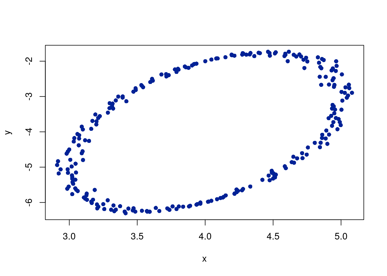
options(warn=-1)N =250x_0 =4y_0 =-4a =1# major axis lengthb =2# minor axis lengthphi = pi # angle of major axis with x axiseps =rnorm(N, 0 ,0.05) #noiset =seq(from=0, to=2*pi, length.out = N)x = x_0 + a*cos(t)*cos(phi) - b*sin(t)*sin(phi) + epsy = y_0 + a*cos(t)*cos(phi) + b*sin(t)*cos(phi) + epsplot(x,y, col='#012296', pch=16)
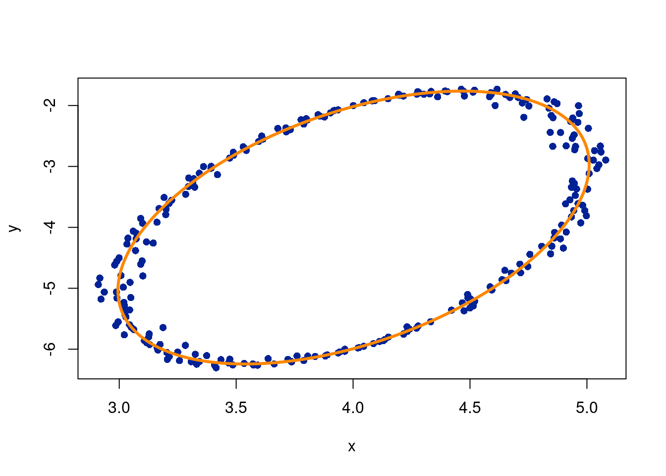
We need to convert to Cartesian coordinates to minimize the equation of the ellipse:
\[
ax^2+by^2+cx*y+dx+ey+1=0
\]
where we set \(f=1\) as a constraint so that not all parameters are just 0. To check the fit, you can sum the fitted coefficients and check they add to 0:
Click here for full code
options(warn=-1)mod =lm(zero ~ x2+xy+y2+x+y-1, data=data.frame(x2=x^2,xy=x*y,y2=y^2, x,y,zero=rep(-1, length(y))),singular.ok = F)a = mod$coefficients[1]b = mod$coefficients[2]c = mod$coefficients[3]d = mod$coefficients[4]e = mod$coefficients[5]f =1# check the solution sums to 0print(paste0('The sum of the fitted coefficients is: ', round(sum(a*x^2+c*y^2+b*x*y+d*x+e*y+1),3)))
[1] "The sum of the fitted coefficients is: 0.001"
The following code converts the cartesian coordinates back to polar. Admittedly, this is copied from this stackoverflow link (the same one as earlier), so the code is hidden since the details are beyond the scope of these notes because they require more advanced linear algebra.
Click here for full code
#| echo: true#| code-fold: true#| code-summary: "expand for full code"#https://stackoverflow.com/questions/41820683/how-to-plot-ellipse-given-a-general-equation-in-rplot.ellipse <-function (a, b, c, d, e, f, n.points =1000) {## solve for centre A <-matrix(c(a, c /2, c /2, b), 2L) B <-c(-d /2, -e /2) mu <-solve(A, B)## generate points on circle r <-sqrt(a * mu[1] ^2+ b * mu[2] ^2+ c * mu[1] * mu[2] - f) theta <-seq(0, 2* pi, length = n.points) v <-rbind(r *cos(theta), r *sin(theta))## transform for points on ellipse z <-backsolve(chol(A), v) + mu x_fit = z[1,] y_fit = z[2,] df =data.frame(x_fit, y_fit)return(df) }vals =plot.ellipse(a,c,b,d,e,1)x_fit = vals$x_fity_fit = vals$y_fitplot(x,y, pch=16, col='#012296')lines(x_fit, y_fit, lwd =3,col='#FD8700')
5.2.3 Summing together simpler functions can do a lot for us
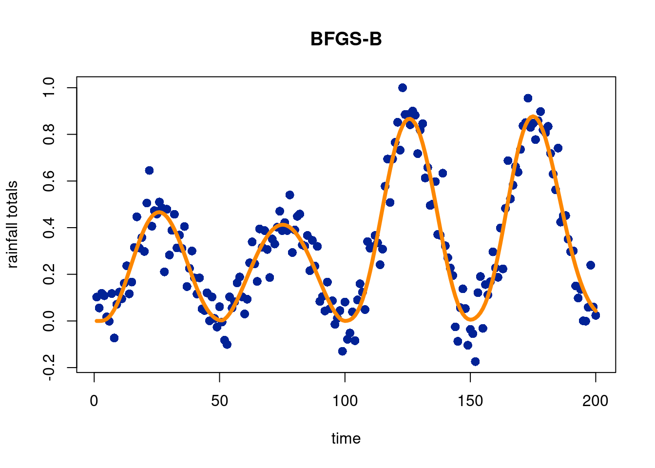
In this subsection, we will try and show how to fit a flexible model to data that is still well motivated. To illustrate this idea, we use the “optim” function in R, which allows for a variety of optimization techniques in an easy-ish way. We simulate from a sine curve with noise to mimic seasonal precipitation totals in a seasonal state in the U.S., but fit with a 4-parameter Beta distribution, which is nice because the parameters are meaningful. In particular, we can control the total amount of the outcome contributed in each curve, the shape of the curves, the number of curves, and the start and end points. We manually set the number of points, \(m\), from a visual inspection of the data. The data also guide our initial estimates of the \(\alpha\), \(\beta\), and start and end parameters for each beta curve.
Unsurprisingly, initial estimates are very important. If we start in a local minimum, we are doomed from the get-go. We first use the “Nelder-Mead” (Nelder and Mead 1965) approach to find the minimum/maximum (depending on the form of the function) of the objective function4. We will not go into detail here, but it is a simplex based method (i.e. a point in 0 dimensions, a line in 1 dimension, a triangle in 2 dimensions, a triangular pyramid in 3 dimensions, and so on). Broadly speaking, the algorithm orders the outputs \(f(x_i)\) for \(i\in \{1,2, \ldots, d+1\}\), where \(d\) is the number of dimensions. The points are ordered by what the evaluation of \(f(x)\), such that \(f(x_1)\) is the “best” evaluation (the closest to the minimum/maximum amongst the points evaluated) and \(f(x_{d+1})\) is the worst (farthest from the minimum/maximum amongst the points evaluated).
4 The mean squared error between the observed data and the “mixture” of beta-functions model we propose.
The simplex is initialized by the \(d+1\)\(x_i\) points (recall, in two dimensions this is a triangle) . We begin by calculating the centroid of all points but the maximum \(x_i\). The centroid is crucial for the calculations of the next steps. These next steps involve going through reflections, expansions, or contractions around the point \(x_{d+1}\), evaluate the new point “\(r\)” $, which is \(f(x_{r})\), and evaluate some criterion for whether or not that move is accepted. All test points are “shrunk” except the best (\(x_1\)). See the wikipedia page for more detail and cool visuals.
Given the function we are fitting, constraints our important because of the allowed inputs to the modified beta function we are fitting. So now we try the ‘L-BFGS-B’ method, which allows for constraints on parameters encoded through intervals from which potential values are explored from. This makes use of a modification of the Broyden-Fletcher-Goldfarb-Shanno (BFGS) algorithm, a method similar in spirit to Newton’s method and put forward in these 4 seemingly independent (!) papers in 1970, see (Broyden 1970), (Fletcher 1970), (Goldfarb 1970), and (Shanno 1970).
Broyden, Charles George. 1970. “The Convergence of a Class of Double-Rank Minimization Algorithms 1. General Considerations.”IMA Journal of Applied Mathematics 6 (1): 76–90.
Dukic, Vanja, Hedibert F Lopes, and Nicholas G Polson. 2012. “Tracking Epidemics with Google Flu Trends Data and a State-Space SEIR Model.”Journal of the American Statistical Association 107 (500): 1410–26.
Fletcher, Roger. 1970. “A New Approach to Variable Metric Algorithms.”The Computer Journal 13 (3): 317–22.
Gibson, Graham C, Nicholas G Reich, and Daniel Sheldon. 2023. “Real-Time Mechanistic Bayesian Forecasts of COVID-19 Mortality.”The Annals of Applied Statistics 17 (3): 1801.
Goldfarb, Donald. 1970. “A Family of Variable-Metric Methods Derived by Variational Means.”Mathematics of Computation 24 (109): 23–26.
Gu, Youyang. 2020. “COVID-19 Projections Using Machine Learning.”Retrieved May 29: 2020.
Nelder, John A, and Roger Mead. 1965. “A Simplex Method for Function Minimization.”The Computer Journal 7 (4): 308–13.
Pell, Bruce, Samantha Brozak, Tin Phan, Fuqing Wu, and Yang Kuang. 2023. “The Emergence of a Virus Variant: Dynamics of a Competition Model with Cross-Immunity Time-Delay Validated by Wastewater Surveillance Data for COVID-19.”Journal of Mathematical Biology 86 (5): 63.
Shanno, David F. 1970. “Conditioning of Quasi-Newton Methods for Function Minimization.”Mathematics of Computation 24 (111): 647–56.