The broad goal in this chapter is to generate an outcome using statistical machinery. Generally, this can be problematic. I can certainly tell you how busy a restaurant is, but convincing someone its “good” or “bad” is a much more ambiguous task. In statistical parlance, predicting a restaurants business level based on factors such as day of week, previous week’s business, price changes, etc. is a straightforward enough task (in principle at least, not the actual process). However, how “good” a place is (assume we don’t have access to YELP/google ratings/awards… which are kinda bad anyway) does not invoke a measurable outcome. Statistically, we can try and group restaurants together based on attributes like those measured above to try and mathematically quantify “good/bad” in a less subjective way than arguing with the fellas1. However, this approach isn’t really better, at least not without intense scrutiny, and hopefully the examples in this chapter help clarify our takes on that.
1 This is basically what chat-gpt does… Answers are given based on which words are “closest” to one another and become the next most probable word. They are fundamentally an unsupervised and generative model (GPT=generative pre-trained transformer). Many chat-bots do have people grade responses (aka reinforcement learning) which in effect places the model into more of a supervised learning territory.
To summarize what we will learn:
The goal of unsupervised learning is essentially density estimation which means learning a probability distribution of the data. A probability distribution of \(x\) would tell us how probable values between a certain interval within \(x\) are. Comparably probable values of \(x\) are considered “similar”. From the wikipedia page for unsupervised learning:
A central application of unsupervised learning is in the field of density estimation in statistics,[12] though unsupervised learning encompasses many other domains involving summarizing and explaining data features. It can be contrasted with supervised learning by saying that whereas supervised learning intends to infer a conditional probability distribution conditioned on the label of input data; unsupervised learning intends to infer an a priori probability distribution .
From the learned probability distribution of a variable, set of variables, or joint probability of input and output variables, we can form a generative probability model!
Generally, this is accomplished using latent structure models, where we assume the data are generated by some hidden variables. These models can have advantages over distance based “algorithmic” clustering algorithms or dimension reduction tools like principal component analysis. For one, many of them are probabilistic in nature, given us a greater sense of our uncertainty. We will discuss some models that fall into this boat in this chapter.
It is possible to perform unsupervised learning outside the context of latent variable models. For example, simply relying on a distance metric as a notion of similarity, agnostic of any outcome given an input \(y\mid \mathbf{x}\), can be useful in this venture. k-means is an example of this. PCA is another example of an algorithmic approach.
10.2 Chapter theme
This chapter is focused primarily on two types of models: the Gaussian mixture and the Gaussian factor model. The goal is to model our features without necessarily seeing our outcome, which lends itself natural to “clustering” our data. We will discuss other similar methods that fall under the “unsupervised learning principal component” (credit to Drew Herren for that joke).
Previously, we have mostly focused on conditional expectation modeling. By that we mean we have had an outcome (response), \(\mathbf{y}\) some other variables we observe (our “independent” variables), \(\mathbf{X}\), and want to predict what \(\mathbf{y}\) would be given that we know the values of \(\mathbf{X}\). Specifically, we want to focus on what would the typical value of \(\mathbf{y}\) given these \(\mathbf{X}\), which is why we focus on the expected value (the average of \(\mathbf{y}\) given \(\mathbf{X}\)) of \(\mathbf{y}\) given \(\mathbf{X}\), which we denote \(E(\mathbf{y}\mid \mathbf{X})\). However, what if we do not have a response? What if we want to learn about the structure of \(\mathbf{X}\) without having “supervision” or an underlying truth? This can be done mathematically (this chapter) or in a kind of ad-hoc manner, like with personality tests such as Meyers Briggs (INTJ!).
Broadly speaking then, this chapter is about modeling \(\Pr(\mathbf{X})\) (which then facilitates the modeling of \(Y\) and \(\mathbf{X}\) together, \(\Pr(Y,\mathbf{X})\), in the next chapter) instead of \(\Pr(Y\mid \mathbf{X})\). From wikipedia:
A discriminative model is a model of the conditional probability\(\Pr(Y\mid X=x)\) of the target \(Y\), given an observation \(x\). It can be used to “discriminate” the value of the target variable \(Y\), given an observation \(x\).[3]
Classifiers computed without using a probability model are also referred to loosely as “discriminative”.
There are two similar, but distinct ways people tend to go about this “unsupervised” route. The first introduces latent variables that generate the observations. Some common methods to do this include PCA (principle component analysis) and factor models, which decompose the variance of \(\mathbf{X}\) as a way to determine the most relevant “features”. Specifically, these methods that decompose the variance in the covariates (columns) of \(\mathbf{X}\) into a subset of features that explain where most of the variance in the data is. The second broad class of methods aims to determine which regions of the covariate “space” are most similar, using through the use of some distance metric, such as k-nearest neighbors methods. Given where the covariates are most similar, researchers will then use these class of methods to “cluster” the data based on these similarities, calling bunches of groups distinct clusters. Of course, these clusters, and the number of them, are unobserved. Different models assume there is an underlying data structure with a distinct set of clusters that created the observed data; others do not but are still used as an algorithm to find these supposed clusters. For example, if \(\mathbf{X}\) represents data about human personalities, the INTJ test defines 16 underlying groups that are distinct enough from one another to describe human personality.
A nice byproduct of this kind of modeling is that if you can fully model \(\Pr(Y,\mathbf{X})\), because \(\Pr(Y, \mathbf{X})=\Pr(Y\mid \mathbf{X})\Pr(\mathbf{X})\) (by the the laws of probability), you now have a way to generate new data! This is probably the easiest example of a generative model, the basis of which has stormed the “AI-sphere” with chat-gpt, Dall-e, and all their derivatives. For example, answering the question is “knock knock?” a “serious” or “funny” phrase based on human labels would be discriminative. On the other hand, a model that “learns” the semantics of language, which means learning the distribution of all the phrases and their interpretations (funny, serious, sad, etc.) without the benefit of the label!
Supervised learning, based on discriminative modeling of \(\Pr(Y\mid \mathbf{X})\) operates under the notion that we are given some inputs, learn function of those inputs that map to the output. This is “inductive” as we learn an output based on patterns from a fixed input. In unsupervised learning, we learn the patterns in the inputs from observed data, create new data without any data explicitly fixed or given to you. We don’t give priority to a variable (the label) that is learned after conditioning on other random variables.
10.3 A damaging flaw
A problematic, in our view, issue with this kind of statistical approach is the lack of “supervision”. Whatever approach we take, whether it be an algorithmic approach (PCA, tSNE, uMAP, k-means) or a probabilistic based approach (factor models, Gaussian mixtures), retain similar drawbacks in some ways. At the end of the day, data will be clustered or projected down into the most mathematically suitable dimensions. If two groupings of data are sufficiently “different”, or dissimilar, enough to satisfy the mathematical conditions of the modeling approach (whether it be maximizing the likelihood of being the correct latent cluster in a mixture model or the variance explained by a linear combination of variables in PCA), they will be “separated”. Without containing any information that labels provide in “supervised” learning, it is difficult to define what “correct” means. We will see this in the Taylor Swift example where the two versions of “All too Well” were classified as different enough to be in separate clusters, which while mathematically valid, struck us as odd.
Additionally, evaluation of latent space models does not make a lot of sense. In predicting a labeled outcome, we do not necessarily need to know \(y\mid \mathbf{x}\) fully. We do not even need all the \(\mathbf{x}\) to be observed. We just need to predict the outcome \(y\) with some degree of certainty based on some metric of our interest. The task at hand is clear. If we predict well and generalize out of sample, we are good. In the latent modeling world, we assume there is some structure of the data we are interested in that we do not see. Not observing all the necessary data is now a really big problem. Maybe “All too Well” would be in the correct cluster if we clustered with the correct observed variables. But it isn’t. And the clustering algorithm still gave reasonably separated clusters nonetheless, even though are intuition says they are not correct. And in scenarios where we do not have an intuition to check the estimated latent space (think bio-informatics), we can get in big trouble real fast.
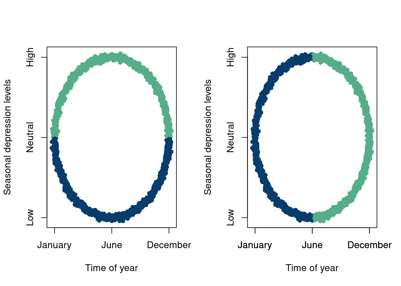
The following example is meant to illustrate these issues, where the meaning of clustering or dimension reductions should be interpreted with extreme caution, and should be subject to many intuitive tests before moving forward. Say our axes are “time of year” and “seasonal depression levels”. We measure peoples seasonal depression levels every day throughout the year and report their SAD at a given day and notice fairly obvious groupings of our data. We have two analysts run separate mixture models and end up being returned the following two plots:
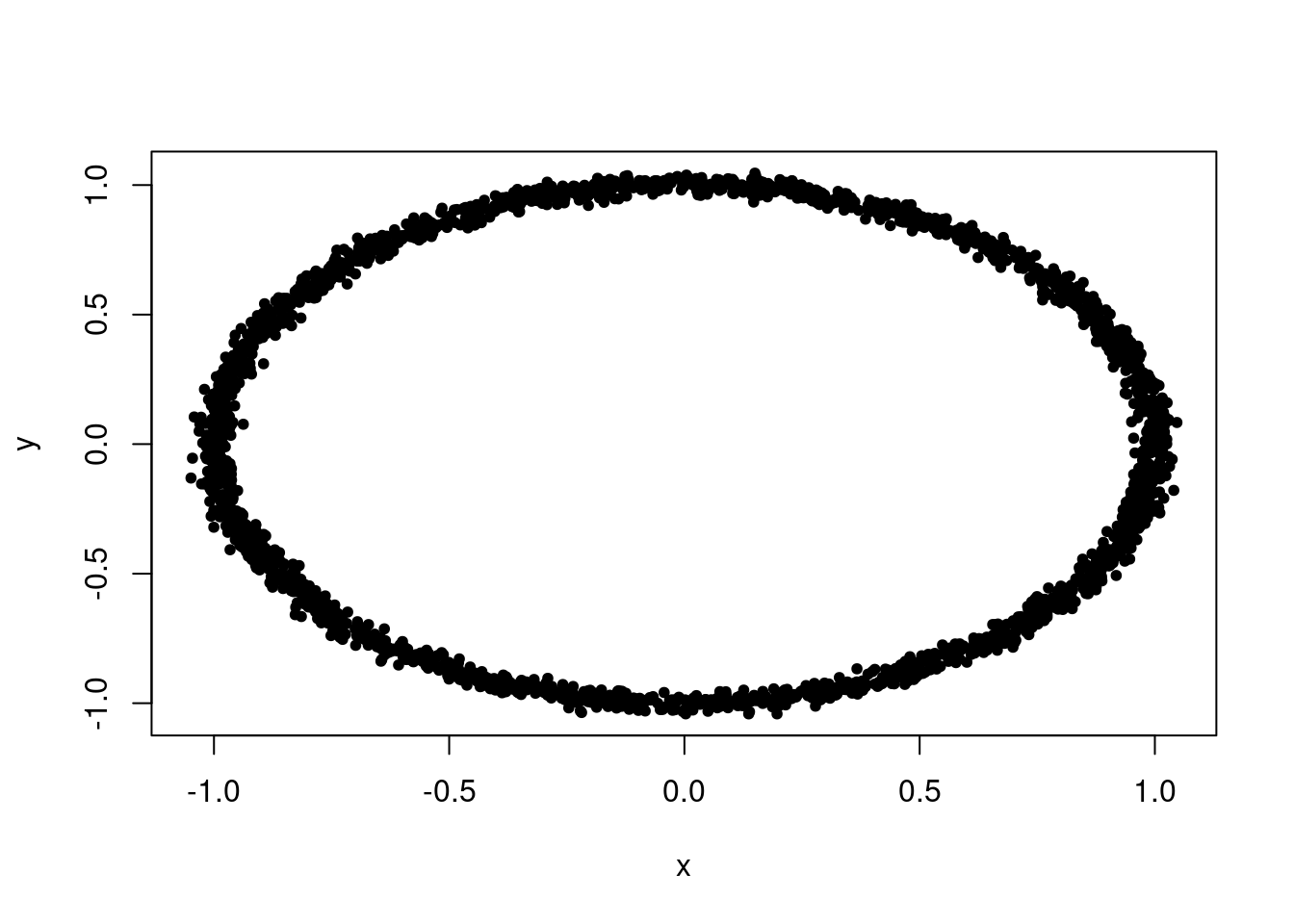
data =data.frame(x,y)# Get the cluster assignmentscluster_assignments <-ifelse(data$y>0, '#55AD89','#073d6d')data2 =cbind(data, cluster_assignments)# Visualize the resultscluster_assignments2 <-ifelse(data$x>0, '#55AD89','#073d6d')data3 =cbind(data, cluster_assignments2)# Visualize the resultspar(mfrow=c(1,2))plot(data2$x, data2$y,col=data2$cluster_assignments,xaxt='n',yaxt='n', main ="",pch=16, xlab='Time of year',ylab='Seasonal depression levels')axis(1, at=c(-1,0,1), labels=c('January', 'June', 'December'))axis(2, at=c(-1,0,1), labels=c('Low', 'Neutral', 'High'))plot(data3$x, data3$y,col=data3$cluster_assignments2,xaxt='n',yaxt='n', main ="",pch=16, xlab='Time of year',ylab='Seasonal depression levels')axis(1, at=c(-1,0,1), labels=c('January', 'June', 'December'))axis(1, at=c(-1,0,1), labels=c('January', 'June', 'December'))axis(2, at=c(-1,0,1), labels=c('Low', 'Neutral', 'High'))
The analyst on the left tells us that their plot indicates that some people are depressed because of the summer heat and others because of the winter cold. The analyst on the right is a little perplexed but tells us that their plot indicates grouping based on people who are moving in opposite directions of their SAD, with grouping 1 indicating increased separation and grouping 2 indicating people becoming more similar. A plausible explanation even.
As it turns out, the data were describing North and South Pole residents (elves if you will). The “correct” grouping, given that we know this labeling (that our analysts were not privy too) is then the left clustering, because the north and south pole experience winter and summer at opposite times!
The point being here when we do have a \(y\), or an outcome/label, it does indeed supervise a model by adding a significant amount of structure and direction. It, at the minimum, allows for a clear statistical goal, like making sure that we predict \(y\) as well as possible on data we have not seen before.
10.4 Another one
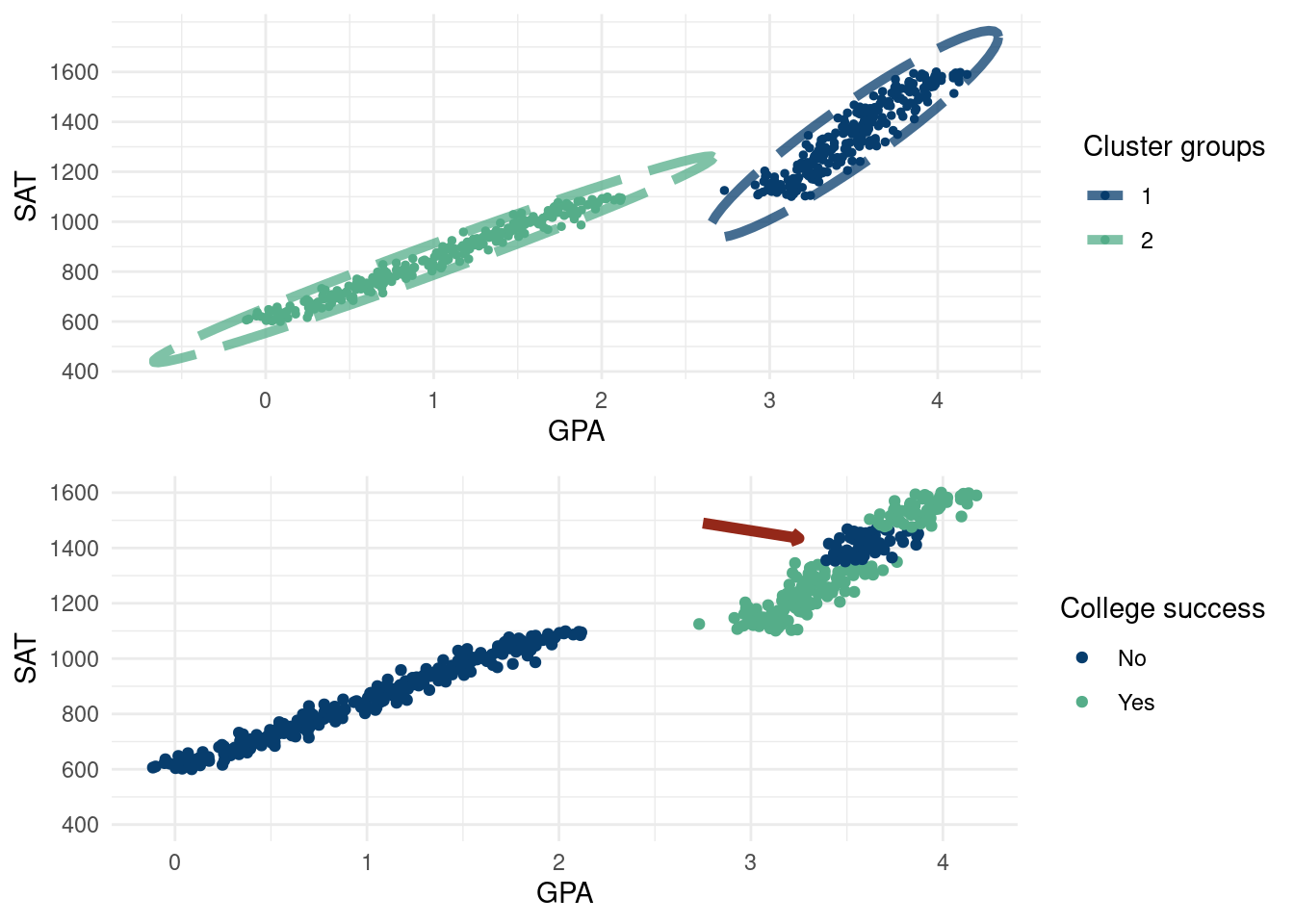
As mentioned above, we have our concerns with unsupervised learning. Of course, modeling data without a “target” is useful and often necessary. However, if a target variable is available, we should use it due to the information it provides. A target variable can help you “cluster” data more effectively. Say we have data on students. If we know whether or not they “succeed” in college, our \(y\) target variable, then we can guide our grouping of the \(\mathbf{X}\)’s. Given this “supervision”, we care about the attributes that predict success in college, not just the attributes that separate the \(\mathbf{X}\)’s the most.
Take the following example. We have data on high school student’s GPA, SAT, and college success (a made up thing for the sake of the example). Their SAT is simply \(\text{SAT}=600+250*\text{GPA}\) and is only their to facilitate the plot being readable. GPA’s are drawn on a grid from 0 to 2.5 and 3 to 4 with \(N(0, 0.1)\) error being thrown on. This also does not really matter, but we just want to make clearly separated data with respect to GPA.
The top graph expresses what any decent clustering algorithm might show. There is a clear split along the X-axis (GPA) for students. There are students in the less than 2.5 GPA and students above 3 and little in-between2. The top graph is a perfectly valid separation of the input data. The bottom graph shows how these students fare in college according to a made up “success” metric. Students between 3.5 and 3.75 GPA in high school for some reason are less successful. A good predictive model would then cluster the data according to the coloring of the bottom graph. The moral of the story is that the clustering on the top is valid but not meaningful!
2 Due to how this hypothetical high school distributes grades
3 A generative model can have great use cases when used alongside a discriminative model. (Goodfellow et al. 2020), which introduced Generative Adversarial Networks (GAN’s) use a generative model to create an outcome which is then judged by a discriminative model, going back and forth. This model still suffers from some of the issues we discuss in this chapter, namely that the typical neural network loss functions become somewhat meaningless. GAN generated data is then usually assessed via an eye test.(Hahn, Carvalho, and Mukherjee 2013) introduces a “Partial factor regression”, which is designed to model the correlation structure in the input features \(\mathbf{x}\) with a factor model, while also considering the \(y\mid \mathbf{x}\) aspect of the problem. Famously, if \(\mathbf{x}\) is modeled agnostic of \(y\), the reduced dimension from the number of factors being less than the number of variables in \(\mathbf{x}\) can render the \(\mathbf{x}_{\text{$\#$ factors}}\) useless in predicting \(y\). We discuss this in the least eigenvalue problem is a hierarchical model where the \(\mathbf{x}\) are modeled as a factor model and then the \(y\) are drawn given the \(\mathbf{x}\)’s, the factor structures \(\mathbf{B}\) and \(f\), and the parameters used to predict \(y\) (in this case the linear regression coefficients \(\beta\). (Krantsevich et al. 2023) model \(\Pr(y,\mathbf{x})\) as \(\Pr(y,\mathbf{x})=\Pr(y\mid\mathbf{x})\cdot \Pr(\mathbf{x})\), with the discriminative model being a BART model and the model for \(\mathbf{x}\) a factor model.
4 This path should also be tread with care. For hidden variable models like the mixture model or the factor model (for example), the number of components in the model are not really interpretable, but it is tempting to think they may be.
These examples are meant to show that unsupervised learning (on its own) needs to be handled with great care and that in general if there is a target variable, use it3. The estimate of \(E(y\mid \mathbf{x})\) is more readily insightful. Supervised learning boils down to, “If I have these covariates, what is my expected response/outcome?”. The unsupervised learning analog is “given these input features, who else is similar to me?”. But what does similar mean? Why is similarity defined only in terms of the input variables we happen to observe. If the \(\mathbf{x}\) input features are insufficient to learn \(E(y\mid \mathbf{x})\), we can easily notice this with simple diagnostics like comparing \(y-\hat{y}\). If the features are insufficient to create a satisfactorily similar person, we cannot really tell. Our only formal validation method would be to compare different models likelihood evaluations and pick the best model (for example, choosing the number of components), but it is still not clear if the best model is in general “good” and is a good representation of the data. “Goodness” is often tested via qualitative checks of how much the results make sense4, such as examining the output of an LLM or checking if your clusters of songs are actually similar to one another (end of this chapter).
The rest of the chapter will show more “technical” details (cool stuff and flaws) with common unsupervised learning and dimension reduction techniques.
10.5 Embedding algorithms
10.5.1 Principal component analysis
Explain first, elbow plot, algorithm vs model, modeling the variance terms, common vs unique variance, different decomposition, eigenvalues… TO DO!
There are some issues we will highlight below. Some are mathematical/algorithmic (such as sensitivity to outliers), while others are more fundamental.
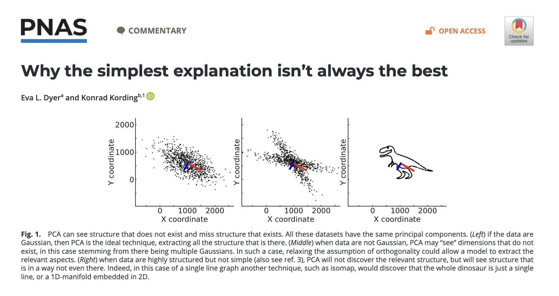
Hallucinations & non-uniqueness: A fundamental problem of PCA (and dimension reduction methods at large) is that we cannot really attribute meaning to the principal components, despite common “interpretability” arguments in favor of PCA. See (Dyer and Kording 2023), with link here. They have a couple of nice quotes summarizing this issue:
However, this similarity also highlights a critical interpretive hazard: just as many different signals can share similar low-frequency profiles, diverse datasets
can yield similar principal components, complicating the attribution of specific meanings or origins to these components.
The principal components describe the data, but depending on the structure of the data, they may not align with the generating factors in data or, alter-
natively, produce hallucinated structure.
The analog to music is different songs can have the same underlying Fourier components. Two songs may share the same major signal components, but they are not the same songs, complicating apps like Shazam to classify solely on “underlying structure”. In that case, we interpretation that the principal components represent the unique hidden structure for the observed data is buns, as the same principal components could describe completely different songs! The overall theme is that PCA will find an underlying structure, but it may be a structure in data where there is no structure (hallucination) or it may be a mis-representation of a true structure!
For a visual of the argument being made, see Figure 10.1 below:
Figure 10.1: Highlight of how PCA can “hallucinate” structure. All the data have the same principal components despite the plots being very different.
Least eigenvalue problem: we don’t see Y! In PCA, it is well known that since the response is not accounted for, the least valuable principle component could actually be the most predictive of y! Here is a stackoverflow example highlighting this. This dates back to the 50s (Hotelling 1957)! (Jolliffe 1982), with a link here provides a concise overview which very clearly states the issue.
Noise is probably a problem: While PCA is a deterministic procedure, it can be sensitive to small deviations in data (particularly if the data are not well separated or there is a lot of noise). See (Elhaik 2022)linked here, in particular page 12 and figure 11.
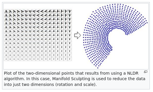
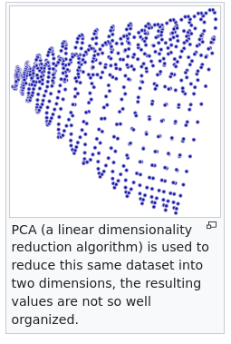
Non-linear structures cause issues, see this wikipedia page.
?fig-nonlin is a structure where the underlying vectors are non-linear with a non-linear dimension reduction technique and ?fig-lin is the PCA reduction.
If the data are generated with thick tails, we need a very large sample size to avoid spurious results fat vs thin tails PCA,
If the data are equidistant, or near equidistant, the “dimension reduction” (say \(k\) cannot be much smaller than the original dimension, \(p\) (irregardless of sample size). Johnson-Lindenstrauss Lemma, see pages 2 and 3 of: the specious art of single-cell genomics. The takeaway here is if the data are equidistant, or the data are noisy in high-dimensions and are nearly equidistant (i.e. there is not a strong signal), PCA is only valid if we keep a fairly high amount of principal component, i.e. \(k\) is not much smaller than \(p\). Reducing to just a few principal components is akin to a random projection, which means the principal component analysis can be specious! So in the case where there is a weak signal, if \(p\) is large (say 10,000), it is very likely that only keeping 2 dimensions (common in bio-informatics) is almost guaranteed to be meaningless at best, and the plot itself is then likely misleading at worst!
Outliers: The PCA algorithm is not robust to outliers as far away individual points will soak up a decent amount of the variance in any linear combinations of the \(p\) covariates. Of course, outliers are an issue in many statistical modeling procedures, and there are techniques for dealing with them before running a principal component analysis.
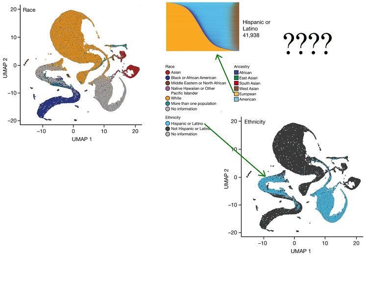
More complicated models like tSNE and UMAP also fall prey, and are actually worse offenders! The “specious art” problem of these algorithms is described by Tara Chari, Joeyta Banerjee, and Lior Pachter (specious art) and is a really interesting read (Chari and Pachter 2023). These methods are meant to be non-linear extensions of PCA, but are even more problematic. Specifically, these methods do no preserve the structure of the data and distorts distances. See All of us failed for a particularly egregious application of uMAP. The authors of a study use a uMAP embedding to reduce the gigantic dimension of the human genome to two dimensions. The color code the points by the reported ethnicity of people in the genetic study but strangely find that “Latino” and “European” had no overlap in the embedding despite “Latino” people being on average ~50% European descent. All to say the embedding is kind of meaningless and you can create really any picture you want. In fact, t-SNE and uMAP are sensitive to random initialization, severely limiting the utility of the resulting plots.
tSNE and uMAP are even more problematic than principal component analyses for a variety of reasons. A nice summary is given by Lior Pachter below:
These plots show the projection of genotypes to two dimensions via principal component analysis (PCA), a procedure that unlike UMAP provides an image that is interpretable. The two-dimensional PCA projections maximize the retained variance in the data. However PCA, and its associated interpretability, is not a panacea. While theory provides an understanding of the PCA projection, and therefore the limitations of interpretability of the projection, the potential for misuse makes it imperative to include with such plots the rationale for showing them, and appropriate caveats. One of the main reasons not to use UMAP is that it is impossible to explain what the heuristic transform achieves and what it doesn’t, since there is no understanding of the properties of the transform, only empirical evidence that it can and does routinely fail to achieve what it claims to do.
While the individual components are not necessarily meaningful, PCA has an interpretability that the principal components represent linear combinations that explain the most variance in the features. See this nature article for more discussion of PCA issues, and the role of the over-reliance on PCA in genetic studies reproducability crisis, with a particular focus on the main two principal components (commonly used probably because the plots are pretty) only explaining a small amount of the variance in the data (Elhaik 2022).
10.6 Factor models
A factor model is similar in some ways to what we learned with principal component decomposition. The general idea is similar, meaning some of the issues with principal component analysis, particularly from the “philosophical” side of modeling are ported over. However, factor models are more robust to some of the statistical/technical problems discussed above.
Factor models are useful when we have multivariate data and are interested in modeling the covariance between the variables, which is particularly useful when the variables are dependent5. In general, we would recommend doing a “factor decomposition” versus a “principal component decomposition” when you can for the reasons we discuss below.
5 Factor models could be particularly useful for “translating” data and making it accessible for a supervised learning routine. For example, perhaps some of your data has text descriptions which is not easy to include as a “column” in a tabular regression setting. Using a factor model to “sort” the text into the constituent factors could be an approach to try in this case.
Formally:
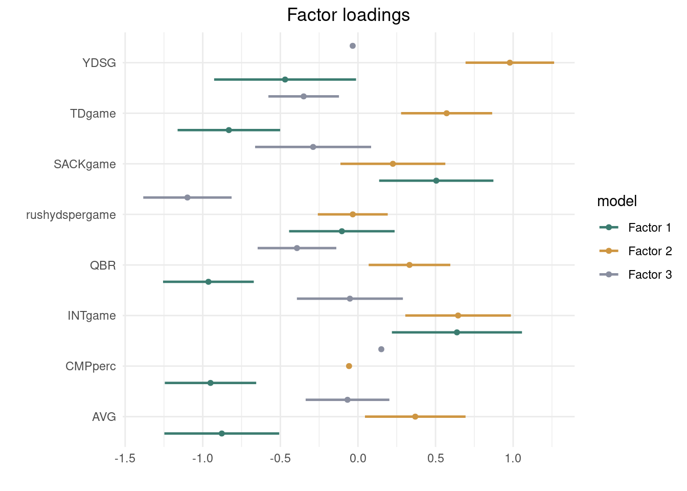
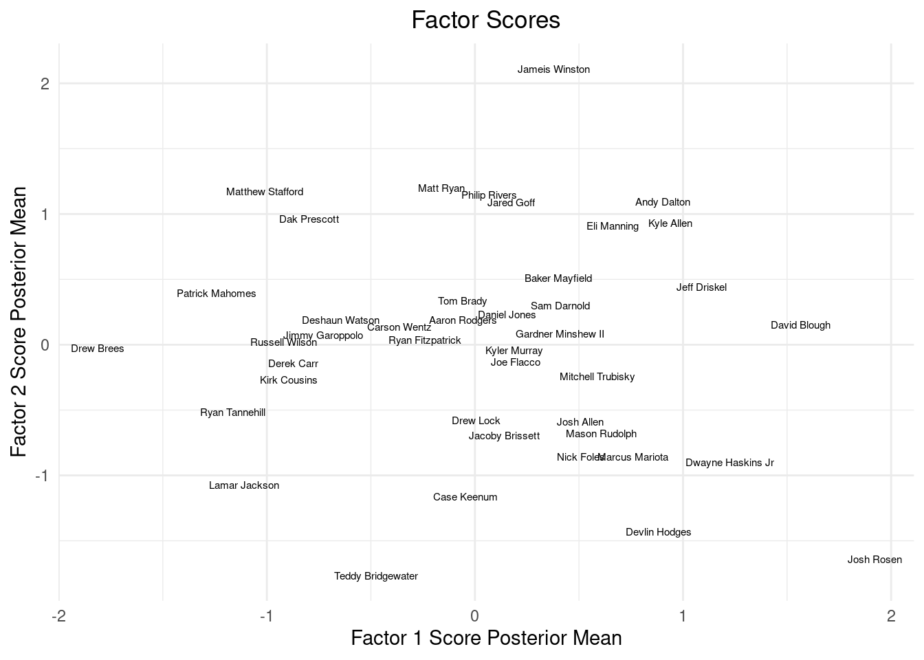
\(X_i = \mathbf{B}f_i+\varepsilon_i, \varepsilon_{i}\sim \mathcal{N}(0, \mathbf{\Psi}), f_{i}\sim \mathcal{N}(0, \mathbf{I})\). \(\mathbf{\Psi}\) is a diagonal matrix with different terms in the diagonals. For \(T\) variables and \(J\) units (quarterbacks), \(\mathbf{B}\) can be thought of as “factor loadings” \(T\times J\) (describe how much variables, attributes of 2019 NFL quarterbacks here, belong to each factor) \(\mathbf{f}\) is a \(J\times T\) matrix of factor scores, which describe the latent \(J\) factors that describe the outcomes at the different times. Given the latent factors, \(f_i\), \(\text{Cov}(X_i\mid f_i)=\Psi\). Integrating out (averaging over the latent factors) the \(f_i\) yields a covariance of the form \(\mathbf{B}\mathbf{B}'+\mathbf{\Psi}\), i.e. \(\text{Cov}(X_i)=\Sigma=\mathbf{B}\mathbf{B}'+\Psi\)6, where \(\Psi\) is a diagonal matrix of noise.
6 Incidentally, the PCA decomposition of \(\Sigma\) is simply \(\mathbf{B}\mathbf{B}'\).
10.6.1 Why factor models are preferable over PCA decomposition
The factor model covariance decomposition is nice because in the variation in \(\mathbf{X}\) is now separated into \(\mathbf{B}\mathbf{B}'\) and the diagonal matrix \(\Psi\). This is preferable over PCA for a couple of reasons. This Lior Pachtor blog is an excellent comparison of the two approaches.
For one, the assumption that the \(\Psi\) matrix is all zeroes feels unrealistic and constrictive. It is not crazy to assume each of the factors/components has a unique noise term attached to it.
The factor model is probabilistic, meaning draws of the latent factors and the factor loadings will be from a probability distribution once we estimate the parameters accordingly, we can do statistical inference and track our uncertainties, which is always nice. As a HUGE benefit, this means the factor model can be used to generate new data, which has a lot of really cool applications.
Interestingly, there are nice mathematical benefits to the factor decomposition, \(\text{Cov}(X_i)=\Sigma=\mathbf{B}\mathbf{B}'+\Psi\), which includes the \(\Psi\) matrix unlike PCA decomposition of the covariance. (Frisch 1934) show that this form has some nice benefits, particularly because of the independent diagonal noise matrix \(\Psi\). If you write \(\mathbf{B}\mathbf{B}'=\Sigma-\Psi\), (Frisch 1934) show that a smaller number of factors can be more meaningful if you subtract off \(\Psi\) first. Formally, the PCA decomposition of \(\mathbf{B}\mathbf{B}'\) may yield “flat” eigenvalues that are all very similar, but the factor decomposition may have a few dominant eignevalues. In other words, the factor model, due to the noise term, will likely explain the variations in the data with less factors (principal components equivalently for PCA).
I think the key really is this: Any covariance matrix will admit either kind of decomposition, but often the rank of B will be substantially smaller if we allow the diagonal elements of Ψ to be non-zero as in the factor decomposition.
For a little more detail, see section 3.2 of (Hahn, He, and Lopes 2018) for a nice explanation on factor models vs PCA.
The code presented below is adapted from Richard Hahn’s blog.From the Bayesian perspective, we introduce a now familiar pipeline. The following procedure represents a helper function for the Gibbs sampler we look at. Priors are chosen to be conjugately prior for convenience.
With \(v\) and \(\beta_{0}\) being prior hyper-parameters, the first stage of the Bayesian sampling routine is: \[
\begin{align}
\psi &\sim \text{inverse gamma}(a/2, b/2)\\
\sigma^2 &= \sqrt{\text{diag}(\Psi)}\\
V_0^{-1} & = \begin{pmatrix}
v&0&0\ldots 0\\
0 & v &0 &0&\ldots 0\\
\vdots&\vdots&\vdots&\vdots\\
\ldots&\ldots&\ldots&v
\end{pmatrix}\\
\hat{\beta} &= (\mathbf{f}'\mathbf{f})^{-1}\mathbf{f}'X\\
V_1&=\frac{1}{\sigma^2}\mathbf{f}'\mathbf{f}+ (V_0)^{-1} \\
\beta_{1} &= V_1\left((\frac{1}{\sigma^2})\mathbf{f}'\mathbf{f}\hat{\beta}+\frac{1}{V_0}\beta_{0}\right)\\
\beta & = \mathcal{N}(\beta_{1}, V_1)\\
\mathbf{B} &= \beta_{2:p}\\
\mu &= \beta_1
\end{align}
\]
Where the final draw from the multivariate normal is done through the Cholesky decomposition of \(V_1\). With \(\mathbf{B}\), the factor loadings, updated, we now sample from \(f\), the factor scores. Then, we update \[
\begin{align}
\psi &\sim \text{inverse gamma}(a/2, b/2)\\
\sigma^2 &= \sqrt{\text{diag}(\Psi)}\\
V_0^{-1} & = \begin{pmatrix}
v&0&0&0&\ldots 0\\
0 & v &0 &\ldots 0\\
\ldots&\ldots&\ldots&v
\end{pmatrix}\\
\hat{\beta} &= (\mathbf{B/\sigma^2}'\frac{\mathbf{B}}{\sigma^2})^{-1}\frac{\mathbf{B}}{\sigma^2}'\frac{\mathbf{X}-\mu}{\sigma^2}\\
V_1&=\mathbf{B}'\mathbf{\mathbf{B}}+ (V_0)^{-1} \\
\beta_{1} &= V_1\left(\frac{1}{\sigma^2}\mathbf{B}'\mathbf{B}\hat{\beta}+\frac{1}{V_0}\beta_{0}\right)\\
\beta & = \mathcal{N}(\beta_{1}, V_1)
\end{align}
\]
Calculate the posterior predictive distribution (the values of the features given observations of them and integrating out the model parameters) of the above factor model. It is interesting to see how different variables vary together when predicting.
If we had more variables, incorporating the variable selection prior from earlier could be a nice idea. The idea is essentially to use the stochastic search variable selection when sampling through the columns of \(B\). We reproduce the SSVS script below:
Click here for full code
ssvs<-function(X, Y,sigma, v=1/5, beta0=0,beta=NULL,q=NULL ){# preallocate containers for our posterior samples V0inv =diag(v,ncol(X),ncol(X)) p =ncol(X) beta0 =rep(beta0,ncol(X)) XX =t(X)%*%X beta=rep(0, p)#go through the columnsfor (j in1:p){# residualize wrt known values of beta r = Y -as.matrix(X[,-j])%*%beta[-j] v1 =1/(XX[j,j]/sigma^2+ V0inv[j,j]) beta1 = v1%*%((1/sigma^2)*t(X[,j])%*%r + V0inv[j,j]%*%beta0[j]) beta.temp = beta1 +sqrt(v1)*rnorm(1) q.post = q/(q + (1-q)*dnorm(0,beta1,sqrt(v1))/dnorm(0,beta0[j],1/sqrt(V0inv[j,j]))) gamma =rbinom(1,1,q.post) beta[j] = gamma*beta.temp + (1-gamma)*0 }return(beta)}
10.7 Gaussian mixture models
Gaussian mixture models can be seen as a generalization of the Gaussian factor model we described above, but with less restrictions on the covariance shape to be Gaussian. This is accomplished by taking a weighted sum of individual Gaussian distributions, with the weights are drawn according to a probability distribution (this point is key). The following code, motivated by this nice stackoverflow exchange, should help clear up what we are doing:
Click here for full code
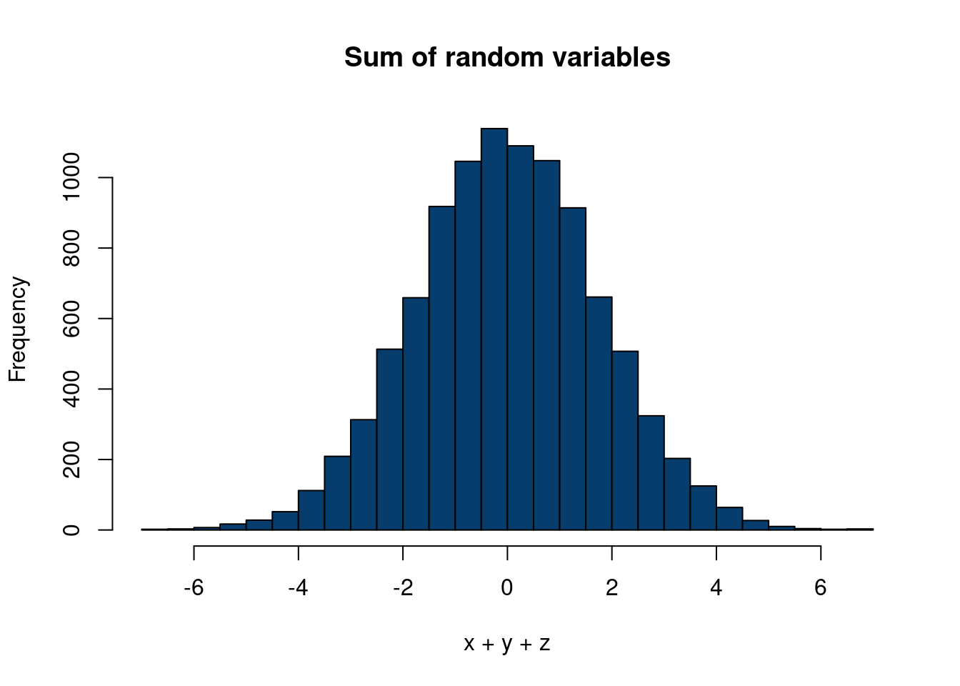
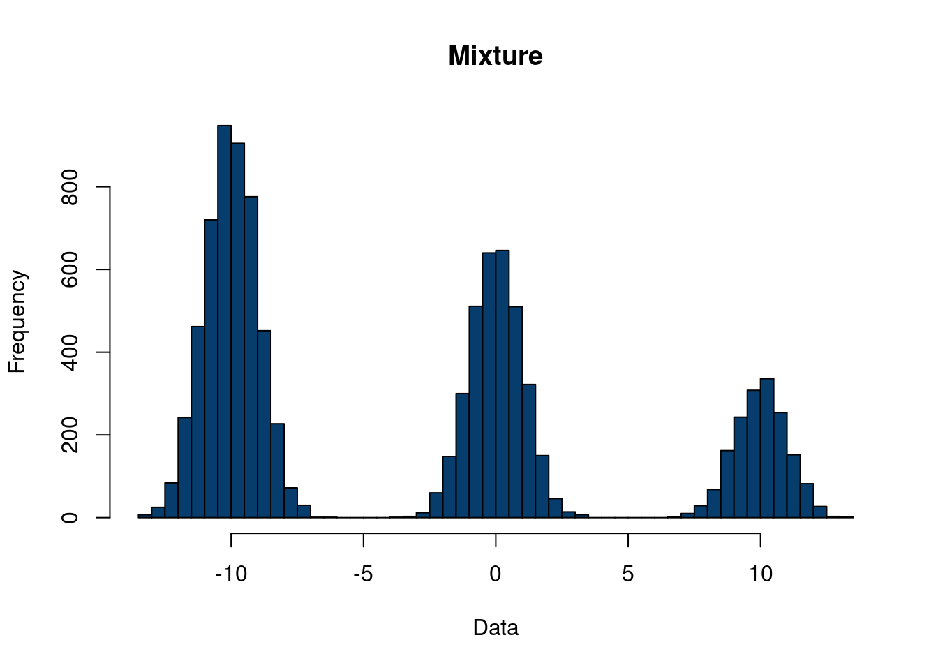
n =10000mu =c(10,0,-10)sigs =c(1,1,1)x =rnorm(n, mu[1],sigs[1])y =rnorm(n,mu[2],sigs[2])z =rnorm(n, mu[3], sigs[3])hist(x+y+z, 40, col='#073d6d', main='Sum of random variables')
Figure 10.2: Comparing a sum of random variables vs a mixture
In contrast to Figure 10.2, see the following, where we generate from the mixture model. We generate our distribution with equal probability to be assigned to each variable, \(x\), \(y\), or \(z\).
In factor analysis, the origin myth is that we have a fairly small number, q of real variables which happen to be unobserved (“latent”), and the much larger number p of variables we do observe arise as linear combinations of these factors, plus noise. The mythology is that it’s possible for us (or for Someone) to continuously adjust the latent variables, and the distribution of observables changes linearly in response. What if the latent variables are not continuous but ordinal, or even categorical? The natural idea would be that each value of the latent variable would give a different distribution of the observables.
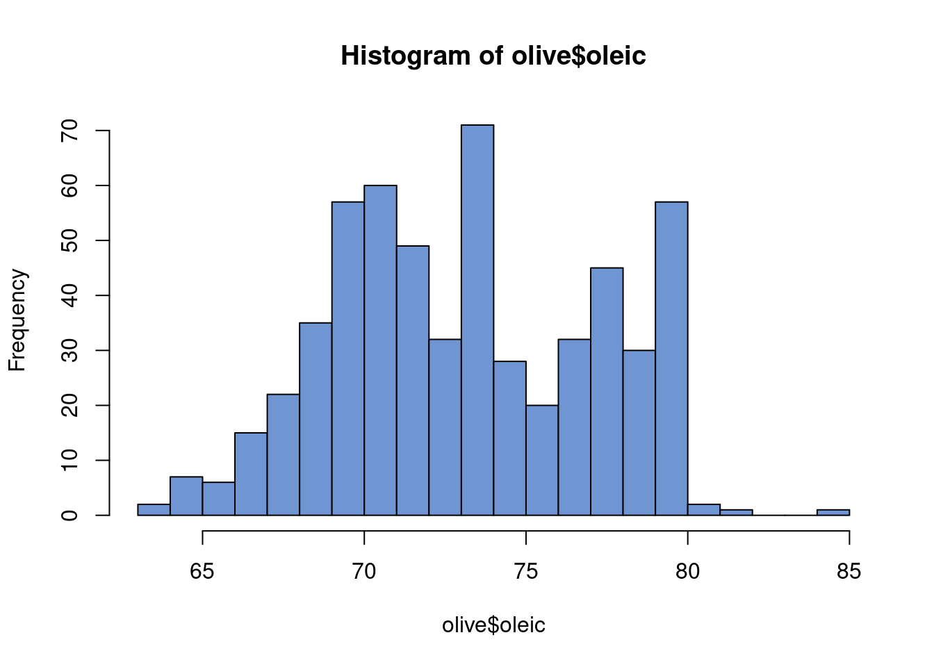
Gaussian mixture models are a really nifty way of using normal distribution to go beyond the normal distribution7. In one dimension, a normal distribution takes on the very familiar bell curve shape. In two, it is an ellipse. After that, it’s pretty difficult to conceptualize, but the general idea is in these low dimensions in particular it is a not a particularly flexible shape. However, what if we sum together two normal distributions? Let’s motivate this with an example. The data are from Terfloth and Gasteiger (2001) and can be found at dslabs. It describes 8 fatty acides found in 572 olive oils from different regions of Italy.
7 Interestingly, the mixture model is (generally) no longer a normal distribution. There is an interesting distinction between the sum of random variables and the mixture of distributions for the interested reader to look into.
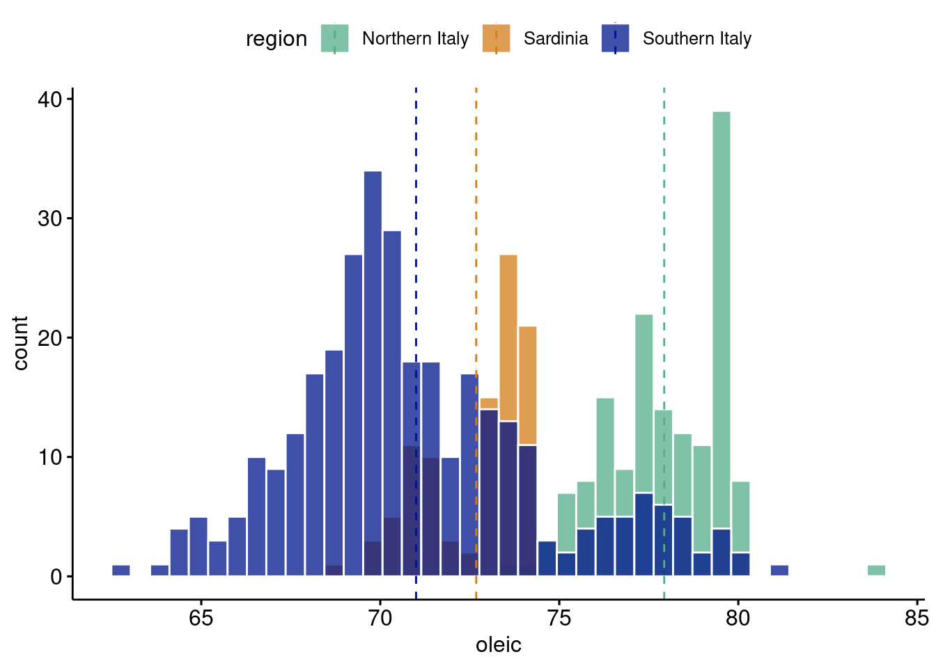
gghistogram(olive, x ="oleic",add ="mean", rug = F,color ="white", fill ="region",alpha=0.75,palette =c("#55AD89", "#d47c17","#001489"), bins=40)
Oleic acid in olive oil is a pretty important feature of why people argue it is a “super food”8 . The above plot is pretty interesting. The histogram clearly looks multimodal. Therefore, a sum of normal distributions seems like a reasonable thing to do. However, of further note, the different modes seem to correspond to different regions in Italy9. This gives us even more reason to use the Gaussian mixture model, and also motivates it’s use as a clustering algorithm. Not only is it a way to generate more flexible densities (or probability distributions or histogram shapes depending on how formal we want to be), but we can interpret the different sums as being underlying factors that generated our data. Hence the “latent” (or hidden) structure this chapter is studying. It is particularly nice if we have data that can confirm our hunch that there is actually a mixture of 3 separate densities that made up our observed histogram, but this is not always the case.
8 Oleic acid is a key ingredient in ibuprofen which is why olive oil can be used for headaches or hangovers!
9 Except for southern Italy…olive oil lovers, let’s get to the bottom of this…
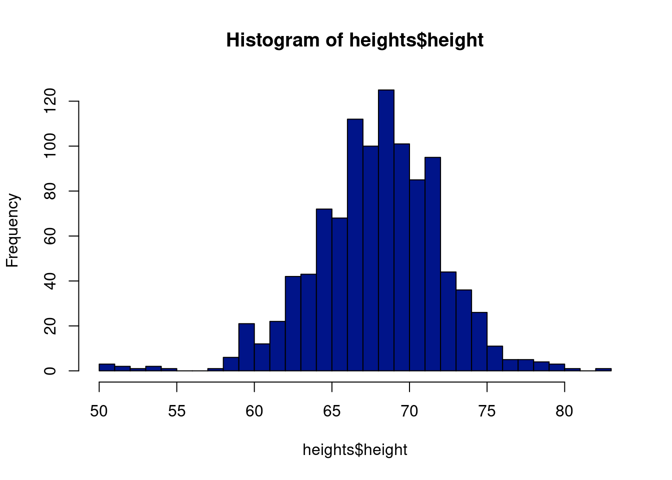
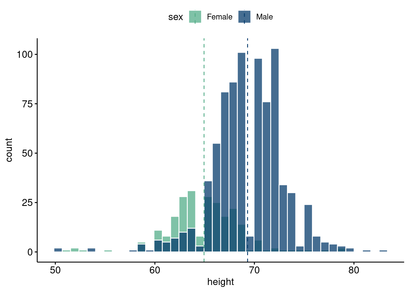
Take the following example: self-reported heights from the dslabs package in R, with a link here. The overall histogram certainly looks unimodal, but if look by sex, we see a clear bimodal breakdown. So there is reason to believe there are two distinct groups generating the data on heights from the further investigation (as well as common experience living in the U.S.), but a first glance at the overall data would not suggest this. If the data were from an area where domain expertise is required to tease out a structure, or where there was not an obvious grouping such as here, then we could be missing out on the hidden structure.
10.7.1 Usage of Gaussian mixture model
The Gaussian mixture model is useful for a variety of applications. A big application is to estimate densities, such as the work done by (Roeder 1990) and (Roeder and Wasserman 1997). This work can be extended to incorporate non-normal errors in a regression model, which helps enable “density regression”. Additionally, the mixture model can be used as an extension of the Gaussian factor model for “clustering” observations. On the “clustering” side of things, some care is required that resembles the issues encountered with the methods we talked about previously.
The Gaussian mixture model is essentially just separating the data based on where it differs the most from other data points; in the case where there are actual underlying groups generating the data and there are clear separations, this tends to work great! When there isn’t an actual underlying structure creating the groupings, or the groupings aren’t particularly strong, there will be issues. There still will exist some separation of the data that will lead to clusters, particularly in higher dimensions, whether or not they are meaningful. An example with Taylor Swift’s music will show this later.
And the examples we have looked at do not even really paint the whole difficulty of the picture! For one, we have only looked at one dimensional data, where clusters are easier to see by eye. Additionally, the data we looked at had obvious clusters rooted through logical reasoning. It is harder to posit an underlying structure when we are not sure what the hidden structure should be, versus thinking there should be one, even if we do not immediately see it in the data. And that’s assuming we are incorporating the correct data that we think describes the object of interest (for example, choosing the correct variables to identify patterns in Taylor Swift’s songs). Oooof, this clustering stuff is gonna be hard. (Yes, so tread lightly)
The methods are simply “mathematically expedient”. We do not have a “label” that says whether or not the output is reasonable and thus it is unfair to represent or even expect these types of models to give a reliable and consistent representation of input features, barring extensive validation. In regression problems, we can check out of sample performance via metrics or loss/utility evaluations. With regards to structures we cannot observe? Good luck.
That being said, the uses of Gaussian mixture models are abound. Chapter 3.9.1 of (Rossi, Allenby, and McCulloch 2003) has a fascinating discussion on identification in Gaussian mixture models that pertains to the discussion we had above. In particular, they discuss the “label switching” problem, where the individual mean components may be mis-labeled if there is scant information in the data available (limited data size or limited separation of the data for example)10. While this can be problematic if we aim to do inference on the sub-populations defined by the mixture model, we can find use of the mixture model if viewed “as a flexible approximation to some unknown joint distribution” (Rossi, Allenby, and McCulloch 2003).
10 Another more problematic identification issue is when the mixture of distributions yield the same distribution. See chapter 17.1.5 of Shalizi’s Advanced Data Analytics from an Elementary Point of View(Shalizi 2013). In this case, we cannot even do any inference on the joint distribution that results from the mixtures. For a mixture of normals (the Gaussian mixture model), we need not worry ourselves, since the sum of Gaussian distributions is not Gaussian. Confusingly, the distribution of a sum of Gaussian random variables is Gaussian. From wikipedia:
In probability theory, calculation of the sum of normally distributed random variables is an instance of the arithmetic of random variables.
This is not to be confused with the sum of normal distributions which forms a mixture distribution.
This leads us to our thesis that these models are useful when used in sensible way. For one, they are useful as a model for a joint distribution, which can be particularly useful for modeling flexible error distributions or density regression. As for clustering, while the model may not actually yield the fundamental underlying truths that may be promised by some online, it can help discern patterns that occur in your covariates jointly, particularly if they are well separated.
10.7.2 Data motivation
Let’s begin our exploration of the Gaussian mixture model with a look at heights in the U.S. The data are also from dslabs, this time under the heights tab, including respondents reported height and sex.
gghistogram(heights, x ="height",add ="mean", rug = F,color ="white", fill ="sex",alpha =0.75,palette =c("#55AD89", "#073d6d"), bins=40)
The general model is: \(f(x)=\sum_{i=1}^{M}w_iN(x;\mu_i, \sigma_i^2)\)
where \(N\) is the Gaussian probability distribution (univariate, although we can use the multivariate version with \(\mathcal{N}(\mathbf{\mu}, \mathbf{\Sigma})\) ). The idea then is a density is estimated with a sum of Gaussian distributions. This sum is no longer Gaussian and can fit quite flexible shapes. The way to compute this is usually to introduce some latent (unseen) random variable, \(q\) , which represents the particular mixture (particular Gaussian distribution) component that a data point “belongs” to.
We will show how to encode this (for one-dimensional \(x\)) using the EM algorithm and a Gibbs sampling approach. We will also explain how to approach the problem from a Bayesian non-parametric point of view (where we do not have to pre-specify the number of components) and point to a codebase that implements the approach from scratch. Before we begin, we want to note that the non-Bayesian EM approach still provides us with a way to sample from the resulting likelihood, but recall that we choose \(\mathbf{\theta}\) (in this case the means and the variances of the mixture components) to maximize that likelihood, meaning we do not do inference on those values. The Bayesian approaches, on the other hand, allow for inference of the parameters of the mixture model as well, meaning we can look at the distributions of the means and the (co)variances.
10.7.3 The EM algorithm
We follow these two nice blogs: EM GMM blog 1, EM GMM blog 2. The Gaussian mixture model, in more detail, is given by:
\(\Pr(X_i=x)=\sum_{k=1}^{K}\pi_{k}\Pr(Y_i=y\mid \delta_i=k)\) for the latent random variable \(\delta_i\), which represents the generative class 11 that observation \(i\) lies in. Essentially, there is some random variable dictating which class observations belong to, where the class corresponds to a normal distribution with mean \(\mu_k\) and variance \(\sigma_{k}^2\)12. In the plots above (the Italian olive oil and gender height distributions), think of the different curves as the latent class, for example the different regions of Italy. Of course, the data may not actually be generated from a latent variable describing the probability of which of the \(k\) mixtures generated that point. And, as we saw, we may still be able to differentiate our data into different clusters regardless of whether or not they were generated in this way. And, even if they were, estimation can be difficult if the mixtures of normals are not particularly well separated. Anyways, the last few sentences are just meant to emphasize the difficulty of the process we will describe more formally.
11 Another way to think of this is which group the data point \(i\) belongs to.
12 The procedures we describe generalize to the mixture of multivariate normal distributions as well.
10.7.4 The Gibbs sampler for Gaussian mixtures
The Gaussian mixture model, as we saw before, is given by:
\(\Pr(X_i=x)=\sum_{k=1}^{K}q_{k}\Pr(X_i=x\mid \delta_i=k)\) for the latent random variable \(\delta_i\). \(\delta_i\sim \text{Binomial}(k-1, q_k)\), meaning \(\delta_i\) is encoded by the probability \(X_i=x\) belongs to class \(k\), drawn with probability \(q_k\). This implies that the observed \(X_i\) is given by \(X_i=\sum_{k=1}^{K}\delta_{k}N(\mu_k, \sigma_k)\).
To proceed with a Gibbs sampler, we need to calculate the probability of the latent “class constructor” given the other parameters of the model. Essentially, this is saying what is the probability that observation \(X_i\) “belongs” to \(\delta_i=k\), for \(k\in \{1, 2, \ldots, k\}\). Given \(K\) component mixtures and \(\mathbf{\Theta}_q=\{\mu_1, \mu_2, \ldots, \mu_{K}, \sigma_{1}^2, \sigma_{2}^{2}, \ldots, \sigma_{K}^2\}\), then we can use our old friend Bayes rule to write the full conditional distribution of \(\delta\) as:
With the full conditional distribution in hand, we can proceed with our Gibbs sampler. The full conditionals for the other distributions are given by:
FILL IN!
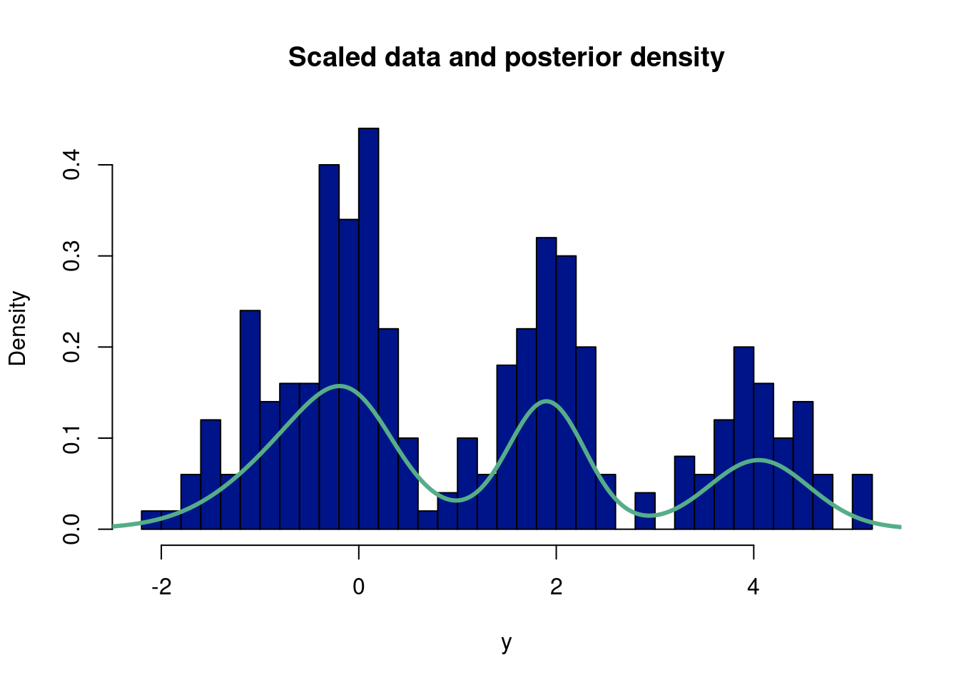
The following script implements a Gibbs sampler on simulated data. This is adapted from a HW assignment for Richard Hahn’s class. Again, we should ramp up the “mc” and “burnin” variables, but we keep them lower here so the code runs faster.
##better way!##suppressMessages(library(gtools)) # for the rdirichlet functionalityset.seed(8) # this makes the example reproducibleN =250# this is how many data you wantprobs =c(0.2, 0.4, 0.6, 0.8) # these are *cumulative* probabilities; since we monte carlo so that we are#can also make these more likely to affect height of each bump.#probs is n-1, because last element sums to 1!dists =runif(N) # here generating random variates from a uniform (250 uniform 0,1 default# to select the relevant distribution# this is where the actual data are generated, it's just some if->then# statements, followed by the normal distributions you were interested indatastuff =vector(length=N) #run a 1000 runs, each of length 1for(i in1:N){if(dists[i]<probs[1]){ datastuff[i] =rnorm(1, mean =-1, sd = .5) } elseif(dists[i]<probs[2]){ datastuff[i] =rnorm(1, mean =0 , sd = .25) } elseif(dists[i]<probs[3]){ datastuff[i] =rnorm(1, mean =1 , sd =1) } elseif(dists[i]<probs[4]){ datastuff[i] =rnorm(1, mean =2 , sd = .25) } else { datastuff[i] =rnorm(1, mean =4, sd = .5) }}y <- datastuffn <-length(y)#hist(datastuff, 40, freq=F)# hyperparameters for the independent mu priorsm0 =0v0 =10# hyperparameters for the independent sig priorsalpha =1beta =1# use a dirichlet(1,1,...,1) prior for q# initialize other containerspost.alphas =rep(0,k)qprime =matrix(0,n,k)#mc countsmc =1000burnin =500#empty k matrices for mu, sigma, and q posteriormu.post =matrix(NA,k,mc)sig.post =matrix(NA,k,mc)#q.post = rep(NA,mc) #save the posterior q (weight)q.post =matrix(NA,k,mc)post.alphas=rep(0,k) #we save all the alphasqprime=matrix(0, n, k) #as we iteratively update qprime, from the data#the data is length n, want a multivarnorm at each component from y for each mixture, hence n x k#initial mu, sig, q, and deltamu_init=0sig_init=2mu_list=rep(mu_init,k)sig_list <-rep(sig_init, k)q <-rep(1/k, k) #same q weight in every mixturedelta <-rbinom(n, k-1, q[1]) #we use gam to draw# since all q are the same a priori, just use the first elementfor (iter in1:mc){#bayes rule, finding probability we came from component 1/ total sum#update q, for this observation probability is belongs to component# qprime = Pr(delta|everything) = q*dnorm(y,mu1,sig1)/(q*dnorm(y,mu1,sig1) + (1-q)*dnorm(y,mu2,sig2))#qprime is the probability simplex#here, we note that gam is the latent variable, an indicator,#draw k values to have an indicator for where were at# sample gamma, given q, mu, sig denom =c()for (p in1:k){ denom[[p]] = q[p]*dnorm(y,mu_list[p],sig_list[p]) }for (j in1:k){#qprime[,j] = q[j]*dnorm(y,mu_list[j],sig_list[j]) #qprime is nxk, n determined by y, k the weights qprime[,j] = q[j]*dnorm(y,mu_list[j],sig_list[j])/sum(unlist(denom)) }# sample gamma for each datapoint#instead of looping through a list of rbinoms, we can isntead#use rmultinom, up to k occrurences, with k-probabilities, draw success/fail at different probabilties#in our case, rmultinom is rbinom, but repeated for n-observations and k-different probabilities#rows are the number of observations, i.e. number of binom draws, columns correspond to different q wefor (i in1:n){ delta[i] =which(rmultinom(1,1,qprime[i,])==1) #instead of binom list, gives the latent var per obs#, i.e. in 2-d case where q==1, but now over all the k-probability columns }# sample mu, given gammma, sigfor (j in1:k){ n0=sum(delta==j) ysum=sum(y[delta==j]) s =1/sqrt(1/v0 + n0/sig_list[j]^2) m = s^2*(m0/v0 + ysum/sig_list[j]^2) mu_list[j] =rnorm(1,m,s) a = alpha + n0/2 b = beta +sum((y[delta==j] - mu_list[j])^2)/2 sig_list[j] =1/sqrt(rgamma(1,a,b)) post.alphas[j] =1+ n0 }#gam_count=as.numeric(table(factor(gam, levels=0:(k-1))))#gam_count not working for scenario where gam=0...annoying# sample q, given gamma#q = rdirichlet(gam_count) q=rdirichlet(1,post.alphas)# q = rbeta(1,1 + sum(gam),1 + n - sum(gam))#posteriors mu.post[,iter] = mu_list sig.post[,iter] = sig_list q.post[,iter] = q}ygrid =seq(-4,6,length.out=2000)fmean =rep(0,length(ygrid))for (j in (burnin+1):mc){ temp =0for (i in1:k) { temp = temp + q.post[i,j]*dnorm(ygrid,mu.post[i,j],sig.post[i,j]) } fmean = fmean + temp/(mc)#lines(ygrid,temp,col='#55AD89',lwd=1)}hist(y,40, freq=FALSE, main="Scaled data and posterior density", col="#001489")lines(ygrid,fmean,col='#55AD89',lwd=3)
Assignment 10.2
You may be wondering about if there is a more streamlined way to choose the number of mixture components. There are certainly tests that can be done (such as checking the AIC criterion), but the most natural way lies in Bayesian non-parametrics. It involves setting a prior on the number of components and through a “Dirichlet process” determining the number of components in the posterior distribution of the mixture model.
Implement the Dirichlet process Gaussian mixture model from scratch. This tutorial should help (with github link should help).
Make a set of slides or a shiny app or a one page pamphlet to explain the main ideas and give a brief tutorial on Dirichlet process GMM to the class.
10.8 In our GMM era
Incoming… we are diving deep into the Taylor Swift lore. Did she lie about having “eras”…soon we will know. Here is where the data are from: https://pieriantraining.com/analyzing-taylor-swifts-songs-with-python/. Uncomment the bottom line in this chunk to save your own mixture model for a later visualization, otherwise use the existing one from the data folder.
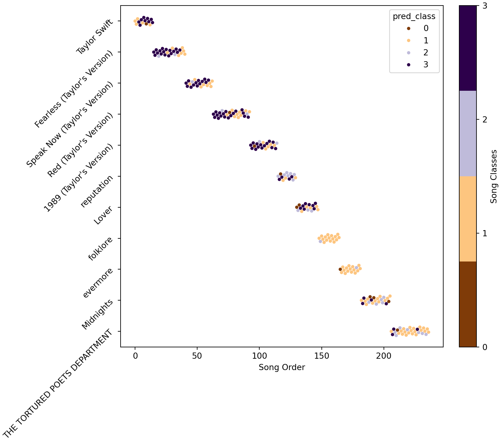
Lets see if there is separation of classes versus some other feature that will help us build faith in the underlying latent structure. Let’s marginalize out year of the song, which isn’t actually part of a song structure, but could be used to show Taylor Swifts changes over time. For example, here the x-axis is the order her songs have been released (the index in an album, with the albums ordered by time)
Click here for full code
palette = []cmap = plt.cm.get_cmap('PuOr', n_mix) # matplotlib color palette name, n colorsfor i inrange(cmap.N): rgb = cmap(i)[:3] # will return rgba, we take only first 3 so we get rgb palette.append(matplotlib.colors.rgb2hex(rgb))matplotlib.rcParams.update({'font.size': 10})fig, ax = plt.subplots(figsize=(8.5,7.5), constrained_layout=True)#https://stackoverflow.com/questions/64553046/seaborn-scatterplot-size-and-jittersns.set_palette('PuOr', n_colors=10)def jitter(values,j):return values + np.random.normal(j,0.1,values.shape)plt.scatter(x = mDF.index,y = mDF.album_name,s=0, c=mDF.pred_class,cmap=plt.cm.get_cmap('PuOr', n_mix))plt.yticks(rotation=45)
Interesting…maybe she did actually have eras who knew? Now, let’s look at some corner plots.
Click here for full code
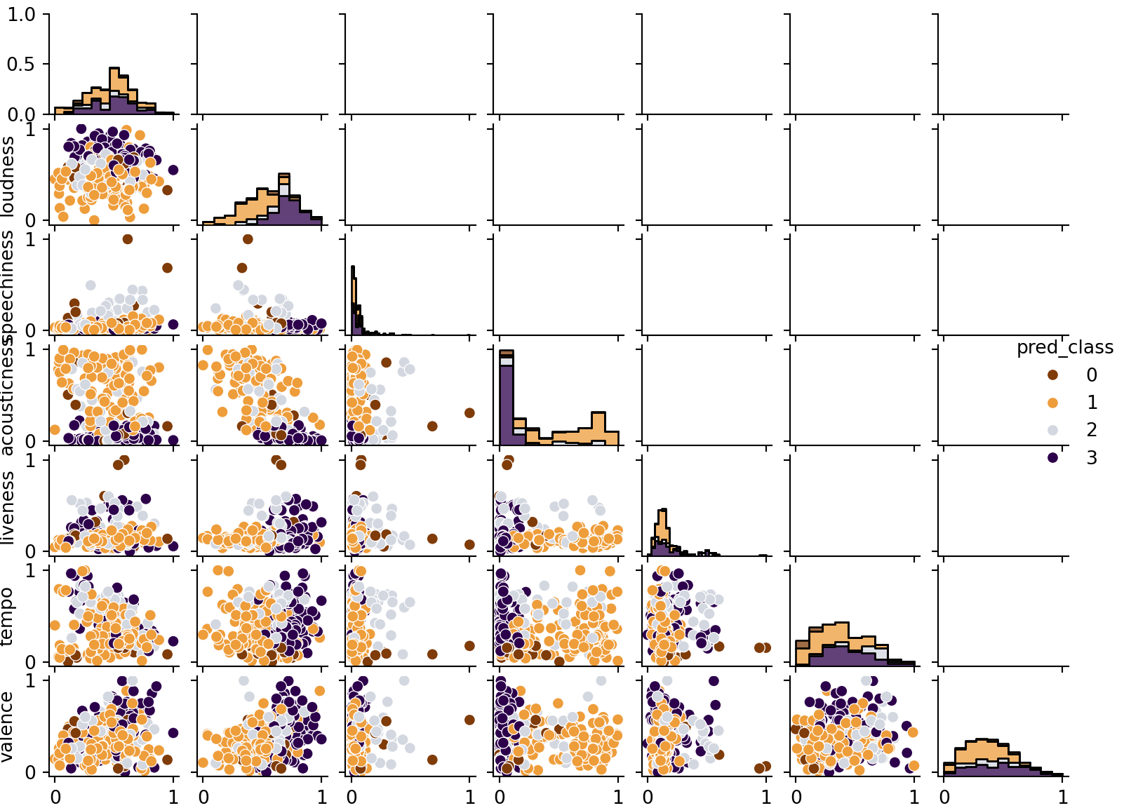
color_list = ['#7f3b08', '#ee9d3b','#d3d7e0','#2d004b']#### Look at biariate plots but just for whiffs ####def bivar_plots(mDF, Title): g = sns.PairGrid(data=mDF,hue="pred_class",palette=color_list) g.map_diag(sns.histplot, multiple="stack", element="step") g.map_lower(sns.scatterplot) g.add_legend() g.fig.set_size_inches(8.4,6)#(X-X.min())/(X.max()-X.min())X['pred_class'] = mDF.pred_classX.columns = song_features+['pred_class']bivar_plots(X, 'Bivariate Separation')plt.show()
Figure 10.5
This example should hopefully be illuminating for many reasons. For one, take a look at the table at the end of the chapter. The data is a little weird. The 10 minute version of All too Well weirdly was about average danceability for a Taylor Swift song, whereas the original 5 minute version was very undanceable. Both songs were also grouped into different clusters, largely driven by differences in tempo. Of course, both songs probably should be clustered together since they are the same song after all, so the fact they are grouped differently because of how the model separates data points into their latent clusters per the stipulations of the Dirichlet process prior (which colloquially serves as a “suggestion” of which means/covariances to generate the mixtures) to find parameters (means and covariances for each mixture) that maximize the likelihood. A mathematically valid procedure, but not necessarily a logical one for the problem at hand. The two All too Well versions may vary enough based on the features to justify two separate clusters (more-so than say All too Well 10 minutes and another song in its cluster which doesn’t have the big tempo difference), but we know as listeners they are the same song!
At the same time, the clustering does seem to separate Taylor Swift’s songs roughly by the time they came out, which makes a lot of sense for an artist who started as a teenager and evolved throughout her career. Given that the features fed to the mixture model did not include a time component, this is encouraging that the clusters are roughly sensible. While the Gaussian mixture model is essentially just splitting the data into clusters that satisfy conditions that make the likelihood of the data as great as possible; it is not guaranteed to tell you anything meaningful.
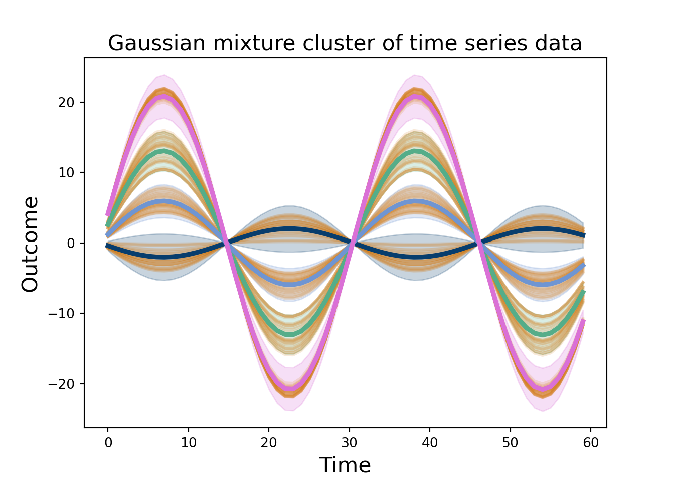
10.8.1 Mixture of Gaussian processes for time series
In this example, we will mix together two features of the multivariate normal we found to be pretty powerful: projecting into higher dimensions (Gaussian processes) and summing together multiple normal curves (Gaussian mixtures). Each idea is surprisingly useful.
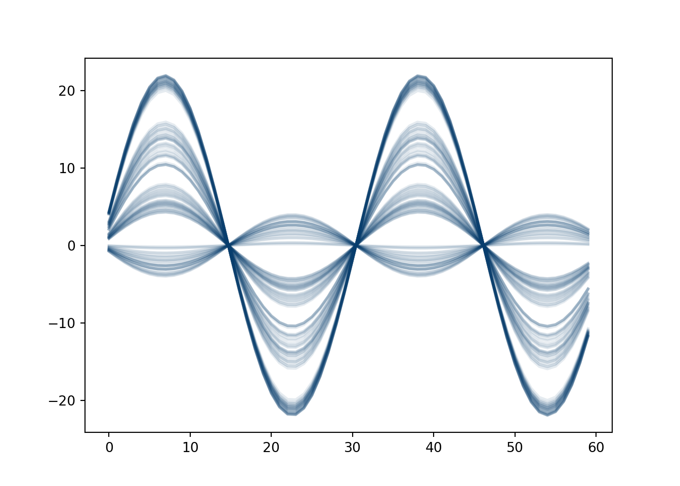
We simulate \(n_2=200\) sine curves with different amplitudes, some noise, and an added time term trend. Over time \(t_2=0, 1, 2, \ldots, 60\). There are 4 subgroups with 50 observations each. This isn’t the best of ideas, as we will discuss soon.
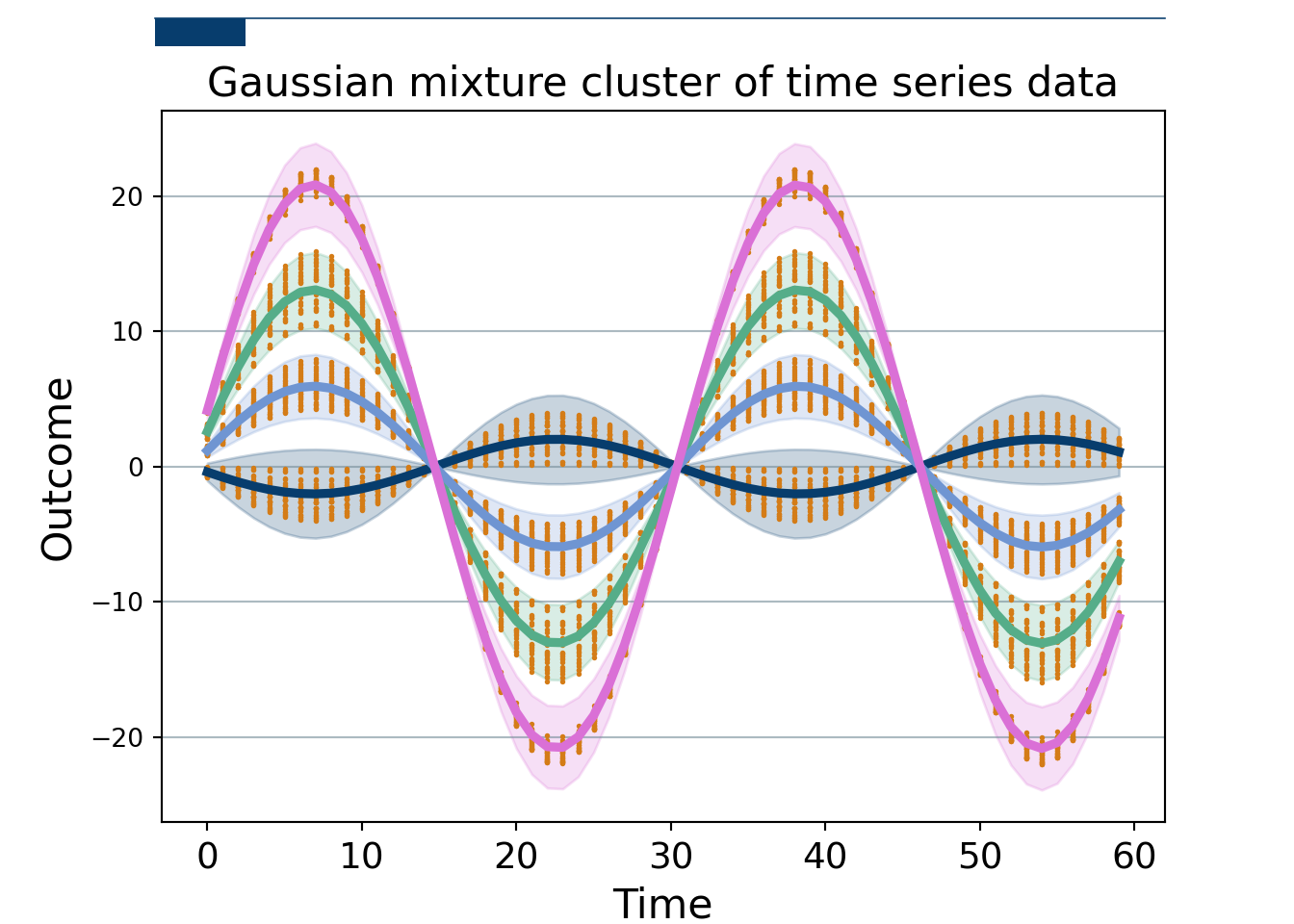
Now, we fit a Bayesian Gaussian Mixture with scikit learn. The data is stacked \(n_2\times t_2\), we take the transpose, so the Gaussian mixture has a covariance that is shape \(t_2\times t_2\) and mean \(t_2\times 1\), meaning we can get clusters across time. We sample from the scikitlearn Bayesian Gaussian Mixture (which allows us to not have to pre-specify the number of clusters…sorta…but thats not really the point), giving us estimates at each time for each draw, as well as which cluster that curve belongs to. We can take many draws to get a measure of uncertainty. We take the mean at each time point and then the 0.025 and 97.5% quantiles to give a 95% uncertainty band.
# Setup plot size.fig, ax = plt.subplots(figsize=(7,5))# Create grid # Zorder tells it which layer to put it on. We are setting this to 1 and our data to 2 so the grid is behind the data.ax.grid(which="major", axis='y', color='#758D99', alpha=0.6, zorder=1)# Plot data# Loop through country names and plot each one.pd.DataFrame(data).plot(legend=False, color='#d47c17', linewidth=2.25, alpha=0.16)#plt.plot(np.arange(0,t2),np.array(data), color='#d47c17',marker='.',#linestyle='None',markersize=2.05, alpha=1)plt.plot(np.mean(sample_1[0][zeroes[0]], axis=0), color='#073d6d', label ='cluster 1', linewidth=3.5)plt.fill_between(np.linspace(0, t2-1, t2), LB_zero, UB_zero, color='#073d6d', alpha =0.22)plt.plot(np.mean(sample_1[0][ones[0]], axis=0), color='#55AD89', label ='cluster 2', linewidth=3.5)plt.fill_between(np.linspace(0, t2-1, t2), LB_one, UB_one, color='#55AD89', alpha =0.22)plt.plot(np.mean(sample_1[0][twos[0]], axis=0), color='#6f95d2', label ='cluster 3', linewidth=3.5)plt.fill_between(np.linspace(0, t2-1, t2), LB_two, UB_two, color='#6f95d2', alpha =0.22)plt.plot(np.mean(sample_1[0][threes[0]], axis=0), color='#DA70D6', label ='cluster 4', linewidth=3.5)plt.fill_between(np.linspace(0, t2-1, t2), LB_three, UB_three, color='#DA70D6', alpha =0.22)plt.xlabel('Time', fontsize=16)plt.ylabel('Outcome', fontsize=16)plt.title('Gaussian mixture cluster of time series data', fontsize=16)# Remove splines. Can be done one at a time or can slice with a list.#ax.spines[['top','right','left']].set_visible(False)# Setup plot size.fig, ax = plt.subplots(figsize=(7,5))# Create grid # Zorder tells it which layer to put it on. We are setting this to 1 and our data to 2 so the grid is behind the data.ax.grid(which="major", axis='y', color='#758D99', alpha=0.6, zorder=1)plt.plot(np.arange(0,t2),np.array(data), color='#d47c17',marker='.',linestyle='None',markersize=2.05, alpha=1)plt.plot(np.mean(sample_1[0][zeroes[0]], axis=0), color='#073d6d', label ='cluster 1', linewidth=3.5)plt.fill_between(np.linspace(0, t2-1, t2), LB_zero, UB_zero, color='#073d6d', alpha =0.22)plt.plot(np.mean(sample_1[0][ones[0]], axis=0), color='#55AD89', label ='cluster 2', linewidth=3.5)plt.fill_between(np.linspace(0, t2-1, t2), LB_one, UB_one, color='#55AD89', alpha =0.22)plt.plot(np.mean(sample_1[0][twos[0]], axis=0), color='#6f95d2', label ='cluster 3', linewidth=3.5)plt.fill_between(np.linspace(0, t2-1, t2), LB_two, UB_two, color='#6f95d2', alpha =0.22)plt.plot(np.mean(sample_1[0][threes[0]], axis=0), color='#DA70D6', label ='cluster 4', linewidth=3.5)plt.fill_between(np.linspace(0, t2-1, t2), LB_three, UB_three, color='#DA70D6', alpha =0.22)plt.xlabel('Time', fontsize=16)plt.ylabel('Outcome', fontsize=16)plt.title('Gaussian mixture cluster of time series data', fontsize=16)# Reformat x-axis tick labelsax.xaxis.set_tick_params(labelsize=14) # Set tick label size# Add in line and tagax.plot([0.12, .9], # Set width of line [.98, .98], # Set height of line transform=fig.transFigure, # Set location relative to plot clip_on=False, color='#073d6d', linewidth=.6)ax.add_patch(plt.Rectangle((0.12,.98), # Set location of rectangle by lower left corder0.07, # Width of rectangle-0.03, # Height of rectangle. Negative so it goes down. facecolor='#073d6d', transform=fig.transFigure, clip_on=False, linewidth =0))# Add in title and subtitle#ax.text(x=0.12, y=.91, s="Ahead of the pack", transform=fig.transFigure, ha='left', fontsize=13, weight='bold', alpha=.8)#ax.text(x=0.12, y=.86, s="Top 9 GDP's by country, in trillions of USD, 1960-2020", transform=fig.transFigure, ha='left', fontsize=11, alpha=.8)###plt.savefig('/home/spange/Dropbox/STP231/statistical_machinery/gmm_ts_sim.png', facecolor='white', transparent=False)# Set source textax.text(x=0, y=-0.1, s="""https://towardsdatascience.com/making-economist-style-plots-in-matplotlib-e7de6d679739""", transform=fig.transFigure, ha='left', fontsize=9, alpha=.7)
Figure 10.7
Of course, fitting a Gaussian mixture to 60-dimensional data is playing with fire. We have to estimate the designated weights (for the number of mixtures). Okay, not too bad. A 60-dimensional mean vector…okay that’s harder. AND a \(60\times 60\) dimensional covariance matrix…yikes! Modeling that many dimensions is really hard and prone to issues.
That being said, the idea is kind of nifty actually. If we have a known covariance and mean vector, then we just have to estimate the weights. In particular, if these are estimated either from many samples or a smoothed trajectory, this idea can be promising. This example was conjured to provide a proof of concept, but for real-life applications fitting this mold, this approach is promising. If we have fairly structured data that we reasonably expect to see distinct generative variations of, and have many repetitions of these data, then we could use this approach to create more synthetic observations. An example might be outputs of experiments run with different settings repeated for each distinct setting. (Yang, Tartakovsky, and Tartakovsky 2018) take this approach but for a single Gaussian process (rather than a mixture, similar to what we did in chapter 8) based off of many physics simulations that emulated an experiment. They take the empirical mean and covariance of the observed data (where each observation represents a random variable realization) and use that to generate synthetic experimental data in lieu of the physics simulations which take days to run on a supercomputer. They call their approach “physics informed” due to the covariance and mean of the multivariate normal coming from the physics experiments.
So this example we think really helps hammer home the issues with this type of modeling. The plot above clusters the U.S. states based on which states are “most similar” based on their driving attributes (which together constitute \(\mathbf{X}\)). Different algorithms will define “similar” in different ways, but they still don’t really say what a “bad driver” is. We cannot look at the plot and say “ah yes, cluster 1 are the bad drivers” because we have not defined an outcome! If the goal was to predict fatalities per capita, we could simply collect more data until we reach an acceptable predictive metric, like rmse or \(r^2\) passes a threshold. If more data changes our probability distribution and consequently which states are clustered together, it will be hard to lend credence to the study. That being said, it is still interesting to see which states are grouped together and if that can yield insight into future data explorations.
In fact, the fivethirtyeight article linked above comes to similar conclusion at the end, writing:
I’m sorry there’s no easy answer here, Lisa. The number of car crashes, even fatal ones, just isn’t a clear-cut way to understand who is and who isn’t a bad driver. But I can say that insurance providers think that you North Carolinians deserve low prices compared to the national average — perhaps because each of your insured drivers only cost them $128 in collision losses in 2010.
Hope the numbers help,
Mona
10.9 Do Chat-bots hallucinate?
It’s not hyperbole to say Chat-GPT took the world by storm circa 2022. What seemed like science fiction ten years prior was all of a sudden reality. Now, a “machine” could write a hypothetical story about 5 goofy pals and their charades and shenanigans while searching for a place to eat dinner, filled with twists, turns, and laughs. But, it was quickly pointed out that chatbots were prone to “hallucinations”, that is they would give wrong answers to simple questions, such as “how many r’s are in the word strawberry?”.
What is going on? On a technical level, we are not equipped to answer this question. For this particular example, there seemed to be an issue with how the tokens were encoded. But at a higher level, we think that Chat-GPT is not necessarily designed to give the “right” answer. As we have seen throughout these notes, the definition of “right” is crucially important to define. In the case of Chat-GPT, it is a language model designed to return the text that is most likely based on the question asked, sequentially building its answer off the first word it generates, then the second, and so on. Sure, it can go “awry” if it’s first word is wrong and maybe this “error” compounds, but we think the more fundamental issue is a ridiculous sounding answer could simply be a reasonable text given the data it was trained on13. For what its worth, this read claims LLMs based on transformer architecture do not actually learn “fundamental semantics” and “linguistic meaning”.
13 IDK man the internet is dumb some times
The picture below is a nice illustration of this. LLM’s, even with “superposition” and the Johnson-Lindenstrauss lemma, are limited by the dimension of the embeddings of words/phrases into tokens, as well as the quantity/quality of data. The former illustrates how hallucinations can occur due to properties of the LLM architecture. The latter would occur even with infinite dimensional embeddings; if certain semantic structures do not exist in the training data, you are out of luck.
A nice example of how hallucination can occur. From linkedin. Ultimately, over-simplified… see this [wonderful blog post](https://mikexcohen.substack.com/p/king-man-woman-queen-is-fake-news).
Why is this rambling in this chapter? Well, we discussed in chapter 7 that LLM’s are probability density estimators (of the entire English language, for example). Therefore, LLM’s are similar to the unsupervised learning methods as it is fairly difficult to define “correct”. In this chapter, we saw an adjacent example with the study of the Taylor Swift songs. Sure, “All too Well” version 2 and version 1 are different enough (because of the time length) to justify being in different underlying clusters defining Taylor Swift’s musical eras. To music fans, this is nuts, as it is literally the same song. But mathematically, its not wrong. Assigning a label to an unlabeled method can make it seem like it’s not working as expected, whereas the issue is really trying to interpret the method’s output as we would a supervised learning method. Same with LLM’s, which fundamentally are estimating a probability distribution and drawing the next likeliest word given the previous ones. Fixing hallucinations could involve understanding the logic behind it’s silly sounding answers, or accept that a transformer based LLM is a next token probabilistic text-generator. It is phenomenal in some very useful cases, but current architectures do have some structural limitations. See this interesting article with an aggressive title (Hicks, Humphries, and Slater 2024).
Are these LLM criticisms due to the unsupervised learning nature of them or just inherent to machine learning methods? A bit of both. An image recognition neural network can still misclassify an image, but we can devise those methods so that we are very confident in them before deployment, whereas building that confidence with an unsupervised method is trickier. It is probably part of the motivation for reinforcement based human rewards that make LLM’s considered semi-supervised learning. Of course, image detection machine learning, despite being “supervised”, is still a victim to a lot of the issues LLM’s are. Some examples include datasets shifting between training and testing, sensitivity to noise, and not obeying physical constraints14.
14 Although an active area of research is to incorporate constraints/rules, which would help a lot with the lack of extrapolation.
10.10 Summary
To attempt to succintly summarize what has been a long winded chapter, we feel that supervised learning has advantages over unsupervised due to a more well motivated question to answer. defining similarity is tricky, and collecting more data does not solve this question, and can often lead to problematic statistical artifacts (curse of dimensionality). supervised learning, otoh, has well vetted methods like out of sample testing and cross validation. These are not panaceas (curse of dimensionality again and shifts between training and test data), but are more grounded. Other areas of statistics are plagued by similar issues, such as causal inference, where the causal effect is unobservable. However, causal effects can be stress tested with reasonable use cases to build confidence, even if a result is unverifable absent an experiement. Doing so builds more confidence than unsupervised learning simulations, in our opinions, since the goal in the simulation can be really easily defined: estimate the causal effect.
That being said, a lot of our gripes with unsupervised learning come from it being used in clustering/similarity score contexts. Saying two points are similar or belong in the same group essentially feels like determining an outcome using a statistical method, and we’ve discussed at length some potential issues with that approach. However, as purely generative models, unsupervised learning methods have some really cool applications! Splitting Taylor Swifts songs into buckets based on their underlying mixture components was problematic, but potentially generating a new song with the modeled distribution could be a really cool idea with useful applications (albeit we would need different data than the example above, but we digress)!
Apple researchers (Mirzadeh et al. 2024) showed how a lot of the “benchmarks” commonly cited are a bit bogus (not their words). This blog by Gary Marcus highlights this paper, again arguing LLM’s are simply really great pattern matchers whose prediction engine is a next token probability. Unfortunately, current examples which show this will be solved. For example, LLM’s cannot multiply two 15 digit numbers at all. Computers have been tasked with, and capable of, this for a while. But, now that this has been exposed, people like Demetri will multiply two large numbers in google to see if it is feasible. Now there is more training data for the next, bigger LLM. So if this “problem” is solved, it’ll be posed as evidence of learning and reasoning when that is not necessarily the case. So it goes.
.standings {font-family:Karla,"Helvetica Neue",Helvetica,Arial,sans-serif;font-size:0.75rem;}.title {margin-top:2rem;margin-bottom:1.125rem;font-size:0.75rem;}.title h2 {font-size:1.0rem;font-weight:600;}.standings-table {margin-bottom:1.25rem;}.header {border-bottom-color:#555;font-size:0.75rem;font-weight:400;text-transform:uppercase;}/* Highlight headers when sorting */.header:hover,.header:focus,.header[aria-sort="ascending"],.header[aria-sort="descending"] {background-color:#eee;}.border-left {border-left:2pxsolid#555;}/* Use box-shadow to create row borders that appear behind vertical borders */.cell {box-shadow:inset0-1px0rgba(0,0,0,0.15);}.group-last.cell {box-shadow:inset0-2px0#555;}.team {display:flex;align-items:center;}.team-flag {height:1.75rem;border:1pxsolid#f0f0f0;}.team-name {margin-left:0.5rem;font-size:0.75rem;font-weight:700;}.team-record {margin-left:0.35rem;color:hsl(0,0%,45%);font-size:0.75rem;}.group {font-size:0.75rem;}.number {font-family:"Fira Mono",Consolas,Monaco,monospace;font-size:0.75rem;white-space:pre;}.spi-rating {display:flex;align-items:center;justify-content:center;margin:auto;width:1.75rem;height:1.75rem;border:1pxsolidrgba(0,0,0,0.1);border-radius:50%;color:#000;font-size:0.75rem;letter-spacing:-1px;}
Chari, Tara, and Lior Pachter. 2023. “The Specious Art of Single-Cell Genomics.”PLOS Computational Biology 19 (8): e1011288.
Dyer, Eva L, and Konrad Kording. 2023. “Why the Simplest Explanation Isn’t Always the Best.”Proceedings of the National Academy of Sciences 120 (52): e2319169120.
Elhaik, Eran. 2022. “Principal Component Analyses (PCA)-Based Findings in Population Genetic Studies Are Highly Biased and Must Be Reevaluated.”Scientific Reports 12 (1): 14683.
Frisch, R. 1934. “Statistical Confluence Analysis by Means of Complete Regression Systems (1934).”The Foundations of Econometric Analysis, 271.
Goodfellow, Ian, Jean Pouget-Abadie, Mehdi Mirza, Bing Xu, David Warde-Farley, Sherjil Ozair, Aaron Courville, and Yoshua Bengio. 2020. “Generative Adversarial Networks.”Communications of the ACM 63 (11): 139–44.
Hahn, P Richard, Carlos M Carvalho, and Sayan Mukherjee. 2013. “Partial Factor Modeling: Predictor-Dependent Shrinkage for Linear Regression.”Journal of the American Statistical Association 108 (503): 999–1008.
Hahn, P Richard, Jingyu He, and Hedibert Lopes. 2018. “Bayesian Factor Model Shrinkage for Linear IV Regression with Many Instruments.”Journal of Business & Economic Statistics 36 (2): 278–87.
Hicks, Michael Townsen, James Humphries, and Joe Slater. 2024. “ChatGPT Is Bullshit.”Ethics and Information Technology 26 (2): 38.
Hotelling, Harold. 1957. “The Relations of the Newer Multivariate Statistical Methods to Factor Analysis.”British Journal of Statistical Psychology 10 (2): 69–79.
Jolliffe, Ian T. 1982. “A Note on the Use of Principal Components in Regression.”Journal of the Royal Statistical Society Series C: Applied Statistics 31 (3): 300–303.
Krantsevich, Chelsea, P Richard Hahn, Yi Zheng, and Charles Katz. 2023. “Bayesian Decision Theory for Tree-Based Adaptive Screening Tests with an Application to Youth Delinquency.”The Annals of Applied Statistics 17 (2): 1038–63.
Li, Yuelin, Elizabeth Schofield, and Mithat Gönen. 2019. “A Tutorial on Dirichlet Process Mixture Modeling.”Journal of Mathematical Psychology 91: 128–44.
Mirzadeh, Iman, Keivan Alizadeh, Hooman Shahrokhi, Oncel Tuzel, Samy Bengio, and Mehrdad Farajtabar. 2024. “Gsm-Symbolic: Understanding the Limitations of Mathematical Reasoning in Large Language Models.”arXiv Preprint arXiv:2410.05229.
Roeder, Kathryn. 1990. “Density Estimation with Confidence Sets Exemplified by Superclusters and Voids in the Galaxies.”Journal of the American Statistical Association 85 (411): 617–24.
Roeder, Kathryn, and Larry Wasserman. 1997. “Practical Bayesian Density Estimation Using Mixtures of Normals.”Journal of the American Statistical Association 92 (439): 894–902.
Rossi, Peter E, Greg M Allenby, and Robert E McCulloch. 2003. “Bayesian Statistics and Marketing.”Marketing Science 22 (3): 304–28.
Schaeffer, Rylan. 2023. “Pretraining on the Test Set Is All You Need.”arXiv Preprint arXiv:2309.08632.
Shalizi, Cosma. 2013. “Advanced Data Analysis from an Elementary Point of View.”
Terfloth, Lothar, and Johann Gasteiger. 2001. “Neural Networks and Genetic Algorithms in Drug Design.”Drug Discovery Today 6: 102–8.
Yang, Xiu, Guzel Tartakovsky, and Alexandre Tartakovsky. 2018. “Physics-Informed Kriging: A Physics-Informed Gaussian Process Regression Method for Data-Model Convergence.”arXiv Preprint arXiv:1809.03461.


.](images/gpt_hallucinate.jpeg)
